By Kirby Clark
Good interior designers are qualified, experienced and creatively talented, but there are some basic principles that all the best designers follow to execute the perfect interior. I’m going to spill the beans on the most important one so you can take advantage of it in your own home!
There is one principle to interior design that rules them all: Balance. Yes, the thing we search for in life, in love and of course in handstands (which I am still yet to conquer) is also the thing the best interior designers strive for to create the perfect interior.
You know that feeling when you put together a room, and no matter what you do it just doesn’t feel right? That’s because it is most likely out of balance. A balanced interior is the aim of every designer, and the way to achieve this is to create ‘equal visual weight’. Every item in your space has a visual weight; some lighter, some heavier. The key is to get the balance just right.
Mass and tone
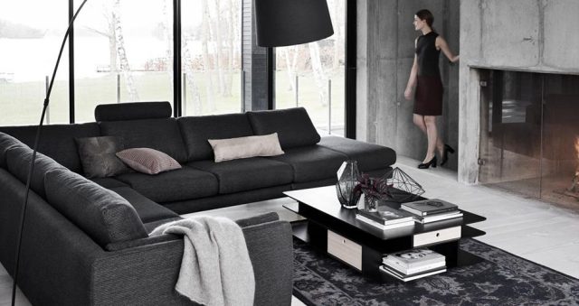
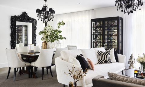
Larger items with darker tones are visually heavier than smaller items with lighter tones. If you have a very dark and chunky lounge suite, this needs to be balanced by lighter and smaller cushions (not just one or two, numerous cushions) and also a throw. Lighter flooring complements the heavier mass of the lounge suite as do lighter walls. Balance this out by adding a coffee table with a similar visual weight, add smaller and lighter decorative elements and voilà, you have a balanced interior!
Patterned vs Plain
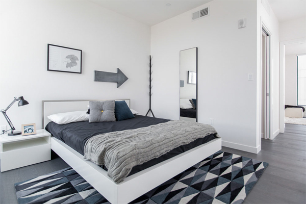
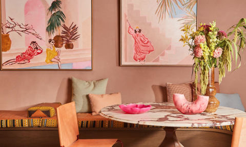
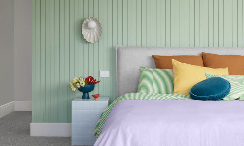
Patterns and textured surfaces are heavier than plain smooth surfaces. If you have a room full of plain, smooth textures, not only does it have the potential to make you feel like you are in a dental clinic, but it isn’t balanced and needs to the introduction of a higher number of smaller patterned and textured features such as patterned throw cushions, textured rugs, chunky knit throws and interesting ornaments to balance out the visual weight.
Layout
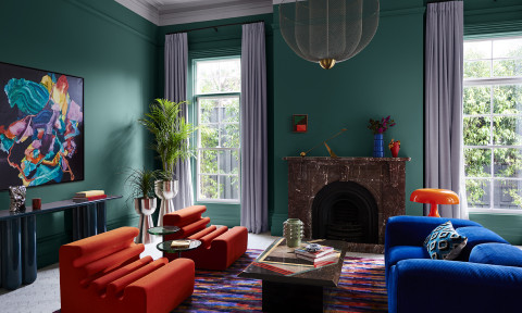
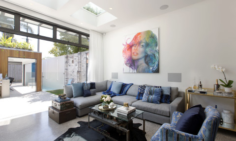
Here’s one that is a little less obvious: objects placed around the perimeter of a space are actually visually heavier than objects placed in the center of a space. This is most tempting in a living room where you feel the need to place your lounge suite, armchairs and entertainment unit all on the outermost perimeter of the room. Trust me here and resist the temptation do so! Get a little more creative with your layout, don’t let everything in this space revolve around the television. Bring that lovely armchair closer to the coffee table and angle it away from the television, this not only encourages interaction with your loved ones but helps create visual balance and places more focus on the centre of your space.
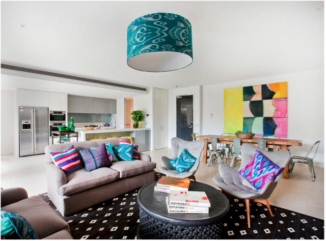
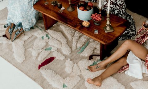
Also, don’t be afraid to get that lounge suite off the wall. Try and incorporate more single chairs than full lounges and make sure you always include a rug under your coffee table. This should be lightly patterned or textured as lounge suites and coffee tables are commonly non-patterned and visually flat. Don’t just use your coffee table as a foot-rest and remote control display, this is where you will feature some of those visually lighter elements such as vases, quirky and colourful personality pieces, ceramics, foliage, small sculptures and/or stacked books with a chunky scented candle on top. I also recommend a simple floor lamp or foliage to break up the perimeter arrangement and add some extra life to the space.
–Kirby Clark is an interior designer and owner of E-Design Australia, an online interior design service.

Comments
Nailed it!
Great article with some solid tips. I need some advice on my little girls room. We have moved into a new home and all the walls are white so we get to start on a blank canvas. I have picked out a lovely little bed for my girls new room: http://www.cuckooland.com/dnc/cuckooland/product/44517/princess-girls-cabin-bed?cat=3235
The problem is i don’t want to over do it will the typical pink and girly theme, do you have any advice on how to keep it fun but minimal (I also hate clutter).
Hi Emily! Gorgeous bed! There’s a lot going on with it already though so can see you wouldn’t want to overdo it. Maybe try and keep everything else quite muted. Pastels are really in and less in your face that brights which can end up looking a bit too tacky or kiddy. Big baskets to chuck toys in at the end of the day are great! Consider adding texture rather than pattern, like in curtains and a rug. Ever thought of a wall done in blackboard paint so she can chalk on it and it can be wiped clean?