The benefits of a good night’s sleep can never be underestimated – and being able to fall asleep in the first place is key to the overall goal! With an estimated four in 10 Australians struggling to get to sleep*, paint brand Wattyl give their take on the best bedroom wall colours to snooze amongst.

Psychologists have found that both energy and mood are influenced by colour; certain colours will make us feel calm and rested, while others will stimulate. Put simply, the ganglion cells in our retinas collect information from our visual surroundings and transmit these to the brain. Non-stimulating colours, such as blue, produce more melatonin (a sleep-inducing hormone) while stimulating colours, such as red, produce more cortisol (resulting in poor sleep).
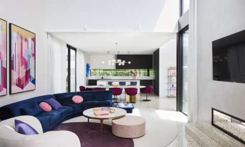
Blue, considered a cool colour, is widely recognised as one of the two best colours to fall asleep to. Associated with calm and relaxation, blue has numerous positive associations; think clear blue skies, tranquil waters and limpid oceans. Pastel or soft blues are the best, as darker shades can be a little more stimulating. Wattyl recommends its Heavenly Tears, Clematis and Piccolini to give a fresh feel to a room while evoking a sense of calm and serenity.


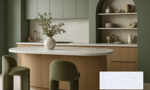
Green is the other favourite for sleep-inducing bedrooms. Again, it is a cool colour and one closely aligned with nature, peace and authenticity. These very positive associations help one destress and relax into a night of restful sleep. Wattyl recommends pastel, mint and sage green hues, alongside the introduction of plants (that will also help purify the air and reduce stress levels). Colours such as Wattyl Celestial Sea, Sage and Serenity will sit in the background of the sleeping space, creating a sense of calm and serenity.


Warm neutrals, such as the tans and beiges reminiscent of sandy beaches, represent our connection to the earth and therefore create a reassuring, nurturing ambience within the sleeping space. These hues, all with brown undertones, lend themselves to layering, incorporating texture and pattern. Wattyl’s Silky Beige, Thredbo Snow and Rustic Light are all excellent starting points for this restful palette.


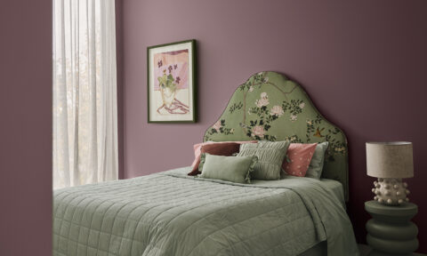
Soft, natural pink, with a blue undertone, is the epitome of harmony and tranquillity – it also suggests quiet luxury, softness and physical calm. Wattyl suggests trying the duskier hues that are more grounding and less feminine than the sweeter pinks. Try Wattyl Flamingo Feather, Millennial Pink and Tombola.


And finally the space maker! White – in particular the more neutral whites – creates the perfect blank backdrop that will allow other favourite, reassuring decorative elements to shine. Comforting whites can maximise the sense of space within a room while still creating a cosy, reassuring ambience. Wattyl Calcium, Whiteweave and Tranquil White are some of the favourites.


Wattyl advises there are a number of factors that will influence the colour on bedroom walls, such as orientation, the amount of natural light, the colour of the room’s lamps or ceiling lights, plus elements such as floorboards and carpet. So it is always advisable to use a sample pot to try out the colours in the room, prior to painting.
Painting techniques can also positively affect the ambience of a space. Using a colour drenching approach, for example, whereby ceiling, walls and trims/skirtings are all painted exactly the same hue, will create a very nurturing, cocooning ambience, while also reducing the perception of clutter within the space.
And finally, the choice of paint finish can also play an important part in mastering the art of sleep – by choosing a matt or flat finish, further light reflection will be reduced (a gloss surface will reflect any bright light).
Swatches and sample pots, together with cans of paint, can be ordered online.
* https://www.comparethemarket.com.au/health-insurance/features/sleepless-cities/