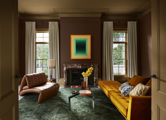
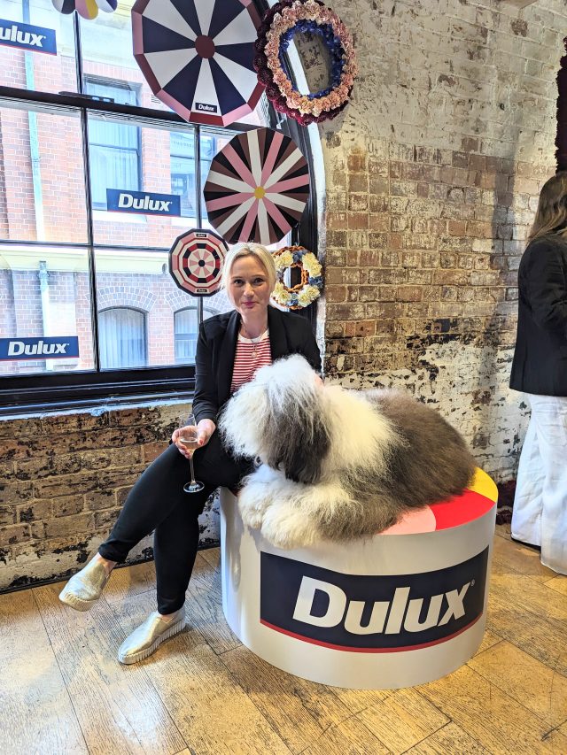
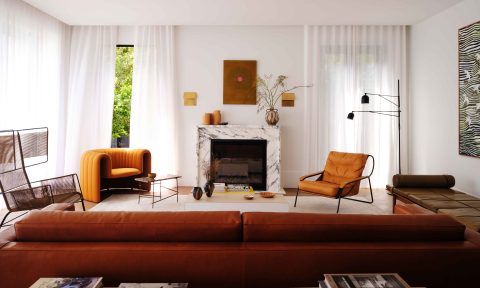
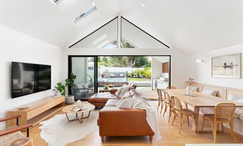
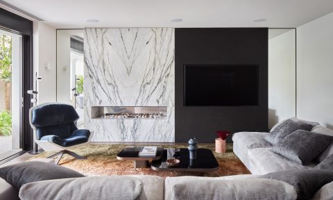
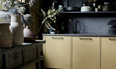
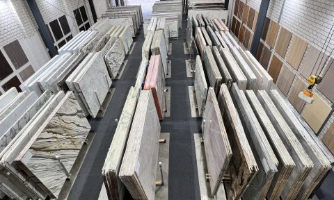
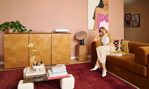
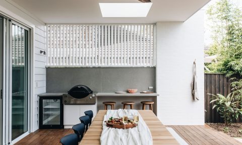
One of the most hotly anticipated events on the design calendar, the Dulux Colour Forecast is always one to watch. In its 25th year, the 2024 Dulux Colour Forecast palettes are some of the most beautiful yet. A reflection of Australians’ increased embrace of colour in their homes, this palette steps deeper into the mid-tone hues to evoke warmth, nostalgia and self-expression. The colours are richer and decidedly less pastel and bright than last year’s shades, reflecting a sophisticated shift in Aussie design.
“The team is informed by seminars, including Future Laboratory London and Colour Hive, Milan Design Week, where this year we hosted a special event to celebrate our 25th anniversary. We also dissect trend reports and editorials, attend fashion catwalks, product and design launches, engage with global and international brands, and review customised research through Dulux’s extensive networks in the UK, Italy and France,” says Dulux colour manager Lauren Treloar.
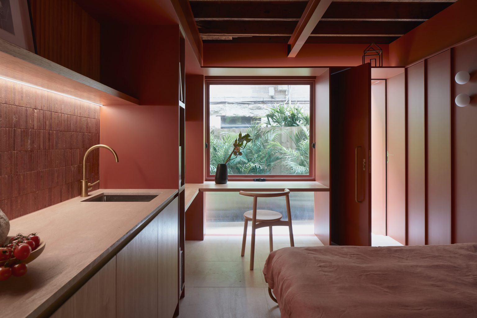
Predominant hues include warm colours with a yellow influence, pink undertones that appear in clay hues and reddy browns, olive green and accents of pale blue and zesty yellow.
Solstice
The most neutral of the palettes, Solstice features a toasty mix of rich browns, clay and warm neutrals with a sun loving yellow as an accent, designed to evoke a comforting, familiar and inviting feeling. “This is a warm and welcoming palette of nurturing hues to make you feel safe and at home,” says Dulux colour and communications manager Andrea Lucena-Orr.
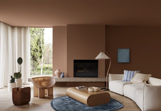
According to Dulux colour forecaster and stylist Bree Leech, Solstice starts with inspiration from the pared back Scandinavian design style but adds a Mediterranean and desert influence. “From the Australian outback to the African savannah, the palette brings together warm colours with cooler accents and tactile details, such as braiding and primitive sculptural forms,” says Bree.
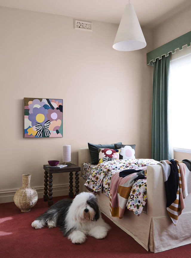
Journey
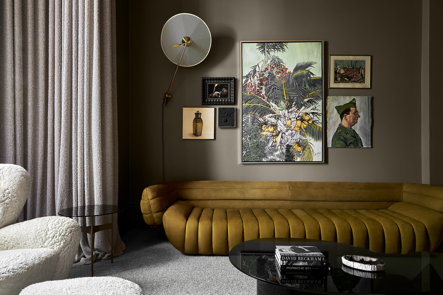
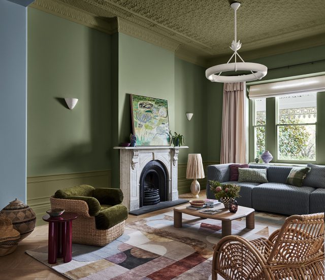
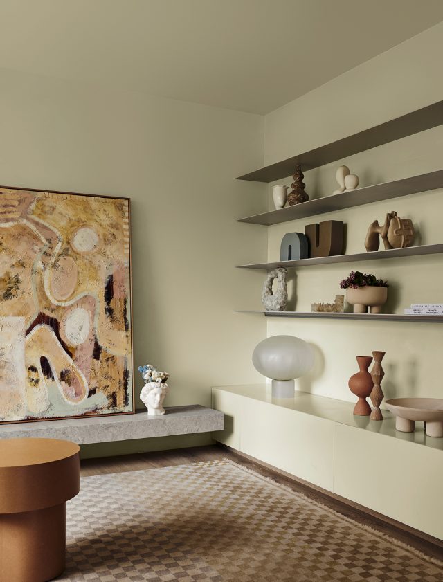
Taking inspiration from travel and cultural differences, the Journey palette highlights rich mid-tone hues with yellowy green and rich decadent reds providing contrast. “At its core, Journey celebrates the art of storytelling, where mythical iconography and cherished folk aesthetics find their rightful place, adding layers of depth and colour to your space,” says Andrea. Think olive green, mustard yellow, dusty blues and rich burgundy.
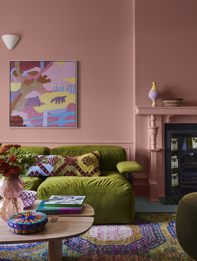
“The Journey palette has a much more eclectic and maximalist feel and brings together global influences to reflect on the history of our ancestry through objects and items handed down through time,” says Bree.
Muse
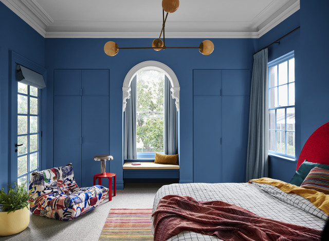
Heavily influenced by the nostalgia of the postmodern era, with a particular emphasis on the 70s, the Muse palette is a celebration of modernising the free-spirited styles of the past. The palette contains an array of mid-toned hues including warm brown, rich tans, deep blues and soothing greens. “This creates a distinctly modern interior that has been fused with nostalgic design references reminiscent of the 60’s to the 80’s, in addition to the textures and glamour from the 70’s,” says Andrea.
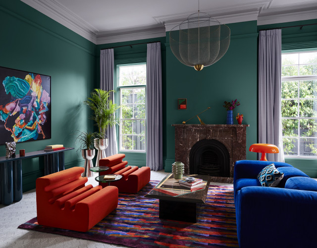
Bree adds that the Muse palette is a trend that strikes the perfect balance between nostalgia and modernity. “The sophisticated palette results in spaces that are timeless and simultaneously modern, that pays tribute to the design icons that have come before us.”
