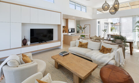
Known for her maximalist styling videos that use colour theory as a foundation, fashion content creator Maxine Wylde is certainly a colour lover. Her social channels are adorned with bold and trendy outfits combining an eclectic mix of patterns, textures and shades and her approach to interior design within her own home is as vibrant and spirited as her wardrobe.
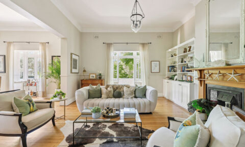
What some may not know is that in addition to having a gorgeously curated closet, interior design has always been a passion for Maxine, having studied it earlier in life. So, when she recently set about refreshing her living room space, which extended into the adjacent hallway, she looked to the 2024 Dulux Colour Forecast, favouring the Solstice palette as her source of inspiration.
“My goal behind this makeover was to use colour to connect the existing furniture and decorative objects within the space to create a cohesive look. Additionally, our living room is not just a place we relax in at the end of the day, it doubles as my creative space, so I needed it to reflect that balance,” Maxine shared.
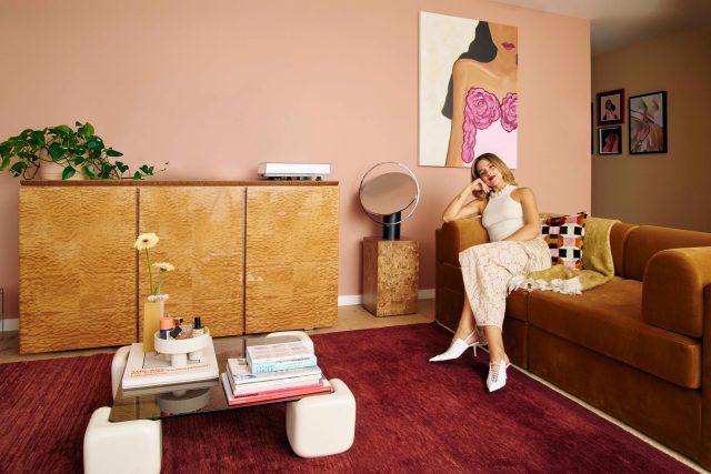
“Looking around the living room, many of the special furniture pieces I have collected over the years reflect an interior style that combines vintage influences from the 70s, alongside more modern touches. I was drawn to the Solstice palette as the tones feel warm, retro and affectionate, and reflected my existing style. I had a lot of fun playing with different colour combinations, working within the confines of the palette to evoke a moody and familiar feeling in my space.”
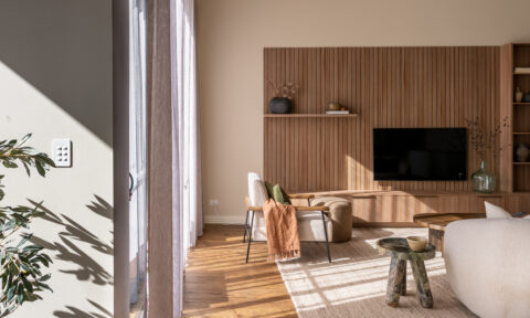
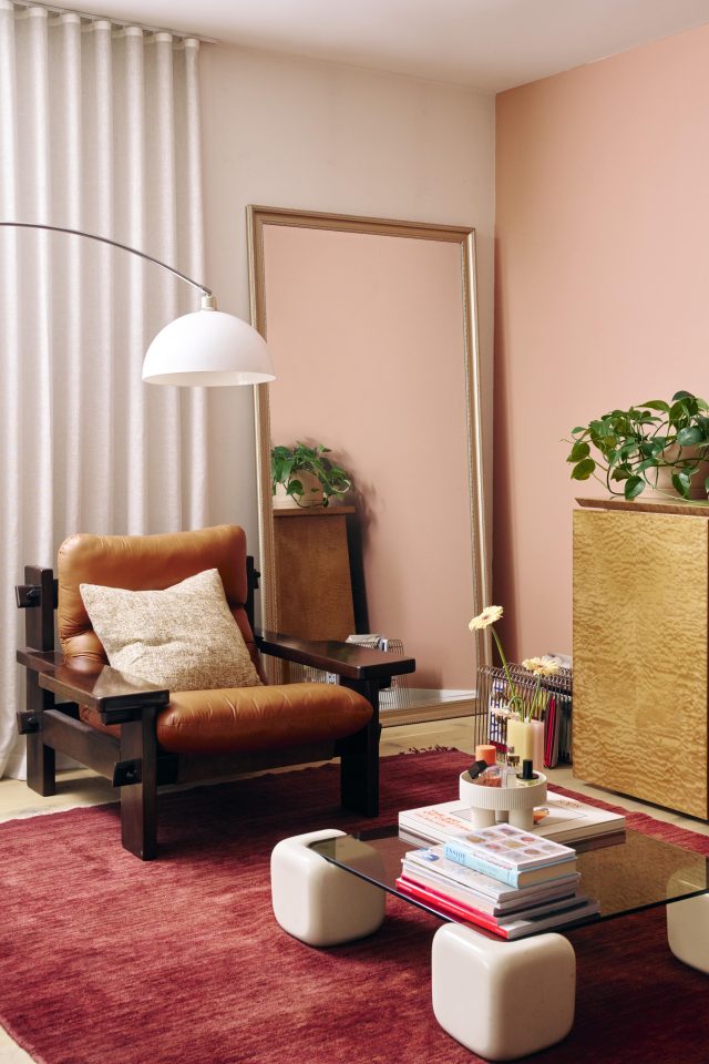
She adds: “Knowing that applying paint to the living room and hallway areas would help create a cohesive look for the space, I selected Dulux Potter’s Pink and Dulux Lama for their nod to the warm colour palettes seen so frequently within 70s interiors and style. Potter’s Pink features on my living room wall, which is a muted, soft and welcoming terracotta pink. It’s incredibly calming and adds a special quality to the space, without it being too loud and demanding on the eyes.
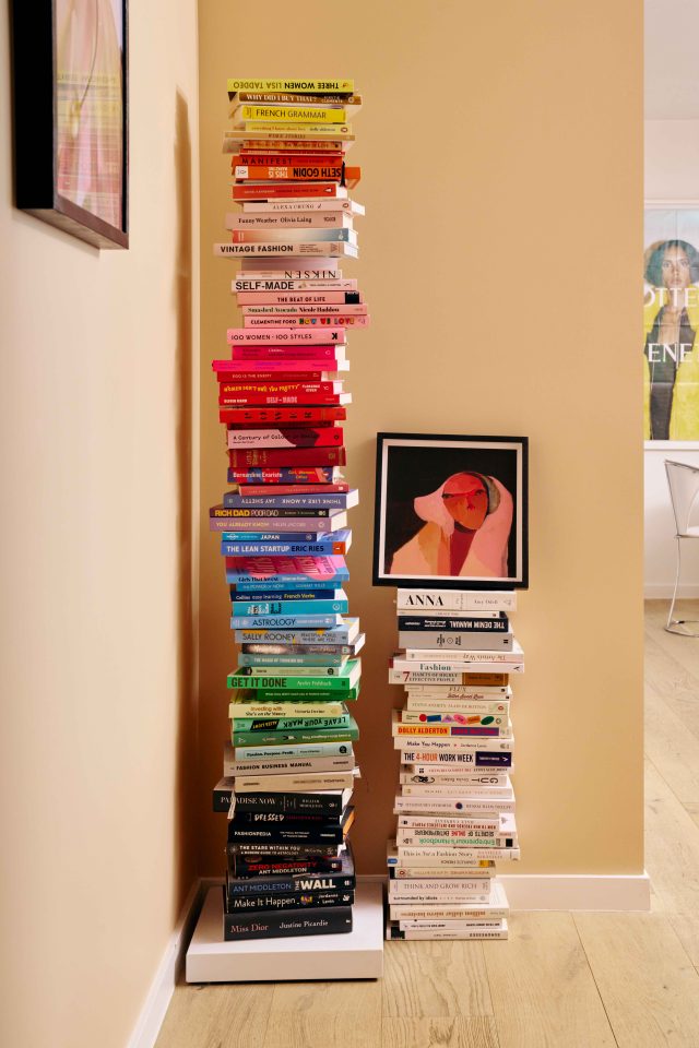
“As an extension of my living room, I used Dulux Lama in my hallway, a serene and sandy neutral shade with orange undertones. The contrast between the two shades creates visual interest, and adds depth and excitement to the space.”
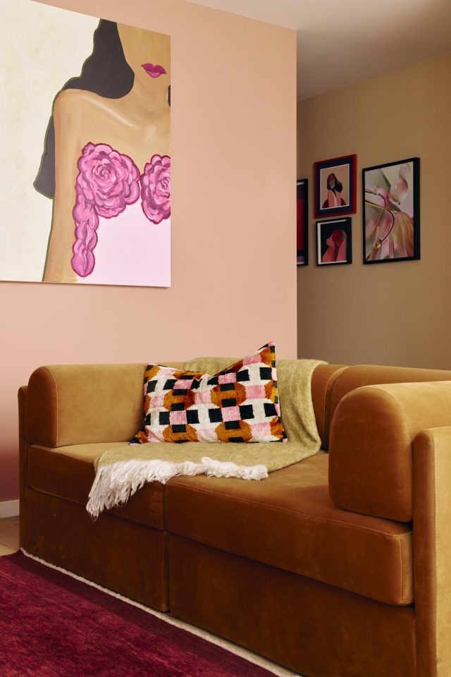
To achieve an overall cohesive look, Maxine sought out additional colours from the palette to inspire decorative objects, furniture and textures. “I was so drawn to Dulux Ripe Lemon, but instead brought it in through artwork, rather than paint. I absolutely love the warmth, cheeriness and brightness this colour evokes, it has added new life to the space as an accent shade.”
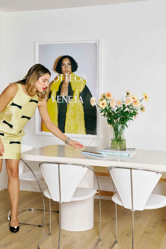
Elsewhere, she had her dark blue dining table painted in Dulux Light Rice Half as she felt it was previously too jarring and interrupted the new, softer ambience. The soft neutral with a slightly red undertone, evokes a “peaceful and lovely cosiness”. She also has a table lamp that references Dulux Pure Blue (a soft baby blue ) that adds tranquillity and freshness to the room to complete the look.
“Designing an interior space is a special opportunity to create a space with pieces that are a reflection of you,” Maxine explains. “It’s no secret I absolutely adore putting outfits together, and I love using colour theory as my inspiration. Similarly, the Dulux Colour Forecast takes away the guesswork in elevating the styling within your own home. By working within the guidance of the Solstice palette, I’ve achieved a living room space I can feel inspired within when creating, while also being able to rest and reset at the end of the day.”
Maxine loves the deep warm red browns contrasted against the pale peaches and light blues. “For those a bit apprehensive about adding bolder colours to the walls, these comforting shades could be just as easily introduced through textures, decorative objects and furnishings.”
For more on Dulux Solstice | Follow Maxine
Styling: Maxine Wylde | Photographer: Eugene Canty