So, did you watch last night’s Block master bedroom reveals? Or, as I like to call it, a really good ad for Kinsman wardrobes! I spent a lot of it with a sort of grimace on my face like Wallace from Wallace and Gromit. You know the one?! There’s an emoticon for it… I do try to be kind and not harp on like some mean know it all because let’s face it I’m a) not an expert and b) it’s bloody hard being on that show. But last night’s bedrooms were so underwhelming on the whole I felt annoyed. And then Hayden and Sara, who threatened to walk last week on account of always coming last, came first. What a surprise! Coincidence? Perhaps, but still!
None of those rooms were particularly different or inspiring. And the fact that words like ‘cute’ and ‘nice’ were used to describe the winning room, said it all really! That and the fact the judges liked all the walk-ins better than the actual rooms.
The worst for me though was Courtney and Hans’ room, by a long way. It was so huge (yet empty) and full of expensive pieces but ultimately looked cheap and wasn’t in the slightest cohesive. All I could see was bloody carpet, carpet, carpet! Speaking of which, what does everyone have against rugs this season?! Where are they?! And, while I’m ranting, enough with the velvet bedheads! I love velvet bedheads. I have one in my own master, but they’re not the only bedhead out there and they certainly aren’t the only way to give a luxury look. Ok, I’ve got that off my chest now! Let’s see something a little different, could we?
There were a few redeeming features for me, namely Jess and Norm’s killer gold LED wall lamps, Bianca and Carla’s timber besides, the wardrobes in general, the herringbone floors and the girls’ Samsung Frame TV (they’re very cool, I want!) that doubles as artwork. I’ve linked to my favourites from each room below.
So, here you go if you missed it: the judges’ comments, what the couples did and how they scored…
2nd (24/30) KERRIE AND SPENCE
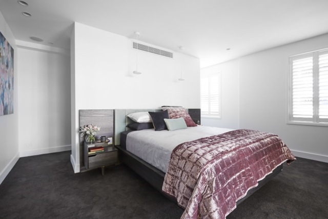
Kerrie and Spence used luxurious velvets and a soft, romantic colour palette in their main bedroom, which featured dark drapes, a custom-built bedhead with seafoam fabric inlay, and huge, dark ‘his-and-hers’ walk-in robes.
But it failed to get the judges excited. Neale said: “We’re in the master bedroom of a luxury apartment. I’m sorry, I want a bit of va-va-voom. It’s a white room.” Shaynna thought the problem was scale. The bed was perfect but the bedhead too short, the artwork and pendants were in the wrong spot. Diplomatic Darren said the light fittings are not as impactful as they could have been. Shaynna said they were ridculous! “It feels a bit hospital.”
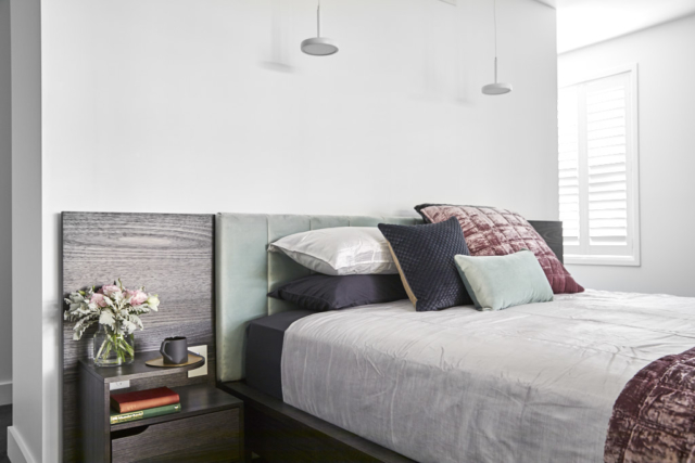
Neale said they were playing it too safe. “It feels like they had a great idea and then they pressed pause because they got scared.” Shaynna said it was very forgettable.
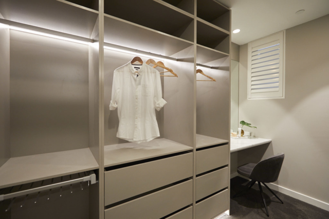
But they all loved the huge walk-in robe. Shaynna said it was amazing. Darren thought it was what buyers would remember. And Shaynna said they could easily restyle the entire thing to make it a penthouse master.
4th (22/30) COURTNEY AND HANS
Courtney and Hans’ main bedroom featured a pink bedhead, a large statement fan, a round mirror, two dark pink velvet chairs and a gold coffee table as a seating area, and THAT controversial artwork. Their deluxe walk-in robes featured a last minute marble stone bench.
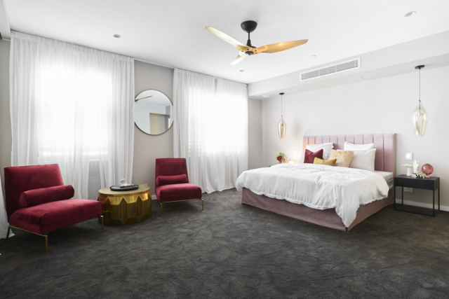
The judges were blown away by the sheer size and couldn’t believe it had its own hallway! Darren said: “These spaces are massive!” Darren and Shaynna loved the bed, its styling and the colour palette. They said the lighting was well planned.
But that was where the good news ended.
Neale said he must have been in a slightly different room. “There is nothing in here that’s going to make me want to buy this apartment. It feels like an exercise in wasted space. The hallway serves no purpose. And that’s the worst piece of art I’ve ever seen.” Eek!
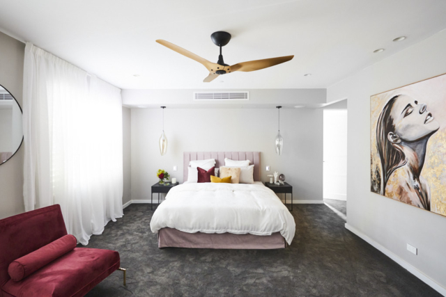
He continued: “I know I’m sounding over the top but the choice of art dictates the emotion you feel when you walk into the room. There are elements that are nice but they don’t come together.” He thinks they should have made a bigger deal of the sheer size with a rug, couch, ottoman or floor-to-ceiling mirrors.
They all noticed the finishes weren’t up to standard either. But, once again, the robe was nicer than room itself! Neale said it was one of the most impressive walk-ins he’d ever seen on The Block. Shaynna agreed it was beautiful.
Our pick to buy: GlobeWest carved gold coffee table (I had this in my last home and it is amazing!)
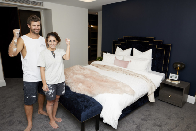
1st (26.5/30) SARA AND HAYDEN
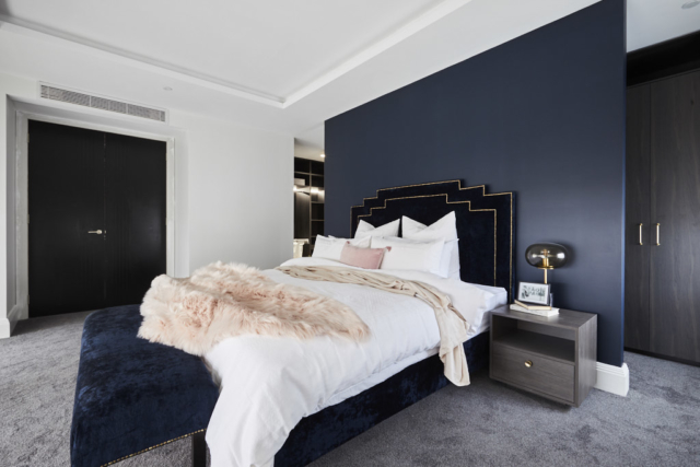
Sara and Hayden finally broke their three-week losing streak, presenting a Deco-inspired main bedroom. They achieved their look by painting a blue-grey charcoal feature wall, including an Art Deco-inspired upholstered bedhead with gold stud details, a pink fur throw and a contemporary artwork in shades of blue and pink.
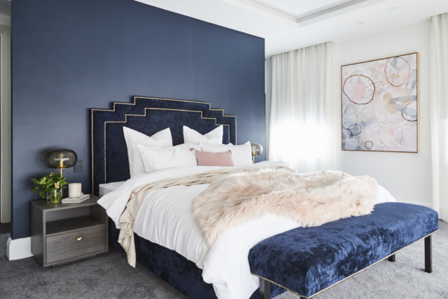
The judges all felt something grand greeted them. Darren loved the coffered ceiling and the way it covered the curtains. Neale said it was cute. Shaynna felt a sense of relief. “The restraint they’ve shown is great.”
All the judges thought it had really worked. Darren liked the bedhead and the blue wall behind it. Shaynna said it was the right balance of Deco and contemporary but the artwork wasn’t hitting the sweet spot. “It feels everyday.” Neale said it was a little generic.
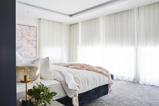
They all agreed the air con vent was very well considered and planned. And they also all noticed the unfinished painting!
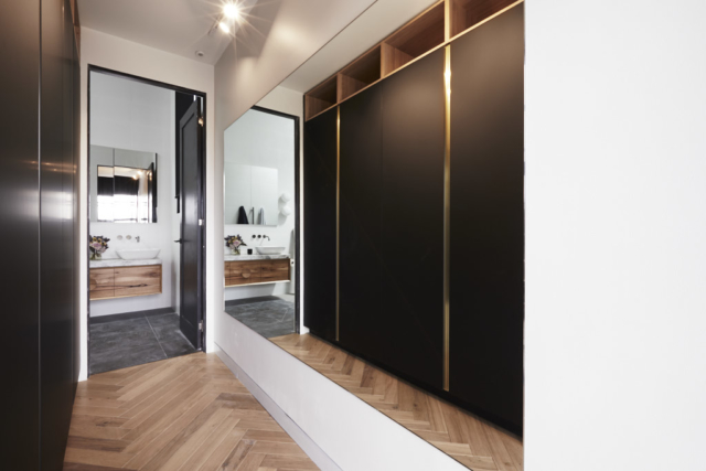
It was another popular walk-in. Shaynna said there was so much storage it wasn’t funny and raved about the sensor lights. Neale and Darren said the mirror wall was very clever. Darren said it had a look of finesse with all the LED strip lighting.
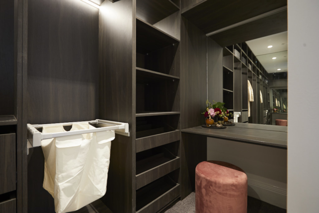
Shaynna finished though by very rightly saying that last week’s en suite definitely didn’t match the room and the walk-in.
Our pick to buy: west elm balloon glass table lamps
Joint 3rd (22.5/30) JESS AND NORM
They might have only had a small space to work with, but Jess and Norm dialed up the luxe with their extra cash from challenges, presenting a room that featured marble, parquetry, bespoke neon lights and a walk-in robe space that had all three judges singing its praises.
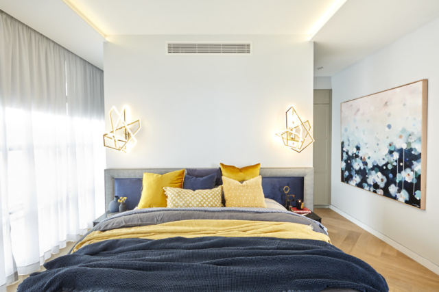
It certainly made a good first impression. Darren said he loved everything, especially the layering of the bed, the colours and the lights.
Neale and Shyanna however, were a little less enthusiastic! Neale asked if it was a bedroom or a gold class cinema seat? “It’s all about the TV.” There was way too much going on. “If ever a room cried out for a little bit of less is more, it’s this one. Wow, what an overload. This room is giving me indigestion!”
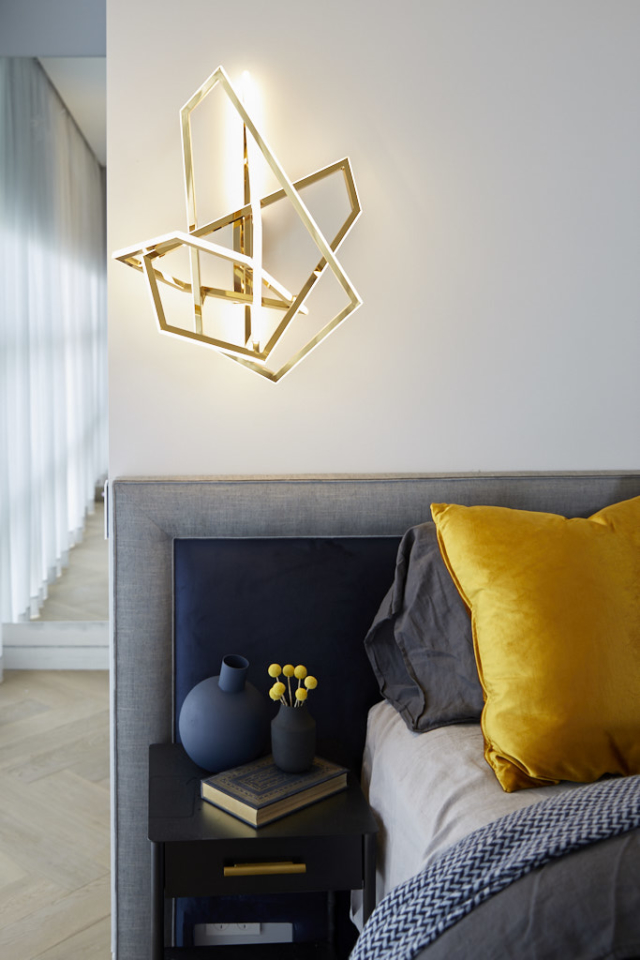
Shaynna was overwhelmed. “I feel so claustrophobic. Scale has got the better of them. This room needed to feel very elegant and simple but they went and filled it with too many distractions. The year 2000 wants its niches back!” Oh, how I laughed!
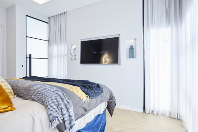
Neale said a lot of people would call it their idea of heaven but it wasn’t the master suite the apartment needed.
They all loved the walk-in (again!), calling it excellent and beautiful.
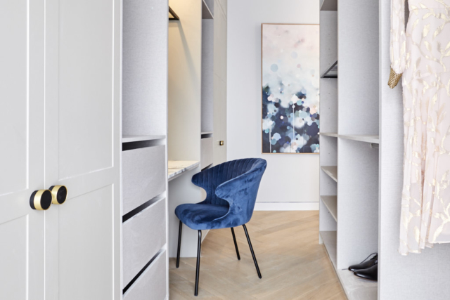
Our pick to buy: Those gold LED wall lamps (fabulous!)
Joint 3rd (22.5/30) BIANCA AND CARLA
Bianca and Carla continued to impress with their subtle, moody monochrome master, but it didn’t get the great feedback of last week. The girls used a dark timber feature wall, dark drapes, custom wooden side tables, parquetry floor, charcoal-coloured linen on the bed, and a timber cabinet under their state-of-the-art (pardon the pun) Frame TV by Samsung.
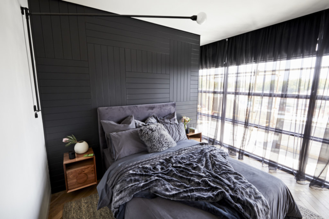
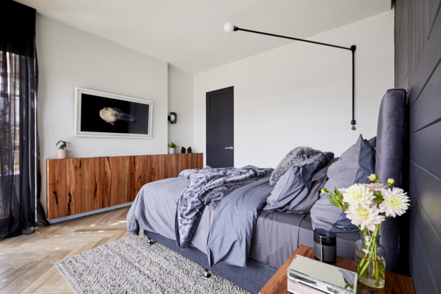
Neale said the girls certainly knew how to surprise them each week. Darren thought they’d delivered a different kind of luxury. “That charcoal tonal, monochromatic look is very tactile. For a neutral palette to be so visually interesting is tricky.” Neale agreed.
Shaynna loved the signature bedsides. They all loved the Samsung Frame TV, cleverly disguised as an artwork. Neale didn’t love the ball light and found it a little bit cold. He thought the bedsides were too small. He wanted to love the wall but was struggling. “I don’t think these girls are thinking how we actually live. It’s style over substance.”
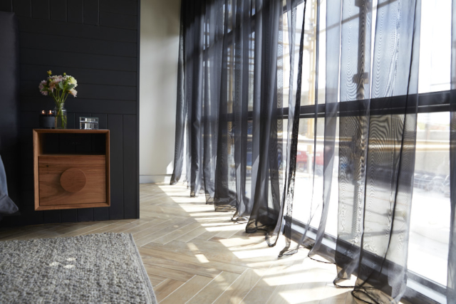
Foreman Dan Reilly had raised the issue about them presenting their reveal without including the air con vents. The judges thought it was a bit arrogant to leave them out while everyone else was wrestling to make theirs work.
They all had issues with the execution of the feature wall which was badly painted and didn’t all match up.
Shaynna said it was so heavily masculine that there was very little that would instantly appeal to a female buyer. Neale said he really like the girls’ ideas but I do want them to spend more time thinking about functionality.
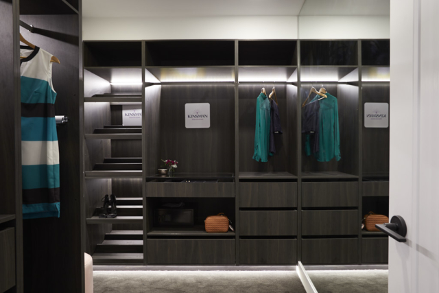
They loved the walk-in but agreed it felt half the size of the others.
Our pick to buy: Timber bedside tables by Ingrain Designs
So, what did you think this week? Were you as underwhelmed and irritated as me or is it my pregnancy hormones?!




Comments
Totally agree!!! Well said! Words fail me!
Me too! I agree with you Jen. Do you think they will all have a ‘challenge’ later on to rectify their monumental design mistakes Jen? They would have to before the apartments go to auction wouldn’t they?
They always have a fix up week, but I don’t know that if I was a buyer I’d trust the standard of workmanship. It’s all a bit slap dash to be spending millions of dollars on.
Agree with all your comments also. Think the judges are really compromised when the wardrobes are all done by the same company. They won’t want to critique. I think a few of this year’s contestants are amateur and struggling. As well, it seems like the tasks are too much to fit in esp when they run challenges in between all the other jobs they have to do. Can you tell me when you’ve done tours of the finished houses/apartments, have they fixed all the painting defects and are they completed to a high standard? They sell for so much money but some of the apartments seem like they will need to be repainted as soon as you move in. Finally, I would like to comment what a nice bunch they all seem -even Sara and Hayden seem well liked, which is so good to see. And given all the criticism dealt out last night, everyone copped it sweet – that’s how you handle feedback Sara and Hayden!
Hi Nicole. Yes, when I’ve visited the finished apartments/houses they have generally been finished to a high standard so there’s a lot of fixing up that goes on later on. I wouldn’t say they’re all perfect, but definitely pretty good! Agree they do all seem a pretty good humoured bunch who take criticism well (apart from Sara, sometimes!) which is good to see! I could never do it!
Agree! They all seemed to be the same bedroom except Jess and Norm’s that I loved. I liked the cosy feel and the colour palette. I know they have to be on trend but there are multiple trends at once aren’t there? All a big yawn.
That artwork… ALL NOSTRIL. Ugh. NOSTRIL. NOSTRIL. NOSTRIL.
Not a great advertisement for whoever the artist is, that’s for sure.
I agree that everything was a bit meh.
I would rather not have a squishy bedroom than have a mega wardrobe. Call me crazy! On the other end of the spectrum, that huge bedroom was kinda ridiculously big. I don’t understand ‘luxury’ living, clearly!
Hi Jen
I stopped watching as I totally hate the dramas and I had something more pressing to do.
Jess and Norm / Bianca and Carla’s bedrooms look more appealing to me. Jess & Norm’s niches are ridiculous though, while Bianca and Carla’s industrial lamp made no sense, they could have sweetened the look with elegant pendant lamps on the sides, and wider side tables … However, the winner is a bland cliché…when you have nothing to “say” you bring blue velvet in…
I guess the judges are to be trusted as we cannot really tell how the spaces look and feel… some spaces are photo friendly but when you are actually there, they feel too busy, while others are just perfect but look bland in photos.
I love Lou Sheldon’s artwork more than anything else in that room so perhaps the art should have been in the lounge or study or the rest of the room should have been filled properly.