Dulux’s colour forecast for 2020 showcases the latest colour palettes to hit the interior world this year – and quite a few tricky paint colours have made their way in! Warmer whites and tonal blues are both featured heavily as hot trends in the world market, whilst grey shades still prove popular amongst Australians.
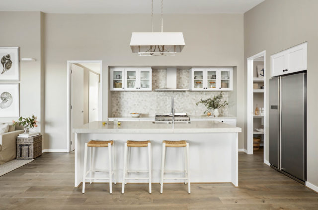
Henley Design’s colour and design consultant Heidi Schwieters, shares her tips for using these sometimes tricky colours:
White noise
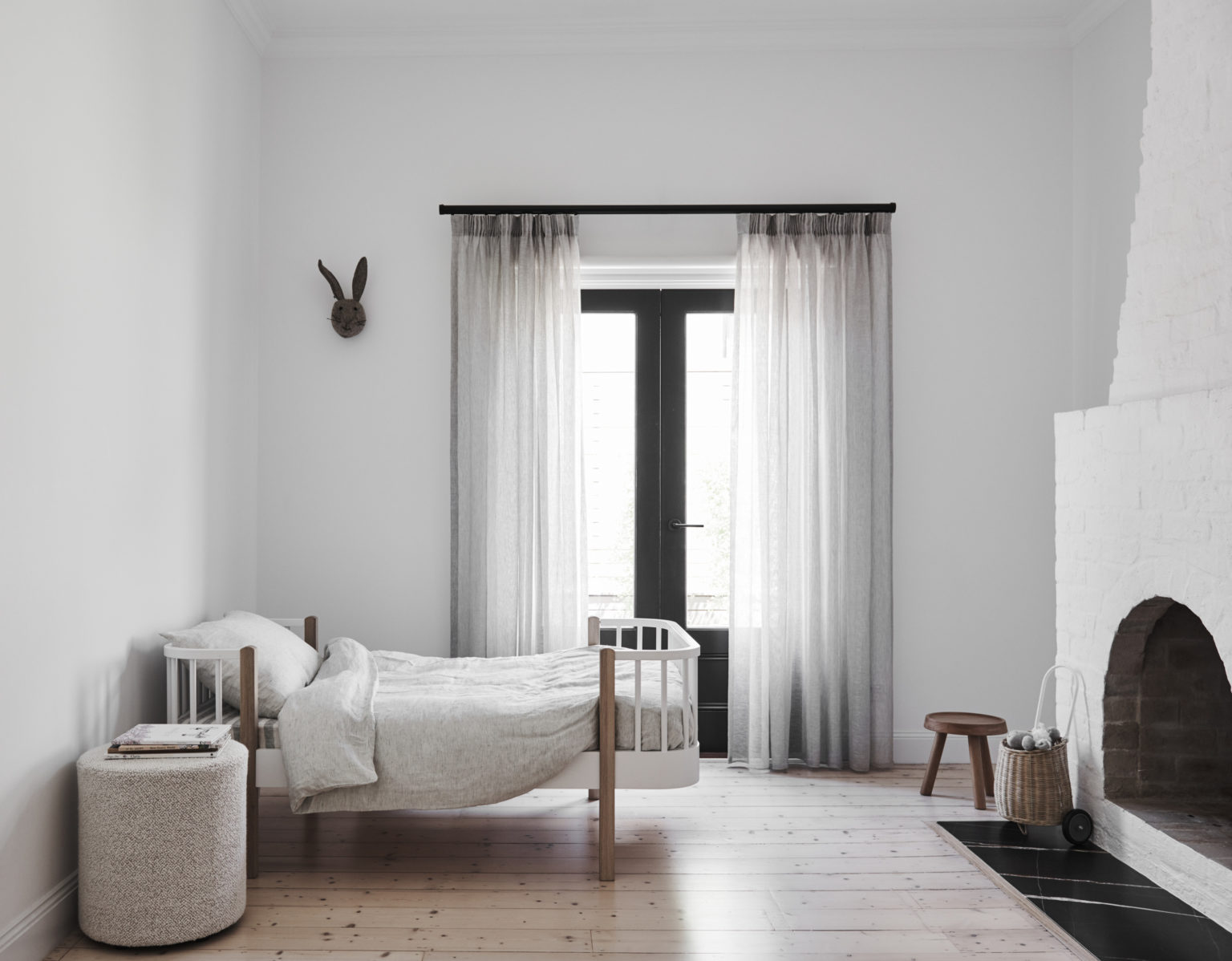
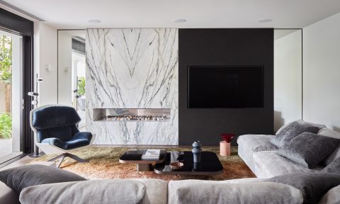
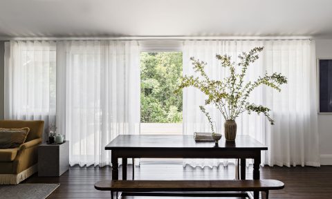
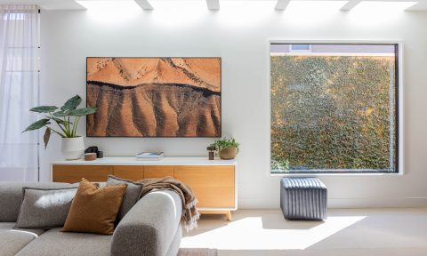
Regardless of what is currently trending, whites are always a leader in interior design. White shades are a perfect backdrop colour to highlight contemporary finishes. They can be used to showcase bold feature pieces of artworks, rugs or cushions. This can then be incorporated with colourful accents or used with a subtle contrast of furnishings that layer similar tones or materials such as linen, woven fabrics or raw timbers.
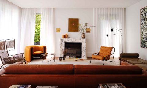
Current trends of white with a warmer tone are seeing a rise, giving a feeling of warmth and comfort from the uncertainly of the outside world. To complement these warmer whites, is an increased use of grounding shades like coffee, stone, dark tans and soft burgundies. These colours give us a warm, inviting naturalness with a feeling of comfort and richness in earthy accents.
Singing the blues
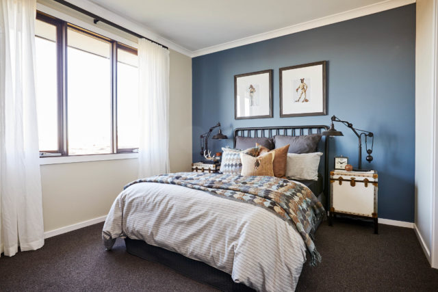
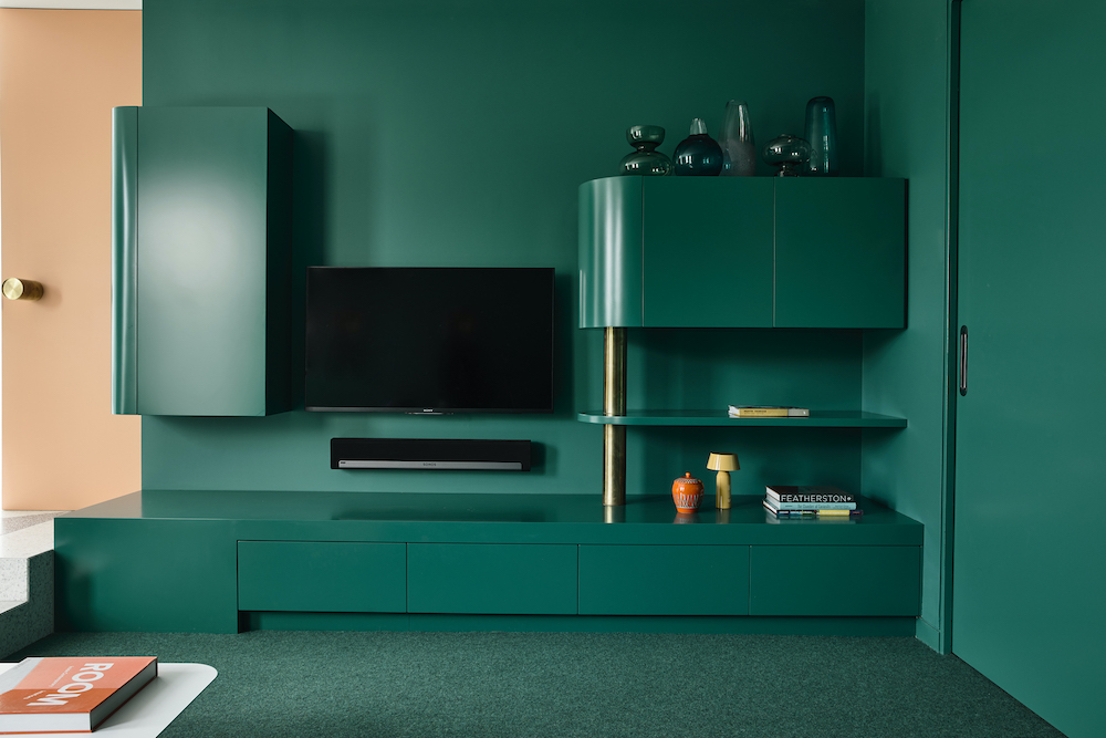
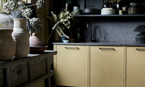
Surprisingly, bolder and soft blues tones have made a revival. Tonal blue colours with accenting rich terracotta shades and subterranean greens, mixed with eclectic vintage, retro inspired pieces and luxe materials such as terrazzo, create a feeling of comfort in the familiarity of homeliness. It also enables us to showcase a break from the norm, inspiring rejuvenation and creativity.
Making it grey
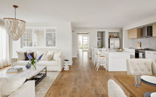
Although greys are still present in colour selections, the trend is steering away from the colder tones of the past, and becoming warmer, much like the trend of whites.
Use greys with textured feature pieces of pine, rattan, wool and handcrafted raw timber furniture, to incorporate neutral tones of beige and blush highlights.
More than meets the eye
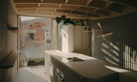
What denotes a trickier colour can be the undertones of the shade, so it is very important to observe colour samples in natural lighting.
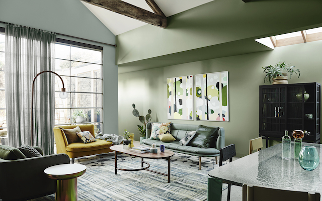
Colours reflect warmer and cooler undertones and mixing these can be complicated to achieve. Usually it is best to keep one dominant and accent where needed, with paint features or furnishing pieces to cool down or warm up the interior space. Alternatively, keeping consistent with shades all from the warmer or cooler family will avoid issues of the selections not gelling.
Look around you
Any aspect of the home can be worked to showcase these trickier paint colours. Like with any colour scheme, it just requires an awareness of the surrounding environment, whether it’s the quality of light or a consciousness to visualise what mood is required. If ever in doubt, patch tests are always imperative to view shades in your home space.
Keeping it simple
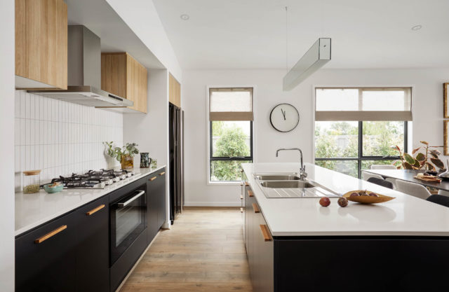
These sometimes more difficult paint colours are on trend with a focus on warmth. Creating schemes that emphasise comfort whilst focusing on raw beauty and the grounding natural colours of the environment, are becoming the priority.
-Heidi Schwieters is a colour and design consultant from Henley, one of Australia’s leading homebuilders with over 30 years of experience in the building industry.



Comments
I’m just asking about the Dulux paint colour Snow Season. I wanted a soft grey that isn’t too dark or too light with Lexicon trimmings. I’ll be having white cupboards and I have dark wood furnishings as well. I want a greige to match cool and warm colours. I want to use the accents of Purples, blues and bluey greens.
Hi Karen! We would definitely recommend speaking to a Dulux colour consultant before choosing your white as it’s never straightforward and each white is different in each home, and even in different rooms within the same home, because of the natural light and other factors. Good luck! Jen