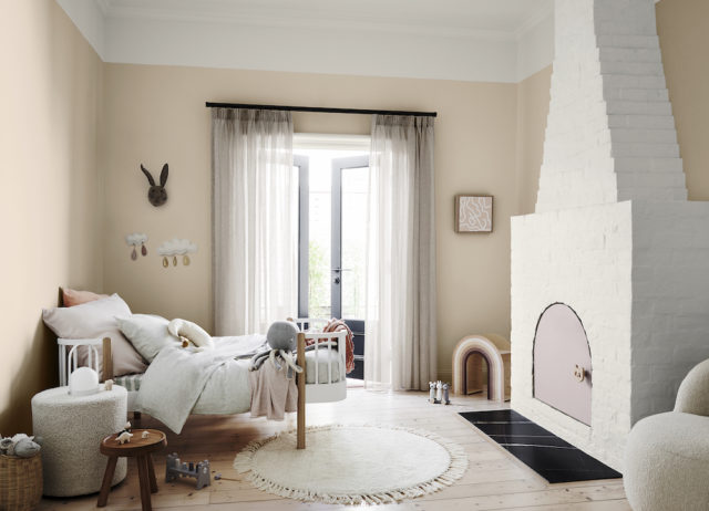
After a decade where cool paint tones reigned supreme, warm neutrals are back on-trend if the latest from Dulux is anything to go by. The work of stylist Bree Leach, a bland white child’s room was imbued with gorgeous warmth courtesy of Dulux ‘Pancake Mix,’ a biscuity, putty-like clay tone that completely transforms the space.
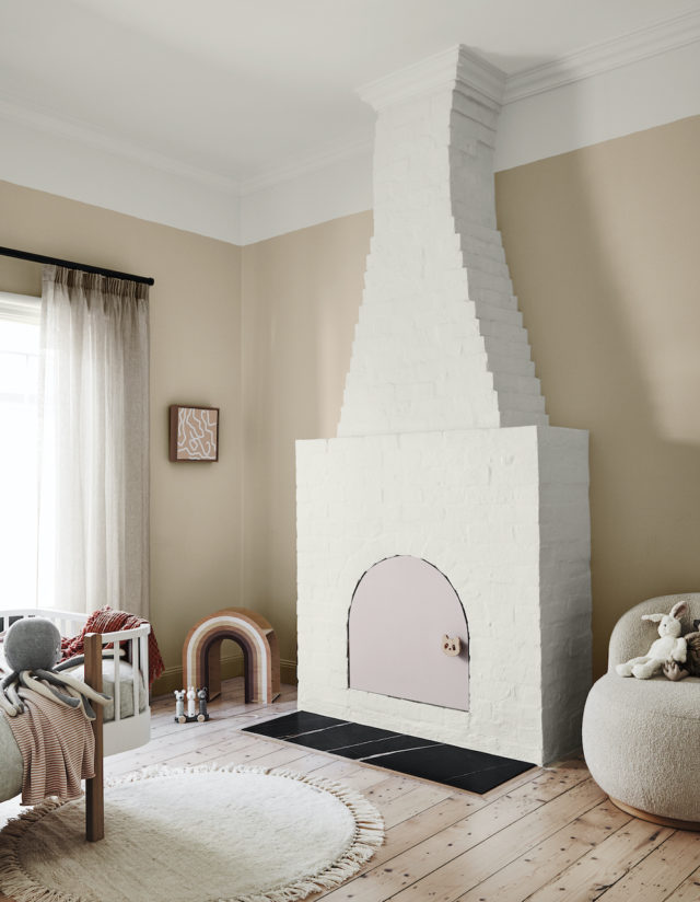
Part of the paint brand’s ‘Grounded’ palette (one of four trend palettes identified in the 2020 Dulux Colour Forecast ‘Essence’), the palette combines warm biscuit tones derived from nature with touches of muted coral, mauve and gold for a contemporary edge. Who would have thought that such warm tones could look so modern?
“We’ve seen a much more tonal palette coming through this year. The bold colour contrasts of previous years have made way for subtle layering of natural hues. Depth is added through texture and materiality,” says Andrea Lucena-Orr, Dulux colour and communications manager.
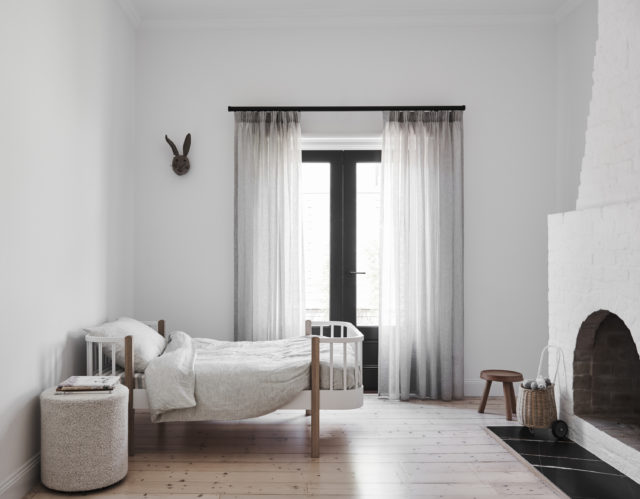
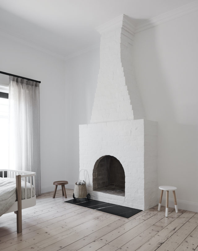
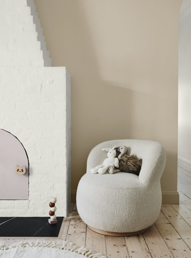
While the original room was fairly monochrome, it did have great features for Bree to work with including a high ceiling, solid timber floor, French doors, plenty of natural light and a striking brick fireplace. The colour palette was less than optimal however; all-white, it was fairly uninviting which is not exactly the vibe that you want in a child’s room!
“I wanted to add warmth and personality to the space so that its little occupant would enjoy spending time here. I aimed to highlight the room’s best features, detract from the less appealing ones, and spend next to nothing,” says Bree who kept the budget in check by retaining key furniture pieces such as the room’s toddler bed (with timber detailing), and the curvy armchair and ottoman.
“When you’re choosing a palette, it’s best to start with one main colour, which you can use across large expanses, such as walls, then a supporting hue and one or two accents,” says Bree.
The room’s existing warm white (Dulux Wash&Wear in Natural White) was retained for the fireplace and ceiling but Bree chose a soft clay (Dulux Wash&Wear in Pancake Mix) for the walls as a feature, to tie in with the warmth of the timber floor and the detailing on the bed. A muted lavender (Dulux Wash&Wear in Hint of Lavender) was chosen for the new door on the fireplace opening, and Bree added touches of coral in the bedding.
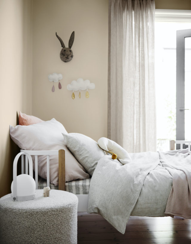
“We made the bed the hero of the room by piling it high with comfy pillows and using bedlinen in shades of grey and coral. An inexpensive rug adds softness underfoot – its round shape echoes the curves in the furniture. To accentuate the fabulous fireplace, we kept it white to subtly contrast with the walls.”
Styling: Bree Leech | Photography: Lisa Cohen
For more on Dulux | Australian bathroom trends: February 2020 edition

Comments
Still love my whites!
Each to their own, we say! I’m not a warm neutrals person myself but love how it looks in these pix! Jen
I agree with Donna. The white looks fresh and clean.
The room is completely different. It would be interesting to see the white room with all the extra decor and linen.