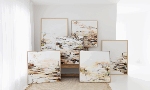
It’s hard to believe that we’re looking at the 2020 trend forecasts already but the Dulux one hit our inboxes recently and it’s a beauty. The result of extensive trend research by the brand’s colour and communications manager Andrea Lucena-Orr and stylist Bree Leech, the nature-inspired palette draws on our desire to escape the digital onslaught and reconnect with the natural world – botanical, mineral and oceanic.
“These colour trends are influenced by what’s happening in the world around us. With more focus on mental health, the wellness movement continues to gain momentum, as does an emphasis on natural materiality,” says Andrea of the collection titled ‘Essence’ that consists of four palettes: Comeback, Grounded, Cultivate and Indulge.
“Colours for 2020 are more restrained than in previous years. Brights are pulled back and influenced by nature. They appear in smaller doses – think feature walls and details – and are often used tonally as a backdrop for hero furniture pieces. Neutrals are soft and sophisticated, with a gently faded feel that speaks of stillness and calm. Clay, with its warm, earthy appeal, is emerging as a key neutral,” says Andrea.
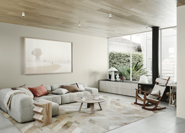
Comeback
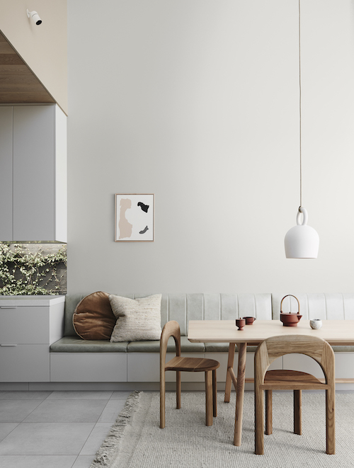
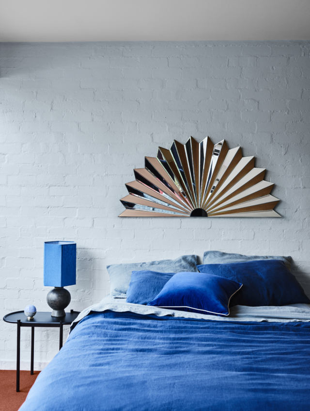
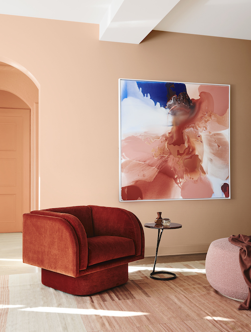
This palette features rich ocean and mineral inspired shades of blue-green, azure and amber alongside warm tones of burgundy, rust and clay. “There’s a lightness and fluidity to the ocean tones in this palette that speak of creativity and adventure, while the warm, earthy shades add cosiness. It’s the ideal backdrop to combine furniture from different eras – from mid-century through to the 1980’s – in elegant and refined shapes,” says Andrea.
The title of the palette, Comeback, reflects a shift in how we view luxury. The current Kondo-esque ‘less is more’ approach is seeing us turn away from cheap, mass-produced pieces to seek out quality and it is often found in recycled and vintage wares.
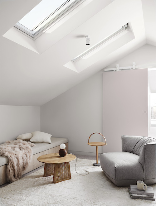
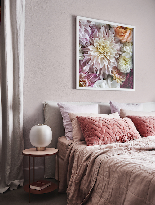
Grounded
The most neutral of the palettes this one runs from soft grey and biscuit to muddy lavender with a touch of warm coral for opulence. “We’re seeing a more tonal palette for 2020, and Grounded is a perfect example. It has a soft, neutral feel that creates a sense of relaxation in a space, with gold and coral adding touches of luxe,” says Andrea.
This palette really picks up on the textural, natural materials trend with a view to the positive effects they can have on our mental health – bringing the outside in is key whether it’s growing our own food or cultivating an indoor plant collection.
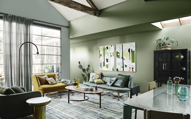
Cultivate
My favourite of the palettes, Cultivate is a celebration of green with layering of different shades of the the hue looking rather effortless in the inspiration shots. From soft olive and pistachio to forest green it’s a rather sumptuous yet calming look that is offset by tones of plum, curd and chalky blue.
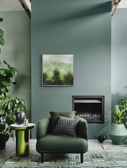
“The colours and textures in Cultivate are easy to work with and have a warmth that really conveys the essence of ‘home.’ They look beautiful paired with raw, mid-tone timbers, natural stone and transparent, coloured glass,” says Andrea.
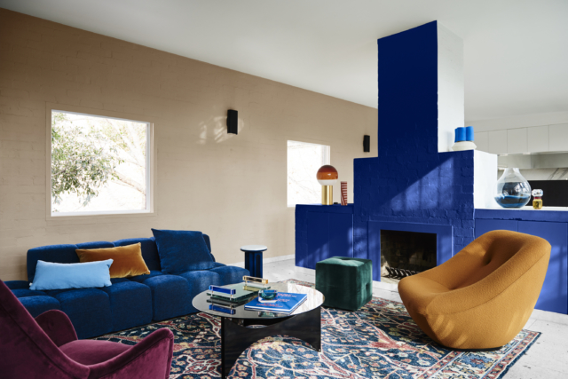
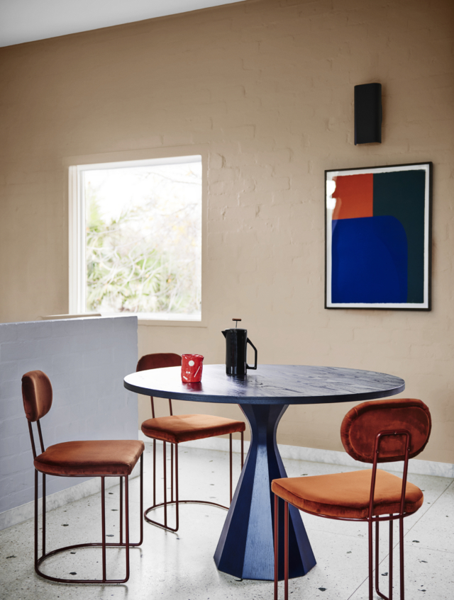
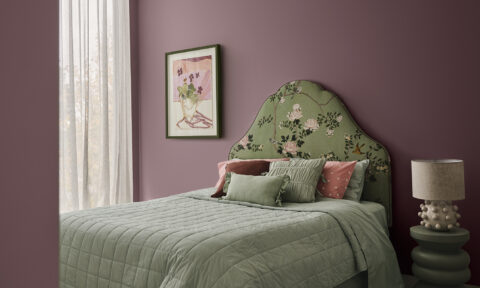
Indulge
As the name suggests, this palette brings together a rather decadent array of colours including rich burgundy, eggplant, earthy brown, faded terracotta and soft coral. Mmm.
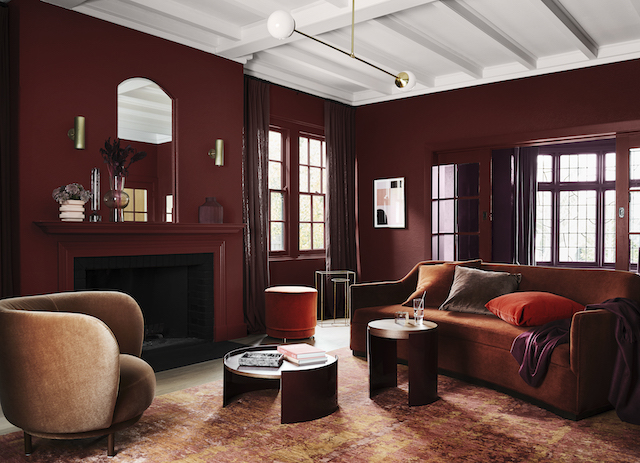
“This palette is not for the faint-hearted – it’s dramatic and exciting and is guaranteed to add wow factor to a master bedroom, dining room or living room. Pink, a key colour of the last few years, makes an appearance, but in a more neutral tone that’s closer to tan, alongside a warm, dusty rose.”
Photography: Lisa Cohen | Styling: Bree Leech

Comments
This jungle-inspired home reminds me of Vogue’s exclusive sneak peek on Cara Delevingne’s wonderful home.
Trackbacks
[…] Photo credit […]