From coffee-making taps and wellness-focused bathrooms to richer colour palettes, intelligent lighting and sculptural forms, Milan Design Week 2026 revealed a future where design is expected to work harder while feeling more personal. Interior designer ROBYN HAWKE shares her key takeaways from Salone del Mobile and EuroCucina.
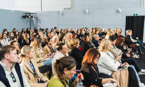
I’ve just returned from Milan, from Salone del Mobile, the world’s biggest design fair for architecture and interiors. This is the third time I’ve attempted the trip. The first time I was booked to go to Salone del Mobile, COVID cancelled it. The second, personal circumstances got in the way. This year, I finally got there, as part of an ACFA tour alongside a group of designers, cabinet makers, and suppliers.
And it was worth the wait. This year’s focus was Eurocucina, with a strong concentration on kitchens and bathrooms. It was an extraordinary experience, and I came home with a head full of ideas, some of which I think will be adapted for the residential and commercial market in Australia.
After a week of walking, staring, photographing and generally obsessing over beautiful spaces, a few clear themes emerged.
Colour is the new black
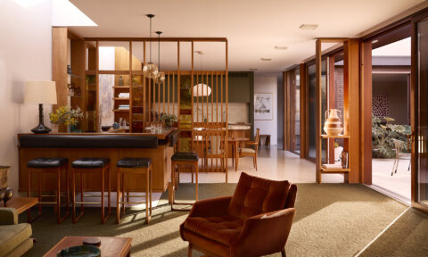
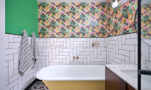
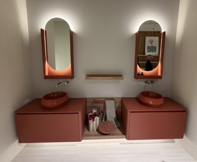
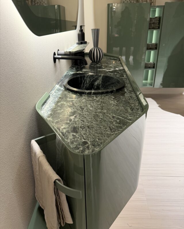
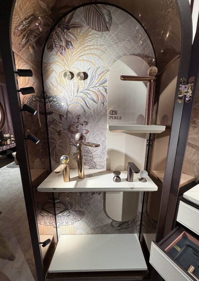
If there’s one word that defines this year’s fair, it’s colour. Deep russets, rich greens, and earthy tones dominated the halls. But it wasn’t just accent colours. There were matchy-matchy combinations: green basins paired with green vanities, coloured baths, coloured toilets. Cohesive, intentional, bold.
Every person does the same thing in Europe. They wander through streetscapes and centuries-old apartments, castles, completely captivated. They photograph everything: the cobalt tiled kitchen, the terracotta bathroom, the wallpapered alcove, the deeply saturated living room, the ornate ceilings, yet despite this, people come back to ask for white kitchens and bathrooms.
They want to play “safe”. I’ve been asking myself why that is. And I don’t think it’s simply timidity or a lack of imagination. I think there are some rational reasons why Australian clients pull back from colour.
Firstly, in Europe, kitchens are largely modular: pre-built systems that can be swapped out relatively quickly and affordably. Here in Australia, custom-built joinery dominates. We demand quality, precision, fit, and purpose-built. This sort of investment is expected to last for years; hence, I believe, why people shy away from colour. In Europe, kitchens turn over every five to eight years. In Australia, we’re typically looking at 15 years or more before a client renovates again. That’s 15 years of asking yourself whether you still love that deep green. However, over the last few years, post covid, I feel this is slowly changing, as after months of living in their sterile homes, people are now realising colour and pattern bring joy to a space.
The other main reason is light. European interiors, especially in the northern countries, are designed to work hard during long, grey winters. Colour, pattern, and texture aren’t just aesthetic choices there. They’re functional ones. They bring warmth, life, and energy into spaces that might see limited natural light for months at a time. Australian light is completely different. Our sun is intense, high and bright. And for much of the year, in Sydney especially, we live with our doors open to the garden, to the bush, to the harbour. Our natural colour palette comes inside: the greens of the garden, the blues of the water, the ochres of the stone. Our interiors are already in conversation with extraordinary colour.
That said, change is coming. The James Hardie Modern Homes Forecast 2026 reports that the way Australians relate to their homes has fundamentally changed since the pandemic. The report identifies a growing need for homes to foster a closer relationship with nature through biophilic and restorative design: environments that support long-term health, comfort, and resilience. Key directions it flags include spaces that reflect personality and promote joy, colour, texture, and form used to evoke emotional connection, and environments that nurture optimism, comfort, and creative renewal. That’s not a minor stylistic shift. That’s a change in what people fundamentally believe their home is for.
When a home is primarily an investment vehicle or a functional shelter, neutral reads as sensible. When a home is understood as a place of restoration, identity, and joy, somewhere that actively supports your wellbeing, colour and pattern start to feel not just acceptable, but necessary. They become part of how a space does its job.I think this is the real reason we may finally be ready to embrace more of what Europe has been doing for decades. Not because we’ve suddenly decided to copy Milan, but because our relationship with home has matured. We’ve lived through a period that forced us to truly inhabit our spaces, and many of us found them wanting. Too safe. Too anonymous. Not quite ours.
The joinery economics and the light argument are still valid. But I do think we’re entering a period where Australian clients will be more willing to make a genuine commitment to colour and personality in their homes, particularly where it connects them to the natural world around them. Biophilic greens, earthy terracotta, textural layering that mimics landscape: these aren’t trends imported from Europe so much as expressions of something we already live with outside, finally being invited in.
So, how do we adapt the trends seen in Milan to an Australian aesthetic?
The trends I saw at Salone that I believe will translate well here are those rooted in quality, texture, and considered detailing: things that earn their keep over 15 years rather than exciting you for five. A beautifully crafted shadow line detail on a benchtop. Integrated joinery lighting. Waterproof wallpaper in a shower niche. A slightly bolder basin choice. These are moves that add depth and personality without requiring a wholesale commitment to a palette you might feel differently about in a decade.
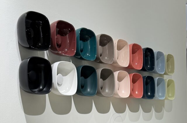
Colour can absolutely work in Australian homes, and I’d love to see us be braver about it. But the versions that will age well are those chosen with our light, our landscape, and our renovation cycles in mind. Not lifted wholesale from a Milanese showroom and dropped into a Northern Beaches kitchen because it looked extraordinary in a photograph.
That’s the difference between being inspired by Europe and being informed by it.
Every millimetre matters
Perhaps the most consistent theme across the entire fair was the obsession with utilising every single centimetre of space. Integrated storage was another big theme. Everything had a dual function. Nothing was wasted.
Curves
Curved cupboard fronts and rounded joinery profiles were everywhere including furniture: not just as an aesthetic choice, but as a way to make spaces feel softer and more resolved while eliminating wasted corners.
Celebrating constraints
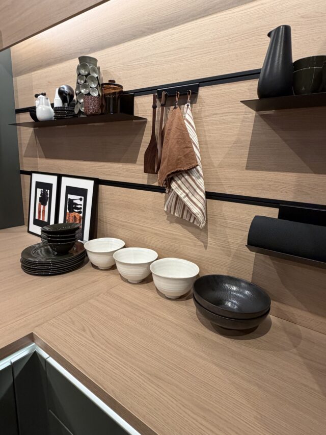
One of the cleverer innovations was how designers handled material joins. Rather than trying to hide where panels met, they made those junctions a design feature, integrating hooks, open shelving, and storage containers directly into the join. Instead of concealing a constraint, you lean into it and make it beautiful.
Refined and considered benchtops
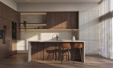
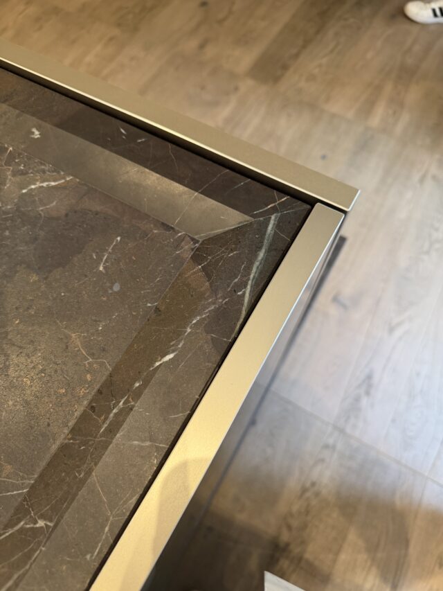
The benchtop profile trend is shifting. What I saw in Milan was a move toward slimmer profiles, around 12mm, with a shadow line detail underneath. It’s a cleaner, more refined look compared to the thicker profiles we’ve seen for the past several years. I have already seen slimmer bench profiles happening in Australia before I left. In Milan, I also saw chamfered edges with trim, though I think the Australian market is less likely to adopt this. Upturns on kitchen benches were also present, though I suspect that’s more a European response to smaller spaces than something we’ll adopt widely here, given our larger kitchens.
Taps that make coffee
One standout product that I genuinely believe could take off in Australia: a hot water mixer tap that dispenses sparkling water, boiling water, and ambient water, but also has a pod system built in so you can make coffee directly from the tap. If that makes it to the Australian market, I could see it becoming a serious statement piece in a high-end kitchen.
Tapware becoming jewellery
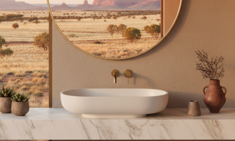
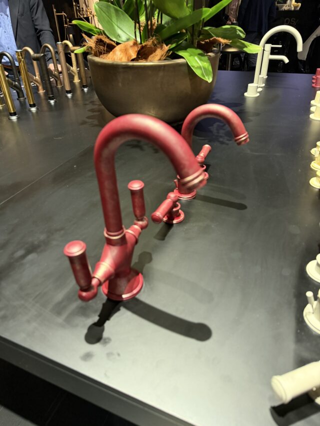
More broadly, tapware is getting more ornate and jewellery-like for the luxury end of the market: think gem-like details on mixers and tap bodies. It’s directional toward a European and Middle Eastern aesthetic, but it signals a broader willingness to treat functional items as decorative objects.
Wallpaper in the shower
This was one of my biggest wow moments of the trip: waterproof wallpaper designed for wet areas, including showers. We all hate grout. And in humid environments, maintaining tiled surfaces is genuinely challenging. Shower-safe wallpaper opens the door to incredible variety in pattern and colour, in a space that’s historically been limited to tile, stone, and paint. I think this will eventually find its way into the Australian market, and when it does, it’ll be a game-changer for bathroom design.
Lighting that does more
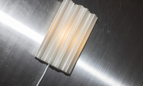
A few lighting innovations caught my eye. The most interesting was a ceiling-integrated light that functions as a standard downlight when you want ambient illumination, but when you need task or directional light, the fitting drops down like a pendant. Discreet when you want it, functional and statement piece when you need it.
Colour-temperature adjustment by touch was also very prevalent. As we learn more about the impact of light on mood, focus, and sleep, this kind of intuitive control is becoming less of a luxury feature and more of a design essential.
Joinery with internal lighting was standard across the fair. Open a cupboard, and the light comes on automatically. There were also stunning pendant lights that were simply there as a statement, essentially from my point of view, there to elicit “wow”.
Sustainability
Sustainability was present at the fair, but perhaps not in the way you might expect. It wasn’t primarily about material certifications or carbon footprints. The sustainability message that came through most strongly was about intentionality: designing things with a purpose, eliminating waste through smart design, and ensuring every element of a space serves a function. No unnecessary elements, no wasted space, no throwaway details. This is the philosophy I use in my designs instinctively.
Health and wellness: The bathroom gets serious
One of the strongest emerging themes at the fair was the integration of health and wellness into residential design, and nowhere was this more evident than in the bathroom.
Spas, steam showers, saunas, and cold plunge baths were all on show, and these weren’t presented as hotel amenities or luxury add-ons. They were being positioned as standard residential features: things people build into their homes rather than drive to a wellness centre to access. The showstopper in this category was a shower that produced its own snow.
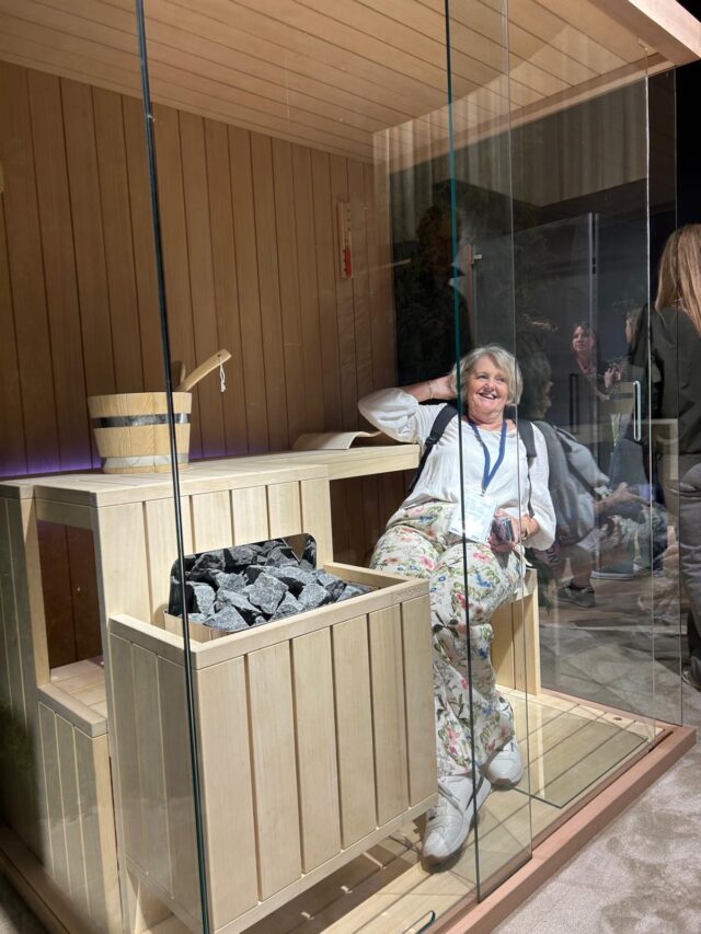
We’re already seeing strong growth in Australia in personal wellness practices: cold exposure therapy, infrared saunas, ice baths. What used to be the domain of elite athletes and day spas is becoming part of how everyday people think about their health routines. The logical next step is designing homes that support those habits rather than requiring people to leave the house for them.
A well-designed steam shower, a compact sauna, or a cold plunge integrated into a bathroom or outdoor area is absolutely achievable in the Australian residential market. I’d expect to see demand for this growing steadily over the next few years.
The fun stuff
Not everything at Salone was about utility and innovation. Some of it was just genuinely for fun.
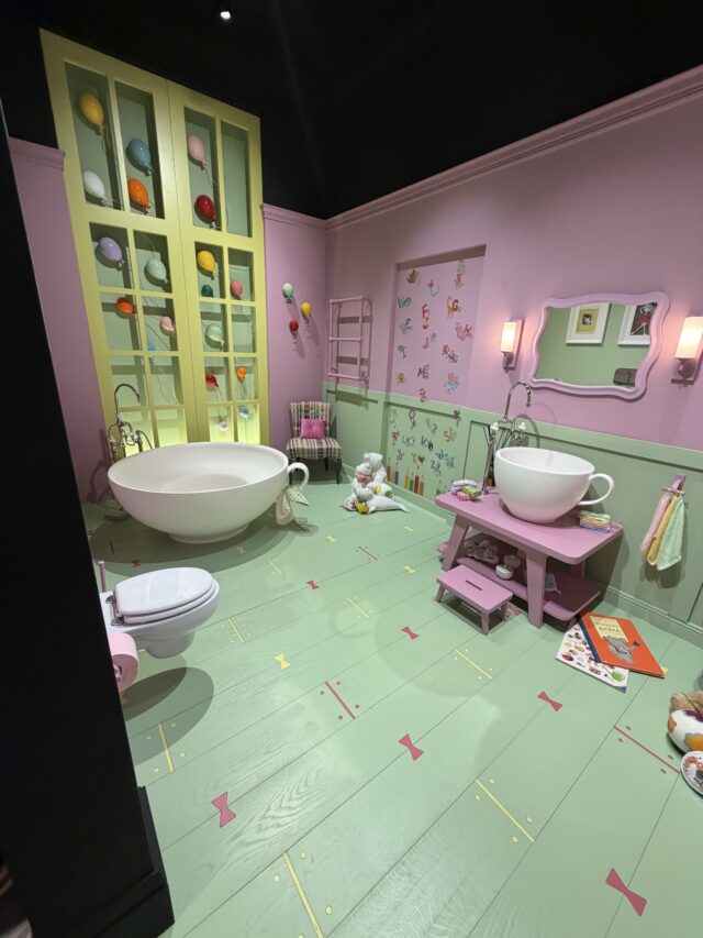
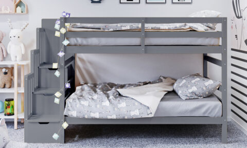
Kids-only bathrooms were a thing. Fully designed, completely whimsical spaces created entirely for children, with playful shapes, bright colours, and a sense of fun that most adults would secretly love for themselves. They were charming and creative, and I absolutely adored them. Will we see dedicated kids’ bathrooms in Australian homes anytime soon? Honestly, I can’t see it. But I did find myself thinking they’d translate beautifully into a childcare centre or a paediatric clinic: somewhere that needs to feel safe and joyful for little people.
A double bath designed for two was on show. Could it find an audience in Australia? Possibly. It would take the right client, the right bathroom. Personally, for me, soaking in a bath is “me” time.
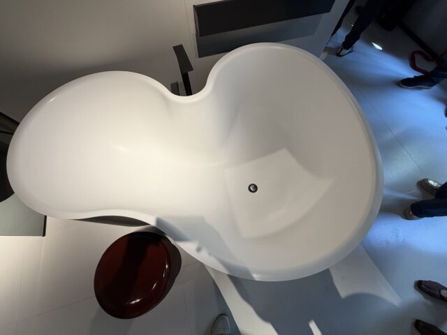
More memorable still was a bath where the colour of the water changed. I genuinely cannot see that landing in the Australian market, but it was playful and unexpected and made everyone who walked past stop and look twice. Which is, in fairness, exactly what good design is supposed to do.
And then there was the bath that looked as though it had been sculpted from bubbles: a black glossy exterior with a gold-plated interior. Dramatic, maximalist, and very firmly aimed at a European and Middle Eastern luxury aesthetic. It was about as far from an Australian sensibility as it’s possible to get, and yet it was impossible not to appreciate the confidence of it. Design that commits completely to a vision, however niche, is always worth paying attention to. Spectacular to look at, and a good reminder that design at its most unrestrained is really just another form of art.
Outdoor living
Designers were using solid materials and bold organic forms, shapes that referenced the body, that curved and contoured in ways you wouldn’t expect from hard surfaces. And yet they were remarkably comfortable to sit in. The form was doing the ergonomic work that cushioning usually does. It was a clever, considered design that happened to also look extraordinary.
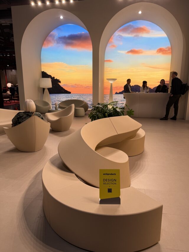
Oversized pots and planters were everywhere, and they were spectacular. Statement pieces in their own right, with texture, weight, and presence that turned a terrace or garden into something that felt designed rather than simply furnished.
This naturally translates to the way Australians actually live. We use our outdoor spaces differently from most Europeans. Our climate allows us to treat a terrace, a courtyard, or a garden as a genuine extension of the home rather than a seasonal bonus. The sculptural forms, the textural layering, the play of shape and material: all of it sits beautifully within an Australian outdoor context.
So, what does this mean for Australian design?
I came home from Milan with enormous respect for European design. But I also came home with a renewed appreciation for what the Australian kitchen and interiors industry has quietly achieved. The Eurocucina hall, the kitchen-focused section of the fair, was genuinely impressive. However, there was very little there that I hadn’t already seen. The detailing, the material combinations, the integration of appliances and storage, the craftsmanship: these were things I recognised. Things we’re already doing here and should be proud of.
Some of what I saw in Milan will translate directly to the Australian market. Slimmer benchtop profiles, integrated joinery lighting, waterproof feature wallpaper, and a slightly braver approach to colour and texture all feel relevant and achievable here.
Other innovations are better suited to the European context they were designed for. The fulcrum-based overhead cupboard system, for instance, requires ceiling heights that most Australian homes simply don’t have.
But perhaps the most valuable thing I brought home from Milan wasn’t a trend at all. It was a clearer understanding of why we design the way we do here, and why that’s not always something to apologise for. Our spaces are larger, our light is extraordinary, and our connection to the outdoors is a genuine design asset. The best European influences are the ones that enhance all of that, rather than override it.
–Robyn Hawke is the founder and principal designer of Inspired Spaces, an award-winning Sydney interior design studio specialising in renovations, extensions, and commercial interiors. With more than 20 years of experience, Robyn is known for creating intelligent, human-centred spaces that balance beauty, functionality, and emotional connection.