Let’s take a look at last night’s fun Block kid’s room reveals (all 10 of them!). From Steph and Gian’s 30 out of 30 showstoppers (which were probably more for the parents’ aesthetics) to Leah and Ash’s, which was all about the kids and the fun, there was plenty of inspiration in everyone’s rooms. And plenty of items caught our eye which we’ve linked to as great buys for your little ones’ spaces!
There’s nothing more fun than designing a kid’s room because all the usual rules go out the window. So as a mum planning on changing up my boys’ room this side of Christmas, I was keen to see what everyone did!
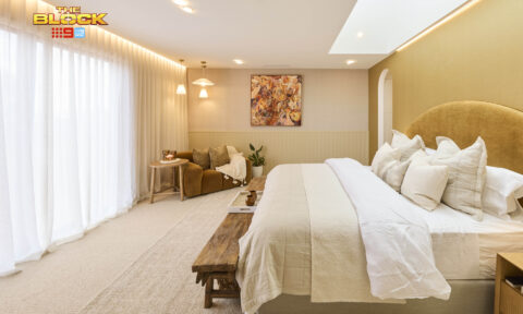
Steph and Gian (First Place): 30 out of 30
“This,” said Darren as he walked into the first of Steph and Gian’s twin rooms, “is the most sophisticated kids’ bedroom we’ve seen!” And the compliments didn’t stop there. With a soft colour palette (thankfully not all beige), the perfect pendants, bedhead reflecting the Japandi style and a swing chair, it was the best styled room of the build, the judges said. Through the Jack and Jill bathroom into bedroom number two, the enthusiasm continued. Ample storage, on-point styling (down to hand-stickered artworks) and again a soft palette, all added up to rooms that combined functionality, marketability and soul for a result Marty applauded as brilliant flexibility.
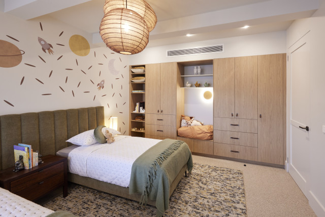
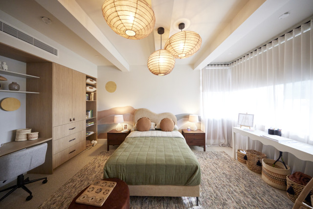
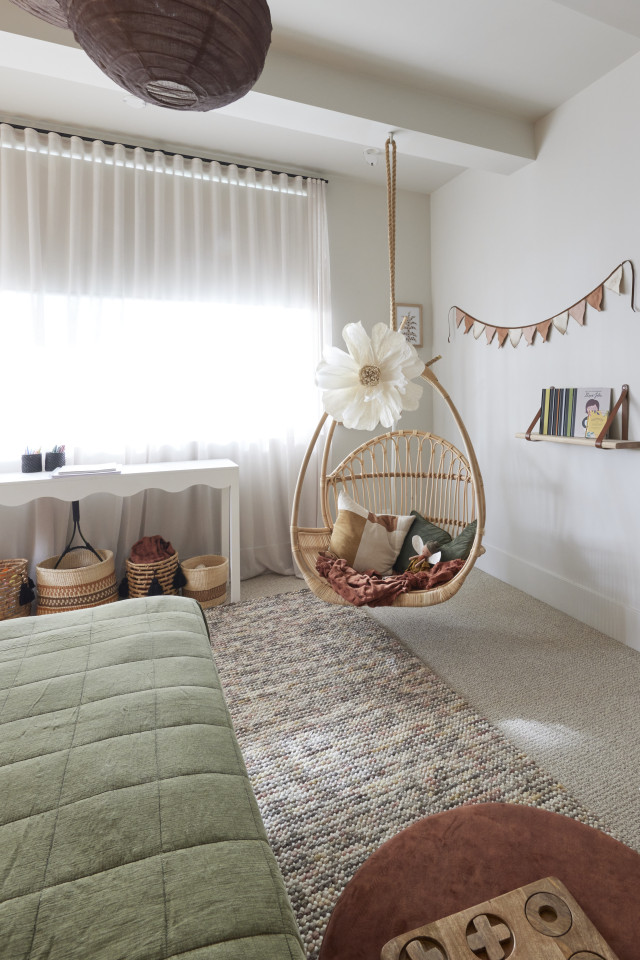
Shop the look: Picture ledge | Butcher’s paper hanger | Velvet beanbag | Hanging chair
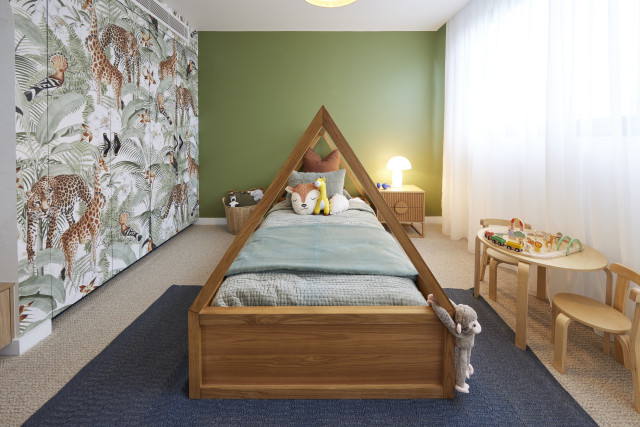
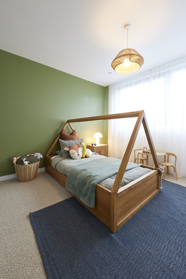
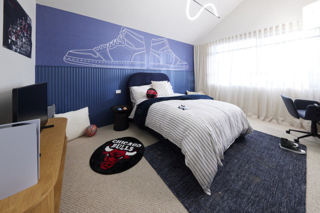
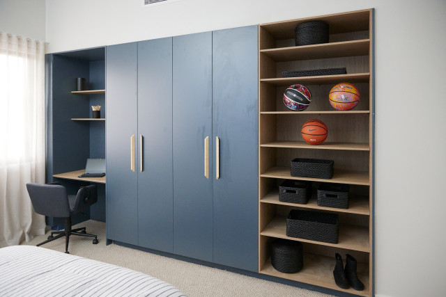
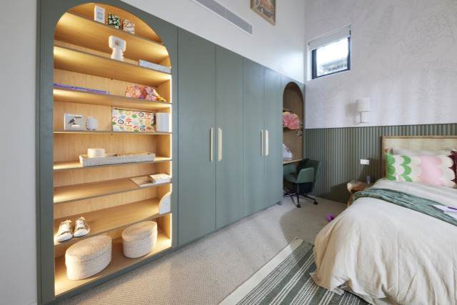
Leah and Ash (Second place): 28 out of 30
With bold Grafico wallpaper and a climbing wall along one curve, Shaynna fell in love with the bold sense of fun in Leah and Ash’s first room. “They’re back to their best,” she said. Into the second room and the same emotional connection called as the judges took in the mirror ball over a curtained quiet (or very noisy!) space. Combining great architectural elements with a sense of fun, it made for a suite of rooms that grabbed them all… nearly. The rooms had: “a great sense of adventure and fun”, Shaynna and Darren agreed, but the daybed in one room was a strange choice, Marty countered, and one that could cost them.
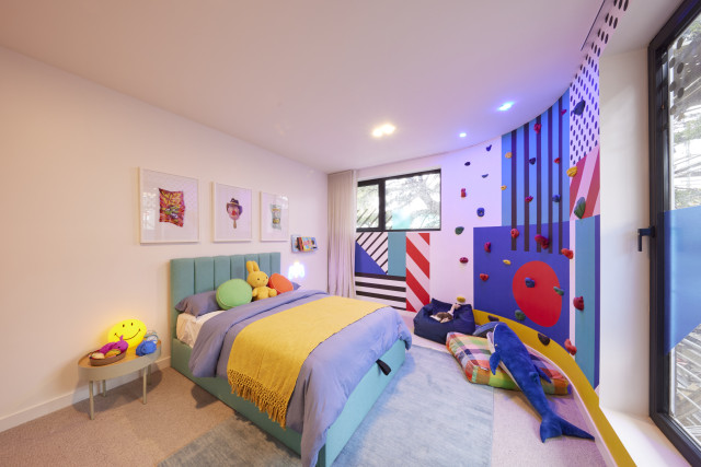
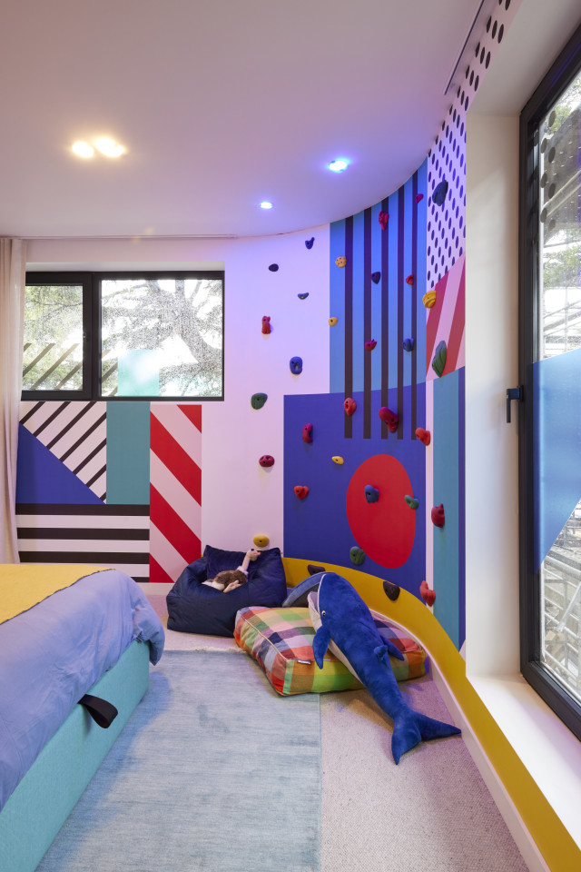
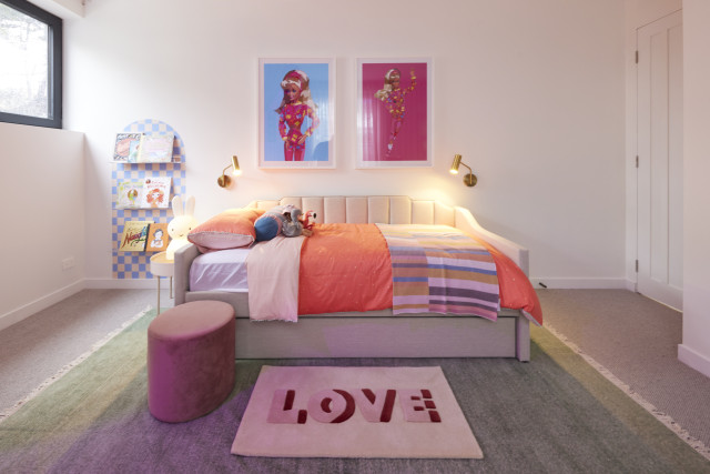
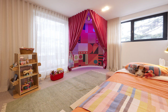
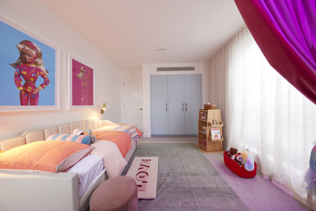
Shop the look: Revolving bookcase | Dr Freak artwork
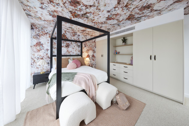
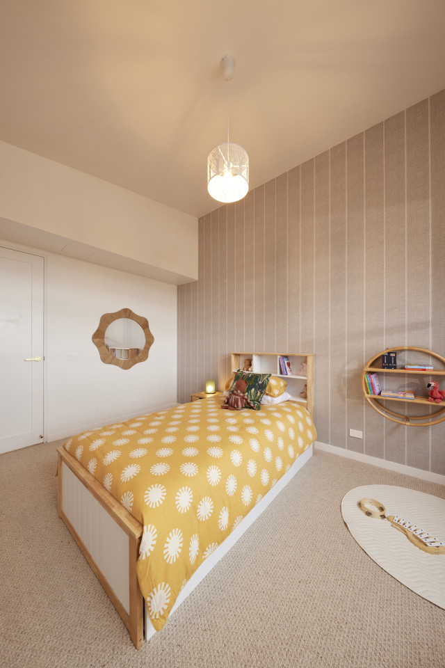
Kristy and Brett (Third place): 27.5 out of 30
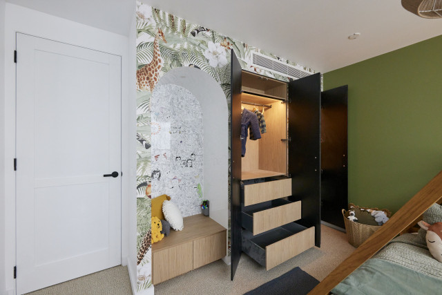
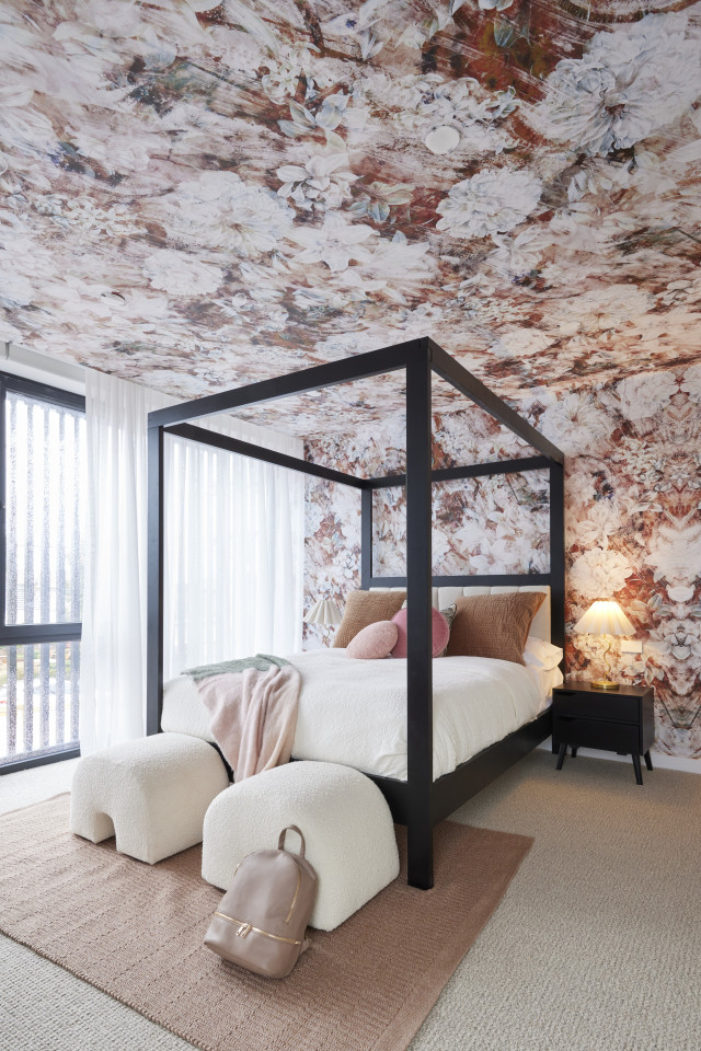
Adding the judges faces into the custom Grafico colouring in wallpaper was always going to win a smile and it certainly did, with all three agreeing it was the perfect touch to the Kinsman wardrobes. With a kid-appropriate bed and styling that showed how the room could easily be repurposed, Kristy and Brett’s first bedroom set the pace… but the second changed everything. With wraparound floral Grafico, sophisticated leather-accented wardrobes and a four-poster bed, this was a space for an older kid, the judges decided, perhaps one who would never want to move out! A sophisticated space, Marty summed up, and in line with the rest of the build.
Shop the look: The Cloud ottoman | The Cloud armchair
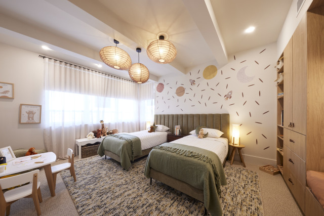
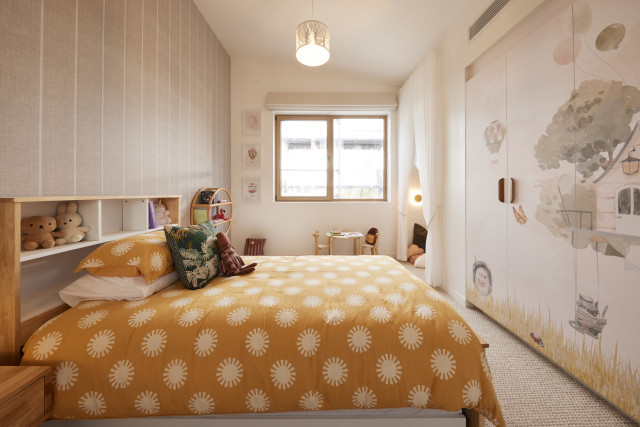
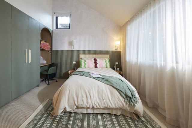
Eliza and Liberty (Fourth place): 26.5 out of 30
With a stunning mural playing off the deep-hued Kinsman wardrobes, custom artwork from young artist Novalie and a unique Brickman original Lego Cheetah plus the perfect bed with bedsides, Eliza and Liberty’s first room was off to a great start. But it was let down by track lighting, Marty said, and a blackboard that just didn’t fit. It was a “damn good room” Shaynna agreed, but one in search of an age group. But into their second space and the judges’ spirits lifted. The mural-fronted wardrobes and reading nook were stunning, Shaynna said, the executions spot on and even the pared back styling looked intentional, Darren said, and not just a cost -saving measure.
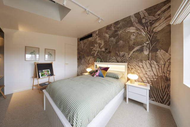
Shop the look: King single bed with trundle | Paris bedside table
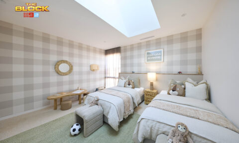
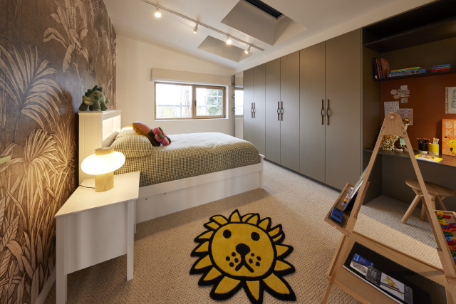
Kyle and Leslie (Fifth place): 24 out of 30
Generously sized and easily adaptable, Kyle and Leslie’s first bedroom showed great promise, the judges agreed and paired well with the second room, which boasted more of the home’s trademark curves. Both shared great layouts and were complemented by the Kinsman built-ins and muted colour palettes that were ready to be personalised, but the styling, all agreed, let them down. From the heavy basketball theme in one room, with blu-tacked posters (unacceptable, Marty declared) and Grafico wallpaper that suited a younger resident in the other, these were spaces that felt disconnected to the rest of the house. The spaces were marketable, they eventually agreed, but just not spectacular.
Shop the look: King of Flowers art print