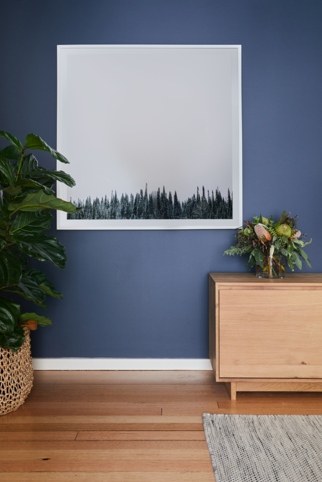
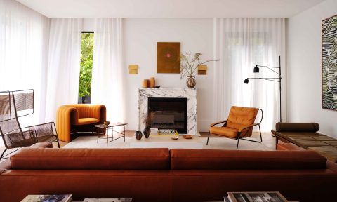
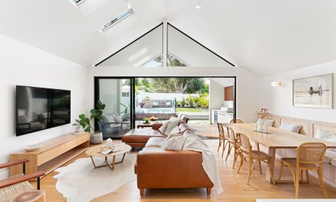
From cobalt to teal, and the myriad shades in between, there’s no doubt that blue is having a moment. And this Melbourne renovation, carried out recently by interior designer Jessica Viscarde of Eclectic Creative, is further proof that a deep version of the hue is a dramatic yet tranquil option. “My clients, a young family, wanted to go with a calming and relatively neutral scheme but were open to introducing some hints of colour,” says Jessica who managed to convince them to take the plunge.
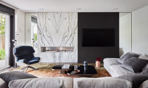
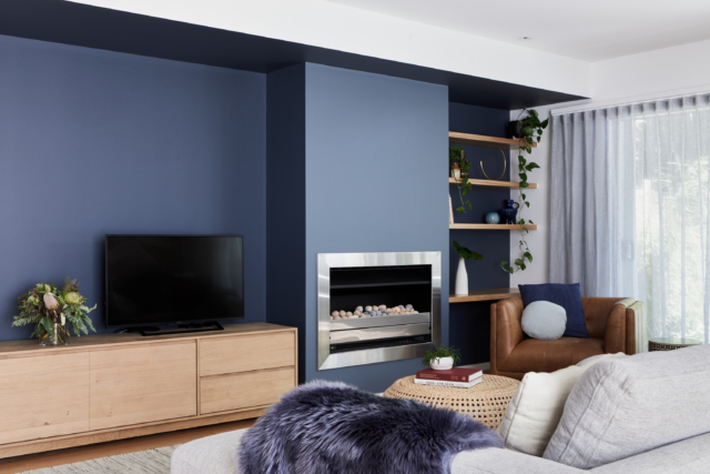
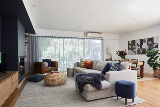
“Upon entering the main living, dining and kitchen area there is a main wall incorporating a beautiful contemporary fireplace and the ideal spot for placing a television. A moody and sophisticated colour and design concept was presented incorporating Dulux Grid and Signature paint colours on the main wall with the intention of both camouflaging the television and highlighting the fireplace. A slightly lighter tone, Signature, was specified for the facade of the fireplace drawing it out visually and the darker shade Grid was used for the majority of the wall as it recedes. This actually made the room feel larger!” says Jessica.
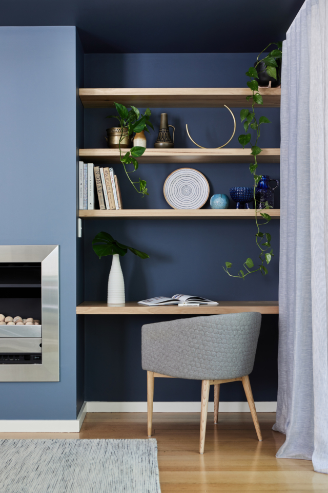
The TV wall was finished with simple solid timber open shelves including one designed at desk height that also doubles as a functional nook for the family. “It’s the perfect spot for homework!” says Jessica.
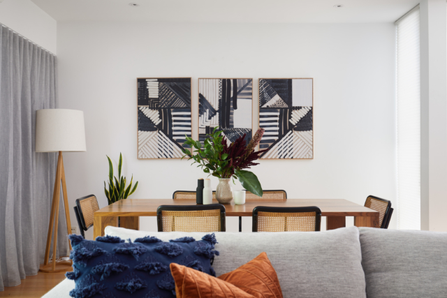
“To balance the boldness and depth of the moody blue tones, hints of similar blues were used throughout the space with soft furnishings, artworks, upholstery and window furnishings,” says Jessica. The curtains are a natural linen in a soft blue grey tone and the living room artwork is steeped in blue too. “We commissioned local artist Tory Burke to create a triptych series to hang in the dining room that is directly across from the accent wall of the living room which balances the colour in the living area,” says Jessica.
“My favourite part of the project is the bold and moody colour palette and I’m so glad that I encouraged my clients to get a little out of their comfort zone. I applaud my clients for jumping on board and entrusting my vision – it’s a reason you hire a designer, to suggest ideas you mightn’t have otherwise considered.”
“The colour works well because we have balanced it with large proportions of neutral and light timbers, so it doesn’t feel obtrusive or dark. The darker background also makes for wonderful television viewing I am told, as well as allowing the equipment to blend into the background.”
Photography: Stephanie Rooney
