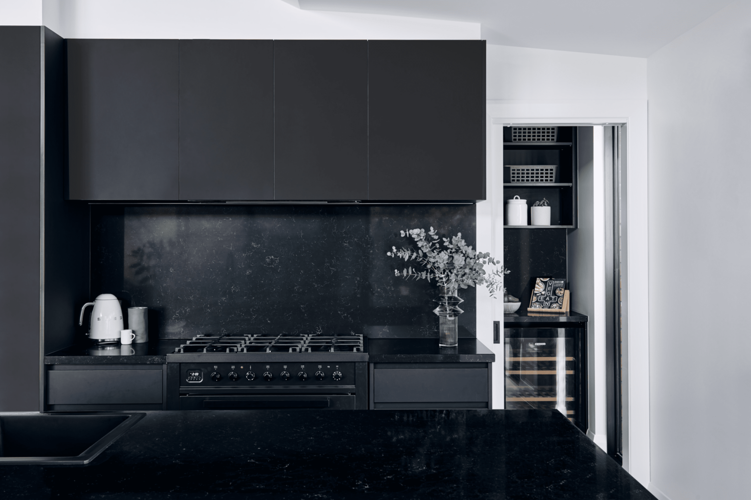
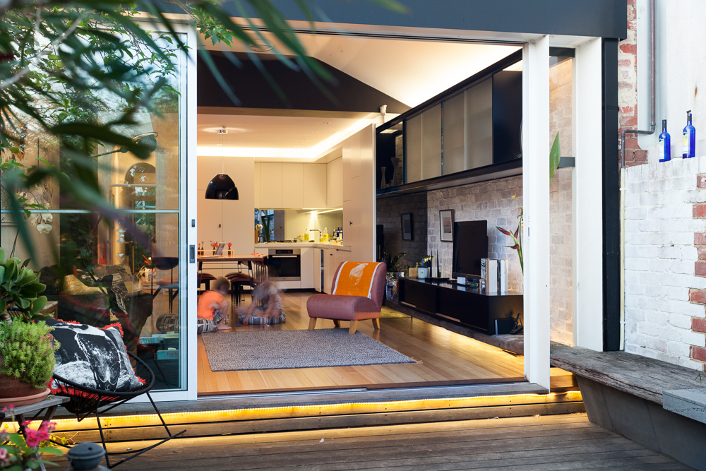
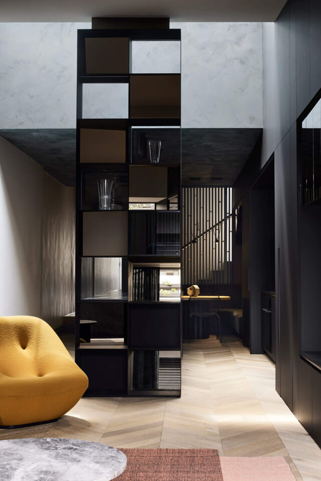
While people often argue that dark houses feel small, Melbourne’s Splinter Society would beg to differ. “We use dark colours as a way of focussing attention and framing things. With light colours, everything is washed out and in your face. With dark colours you have more control over what is highlighted – it’s all about creating theatre, intimacy and atmosphere,” says director Chris Stanley. He adds that playing with natural and artificial light is key to the aesthetic which is demonstrated beautifully in this Brunswick East renovation and extension.
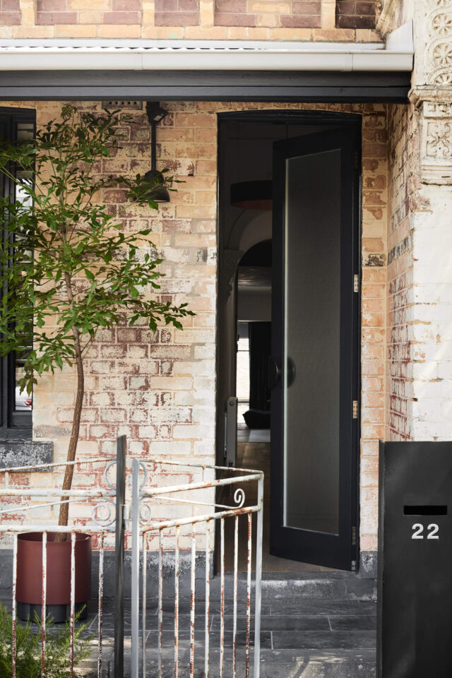
Home to a family of five, this small but perfectly formed abode sits on a narrow 4.5-metre-wide block inside a classic single fronted Victorian terrace. Affectionately named Villa Italia in reference to the owners’ Italian heritage, the designers attempted to distill classic Italian qualities into the home. “Our clients are classically Italian in every way. They love simple beautiful things, food, they are very hospitable, and the house is always immaculately clean and well presented,” says Chris.
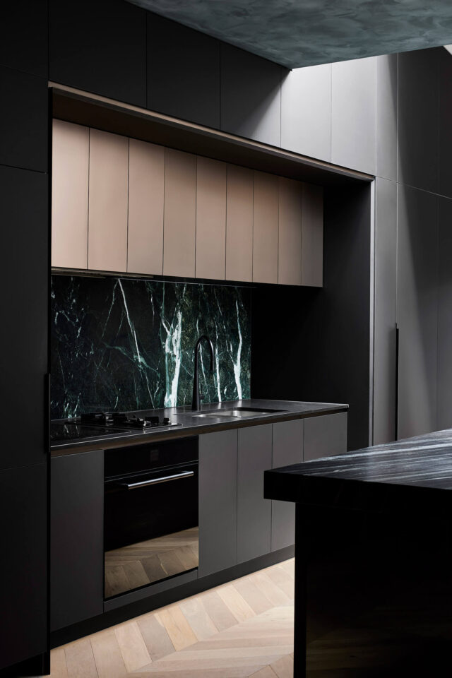
“The house is very well put together and it’s designed to host people despite being on the smaller side. Australians don’t cope with living in such squishy spaces because we’re not used to it, but Europeans are much better at it. I’ve found that people can be very fulfilled in small spaces,” says Chris who explains that the family decided to sacrifice extra space to stay in the inner city.
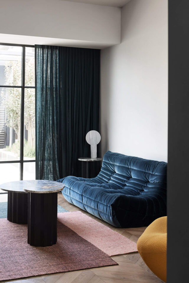
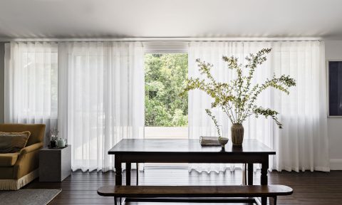
A carefully curated open plan space, the kitchen, dining and lounge areas are all designed to serve multiple functions – various seating and dining configurations have been composed to accommodate gatherings with the owners’ large Italian family. For instance, the banquette in the dining area doubles as soft seating for the living area.
“The family eat around the kitchen bench every night – it’s the centrepiece of the home and the ‘dining’ area is used when friends come over. The kids sit at the bar and the adults at the dining table when entertaining,” says Chris.
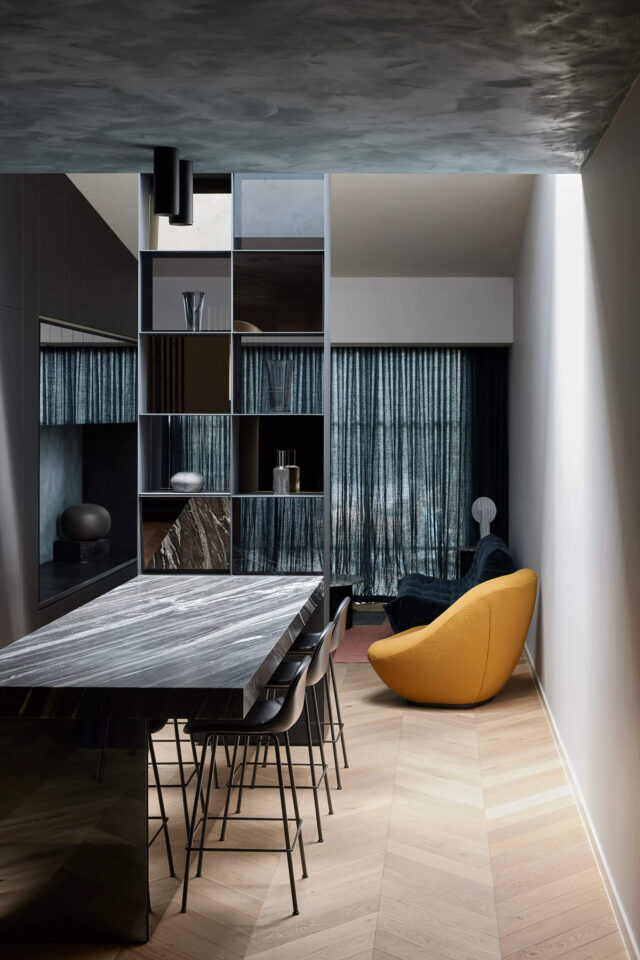
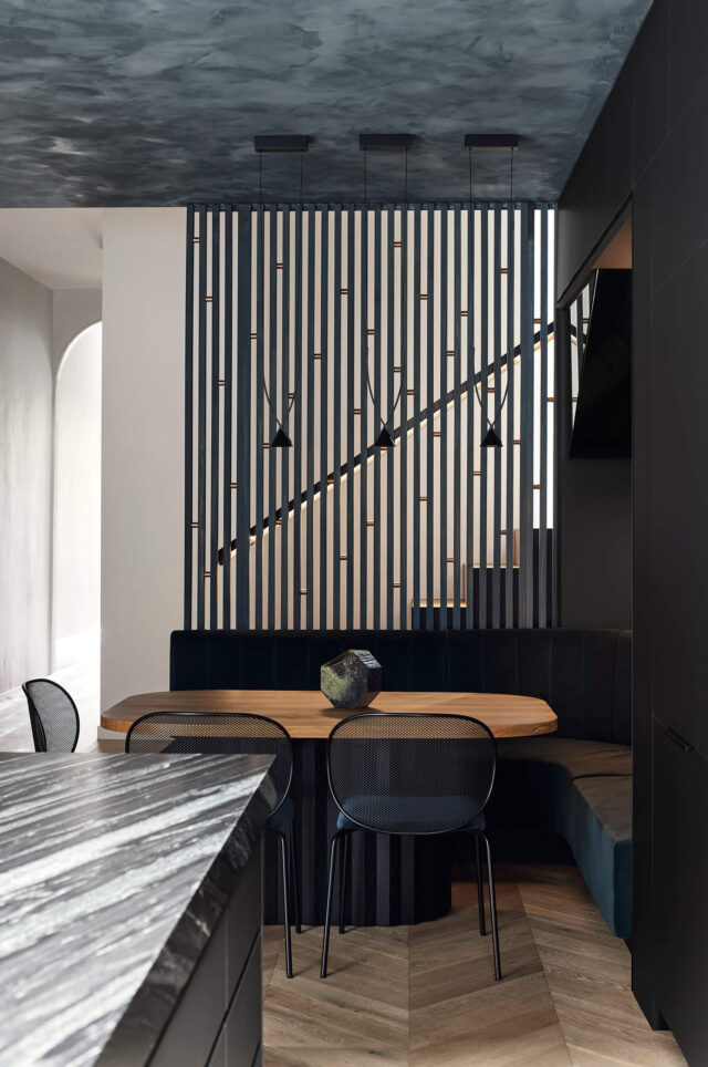
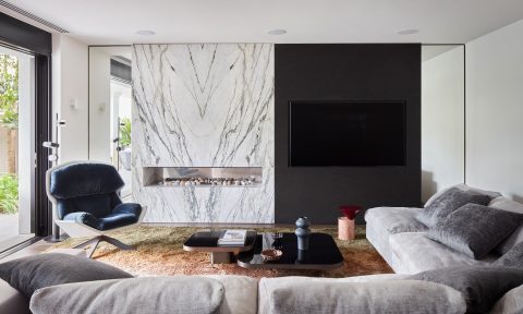
The sophisticated materials palette references the patina of an archetypal Italian village with layered fresco finishes on the walls, bespoke upholstery, textured stonework and parquet timber flooring. Moments of colour are incorporated through the interiors also with with emerald, aquamarine and lapis shades taking centre stage.
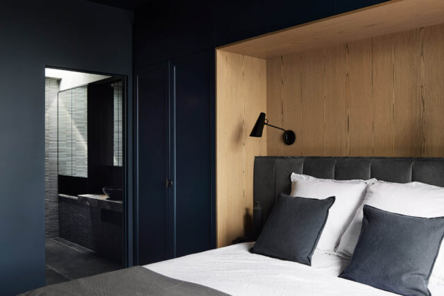
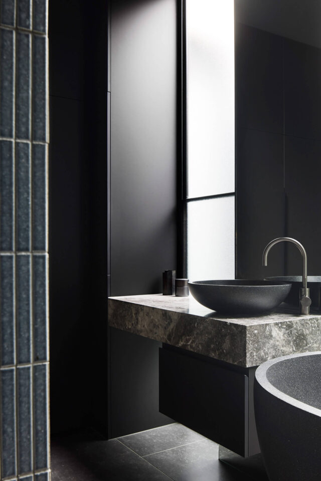
“Drawing on the clients’ heritage, the redesign is guided by qualities often associated with Italian brands: fine craftsmanship, sophistication, elegance, and a touch of luxury.”
Photography: Sharyn Cairns
