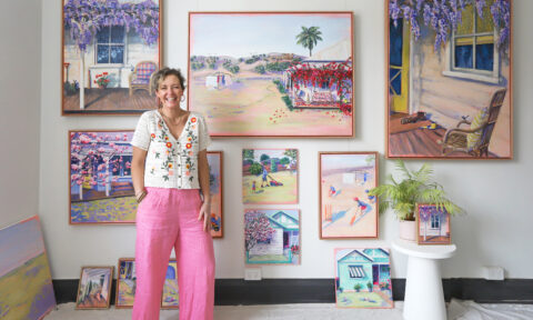
It used to be that painting a house white was fairly standard practice but (controversial opinion!) I predict those days are numbered. Yes, white paint is always a classic, clean look but it can be a little lazy from a design perspective which is why it cheers me to see so many people embracing colour inside.
“Australians’ confidence with colour is growing, and with this the drive to create spaces that reflect our individuality and personal expression,” says Porter’s Paints colour expert Melanie Stevenson. Cue the brand’s latest release; a glorious palette of 44 rich and uniquely textured colours with a velvety matte finish, appropriately titled Smooth Impasto.
Application is key for the range with the end result characterised by a lack of uniformity — subtle but visual brush marks create an undulating texture and shadow effect. I remember a similar look from the nineties but the paints look thoroughly modern here courtesy of the palette and stylist Heather Nette King’s sophisticated interpretation of them.
The sumptuous colours run from a rich grenache tone to a verdant green, terracotta, burnished red and vintage blue and the 44 new shade are also available in existing Porter’s Paint finishes such as their signature wall paint Eggshell Acrylic or Low Sheen Acrylic which is perfect for high traffic areas.
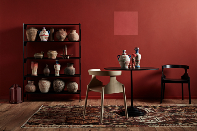
Warm reds
“Warm terracotta and burnished reds, such as Dolce Vita and Santa Cruz hint at an Eastern influence, and pair beautifully with natural materials, such as warm timbers, stone and linens,” says Melanie. Heather Nette King has styled these earthy hues with an array of handmade ceramics in the campaign imagery — the perfect complement for tones that are grounded in nature.
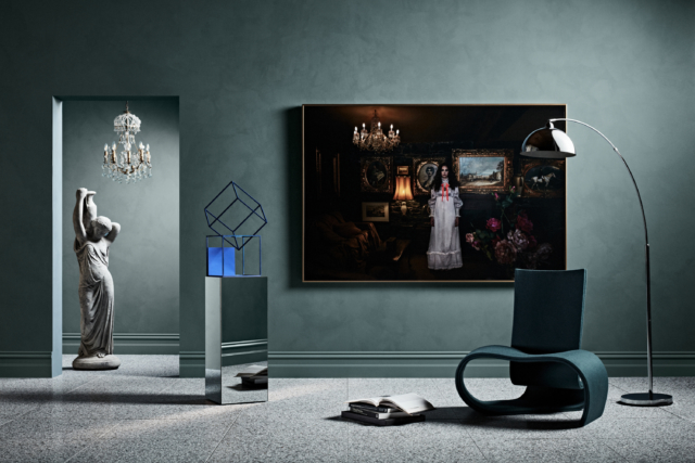
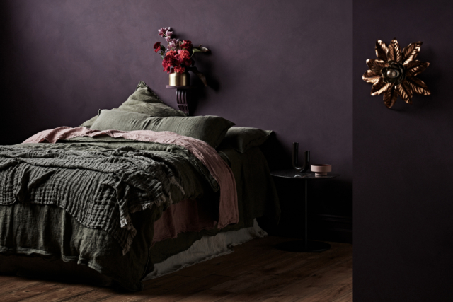
Deep greens
One of my favourite tones from the range, Gulf Stream is a rich teal tone that looks fabulous with brass accessories and that rich red Derek Swalwell print.
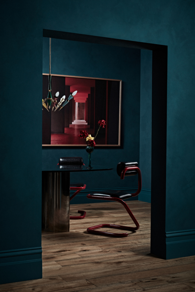
“Complex deep greens like Nori and Andalusian Olive, decadent blue-greens such as Gulf Stream and Viridian, and vibrant olive tones like Castelvetrano and Extra Virgin create an elegance, moodiness and theatre, which can work well in studies, dining spaces or master bedrooms,” says Melanie.
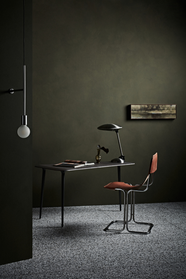
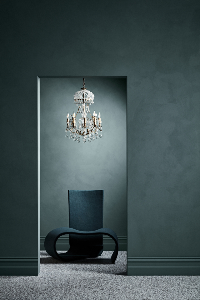
Blues & greys
“Smoky, cool and muted blue-greys, such as Anchorage, Duck Egg and Vintage Blue denote laid back drama, sophistication and simplicity, complementing furniture and accessories with minimalist lines, particularly in black and metallics,” says Melanie of the Smooth Impasto range’s blue based tones. Anchorage in particular works beautifully with the paint’s unique texture and is another collection highlight.
Photography: Mike Baker | Styling: Heather Nette King for Porter’s Paints