The 2019 Dulux colour forecast ‘Filter’ is upon us and it’s divided into four palettes with names that sound less like paint and more like something from a therapy session. ‘Repair,’ ‘Wholeself,’ ‘Legacy’ and ‘Identity’ all point towards a more introspective year, notwithstanding the exhilarating brights within.
“Filter speaks to our collective craving for individuality and personal expression. It helps us mindfully tap out all the distractions and focus on the things that move and inspire us,” says Dulux Colour Expert Andrea Lucena-Orr of the palettes that are inspired by extensive global trends research.
“Our confidence with colour is growing, and with this the drive to create spaces that reflect our history, hopes and dreams. Mindful consumption is a key theme for 2019 and we can expect to see a paring back of the unnecessary and a greater emphasis on repurposing and reimagining objects surrounding us. The result is a new kind of bespoke where the traditions of the past are celebrated in dynamic and modern ways,” says Andrea.
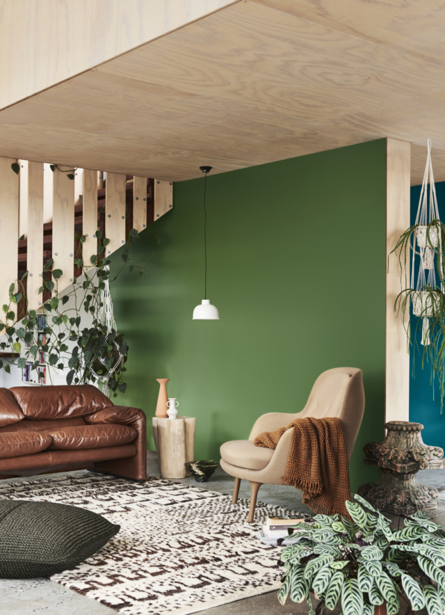
Repair
“Repair is my favourite palette of 2019. I love its muted, tonal combinations and slightly off-beat, vintage feel. It sets a warm, nurturing mood in a space and creates the perfect backdrop for timber, leather and unusual collectibles,” says Andrea of the colour grouping that includes earthy neturals, rich greens and spicy notes of cinnamon and sienna – all drawn from a desire reconnect with nature.
Wholeself
Perhaps a byproduct of the wellness trend, ‘Wholeself’ was borne out of a desire to move away from our devices and embrace a quiet stillness.
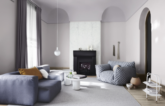
“From our global research it’s clear there will be an emphasis on wellness and mindfulness in 2019 and the Wholeself palette really plugs into these themes. With its soft, light tones and subtle layering of texture, it’s a palette to ignite the senses and revive a tired spirit. It’s also easy to decorate with existing whites and cool neutrals, which I believe will make it a popular choice for home enthusiasts,” says Andrea. Think mauve-grey, powdery pinks and touches of gold.
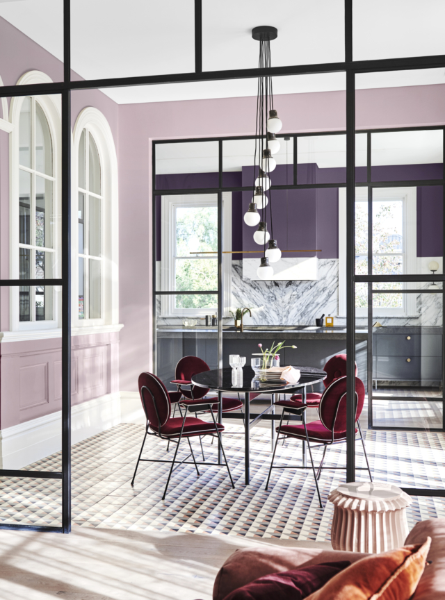
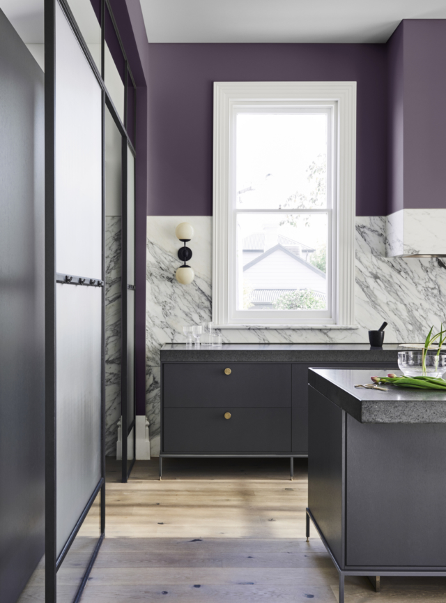
Legacy
A palette of intense, saturated hues, ‘Legacy’ combines deep purple, russet and aqua offset by brown-based pink tones. “The Legacy palette is timeless yet thoroughly modern. Think rich colour, classic furniture and sumptuous textiles used in unexpected ways. For example, these colours may be set against a streamlined backdrop or styled with an industrial edge,” says Andrea.
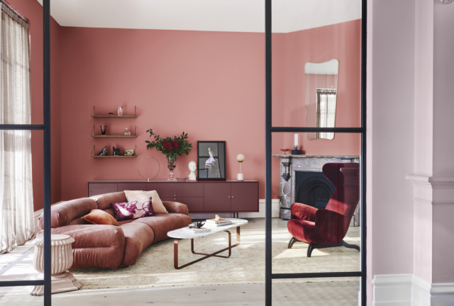
And as we noted a few months ago, much-maligned purple is back. “Purple has emerged as a base colour and is softened by paler shades of lilac and mauve – it’s a palette to push your creative boundaries,” says Andrea.
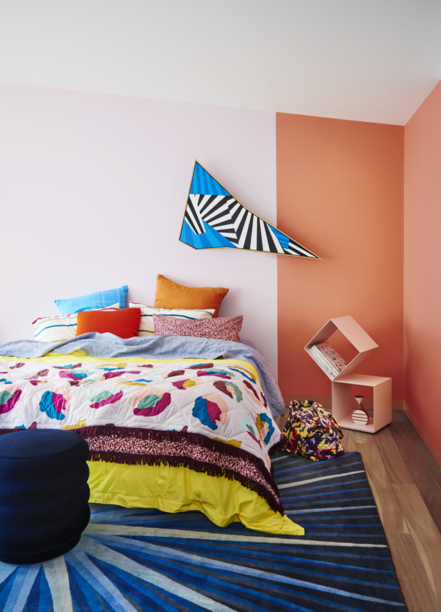
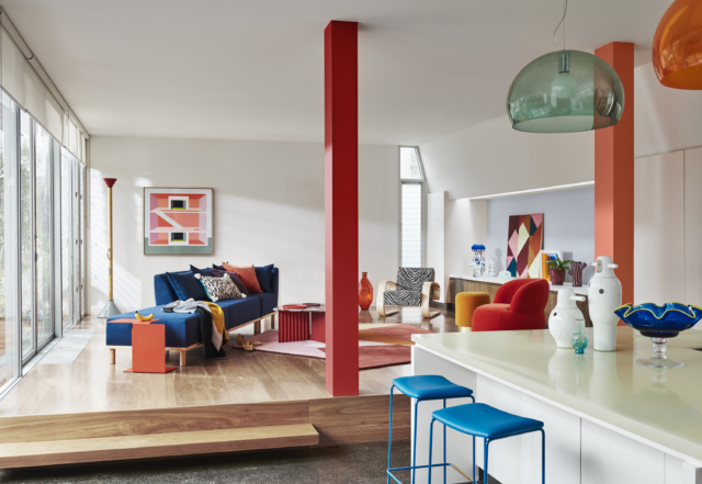
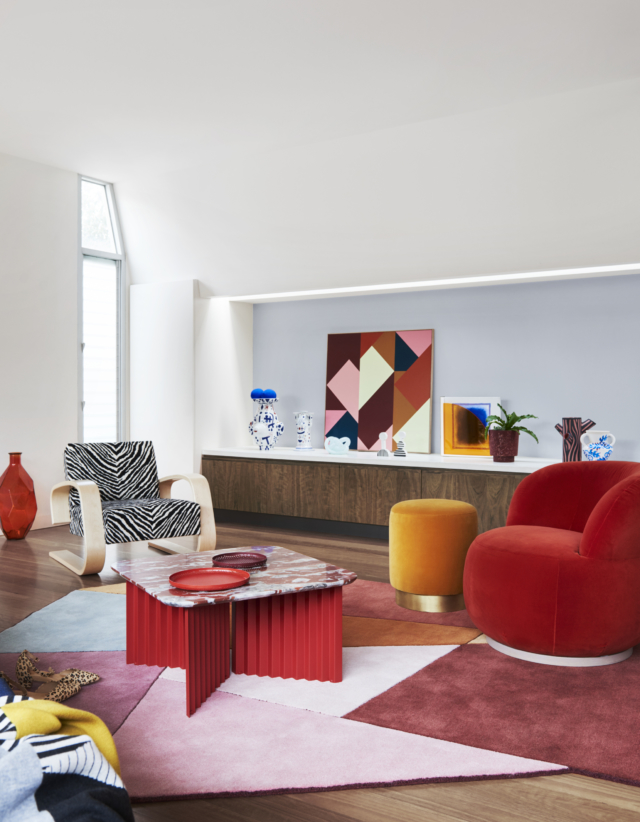
Identity
Speaking to the anti-establishment among us, ‘Identity’ celebrates clashing patterns, eclecticism and bright hues. “Featuring striking blues, purples and shades of citrus, this palette encourages you to incorporate a playful side into your décor. These colours command you to be brave and experiment with unique looks in the home. They translate particularly well in the bedroom – a nurturing space that’s all about you. Paint the door, a piece of furniture or a feature nook in a bright and invigorating shade and watch the room come to life,” says Andrea.
Styling: Bree Leech | Photography: Lisa Cohen
Comments
Gorgeous palettes! My personal fav here is the one “Repair”. Indeed quite nature-driven and calming, not to mention how good the painting itself is. What I notice is that besides “Identity”, all of the other projects feature walls to ceiling contrast, which is not an easy one to achieve without having to repeat due to spills/marks (either wall or ceiling, depending on which you do first), and if anybody reading this thinks DIY can work, I’m leaving a guide below, with most of the tips I would recommend.