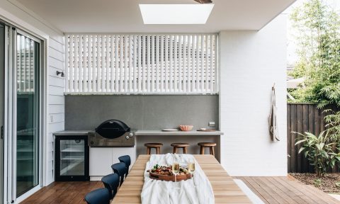
In its 32nd year, this year’s Dulux Colour Awards had a record number of entries (more than 300) from across Australia and New Zealand, many of which were pretty incredible. I’ve no doubt the judging panel (including industry luminaries Miriam Fanning, David Flack and David Hicks) had a tough time of it before the awards were handed down recently at a gala event at the National Gallery of Victoria.
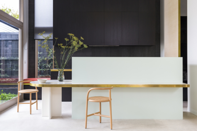
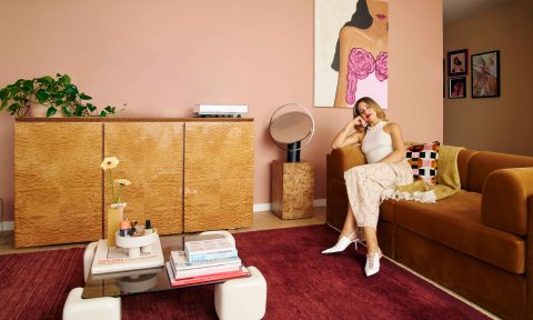
Taking out the top award in the ‘Single Residential Interior’ category was the ‘Percy St’ residence by Bagnoli Architects. The original Victorian cottage was renovated and extended and features the most glorious pastel paint shades.
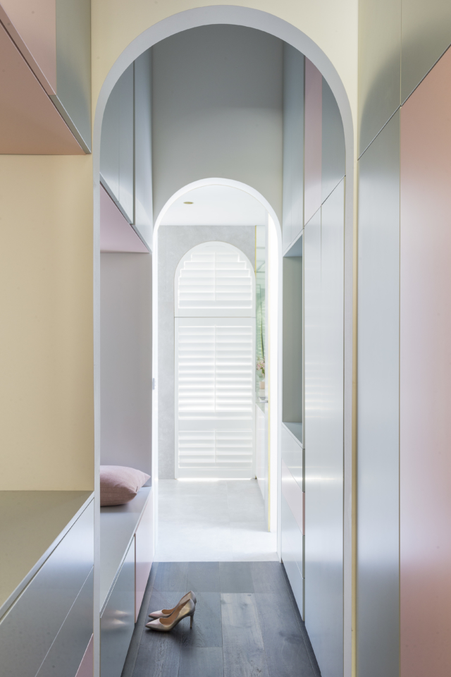
“Underpinned by an innovative approach to its philosophy and execution, this entry has a beautiful energy and innocence, which captures the essence of what the Dulux Colour Awards mean to us. The exploration of colour is soft and serene, yet commanding, and responds to the architectural form rather than being simply applied to a surface. With greys, blacks and splashes of colour, the interior scheme flows seamlessly to the exterior, demonstrating how the consideration of colour in a design concept can add light and depth to a home,” says judge David Flack.
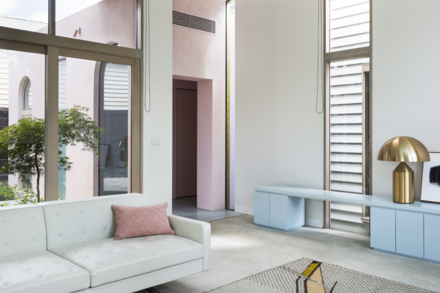
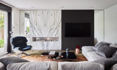
Special commendation went to Fiona Lynch’s ‘Elsternwick House’ project which another grand Victorian restoration. “This classically beautiful and sophisticated residence has been pared back for all the right reasons, and the monochromatic palette fits the architecture: white and black highlight structural elements and openings, while a range of greys tint the walls,” says David.
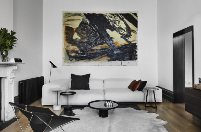
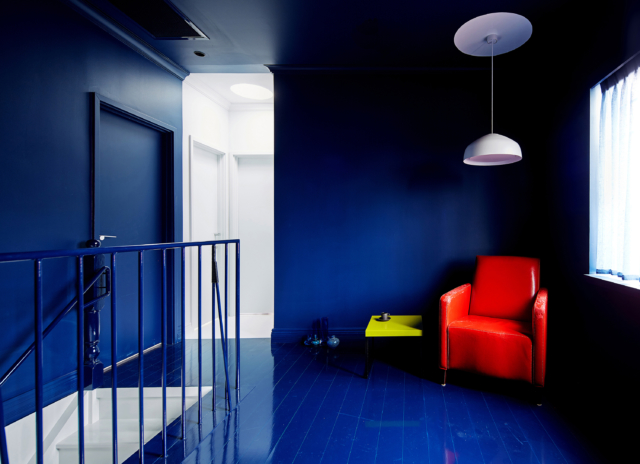
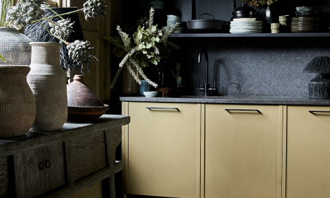
Another special commendation went to Arent&Pyke’s ‘Amarelo Terrace’ project which is a glorious celebration of blue. “The considered delivery of the whole project, fully resolved in composition, style and design, is evident here. It wasn’t forced, and results in a timelessness that is heightened by clever layering, materiality of finishes and an intimacy in the design and use of colour,” says David.
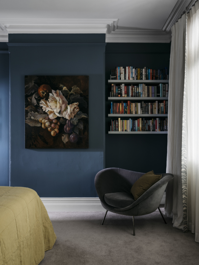
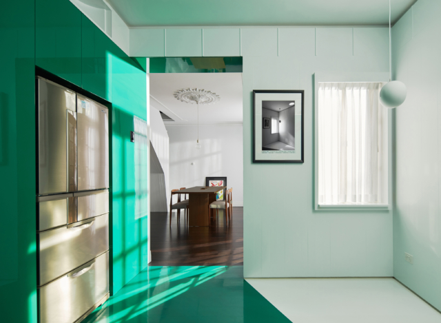
The ‘Multi-residential Interior’ category was taken out by Perth architect Simon Pendal for his daring ‘North Perth Townhouse’ project. “A clear, concise concept at the heart of this entry separates it from the rest. With bold hues cutting through a base of white, the internal spaces are cleverly defined, while a play of gloss and matte paint finishes adds another dimension to the form. There is no subtlety here; instead there’s an unwavering commitment to the use of contrasting tones to delineate the interior,” says David.
