While it’s not quite the same as Pantone’s colour of the year announcement, any trend watcher worth her salt, sits up and takes notice when Dulux releases a new colour forecast. Something of a colour barometer, it usually gives us a strong hint as to the kind of hues that will adorn our walls (and interiors in general) come next season.
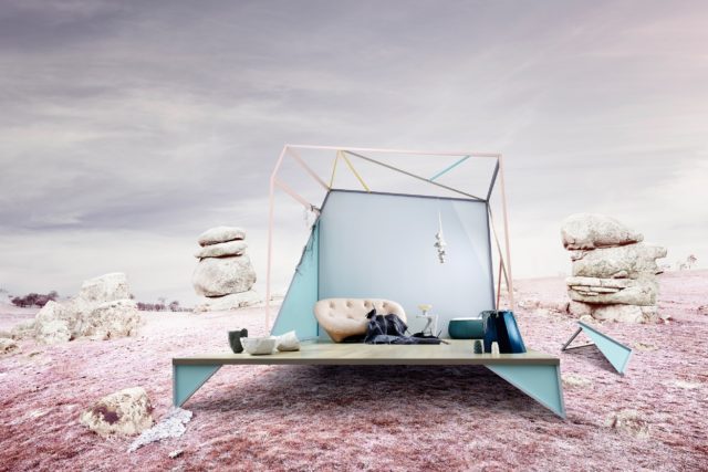 Bio Fragility palette
Split into four palettes, Dulux has worked with local craftspeople to bring the colour themes to life. “This year, we are drawing upon international trends as well as celebrating the contributions and growing influence of local designers. Working with the four ‘makers’ has demonstrated the versatility of each palette when introduced to the interior environment,” says Andrea Lucena-Orr, Dulux Colour Planning and Communications Manager.
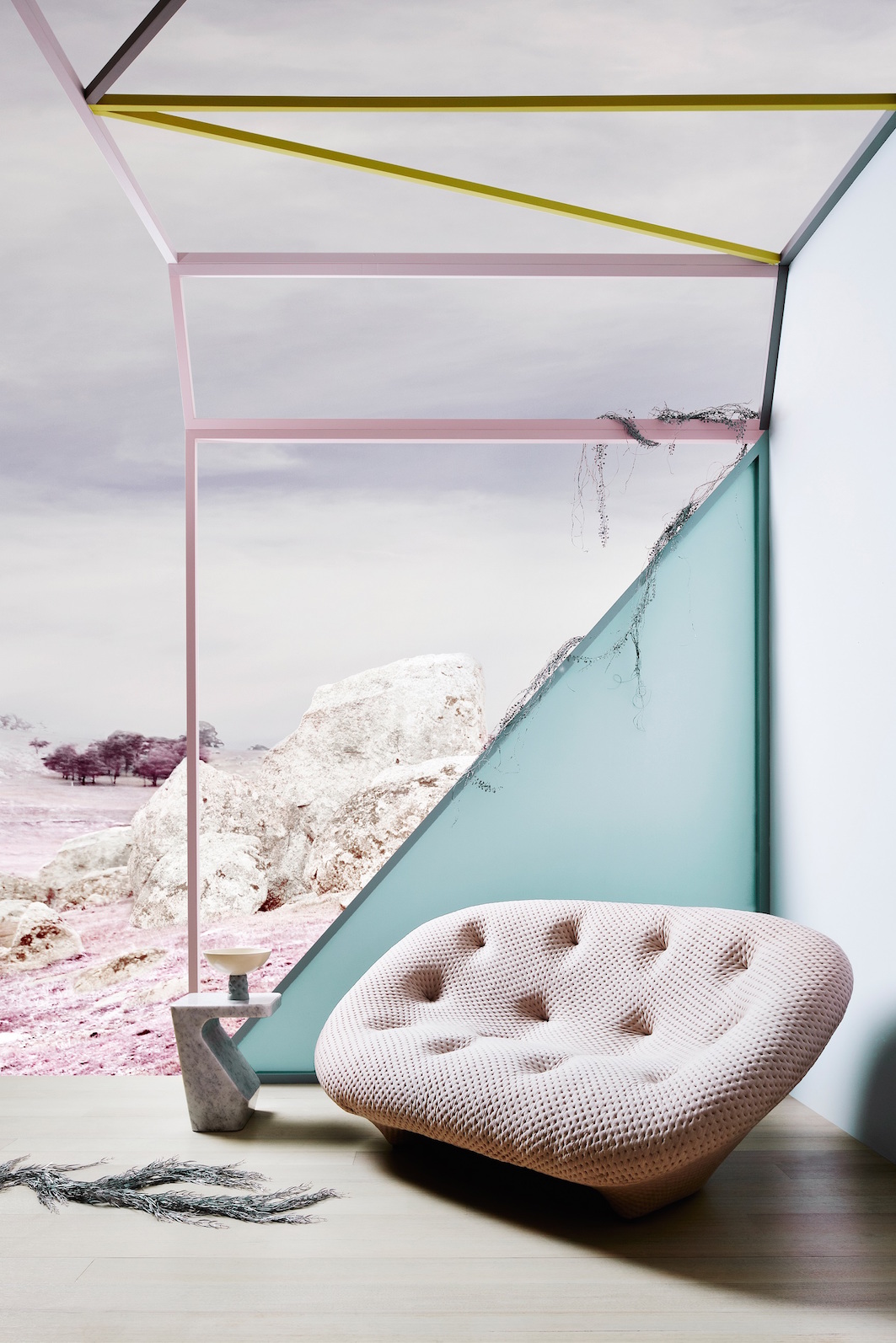 Bio Fragility palette
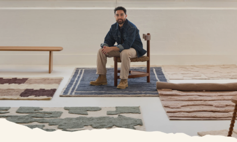
Melbourne ceramicists Porcelain Bear have created a porcelain bowl for Dulux’s Bio Fragility palette that draws on delicate hues comprised of subtle, chalky tones of pale aqua, lilac and dusty pink.
 Retro Remix palette
Bringing the past into the present, Retro Remix is a celebration of mid to late century design – Grazia & Co’s custom designed ottomans and side table evoke the retro feel of this palette.
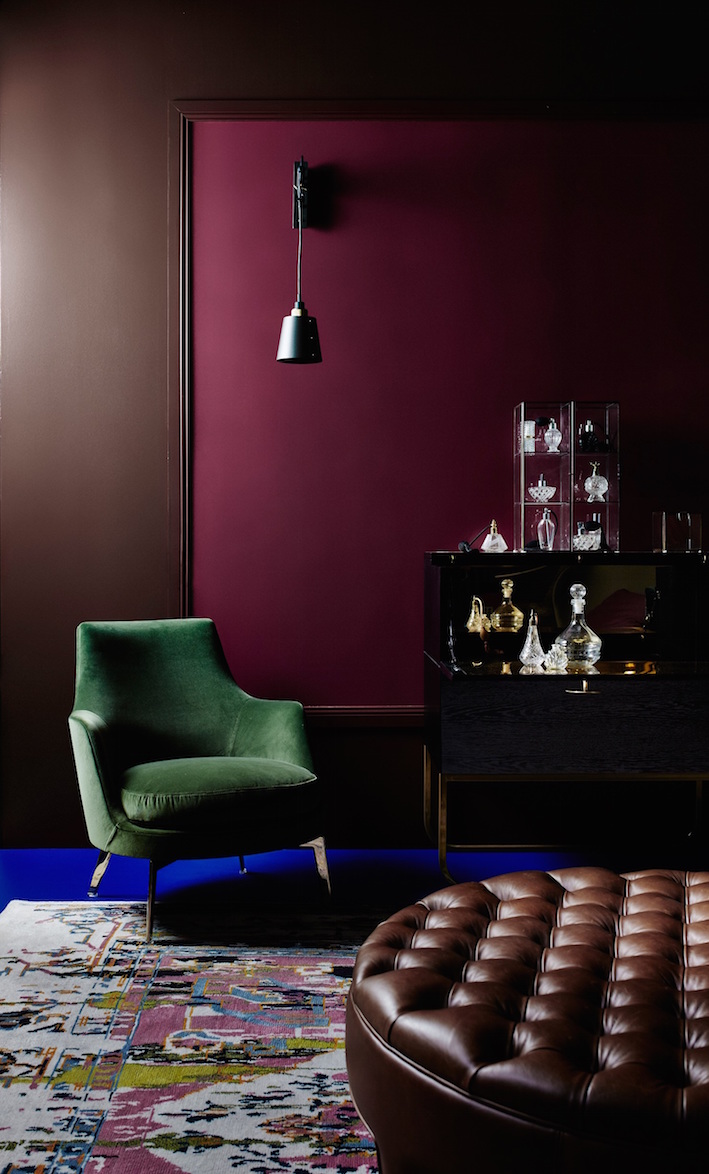 Future Past palette
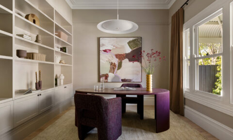
Moody and romantic, Future Past draws on nostalgia and tradition with a colour scheme of burgundy and grape tones, rich brown and deep emerald. Perfume maker Emma Leah, of Fleurage, has brought this colour way to life with a custom room scent.
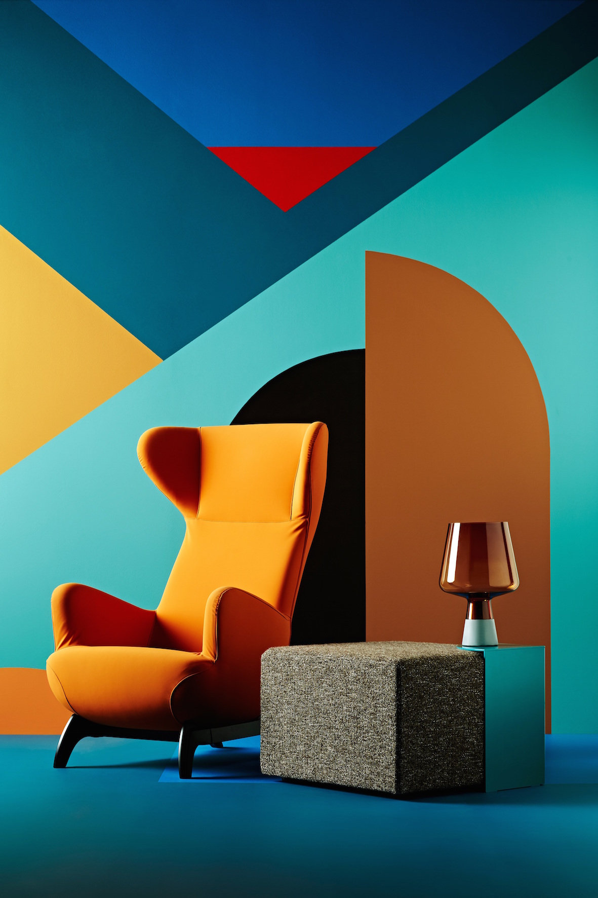
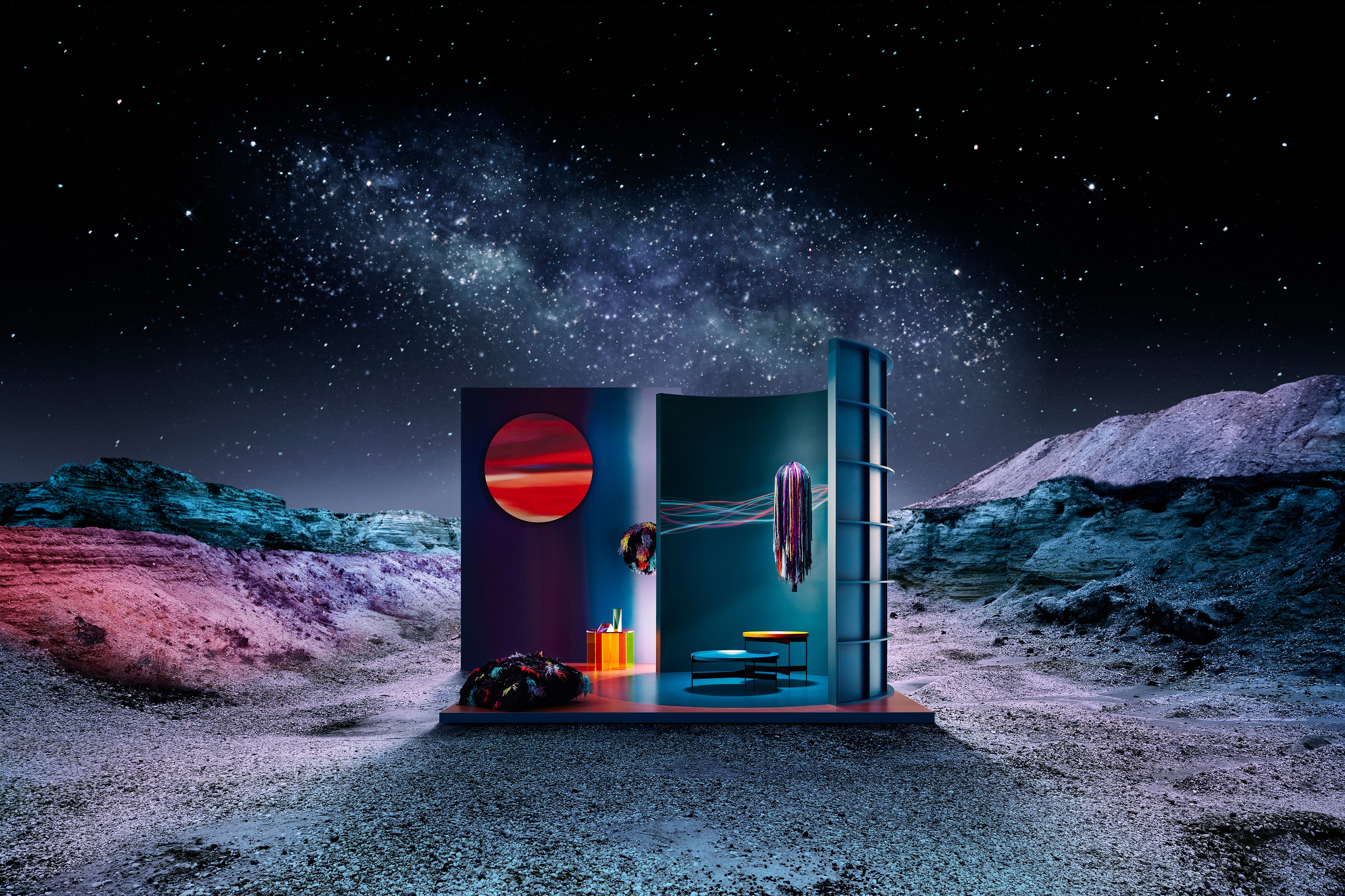
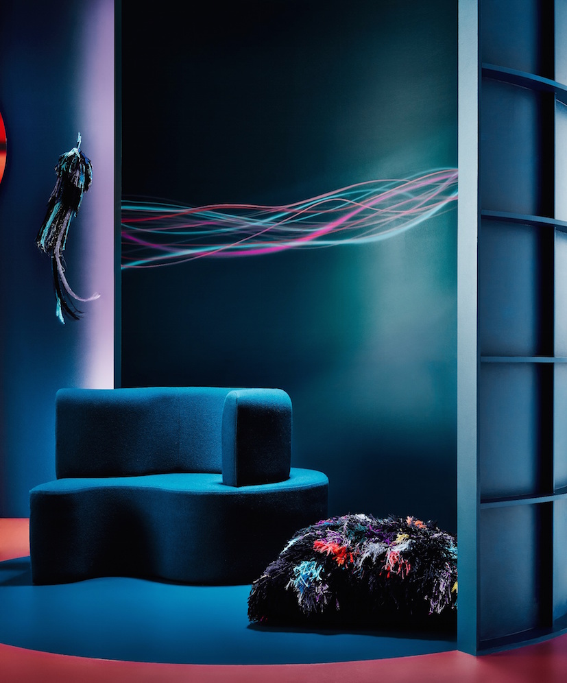 Infinite Worlds palette
Evoking the seventies and its futuristic science fiction obsession, Infinite Worlds is a celebration of hues made popular at the time – amethyst and teal. Textile artist Elise Cakebread brought this look to life with printed and constructed textiles.
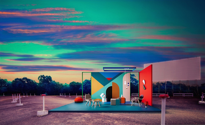 Retro Remix palette
See more at Dulux.

Comments
Great read, beautiful colours and photos! Inspiring!
Trackbacks
[…] Apartmenttherapy. 2. Annasheffield. 3. Theinteriorsadict. 4. Shopstyle. 5. Designspiration. 6. […]