Part of a newly renovated heritage home in the Melbourne suburb of Kew, these two bathrooms were overhauled recently with an emphasis on bold, bright colour. Home to a busy family of five, the new children’s bathroom is notable for its bright yellow ceiling while the parent’s ensuite features a unique, multi-coloured fish-scale tile for maximum impact.
“My client Julie has a great love of colour and wanted to express this in the spaces we designed. I think using colour in a bathroom adds an element of surprise,” says the project’s interior designer Fiona Parry-Jones of Von Haus, who is known for her creative use of the colour wheel.
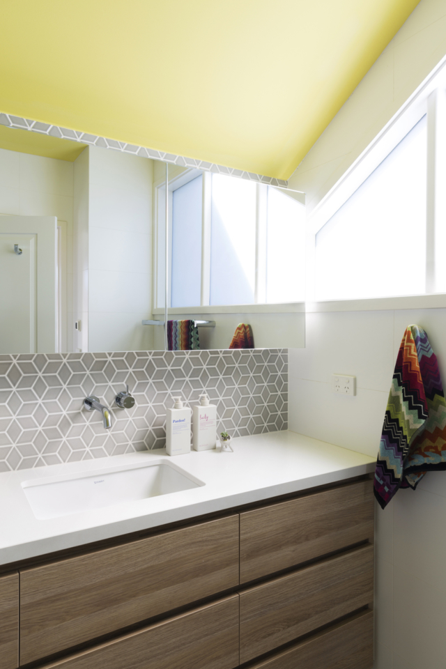
The yellow accented bathroom was designed for the children of the house, with the words ‘fun,’ ‘relaxed’ and ‘functional’ featuring heavily in the brief. “The client was very keen to use yellow in the space as it’s a colour her kids love,” says Fiona.
After an exhaustive hunt for the perfect yellow tile, and a lack of consensus on which one to choose, the designer suggested a yellow ceiling – Haymes Paint in Primrose Path. “It’s a fresh, clean yellow and it’s vibrant and energetic. The beauty about a painting a ceiling is you can change the colour after a few years if you get bored with it,” says Fiona.
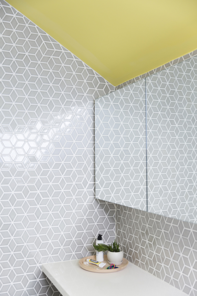
Yellow paint aside, the room also features a cool grey cube mosaic tile from Tiento Tiles. “They added to the fun feel for the kids’ space,” says Fiona who maximised storage using mirrored cabinets.
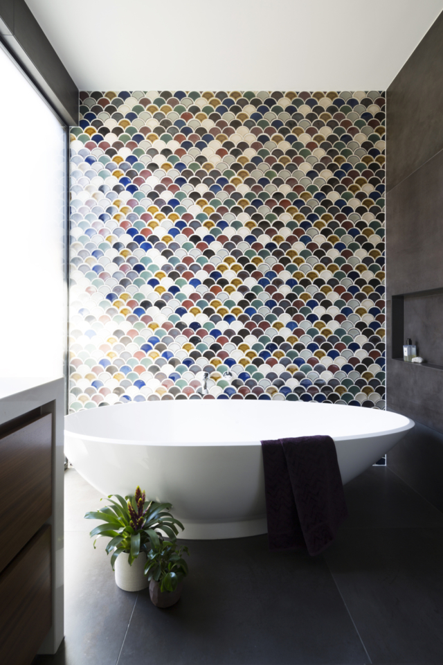
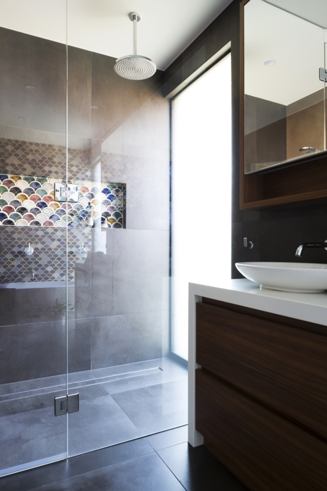
In contrast, the master ensuite is a moodier affair with its earthy brown undertones. “The brief was for a calm tranquil space with colour injected into the design to create a focal point in the room. The brief was for something more moody and earthy compared to the kids’ room though,” says Fiona.
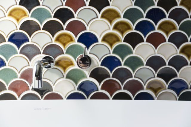
An eclectic vibe was created using Japanese fan, or fish-scale, mosaic tiles sourced from Academy Tiles behind the free-standing bath and in the shower niche too. “They created an eye-catching wall that suited the bathroom retreat vibe,” says Fiona. The carefully selected Victoria + Albert bath was no accident either. “The bath shape was important as we wanted it to be luxurious and curvy with no hard edges,” says Fiona.
As for her take on colour in a more general sense, Fiona always encourages her clients to go beyond the safe options that most people opt for. “Colour can be used in such a way masterful way and it doesn’t always have to be bright and bold. When I think of a kid’s room for example, if you are going to choose a white as base, why not have a little fun and paint an accent colour all the way around the room from bedhead height to the floor? This breaks up the white and adds personality to the room.”
Styling by Petrina Turner Design and photography by Elizabeth Schiavello.
For more on Fiona and Von Haus | Colourful, functional one-of-a-kind Aussie ceramics