Renovated in time for the arrival of a baby, almost every aspect of this 1950s Sydney apartment was overhauled over a 12-week period, with a budget of $120k, and the result is Scandi-chic.
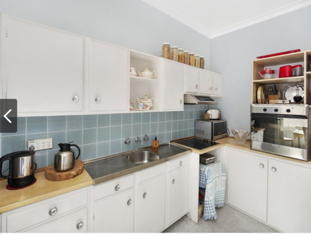
BEFORE kitchen
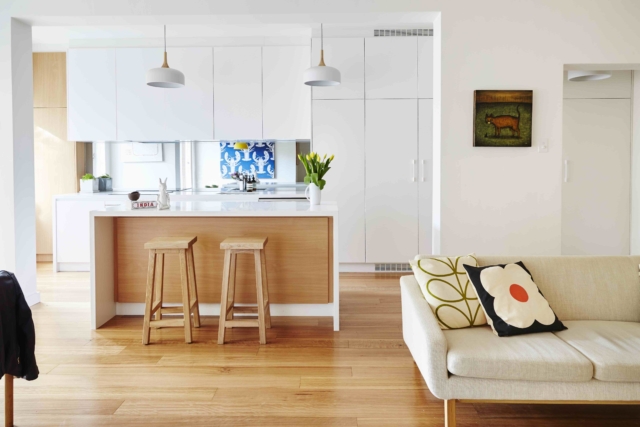
AFTER kitchen
“The apartment was in its original 1950s state, obviously needing a complete overhaul, but we saw the potential because of the natural light streaming through the northerly facing windows and the beautiful green outlook. We love period buildings and the opportunity to completely overhaul the interior was just too much to resist,” says owner Sian Jenkins.
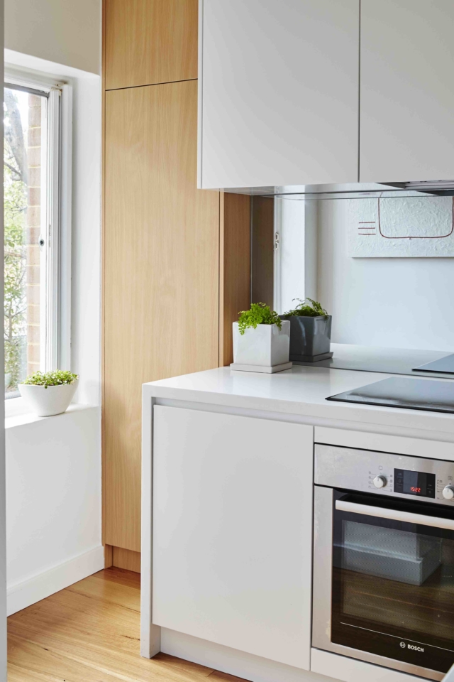
AFTER kitchen
Aside from the aesthetic revamp, the most transformative aspect of this renovation was structural. “We removed a section of a structural wall that closed off the kitchen from the living and dining area. This really opened up the whole space and meant we could also fit an island bench for extra storage, benchtop space and casual seating,” says interior designer and project manager Luisa Volpato, who cleverly chose a mirrored kitchen splash back to open up the space even further. “This reflects space and light from the large north-facing kitchen window. So even if you’re standing at the stove, you can still see what’s going on around you which is perfect if you have young kids. You can also chat with someone sitting at the island bench behind you,” says Luisa.
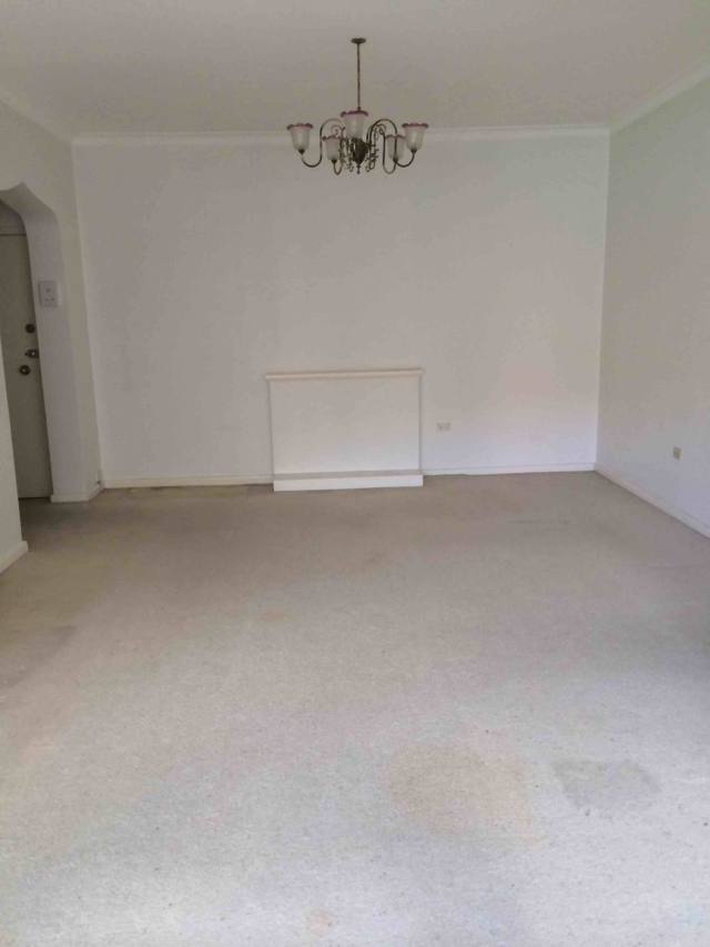
BEFORE living room
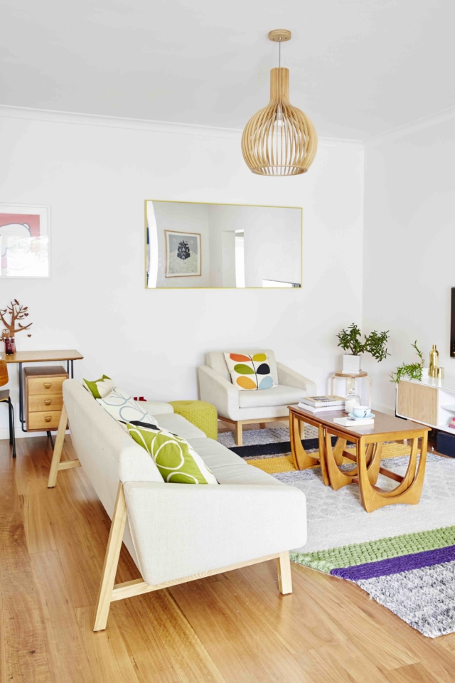
AFTER living room
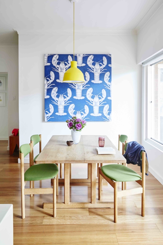
AFTER dining
“The old carpet and lino was replaced with Blackbutt timber floorboards and all the walls were painted in Dulux Natural White. This provides a modern yet timeless blank canvas for Sian’s colourful artwork, quirky homewares and vintage furniture pieces,” says Luisa. She selected neutral wool carpet for the bedrooms, modern frosted glass doors in the main bedroom and mirrored sliding doors in the second bedroom. “You can’t go past mirrored sliding doors to help small rooms look bigger.”
BEFORE main bedroom
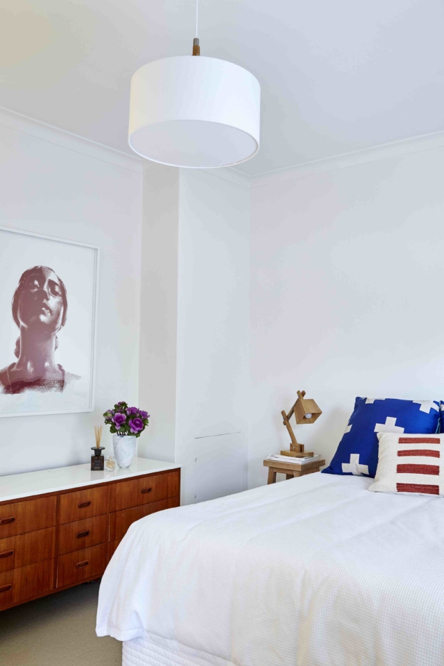
AFTER main bedroom
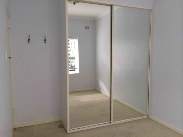
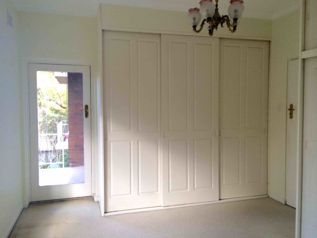
BEFORE second bedroom
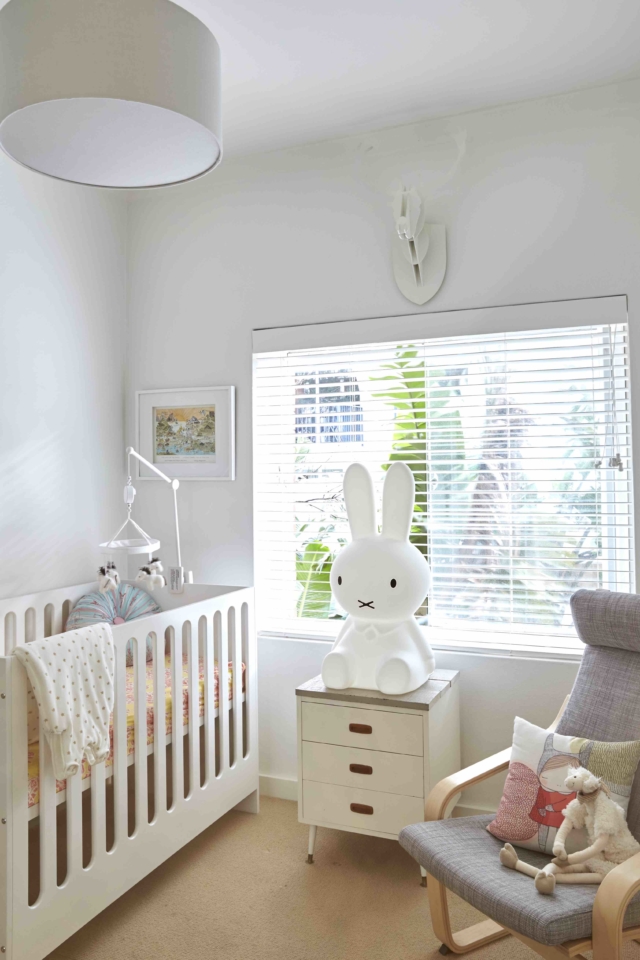
AFTER second bedroom
Massive fans of pink, we were rather taken with the original bathroom – the sorbet-toned mosaic floor tiles in particular – but it obviously had to be overhauled for design consistency alone! “Besides the original 50s pink tiles and matching pink bath, toilet and pedestal vanity (which were totally fabulous in their own quirky way) the main problem with the original bathroom layout was that it was very cramped,” says Sian.
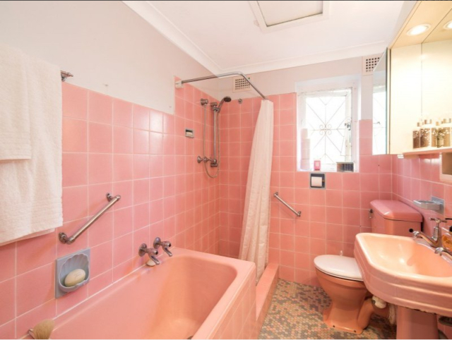
BEFORE bathroom
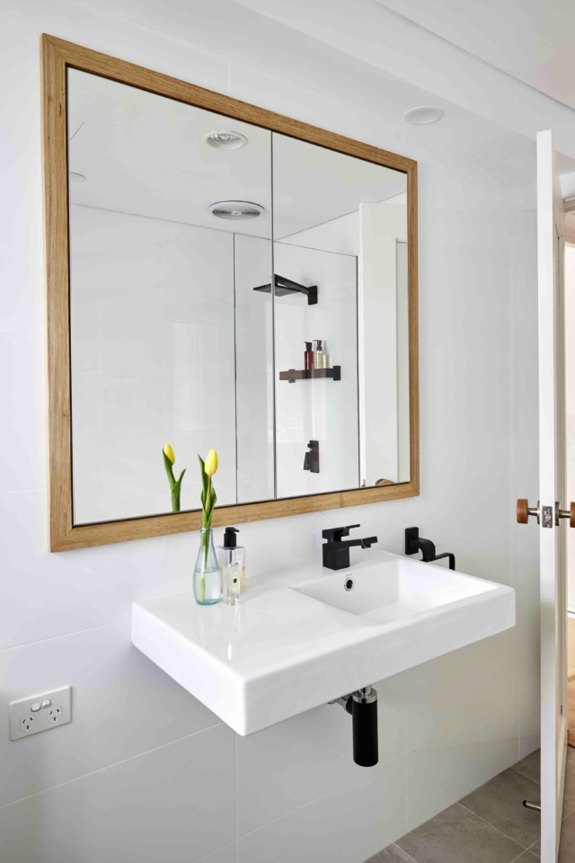
The configuration was changed completely and a large mirrored cabinet (in lieu of a vanity) and combined bath/shower were installed: both space-saving measures. “With a baby on the way, we didn’t want to remove the bath altogether so it was a happy compromise,” says Sian.
AFTER bathroom
“While large-format white wall tiles help make the space look bigger, we decided on a concrete-look tiled floor, black fittings and timber accents to give the bathroom more character than if it was entirely white,” says Luisa.
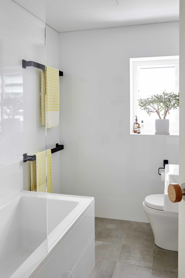
AFTER bathroom
Sian, who recommends informing your neighbours when any noisy renovation works are planned, and generally filling them in on your project’s progress, is thrilled with the end result. “You labour over every decision for each and every aspect so you’re emotionally involved in even the littlest things. I completely love the kitchen with its clean lines, mirrored splash back and 11 square metres of storage; but then I also adore the oak modknob door handles we had imported from the US for the bedroom and bathroom doors,” says Sian.
See here for more information about the interior designer.


Comments
Looks good but would be great if the before and after pix were from the same angles so we’re comparing apples with apples and it would also be helpful to see floorplans, especially as they’ve mentioned removing walls.