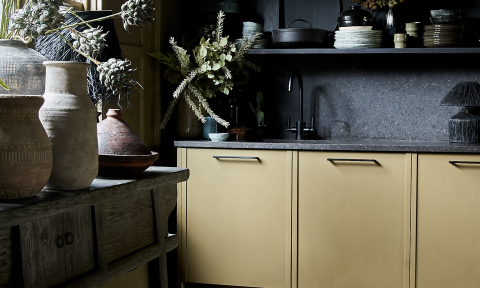
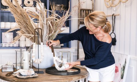
Wattyl have released their colour trends forecast for 2018. Having monitored and analysed the global trends – looking at living behaviour and design styles – Wattyl have translated them into four colour palettes. Findings point to an increased focus on the home being considered a refuge, a place to retreat from the fast pace of everyday life… FOMO (fear of missing out) has been replaced by JOMO (joy of missing out)! So what colour palettes did these trends amount to? Let’s take a look.
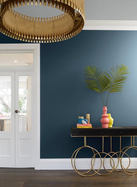
Nowstalgia: A desire to return to a time when life was simple and optimism ruled. The look echoes the mid-century modern design of Palm Springs with a hint of luxe! Colours include Midnight Seas, Silver Shadow, Gold Mine, Fifi and Space Odyssey.
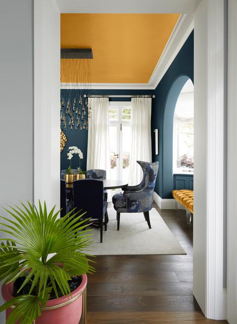
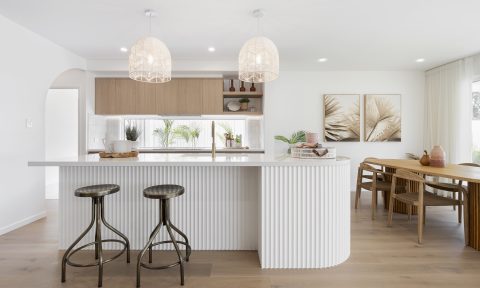
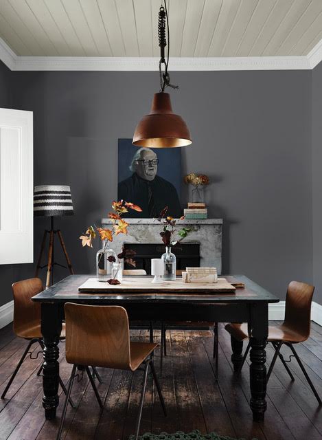
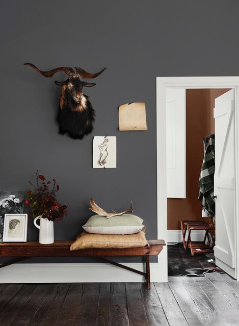
Grounded: This reflects our desire to gain meaning and purpose in our lives, and regain a connection to the environment. Botanical and mineral palettes set the scene; for example Grey Ember, Sashimi, Fossilised, Bobby Brown and Calcium.
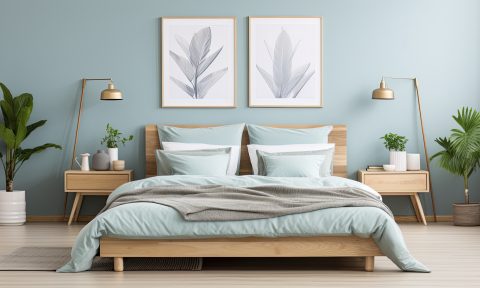
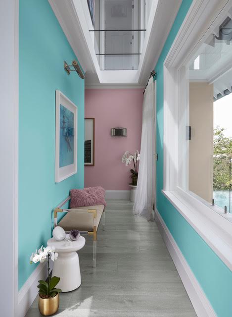
Mood monitor: Reconnecting with ourselves, taking time to reset and strengthening our bodies and minds are all key focuses in this palette. Colour and light stimulate our dormant senses and we can breathe. Be relaxed with the colours of Coastal Views, Posh Pink, Alta Sierra and Imperium.
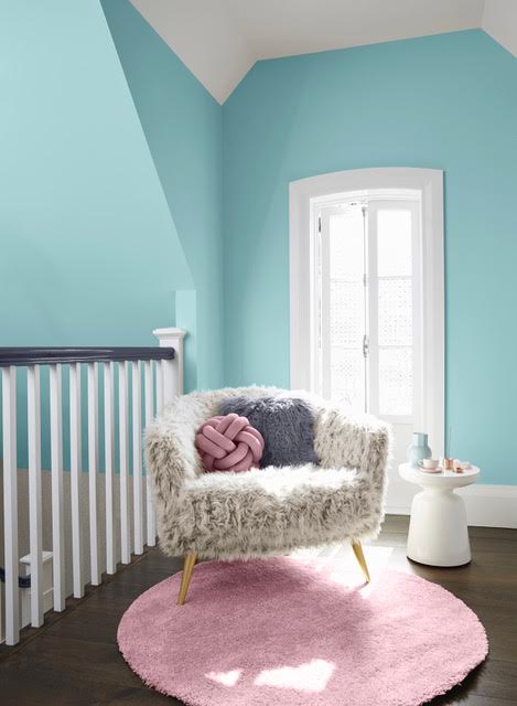
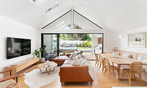
The slow down: We are searching for ways of slowing down in a bid to manage our connected and busy lives. We want to spend more time at home, the fear of missing out is no more! Colours are soft and quiet; think Baby Seal, Subtle Hint, Pilbara Sand and Sheer Granite.
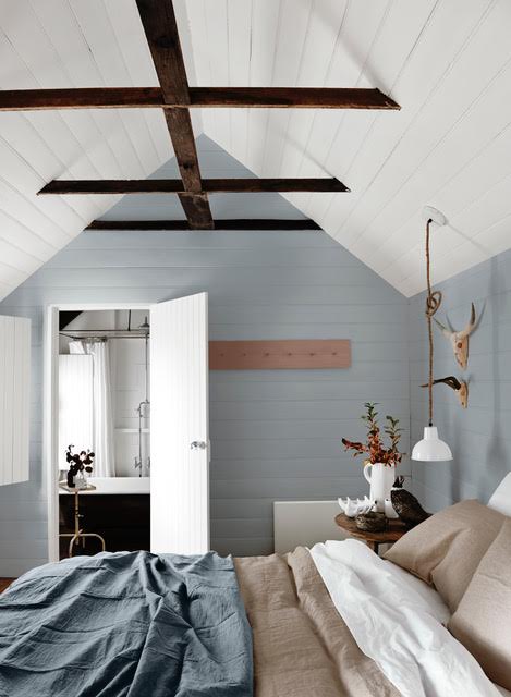
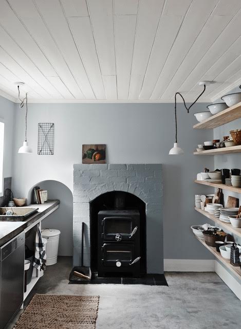
The 2018 colour palettes are available in Wattyl’s premium paint range, in a range of styles.
