This week didn’t see the faves as the obvious frontrunners. Ronnie and Georgia came fourth while Mitch and Mark came second. And Josh and Luke managed to pull first place out of the bag after last week’s somewhat disastrous ensuite! Tanya and Vito made more bold and quirky choices and Kirsty and Jesse didn’t quite get it right.
Ronnie & Georgia: Fourth
Score: 23.5/30
Spent: $24,500
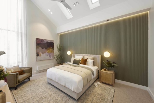
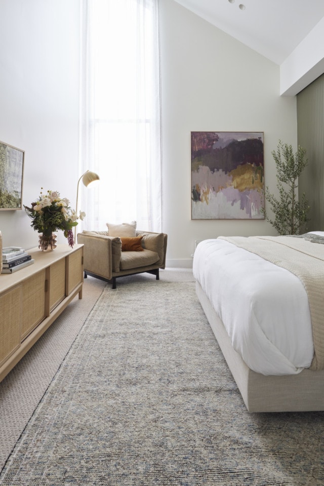
“Enormous, Vast, Cathedral-like” and more – Ronnie and Georgia’s master bedroom certainly stopped the judges in their tracks and it’s easy to see why. With its soaring sloped ceiling leading up to Velux skylights, a massive floor to ceiling window, chic Laminex panelling, disguised television and more this was a statement room.
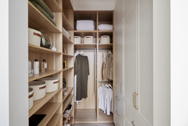
All agreed the walk-in robe could have been more generous, a fact Ronnie and Georgia might want to remember when it comes to make-over room time. Shaynna called it “teeny tiny” and “miniscule”. It was well styled though.
But overall, said Neale, with this room, the team stamped themselves as “the masters of sophisticated subtlety”.
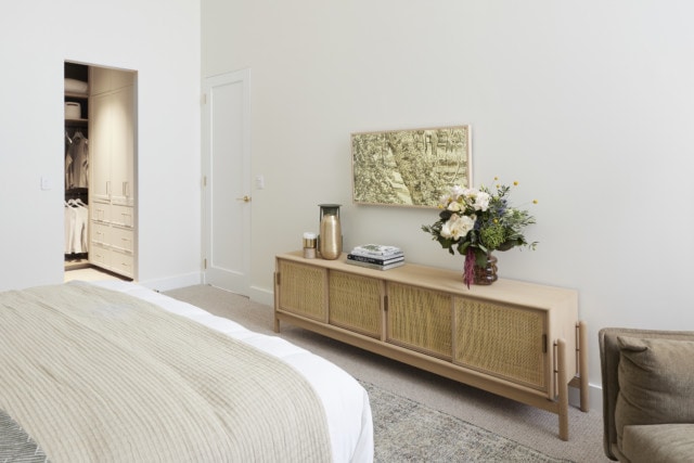
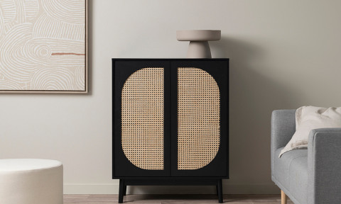
Get the look: Alfa sideboard
Personally I think they were robbed! Yes, the wardrobe was too small but this room wasn’t fourth place at all!
Mitch & Mark: Second
Score: 26.5/30
Spent: $20,376
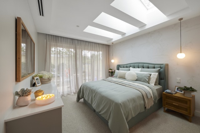
With its generous walk-in robe, balcony hinting at a secluded outdoor sanctuary and beautiful finish, Mitch and Mark’s master bedroom retreat showed the judges they’ve well and truly moved on in style and execution from their first Block!
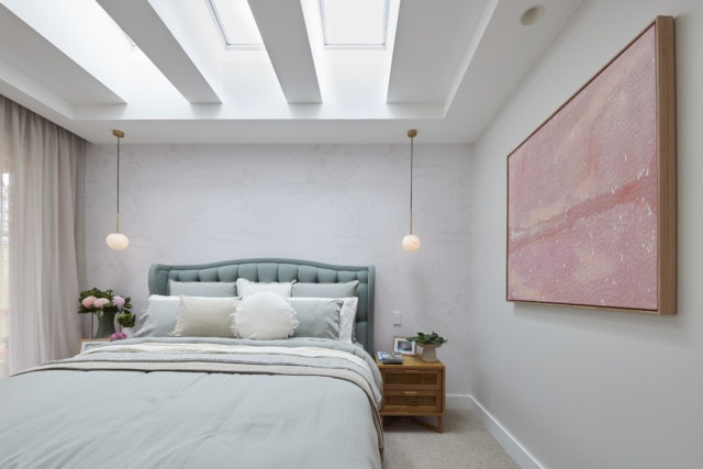
A traditional, yet contemporary room, they decided, with features such as ceiling a standout, drawing the eye to perfectly place pendants over ample tables flanking a bed so beautifully styled Neale was left asking for tips. For Shaynna it was the artwork – matched to the bed – and colour palette that combined to scream luxe!
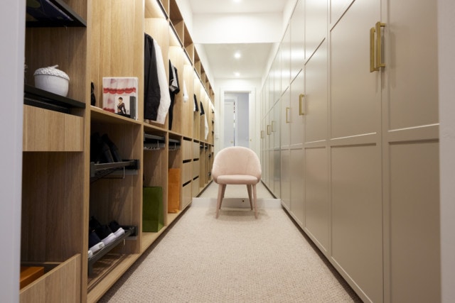
They were frothing over the wardrobe too. Neale said it was very well thought through and beautifully styled and Darren said it was Tardis-like.
Get the look: Jonathan Gemmell art print
Personally I hated the bedhead and although I loved the wardrobe, I couldn’t get overly excited about the bedroom and didn’t think it was a second place room.
Tanya & Vito: Third
Score: 24/30
Spent: $25,649
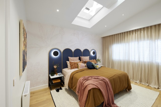
Light bright and colourful, Tanya and Vito’s master bedroom was the “Goldilocks room” for the judges this week – not too big and not too small, but just right. Bringing the Moroccan feel of the guest ensuite into the space, the pair created a haven away from the house but still connected.
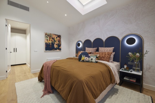
Shaynna immediately fell for the bedhead, the side tables, the wallpaper and the artwork – including another Tanya original – with Darren warming to the quirky styling touches. While the wardrobe certainly had lots of space, Neale said it lacked the glamour and luxury and Shaynna wasn’t a fan.
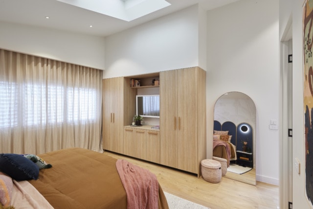
Get the look: Tanya’s own artwork
Personally I love how this couple have committed to their quirky style. Wasn’t a fan of either wardrobe but the crazy bedhead and light combo did kinda work, didn’t it?!
Josh & Luke: First
Score: 27/30
Spent: $19,830
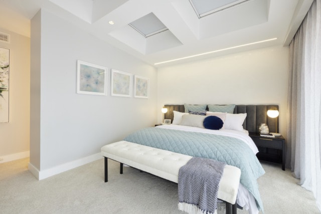
One of the most controversial choices of The Block so far, Josh and Luke were always heading for controversy when they flipped the original intent and placed their master suite where the double garage had been aimed, but did it work? Apparently, yes!
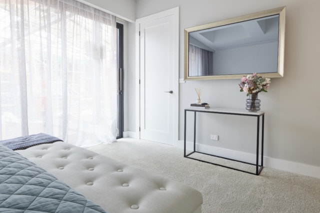
Spacious, light soaked, separated from the rest of the house with its own view to the courtyard, the judges finally saw why the twins had put themselves through so much. Architecturally clever enough to forgive the obvious styling flaws (fake flowers, guys? Really?), it’s fresh, sophisticated and puts the pair back in the game, Neale said.
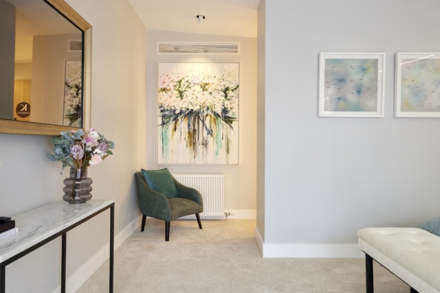
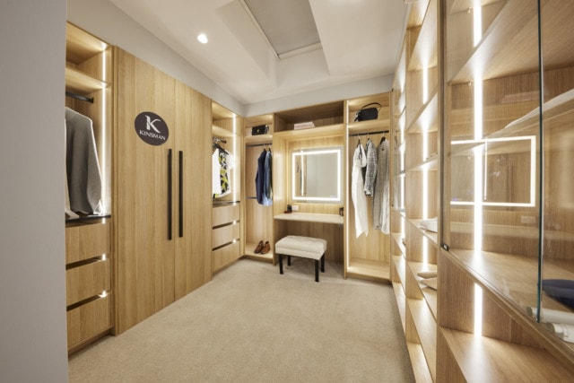
Shaynna loved the wardrobe! They all did. “This is a master bedroom in a multimillion dollar house,” said Darren. “Space is a luxury.”
Get the look: Drip Flowers artwork
Personally, I thought the wardrobe was way nicer than the bedroom which although spacious, I just found a bit bland! And as for that mirror over console combo? No thanks.
Kirsty & Jesse: Last
Score: 22.5/30
Spent: $24,920
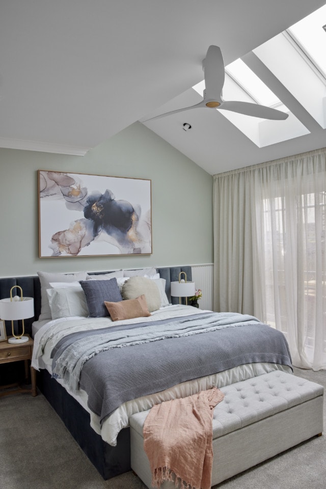
With wide North-facing windows, a generous layout that draws focus to the beautifully styled bed, arches adding a softness and warm tones from the rich carpeting to the walls, the judges were immediately impressed by Kirsty and Jesse’s master bedroom.
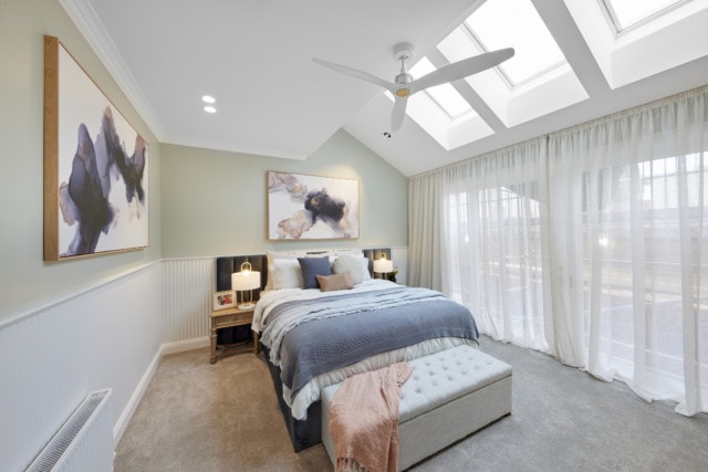
A closer look however revealed a few problems – the artwork wasn’t exactly what Shaynna would have liked to see, the tallboy looked out of place and in general there seemed to be a clash between the contemporary and classic styles. Add in a beautiful, but undersized walk-in robe and the country couple were left wondering if the pluses the judges found would outweigh the negatives.
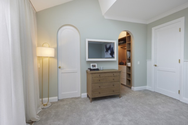
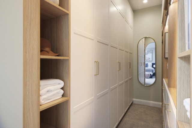
There was too much joinery squashed into the wardrobe space, although it was nicely styled and they liked the finishes. Darren said they needed to start again. The judges said the whole space needed to be re-planned.
Get the look: Ashlee blanket box
Personally, I agree this room should have come last. The wall opposite the bed was all wrong, the wardrobe was tiny and although on first glance the whole bed setup was lovely, on closer inspection, like Neale said, there was a lot I didn’t love. Including the arches.
What did you think?
Photography: David Cook Photography.
