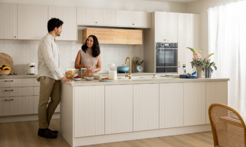
“The clients’ brief was very clear. They wanted me to create an interior using quality and practical finishes with layered textures and to provide comfortable spaces that were inviting and warm. They ultimately wanted a sophisticated interior with a restrained palette of neutral tones,” says Deborah Schmideg of Deborah Schmideg Interior Design. Well Deborah, I think you nailed it!
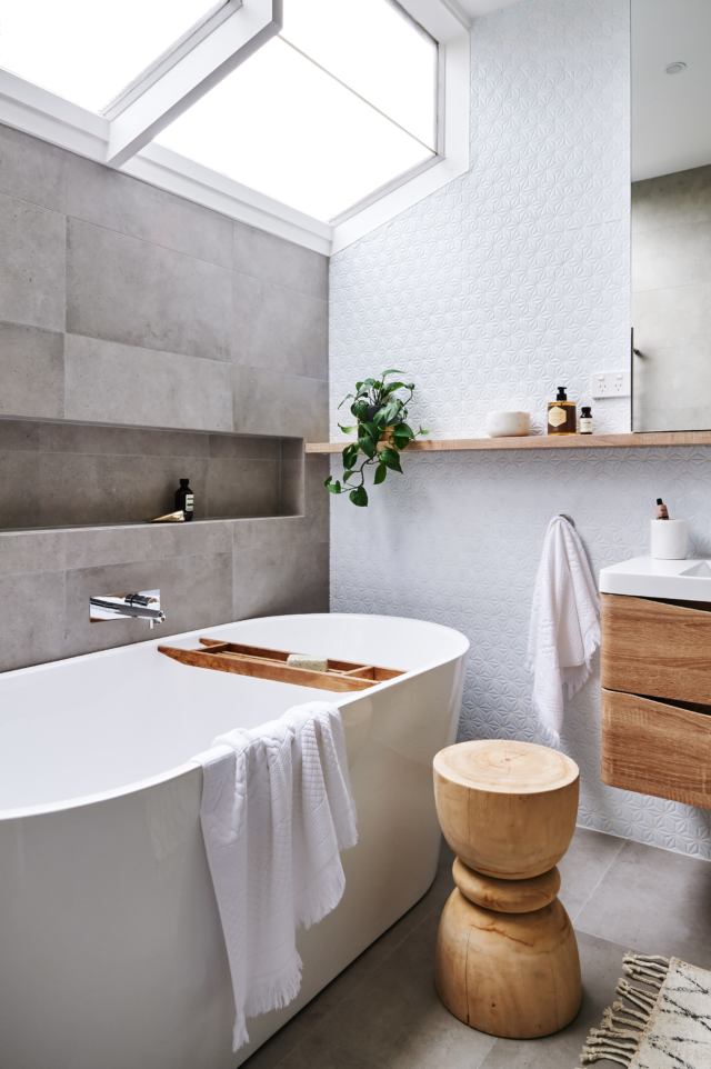
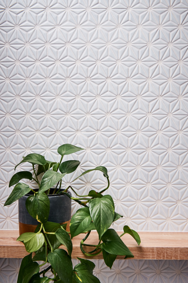
Located in the Melbourne suburb of Caulfield North, this 1980’s split level home was in dire need of a refresh but dollars were tight. “We were conscious of remaining sympathetic to the original 1980’s architecture and, given we were working to a limited renovation budget, had to do our best to incorporate the original built form into the concept of the new interiors,” says Deborah. The most striking example of that would be the waterfall windows in the master ensuite. What is a rather dated feature suddenly looks fresh again with the addition of contemporary tiles and lovely pops of timber.
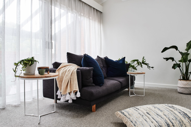
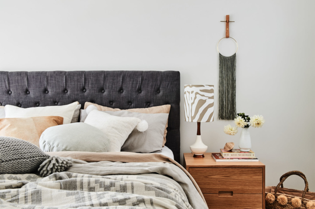
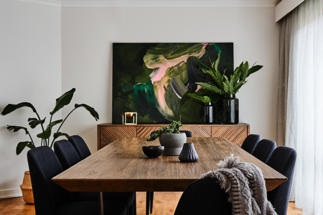
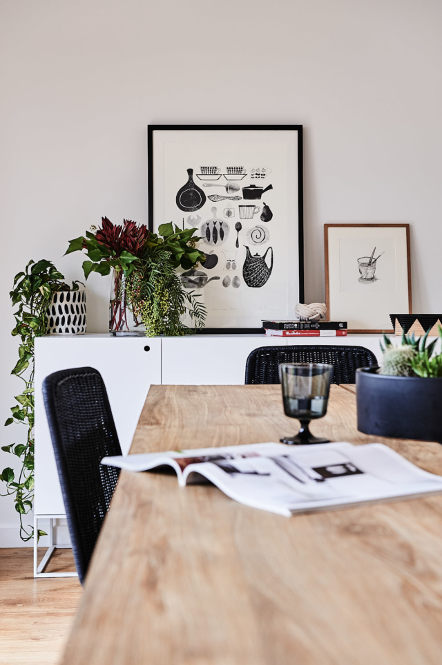
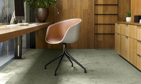
The classic, neutral colour palette also allows the homewares, artwork and furniture to shine. “The interior is more of a contemporary space with an eclectic mix of furniture and artwork pieces that we feel provides a sense of elegance and style. The colour palette was restricted to neutrals and black accents for the built form, which allows the furnishings and homewares to stand out.”
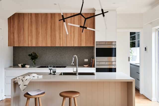
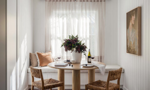
Key to bringing the whole look together is the use of texture – embossed tiles, rattan, painted vertical timber panelling, warm wood and pops of greenery combine to make this a very homely space. “Visual interest and depth to the spaces were added through careful material selections and the layering of materials,” says Deborah.
I’m particularly taken with the bathroom and kitchen tiles, a feature that Deborah is particularly proud of. “Design features that we feel deserve special mention are the feature tiles in the master ensuite and kitchen splashback. These were both cost effective solutions, for a project with a very tight renovation budget, that really provide the wow factor!” says Deborah.
By far the biggest change was the relocation of the kitchen to sit closer to the heart of the home. “We especially love the new centralised location of the kitchen making it the hub of the home and how the existing kitchen space is now an awesome butler’s pantry,” says Deborah.
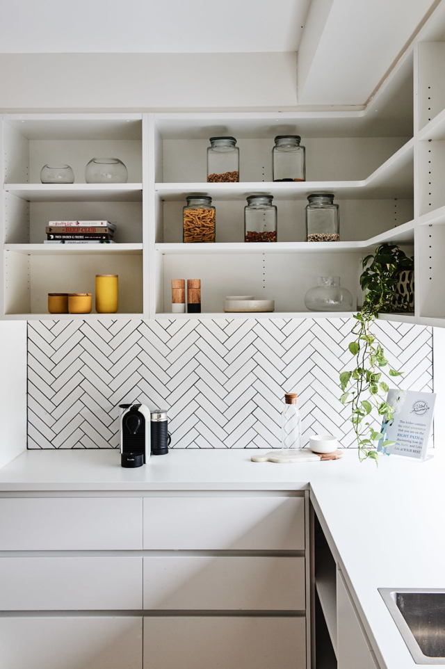
The herringbone splash back in the butler’s pantry is another highlight – the tile formation and black grout make an inexpensive product look big budget.
Unsurprisingly, the makeover was well received by the owners. “We loved seeing the transformation of the initial conceptual design on paper turn into reality. The owners were just so thrilled with how the renovation turned out!”
Photography: Dean Schmideg | Styling: Bree Leech
Comments
That’s definitely the definition of warmth! I love the outcome!
Dying to know where I can get the feature tile thats in the bathroom from??? Stunning!!
Would love to know where the tiles are from in the bathroom?
Tiles name and details please. Many thanks
Hi Chaw. Best to contact the interior designer; there’s a link at the end of the article. Thanks!