The following is an extract from The Little Book of Colour by Karen Haller, published by Penguin Books.
When we understand that every colour can be used to create a positive emotional response, it becomes a powerful tool to affect our wellbeing; it has a transformative effect on how we feel, think and behave. Following is a quick reference guide as to how to use colour in different rooms.

RED
Some popular names: Rust, russet, cherry, strawberry, maroon, watermelon, pillar-box, burgundy, fire-engine
Positive effects using the right tone for you: Feelings of physical energy, excitement, strength and courage
Adverse effects using the wrong tone or too much: Can feel overheated and aggressive, can lead to feelings of impatience or being emotionally overwhelmed
Ideal area in the home
- Bedroom – passion (lust)
- Dining room – can stimulate conversation (though too much red can turn a discussion from friendly to heated)
Best avoided
- Any room that feels hot, like a kitchen, or receives full direct sunlight
- Study, meditation room, as can overexcite
PINK
Some popular names: Pastel pink, nude, shell, rose, dusty pink, blush, fuchsia, magenta
Positive effects using the right tone for you: Feelings of maternal love. Nurturing, compassionate
Adverse effects using the wrong tone or too much: Can feel emotionally fragile, emasculating, physically draining
Ideal area in the home
-
Nursery – eases tension, soothing
- Bedroom – can help with grief or loneliness
Best avoided: Avoid soft pink in a home gym, as it’s physically soothing

YELLOW
Some popular names: Daffodil, buttermilk, magnolia, saffron, lemon, sunflower, mustard, fluorescent yellow
Positive effects using the right tone for you: Feelings of happiness, optimism and confidence
Adverse effects using the wrong tone or too much: Can feel overstimulating, can lead to irritability and feelings of anxiousness
Ideal area in the home
- Hallways – these are usually dark without much, if any, natural light.
- Breakfast areas – great if you wish to create a sunny, happy way to start the day
- Brightens a dark space
- Can create a sense of light, warmth and a friendly welcome
Best avoided
- Bedroom – over time, a yellow bedroom is likely to mean waking up irritable and annoyed
- Babies are very sensitive to colour frequencies, so avoid using cream, which also contains yellow
- Spaces that already feel overheated
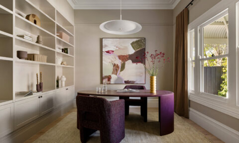
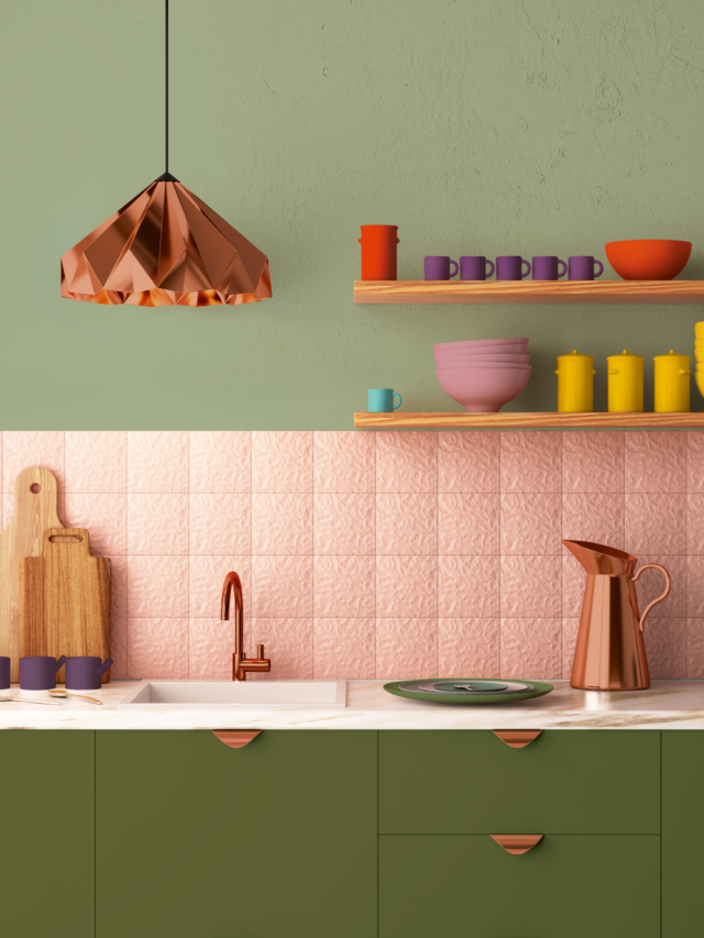
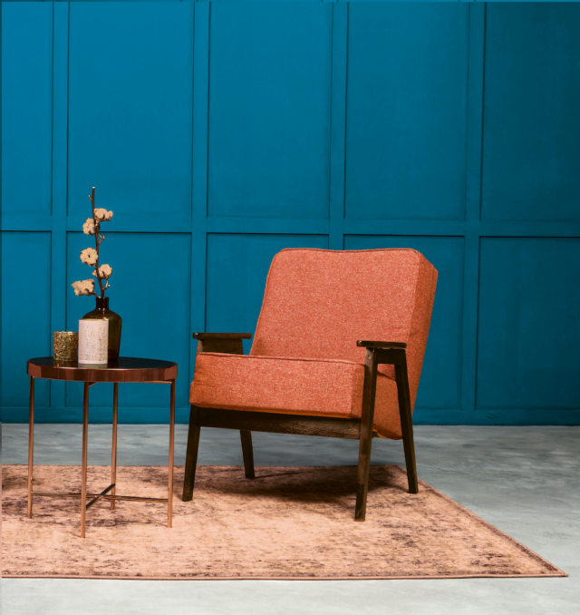
ORANGE
Some popular names: Terracotta, amber, peach, apricot, burnt orange, salmon, pumpkin, Persian orange
Positive effects using the right tone for you:
- Feelings of fun, playfulness and joy
- Supports feelings of physical comfort, security and warmth
- Stimulates appetite
- Feelings of sensuality and passion
Adverse effects of using the wrong tone or too much
- Can feel too playful and over-stimulating
- Too frivolous
Ideal area in the home
- Kitchen, dining room – encourages socialising and stimulates appetite
- Bedroom – look for soft peach and apricot tones
Best avoided: Study, meditation room – as orange can be playful and fun, you may find it difficult to concentrate
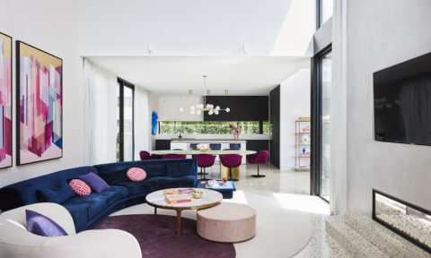
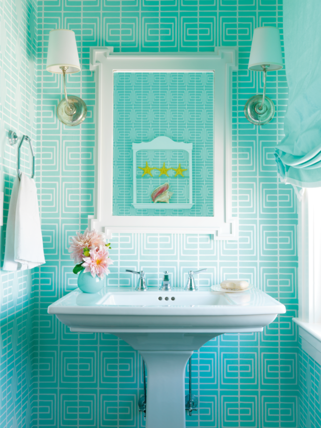
BLUE
Some popular names: Sky blue, duck egg, periwinkle, navy, royal blue, turquoise, petrol, teal, powder blue, midnight blue
Positive effects using the right tone for you
- Light blue creates feelings of calm and serenity
- Can aid in reducing mental stress and relieving tension
- Dark blue aids focus and concentration
Adverse effects using the wrong tone or too much: Can feel depressed, withdrawn, cold
Ideal area in the home
- Bedroom – light blue helps to relax the body and prepares us for sleep
- Study – light blue for creative, ‘blue sky’ thinking, dark blue for focus and concentration
- Bathrooms – turquoise for morning energising and waking up the body and mind
Best avoided
- Kitchen and dining areas – as blue can aid in suppressing the appetite
- Spaces that already feel cold
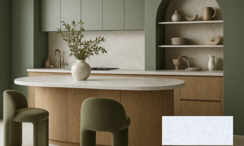
GREEN
Some popular names: Apple, mint, forest, bottle, sage, jade, moss, pea green, pine, chartreuse, seafoam, pistachio, aqua, emerald, khaki, olive
Positive effects using the right tone for you
- Creates feelings of harmony, peace, reassurance
- Restorative, restful and tranquil
- Lighter greens can be refreshing
- Can help us to feel connected to nature
Adverse effects using the wrong tone or too much: Feelings of stagnation and lack of motivation
Ideal area in the home
- Bedroom, study, home office, living room
- A psychological primary colour – restorative and rejuvenating for the holistic whole
Best avoided: Using lime green in the bedroom – the yellow in this overstimulates the nervous system
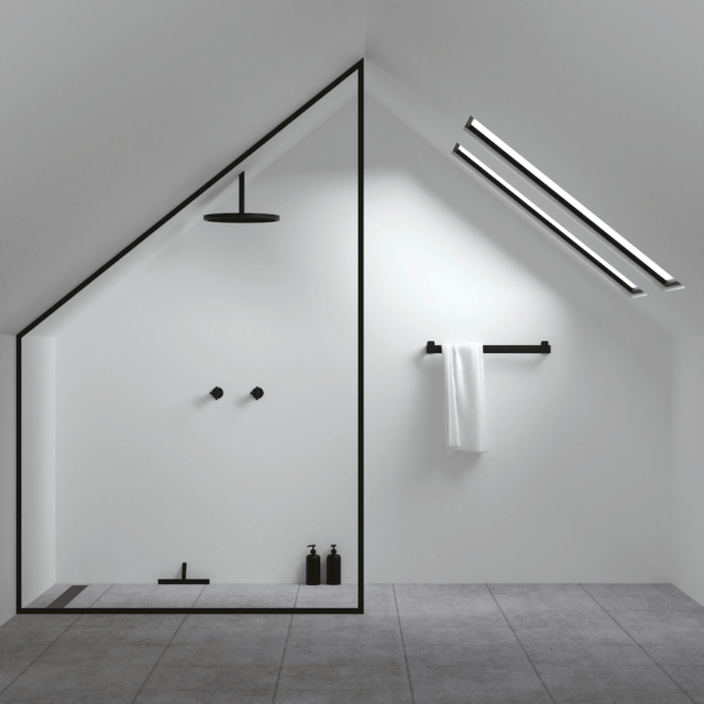
BLACK
Some popular names: Onyx, jet
Positive effects using the right tone for you: Sophistication, glamour, aspirational, protected
Adverse effects using the wrong tone or too much: Oppressive, cold, menacing, straining, intimidating
Ideal area in the home
- Recommended for use only by those who have black in their tonal colour family
- More supportive dark colours are dark browns, purples or blues
Best avoided: A room that already feels cold, small or with little light, as it will make the space feel smaller and possibly claustrophobic
WHITE
Some popular names: Ivory, oyster, pale cream, pure white, Brilliant White
Positive effects using the right tone for you: Clarity, purity, cleanliness, simplicity, sophistication, efficiency
Adverse effects using the wrong tone or too much: Isolation, sterility, coldness, unfriendliness, elitism
Ideal area in the home: Kitchen, bathroom (accent colour) – creates feeling of cleanliness
Best avoided: If white makes you feel very cold, then avoid using as the main colour. It can also feel sterile and isolating
Download the first chapter or purchase The Little Book of Colour