As colour palettes they couldn’t be more disparate, but that’s because Wattyl’s 2020 trend release draws on two very different themes; the fast-paced digital world and our desire to get back to nature. “We are moving forward, whilst looking back. The digital and the natural are so close – and yet worlds apart!” says Sarah Stephenson, Wattyl’s colour and design expert.
Bright Future
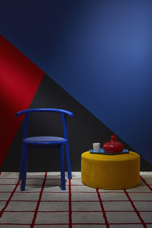
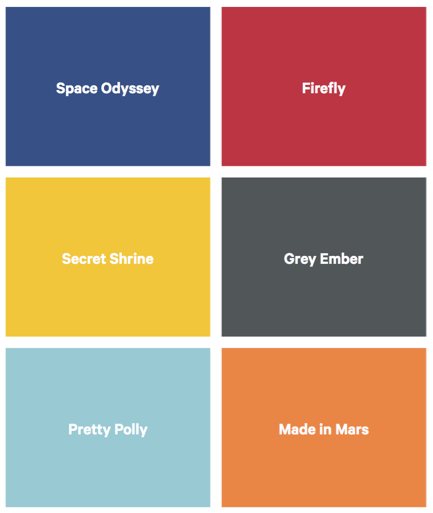
With its saturated, bright and bold primary colours, this palette evokes the paintings of Piet Mondrian. “There is a growing focus on artificial and digital tones that pop on screen as much as they do in real life. The youthful, tech brights of Bright Future create the feeling of an art installation,” says Sarah.
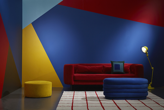
Cobalt blue (Space Odyssey), bold red (Firefly), bright yellow (Secret Shrine) and orange (Made in Mars) sit alongside the calmer almost duck egg blue (Pretty Polly) and charcoal (Grey Ember). A palette for the brave, these colours would work best in a child’s playroom or a commercial space.
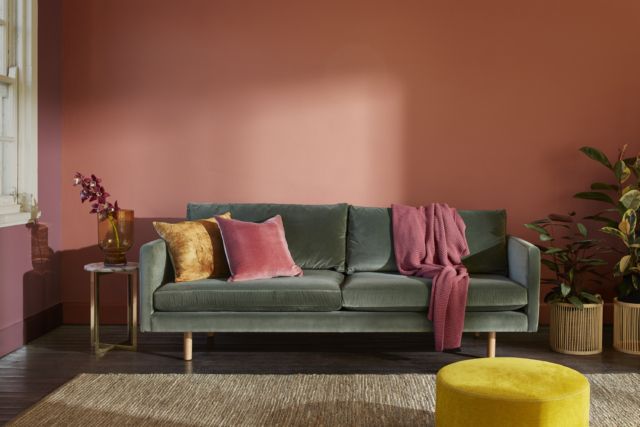
Natural Connection
By contrast, the Natural Connection palette is rooted in the gorgeous organic tones that bring us back to earth and many of the shades would look glorious at home.
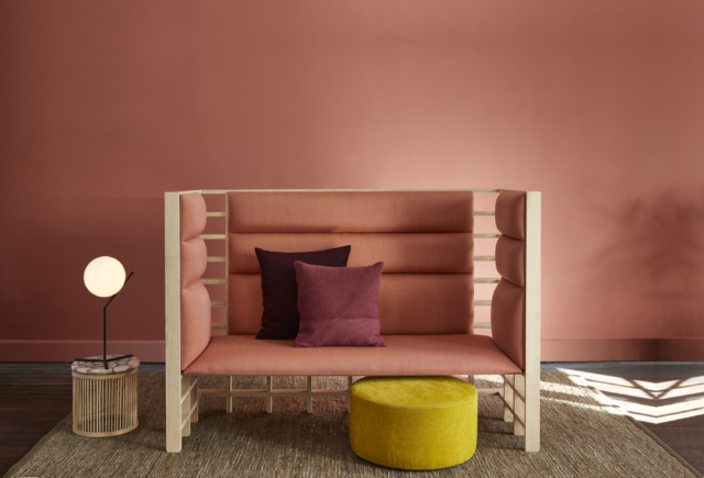
“Our homes become sanctuaries with a priority for calm and comfort. The harmony of mid-tone colours creates a calming, cosy environment,” says Sarah of the palette that is comprised of six colours that draw on grounded, mineral hues, textured surfaces and sustainable materials.
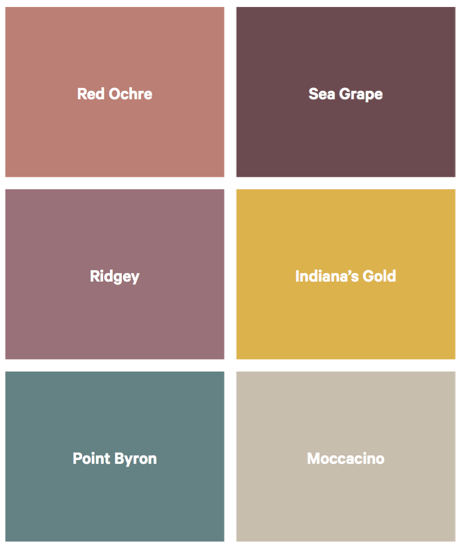
There’s a gorgeous pinky-terracotta tone (Red Ochre), a shade that evokes red wine (Sea Grape), a pinkish purple (Ridgey), a gold tone (Indiana’s Gold) as well as the cooler toned teal (Point Byron) and Moccacino which looks just as lovely as it sounds.