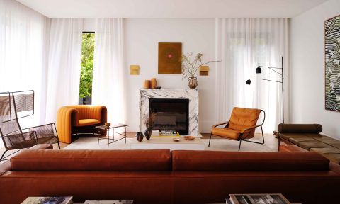
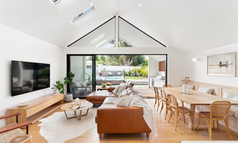
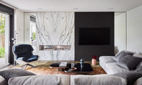
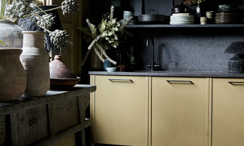
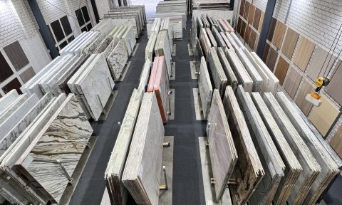
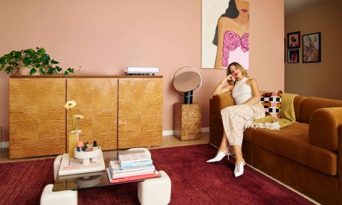
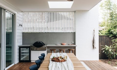
Part travel compendium, part colour celebration, Vivid: Style in Colour is a gorgeous new interiors coffee table book compiled by interior stylist and colour queen Julia Green alongside her long-time collaborator, the photographer Armelle Habib.
“The fear of colour and using it is palpable. I speak to people every day that are scared of colour and don’t know where to start. So, after 11 years of styling and writing about colourful interiors, it was time to put it all together and create a ‘bible’ that would hopefully instil people with colour confidence,” says Julia, who embarked on the project with Armelle during Melbourne’s gruelling first COVID-19 lockdown.
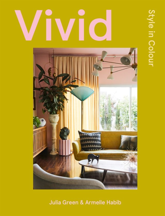
The book includes eight chapters divided by colour – orange, red, blue, green, pink, yellow, neutrals and black – and it’s filled with plenty of gorgeous interiors and practical advice alongside travel vignettes that illustrate how different palettes are interwoven in our lives. And with international travel off the cards for a while yet, it’s a wonderful escape for those suffering with wanderlust.
“Armelle, my collaborator, and I have both travelled extensively and really wanted to share some of our favourite images. It’s like armchair travel which is more pertinent now than ever before,” says Julia.
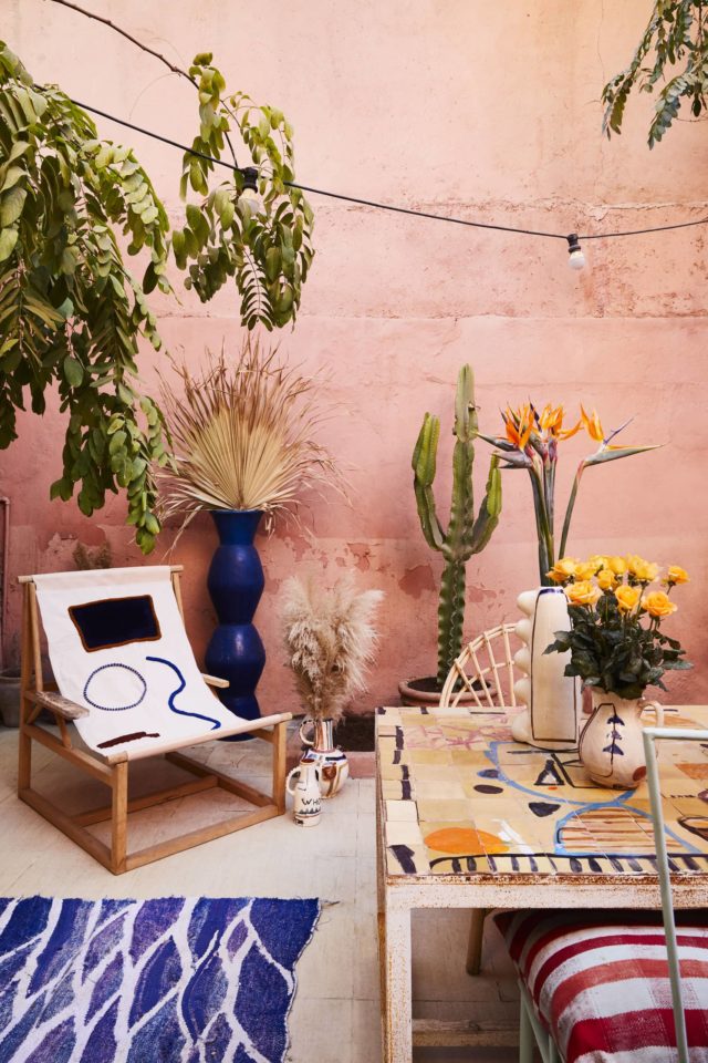
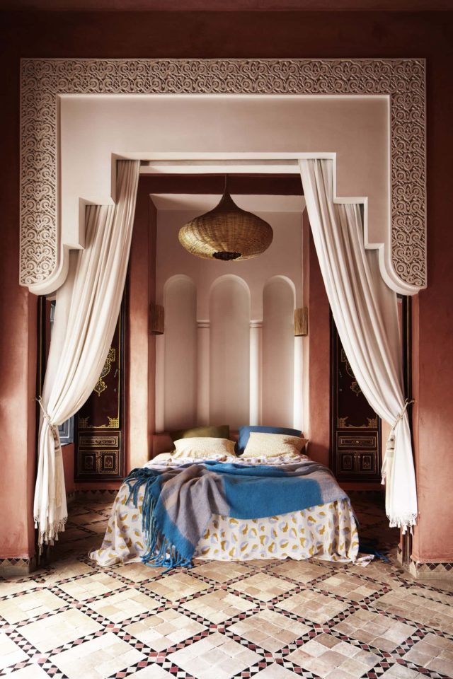
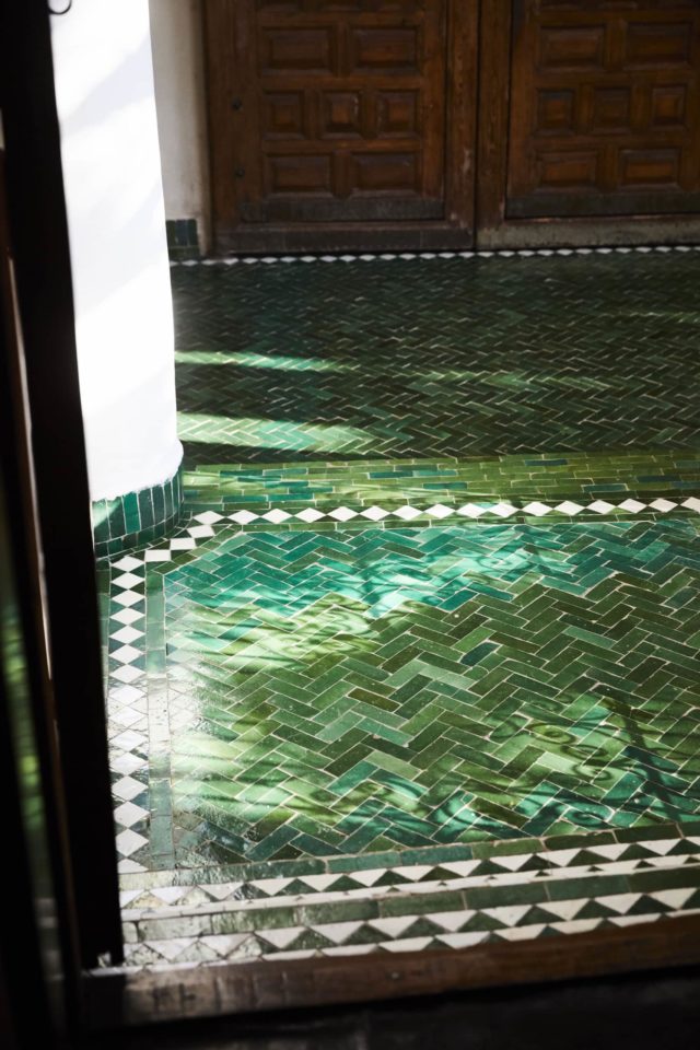
Gathered over a decade, from all corners of the globe, Armelle’s beautiful travel photographs showcase how colour is used around the world. There’s the blues and greens of Sicily, that reference the Mediterranean, and the bold bright shades that are an antidote to the desert surrounds in Morocco. “Colour is a universal language, but each country uses it differently, so it was fascinating to see the colours emerge, and understand why,” says Julia.
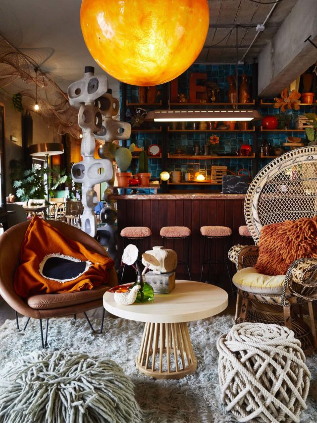
Brimming with inspiration and practical advice there’s short essays on colour in styling and design as well as an exploration of the science of colour and colour psychology. There’s also information about using colour to connect or divide spaces, layering colour for depth and texture as well as building your confidence around embracing the colour spectrum.
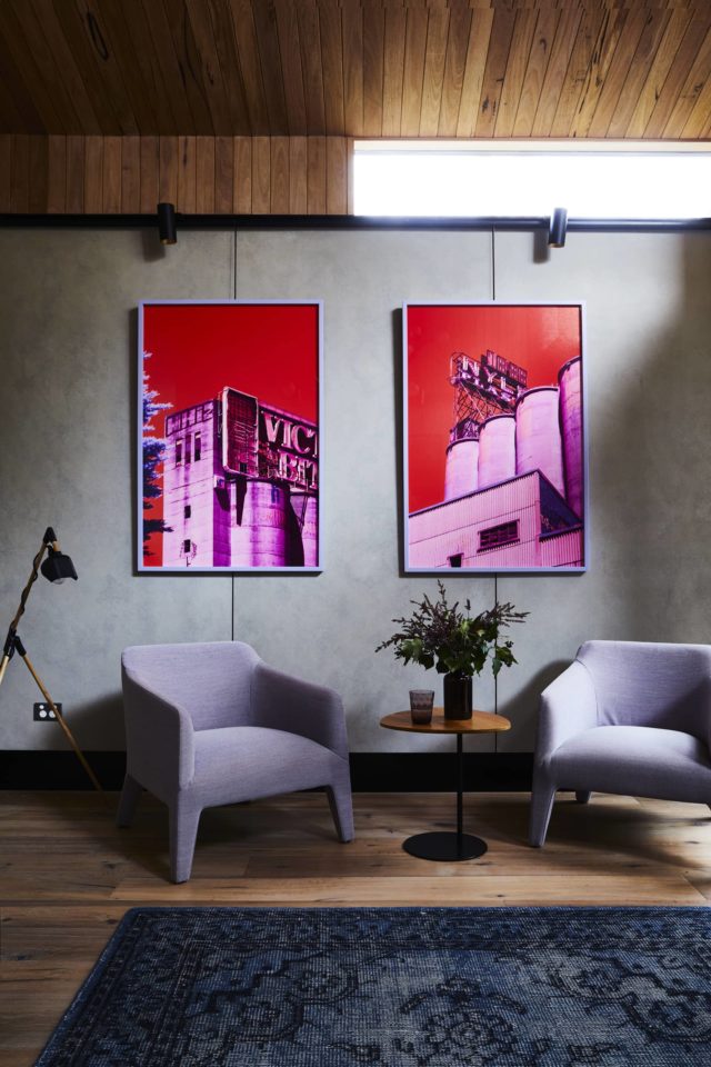
“There is a lot to say about the psychology of colour but in the end, colour is emotive – it is energy made visible. I like to think that each colour represents an emotion and to ensure the colours selected match the mood you want for a space,” says Julia.
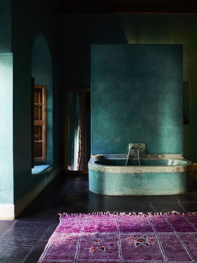
The book also features interviews with leading colour proponents including Martyn Thomson (Sydney), Jessica Bettenay (Melbourne), Marielle Ienna (Palermo), Los Enamorados (Ibiza) and the fabulous LRNCE from Marrakech. “It made sense to capture some of our favourite designers from across the globe that are colour confident and give the images some rigour with words and advice on how to break it down for people to use in their own homes,” says Julia.
And as for Julia’s favourite colours, she explains that it’s like choosing a favourite child. “If I had to narrow it down I’d select green for the ‘life’ it represents and the energy it brings to a room,” says Julia who is a massive fan of pink too, in all its many iterations. “I love its versatility and find it is a colour that works back with so many others as a companion. Both bright and soft versions bring different things to the table, but I am up for them all.”
Julia’s top five colour tips
- Only surround yourself with what you love and don’t listen to others – it’s your space.
- Start slowly with colour. You can easily build on it but it’s always harder to edit.
- Use old fashioned magazine cut outs, Pinterest or even social media to collect images you love and look for colour patterns within them. Often the answers are within your own instincts.
- Seek professional advice for bigger decisions, if you need reassurance before outlaying large sums of money.
- Pantone has an excellent app that will show you companion colours if you are unsure of what to use when pairing them up.
Photography: Armelle Habib
