With many of us currently enveloped in a KonMari decluttering frenzy it’s no surprise that people are looking to the Japanese for more than just their home organisational habits. The logical extension of looking east is a renewed interest in their distinct design philosophies, many of which were observed recently by Haymes Paint colour and concept manager Wendy Rennie when she went there to attend the Interior Lifestyle Living international trade fair. “Overall the Japanese design and approach feels refined and focused and it is in the simplicity that the genius lies,” says Wendy who brought back plenty of insider tips as to how to inject your home with some Japanese cool.
Colour
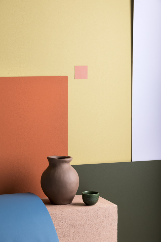
“There is a unique, subtle use of colour in Japan. It’s part of the fabric of the country and is blended with texture and materials to create its own aesthetic. Accents of colour are often used against white to create a striking contrast, that includes the use of green and earthy tones found in the natural landscape and floral colours such as pink and lavender. These colour combinations create a serene beauty that would fit well in Australian interiors and lifestyles,” says Wendy.
Materials
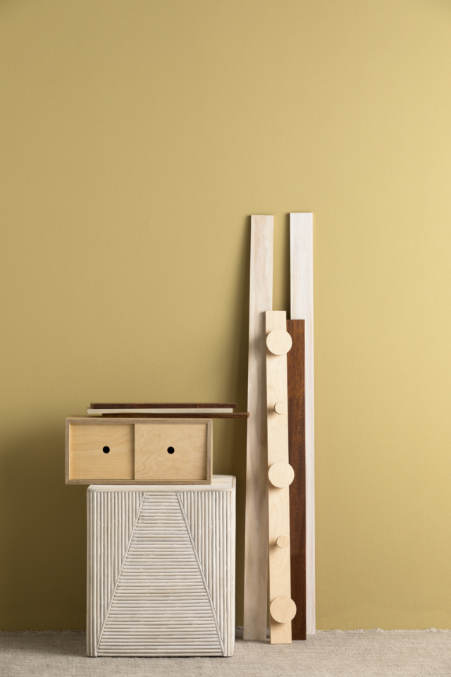
“Wood was showcased in many diverse forms from light to dark. There was a lot more light wood used, which was quite a contrast from Milan where dark wood was a focus. The use of wood in furniture exhibits simplicity in design that is effortless and refined,” says Wendy.
Texture
“Texture was all encompassing in Japan with sophisticated applications in design from small to large scale projects. There was a focus on ensuring textures weren’t clean or perfect, with the beauty in the imperfection,” says Wendy who spotted it everywhere on her travels.
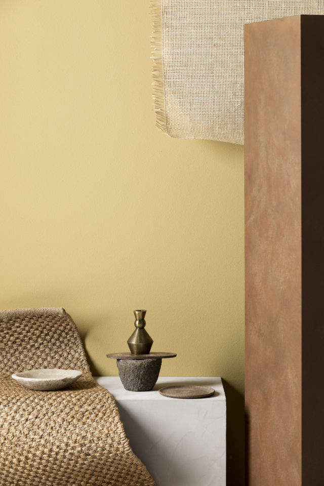
“Variations I observed included texture in paper screens, woven papers, quilted upholstery, ribbed carpeting, linen and incredible textured applications for walls using layering to create a tactile, bespoke space,” says Wendy.
For more paint inspo | Our favourite stylish storage solutions