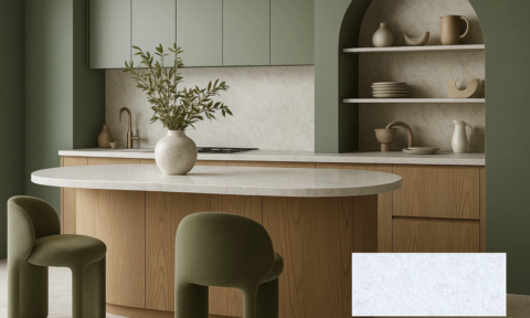
With greater renovation confidence and consumers taking cues from their favourite eateries and venues, we are seeing dark and bold colours, less typically not seen in residential spaces, inspiring homeowners. While a commercial trend would traditionally take three years to appear en masse in residential spaces, we are seeing this transition shorten, with homeowners instantly introducing creative ideas from commercial designs into their home.
Colour and communications manager at Dulux Group, Andrea Lucea Orr, says: “Being bold with colour isn’t something to fear, it’s a look to embrace. Highly colourful interiors are a way to show your personality and create a space you love. With blacks, dark and light blues, and eclectic mixes of bright pops, we are seeing more and more homeowners move away from safe neutrals and make their mark with colour in a way previously not seen.”
For consumers willing to be bold and brave with colour, we’ve identified three striking looks from the 2015 Dulux Colour Awards, announced earlier in the year:
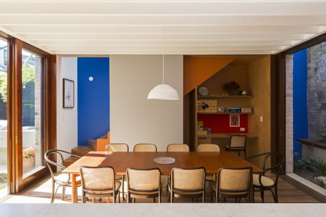
The cafe style look
The café style look uses materials not commonly seen in the home, such as plywood and concrete, paired with practical applications such as Chalkboard paint, a look that can be achieved with Dulux DryErase.
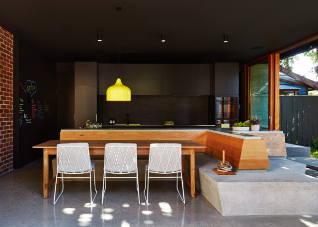
Typically paired with a bold base colour, such as Dulux Black or Black Caviar, this mix of materials create spaces perfect for entertainers who want the same experience at home as they get from dining out.
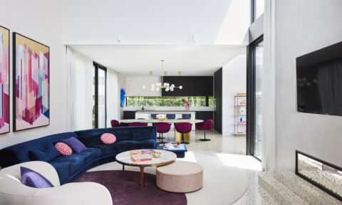
Block colour used for impact
Moving away from traditional whites, there is a movement towards a range of blues used to create stunning and calming interiors. Both of these looks by Arent & Pyke reference a chic, romantic and effortless style, created through the shades of blue and timber tones.
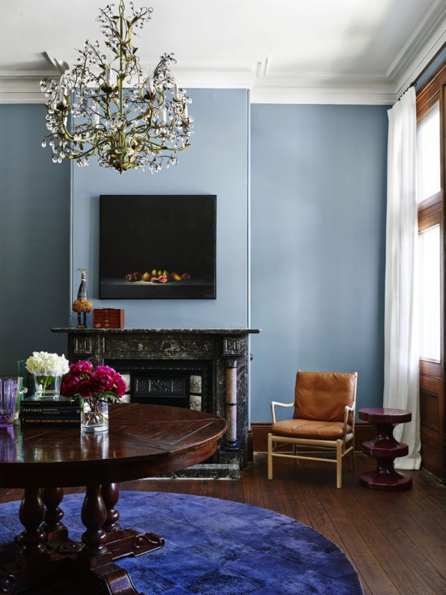
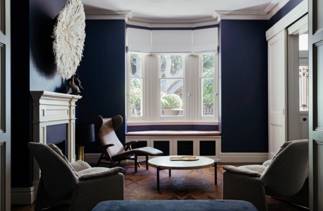
Recreate these looks (above) with Dulux Blue Steel (Bronte Terrace) and Dulux Hildegard (The Avenue). These blues are great choices with the former displaying a dark, dramatic essence and the latter a lighter hue. To finish the look, blues work beautifully alongside various natural earthy and brown tones.
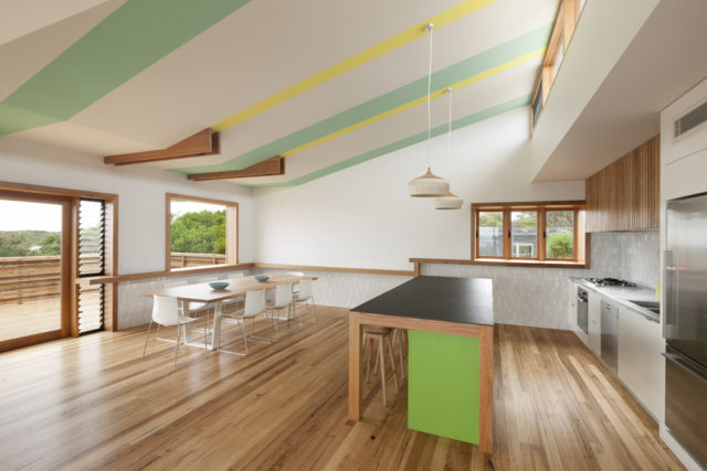
Colour in unexpected places
Colour is being used differently and we are seeing great results when people think of innovative ways to introduce colours into a space.
In the Awards, we saw colour used to create interest, through appealing shapes and patterns. Colour was used in nooks above doorways, it was used on the ceiling and also moving down the ceiling onto the walls. To achieve this look in your home, find areas you could introduce pops of colour, such as nooks and the ceiling, then think about how colour could enhance the feeling and sense of function in this space.
In the commercial categories in the 2015 Dulux Colour Awards we saw a brilliant graphic trend appearing. Keep an eye out for graffiti style art making its way into interiors very soon.
View all of the winners and finalists in the Dulux Colour Awards.
Trackbacks
[…] confidence. I’m glad to discover I’m no longer the lone bold paint lover. When I happened upon this post on Interiors Addict blog last week, which discusses how homeowners are currently inspired by dark, […]