With the events of the last 18 months changing the way we interact with the world in an irrevocable way, it’s no wonder that many of us have rekindled our relationships with our homes. Let’s face it, with much of the country in lockdown we haven’t really had much choice! So, it came as no surprise to read that the Dulux Colour Forecast for 2022 has been shaped by the COVID-19 pandemic.
“When it comes to future trends, comfort is key. We want our living spaces to calm and nurture us, so we can process everything we’ve experienced over the last year, and at the same time, help us rediscover our zest for life looking forward,” says Andrea Lucena-Orr, Dulux colour and communication manager.
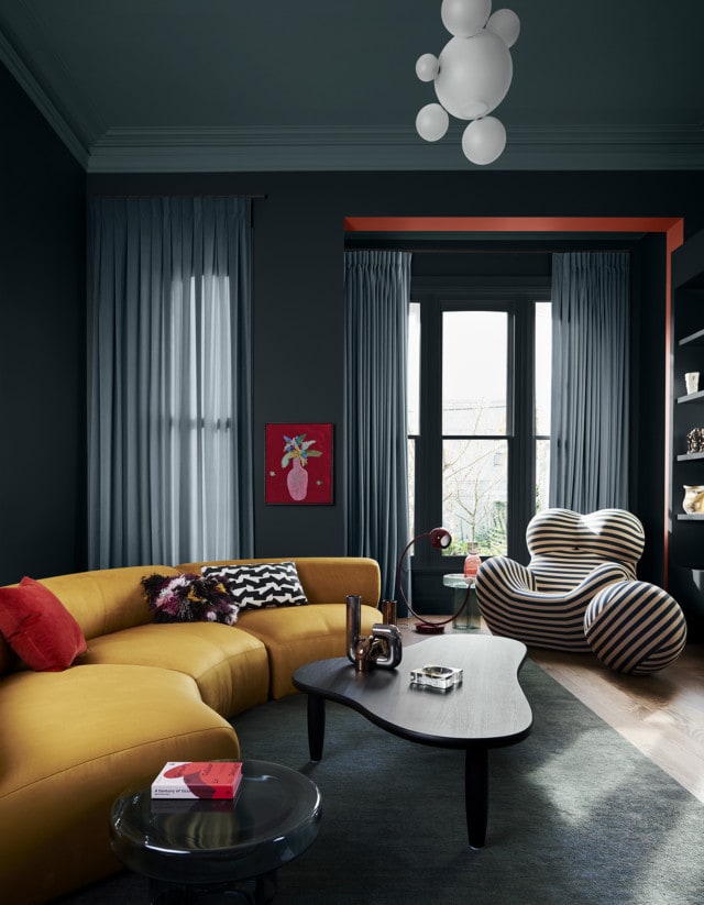
After months of arduous restrictions, a couple of key trends have emerged – people have a desire to be bold, expressive and try new things in their homes while simultaneously seeking comfort and security. Furthermore, people are not only seeking great design and functionality from their homes but improved wellbeing and quality of life too.
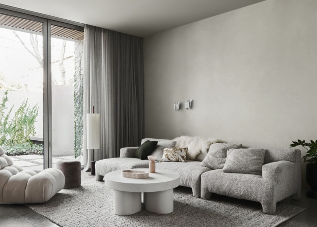
“Having spent so much time isolated and on devices, we find ourselves craving authentic connection. In our homes, we desire textured, natural materials and finishes that ground us and provide those tactile experiences we’ve been missing. We are excited to spend time with friends, family and colleagues, and find ourselves viewing the simple and mundane parts of life – things we once took for granted – with a new sense of wonder and excitement,” says Andrea.
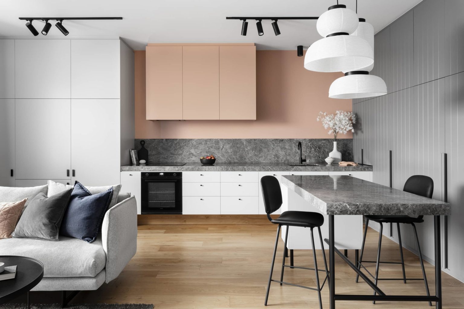
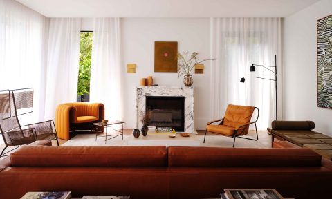
Reflecting the trends, the latest Dulux colour forecast is comprised of three palettes – Restore, Flourish and Wonder.
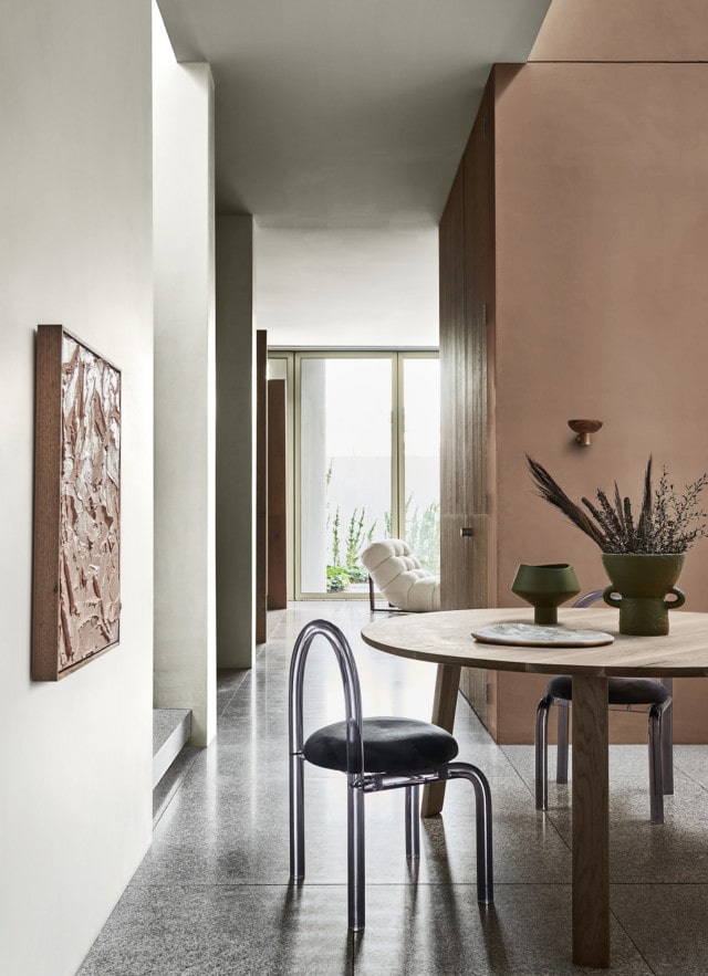
Restore
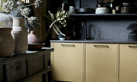
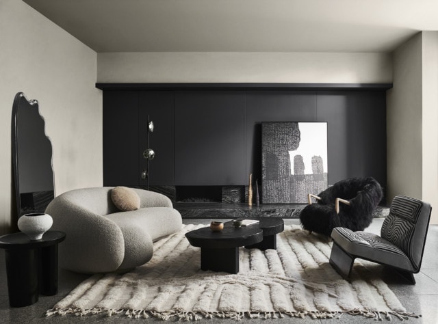
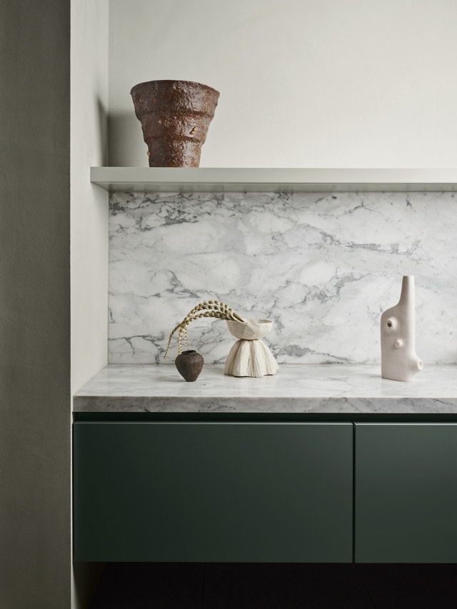
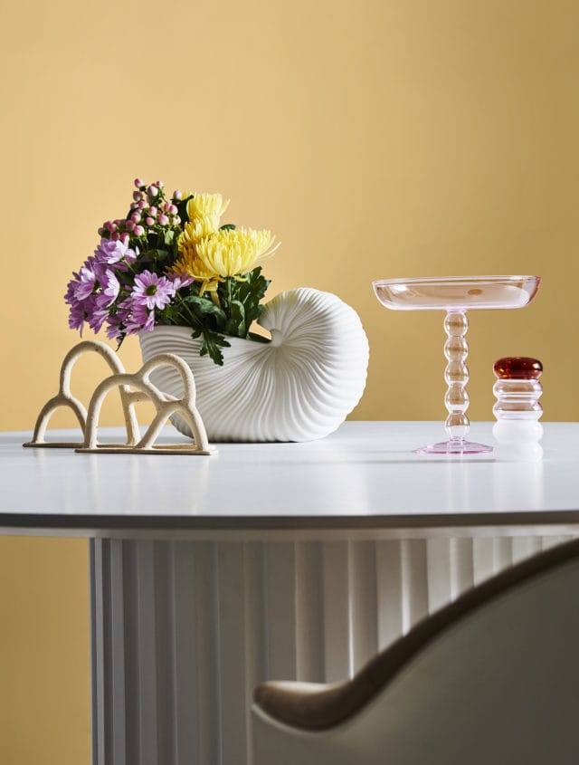
Containing earth-based neutrals alongside more rugged, natural tones, the Restore palette is awash with gorgeous colours including buttercream, pumice, deep blue, clay, rich forest green, moss and a charcoal purple.
“This palette is inspired by our innate need for authentic connection and experience. Interiors have become our cocoon and a place where we can practice wellness and self-care rituals. We’re choosing less, however, focusing on more quality items that last and provide comfort above all else,” says Andrea.
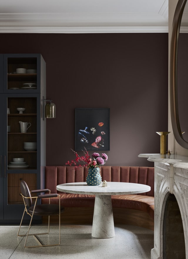
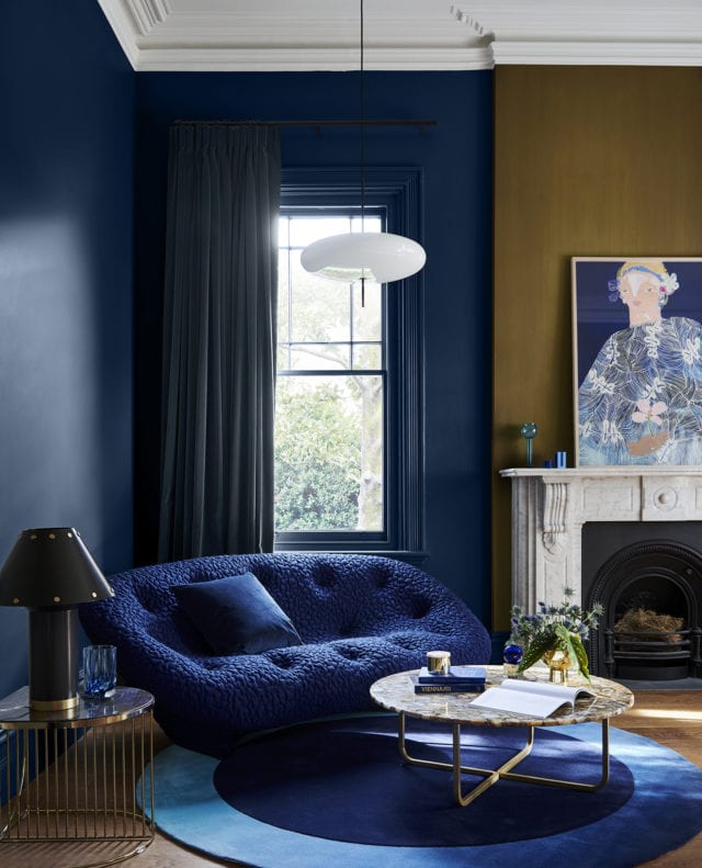
Flourish
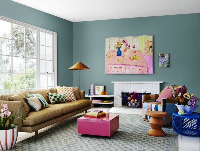
With its bold colours including petrol blue, desert red and vintage gold, the Flourish palette captures our desire to break free from restrictions in every sense. “As we move towards more freedoms, these colours enrich our feelings of empowerment and spark our imagination. With this comes unrestricted expression, inclusivity, and a celebration of the diversity in our community,” says Andrea.
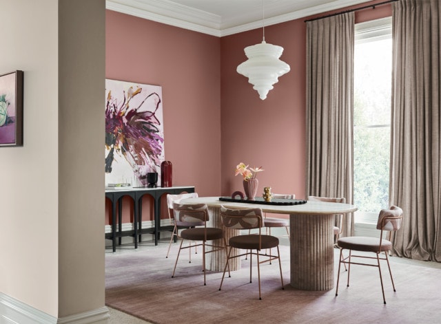
Wonder
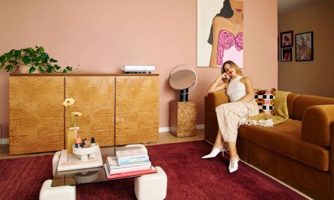
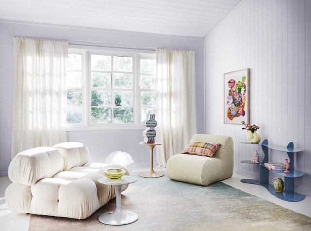
As we emerge from plenty of time spent indoors, there’s a sense of reawakening and celebration as we prepare to connect with friends and family. The Wonder palette is a visual representation of this with its playful, summery, 80’s inspired tones of cornflower blue, lilac, lemon, green and rose gold.
“These colours set the stage for regeneration and growth, with unexpected tones drawn from the natural world around us. As we add more colour to our interiors, our imaginations are rekindled.”
Photographer: Lisa Cohen | Stylist: Bree Leech
