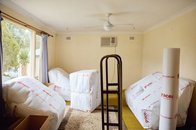
This week we’re back with the interior before and afters of Wednesday’s Selling Houses Australia from Greystanes; quite the time capsule in original fifties condition!
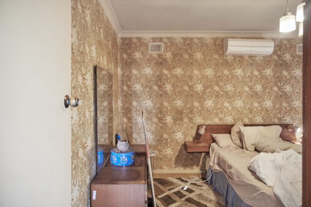
In 1968, Richard and Corinne bought their house for just under $10,000. It has served as a wonderful family home for over 50 years and now that their children have children, it’s time to sell and downsize. It’s been listed for a few months with little interest and Andrew Winter says it’s no wonder why. This 50s home hasn’t been touched since it was built!
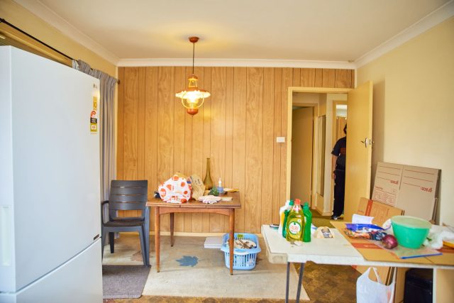

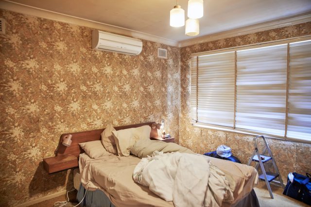
Everything is still in original condition. From the floral wallpapered master bed to the pastel pink and blue bathroom, this house is well worn. Over the last few years, Richard and Corinne chose to invest their extra money into travel and priceless memories, with any renos sitting on the back burner. The couple are looking to sell so they can make the move down south to the ACT and spend more time and be closer to their children and grandchildren.
What they did
The house wasn’t large, but it still felt very disconnected. There was no flow from the living and kitchen/dining areas. Wendy Moore wanted to work with the period of the home, so she picked some features – the yellows, the bedroom pendant lights, the curves, the open plan access into the living room – and worked them into the design.
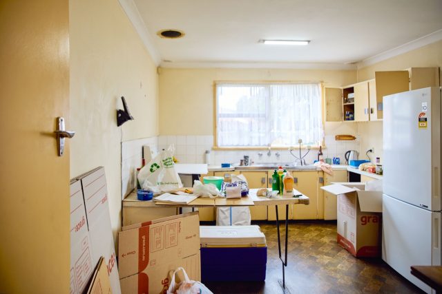
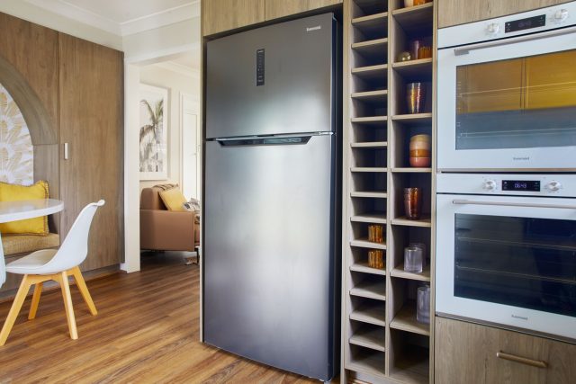
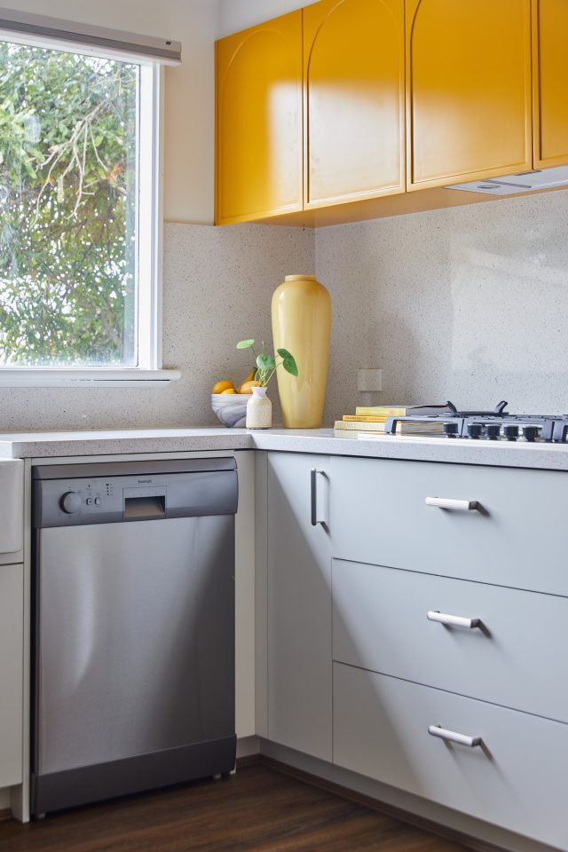
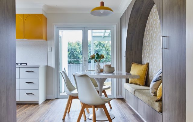
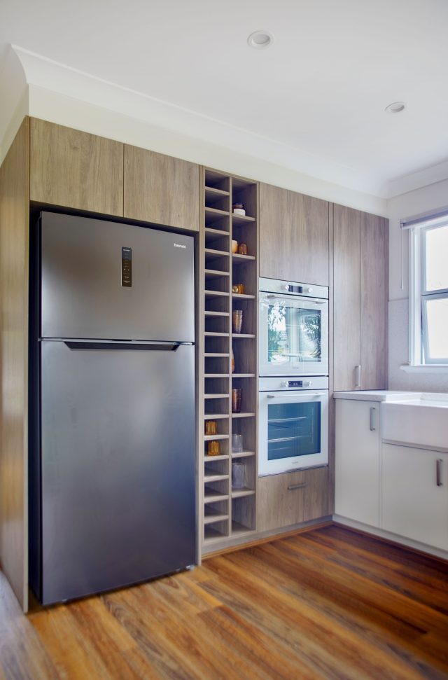
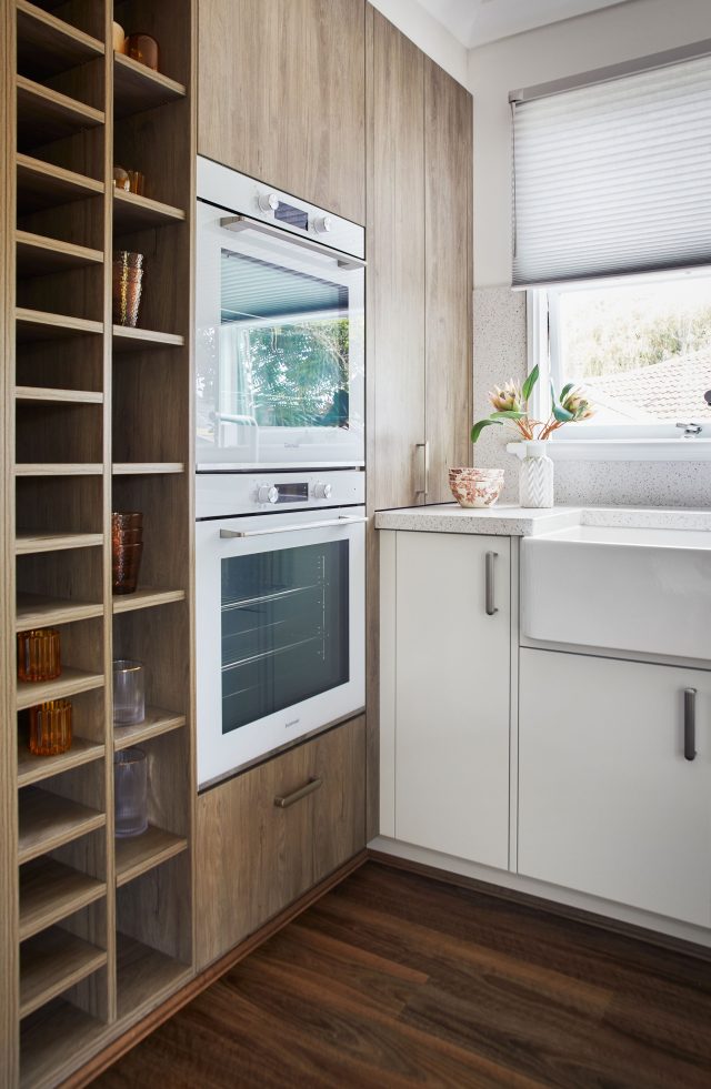
She opened the floorplan to create a connection between the kitchen and living room, giving the house a seamless flow from front to back door. The new entry into the kitchen mirrors the existing opening from the hall to the living room archway. But taking out this wall meant they had less space to work with in the kitchen (already a small kitchen by modern standards) so they managed to install more storage with a custom kitchen. Curved cabinet doors and the yellow colour provided a link to the heritage of the house.
There wasn’t enough room for a separate dining, but the team were still able to make a dedicated dining area with a nook, bench seat and semicircle table. A banquette was built into a cosy nook – mirroring the shape of those curved doors. Storage is always tricky in a small kitchen, so the nook was able to serve two purposes: it’s a recessed dining area that helps keep the floor space clear, and on either side is tall storage – for a pantry and broom closet, with drawers below.
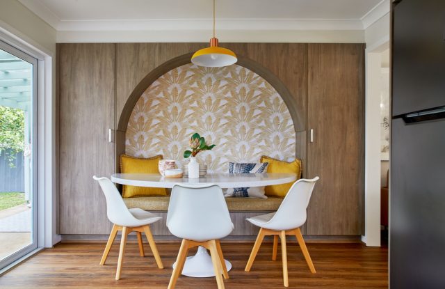
The new dining table has been shaped like a semicircle, with the flat edge next to the banquette and the curved edge facing outwards. This curve is again being incorporated into the design, but not just for appearance – it also guides people smoothly around the dining table, through the high traffic area, without having to negotiate any sharp right angles or corners. A sturdy tulip base ensures it is stable no matter where anyone is sitting.
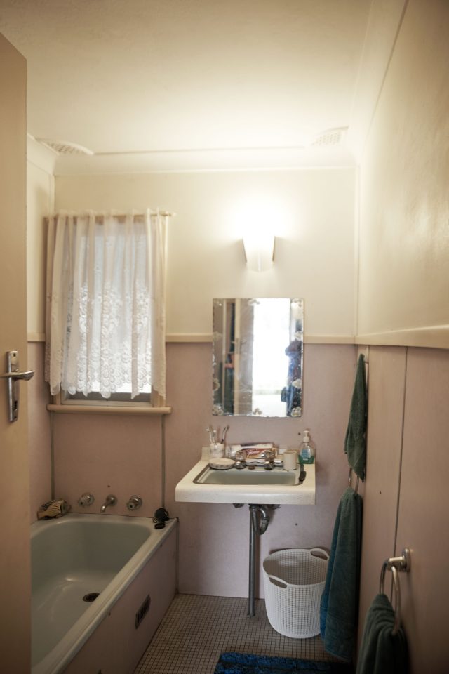
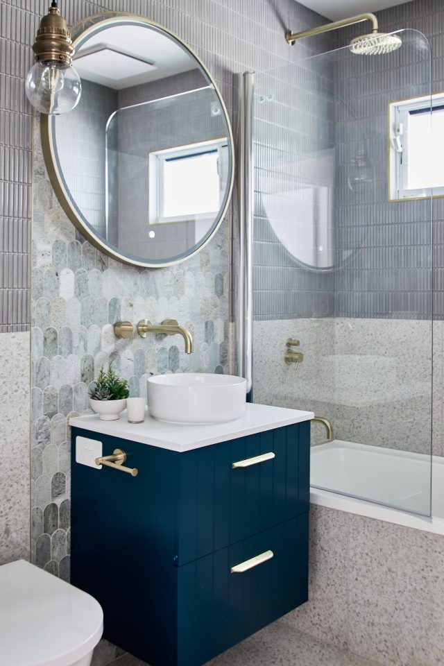
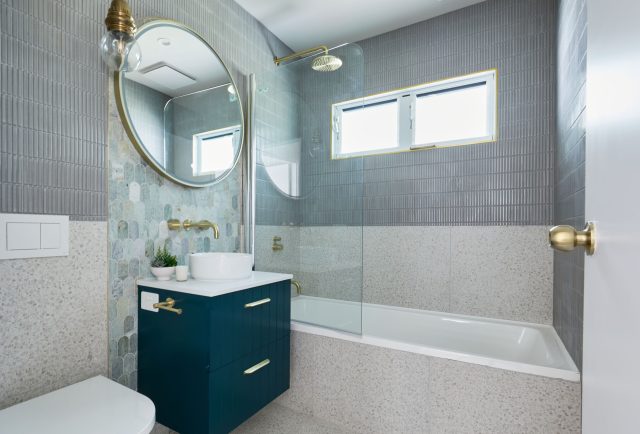
The new bathroom is quite small too, but they were able to pack in a shower, bath and toilet. While it was important to have a toilet inside, it was also really important to fit a bath in too. Families looking at this home with young kids want to know they can bathe their kids easily. It’s a lot to cram into a small space, but they created a false wall and recessed the cistern and plumbing services on one side, making the space more streamlined. They also installed a raised window to accommodate the shower over bath.
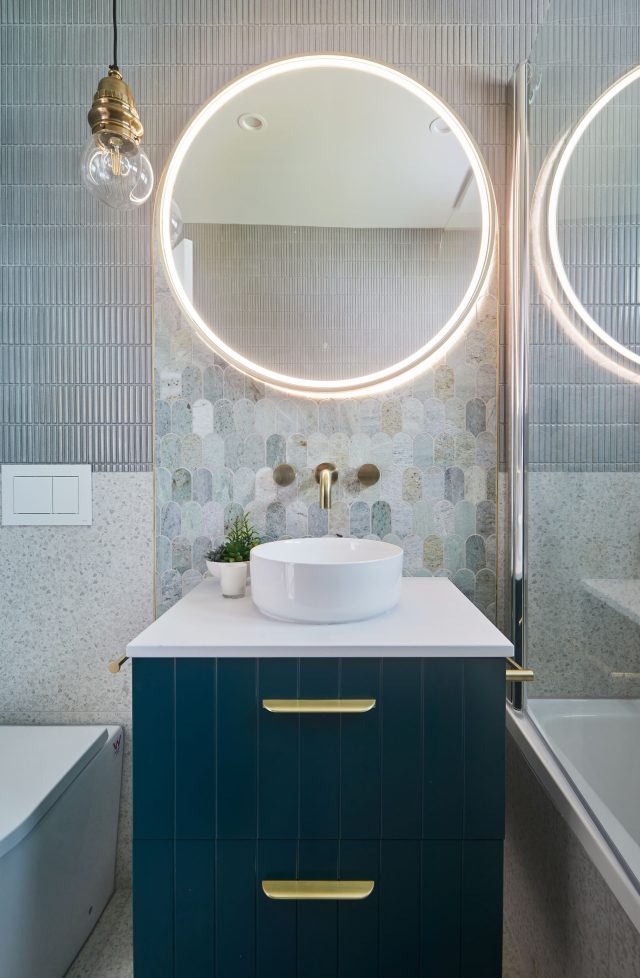
Instead of a complete, pre-designed bathroom package, Wendy created a new bathroom from scratch. The old school style of the home influenced her design but didn’t dictate it. There can be a tendency to make small spaces very plain and light to try and create an illusion of space, but a well-planned colour palate can still be bold without feeling cramped or overcrowded. A mix of tile size, texture and colours were complimented by a white basin, green vanity and brushed brass hardware. And to complete the look, Wendy designed a feature panel to go behind the vanity. The shape of the panel resembles the lines and curves in the kitchen.
For the flooring, Wendy wanted a contemporary look with a nod to the history of the home, so she chose the dark brown oak board. This colour captures that classic, natural, warm tone, perfect for the retro Aussie styling, but it can also work beautifully if the new owners opt for a more modern style.
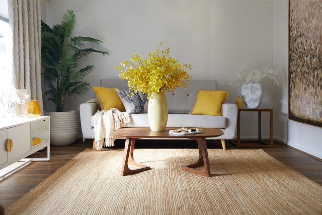
Wendy selected 1.8m board lengths, which are over half a metre longer than standard boards. This meant that there were less joins at the end of the boards, and because they were running from the front of the house to the back, they really accentuated the extra floor space.
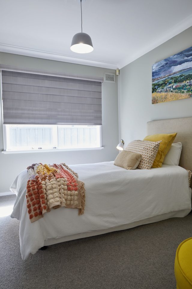
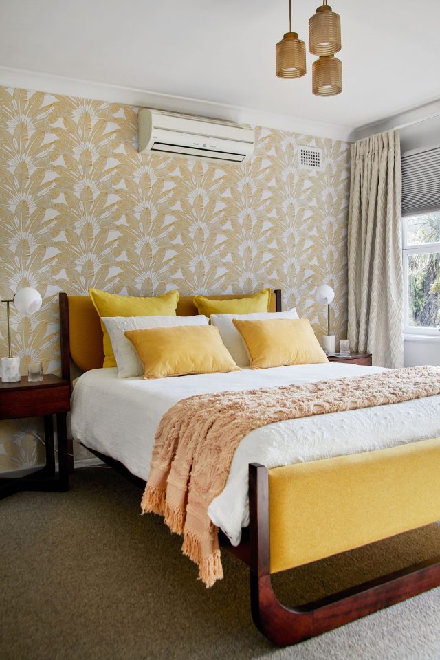
The bedrooms received a total refresh, with a nod to the history of the house. As a nod to the original floral wallpaper in the master bedroom, Wendy made a feature of some beautiful yet modern gold palm patterned wallpaper which provides a nice modern mid-century touch.
We don’t want to spoil the ending so stream the episode and see for yourself on Foxtel!
