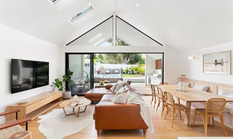
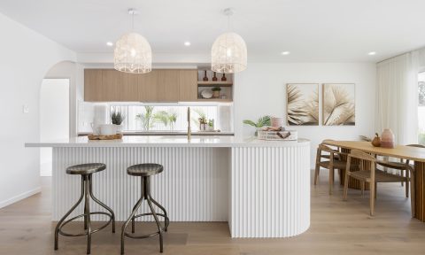
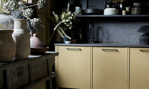
The future is pink and green! That’s the message according to Dulux, who will release their 2015 forecast later this week. after studying trends from around the world. They’ve shared these images of the Silentshift palette, styled by architects Edwards Moore, exclusively with us.
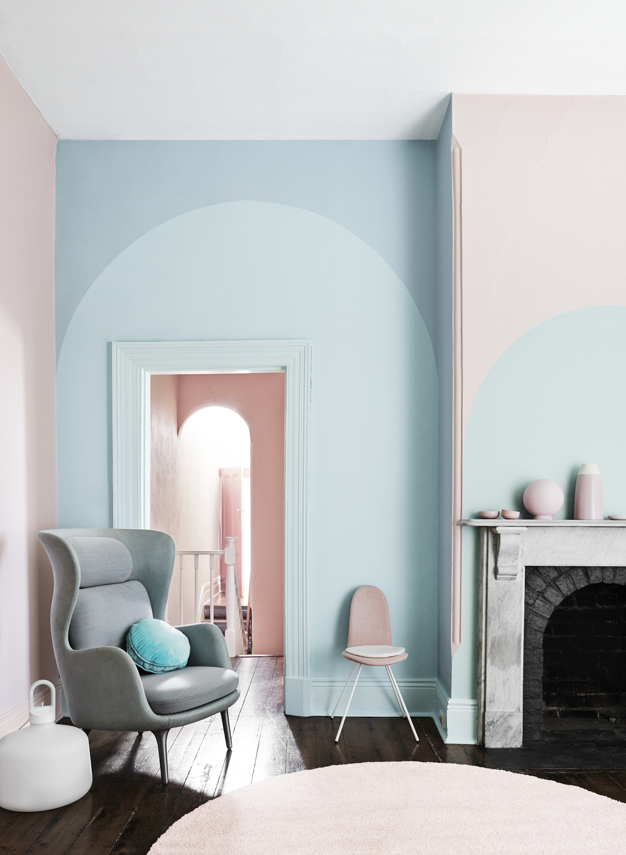
Dulux say pink hues partnered with pastels are set to dominate interiors. There will also be lots of colour on the horizon with bright, bold unexpected blends to more relaxed neutral combinations.
“We are going to see a lot more pink being used daringly as people become adventurous and have fun with colour,” Dulux colour expert Andrea Lucena-Orr said. “You can use a bold pink to create maximum impact or in small quantities to soften a space. Soft mushroom pinks such as Dulux Salmon Grey create a subtle, neutral scheme while a vibrant pink such as Dulux Pink Papaya can really liven up a space.”
But the future isn’t all pink, as Australians look to nature to guide us. 2015 will also be raw and rustic with more earth- inspired influences. Greys will continue to be important going forward. “Natural landscapes, raw elements and minerals, fashion and the connection between digital and rediscovering our offline lives are the most influential factors for 2015,” Andrea said. “Natural colours such as greens and neutrals with green undertones will be pivotal. This includes earthy greens, such as Dulux Grape Leaf and mineral greens, such as Dulux Porpoise Place.”
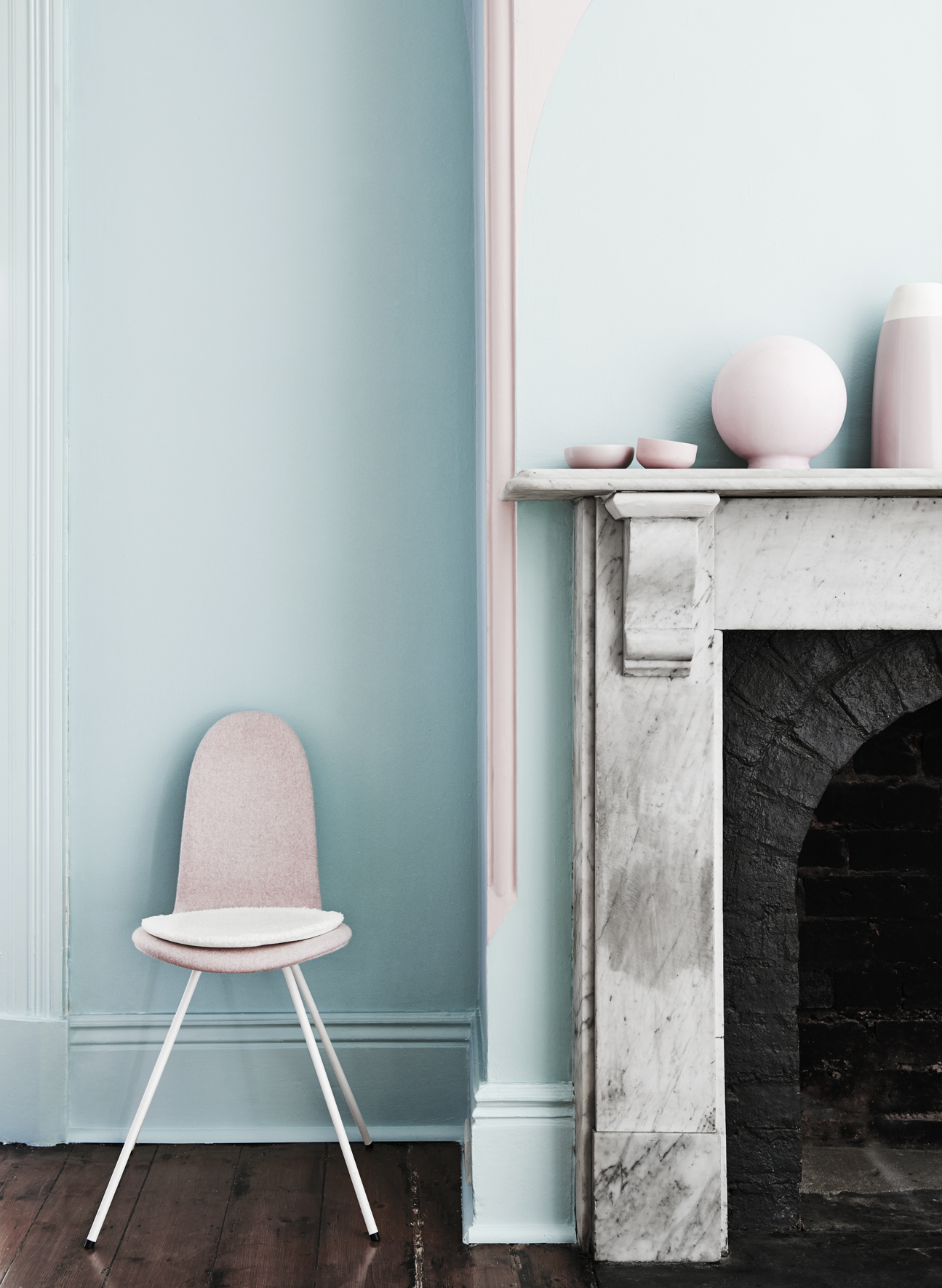
Dulux colour experts study trends from around the world to develop their forecast, attending trade fairs in Europe, studying product and design innovation, colour and finishes and emerging global designers. They source information locally and from overseas, analysing influences such as fashion, media, world events, technology and science, social fundamentals, financial economics and politics.
Based on the trends research, The Dulux 2015 Colour Forecast, Connection, will release four palettes: Wildland, Silentshift, Earthwerks and Modhaus. They collaborated with Edwards Moore and textile designers Bonnie and Neil, under the creative direction of stylists Bree Leech and Heather Nette King, to showcase them.
Bed Edwards of Edwards Moore, said: “Before picking a colour it is important to decide what you are trying to achieve. Think about the overall ambience you want and do not think of colour as flat. In-between spaces such as corridors and circulation spaces between rooms are often overlooked. They act as transition spaces and can add delight, linking spaces in the home.”
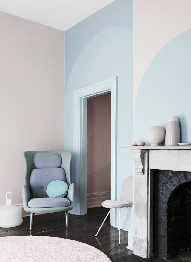
Above all, homeowners should remember that a fresh coat of paint is a simple and inexpensive way to add colour, personality and create a place where they feel comfortable, inspired and happy. “Colour is amazing! It can highlight items you want to focus on and can camouflage the elements you wish to hide. Colour is so versatile and flexible and can empower a space or provoke a sense of tranquility,” Andrea added. “Colour plays a pivotal role in the home as it helps define the feeling and mood of a space and it so simple to create with a simple painting project.”
Q&A with Ben Edwards and Juliette Moore of Edwards Moore
Why is colour so important?
Colour touches all of us at a basic, even primal level. It creates ambience and mood. The use and skilful handling of colour can make a project. It can create an entirely new environment, either saturated or in small suggestive hits.
What are your sources of inspiration?
Our lives and the world around us. Artists such as Bridget Riley, Damien Hirst, Jackson Pollock and Wassily Kandinsky. Fashion designers such as Gareth Pugh, Victor and Rolf and Iris Van Herpen.
How has online or digital influenced design trends and colours? It has made work more widely accessible, allowing us to draw on influences not only from within our community but from across the globe. It has also enabled us to work more collaboratively.
How can colour be used to complement surrounding furnishings and accessories? Carefully considered colour used in the building fabric can create a dialogue and relationship between spaces, and can be used to support the overall architectural language.
What are the dos and don’ts when it comes to using colour? Do not use colour as a presiding design solution. Do use colour to support the overall conceptual approach to the space. Be adventurous and try unusual combinations.
How can colour change the mood of a room or how you feel? Colour can be extremely emotive. Not just in the better known psychological properties of colours, but also in evoking memories. Similar to sounds and smell, colour can be used to connect to a memory, place or event. The choice of colour therefore is a very personal process.
What do you think is going to the most influential colour in 2015?
Pink! Soft, gentle and delicate pink.
What inspires your creativity?
Our lives, the world around us and everything we see and feel.
How can home owners use these colours in the home?
Before picking a colour it is important to decide what you are trying to achieve. Think about the overall ambience you are trying to achieve and do not think of colour as flat.
What room in the home do you think is ideal for injecting colour? Any room. In between spaces such as corridors and circulation spaces between rooms are often overlooked. They act as transition spaces and can add delight linking spaces in the home.
What is your single favourite colour from the forecast? How would recommend using this colour in the home? Dulux Pink Marble. Use this colour with more neutral natural whites and soft tones to delicately shift ambience and create calm sophisticated spaces.
Find out more on the Dulux website.



Comments
Love love this colour!