Sponsored by kaboodle kitchen
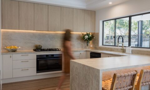
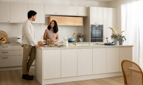
kaboodle kitchen have unveiled its latest Trends Range – a biannual edit of muted, earthy tones crafted to bring calm, clarity, and a closer connection to the natural world. And I’ll level with you: it’s really making me want to swap out my white kitchen cabinetry! That said, if you’re a neutral gal, there’s something for you too.
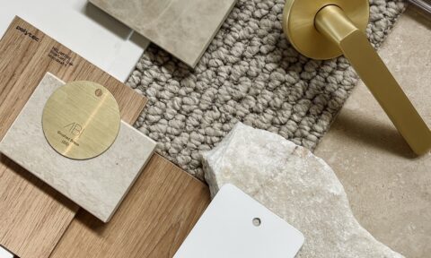
This isn’t colour for colour’s sake. Down to Earth is the result of two years of deep dive trend research by the kaboodle team – tracking shifts in global and local design, attending headline events like EuroCucina in Milan and pulling insights from trend forecasters like WGSN.
“We’re not just following trends, we’re anticipating them,” says marketing manager John Harrison. “By tapping into global conversations and local creative voices, we’ve built a range that feels timeless but totally of the moment.”
The new collection is designed with intention – a nod to the rising demand for homes that act as a sanctuary from the pace of modern life. It’s about stripping back, slowing down and creating space that supports wellbeing, both inside and out.
“The colours we live with shape how we feel,” says John. “This palette, inspired by earth, clay, stone and moss, invites mindfulness and presence. It helps make home a place to reset.”
The new colours
Oyster
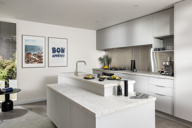
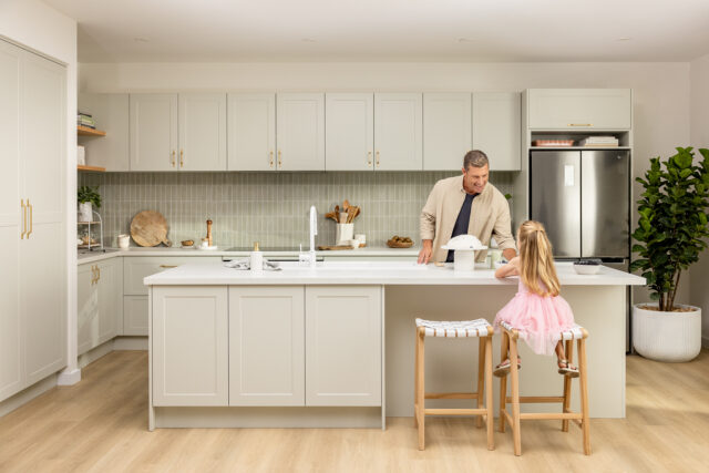
A soft grey with subtle silver undertones that perfectly captures calm, clean simplicity for the minimalist home.
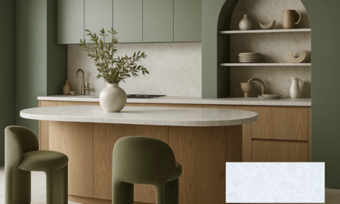
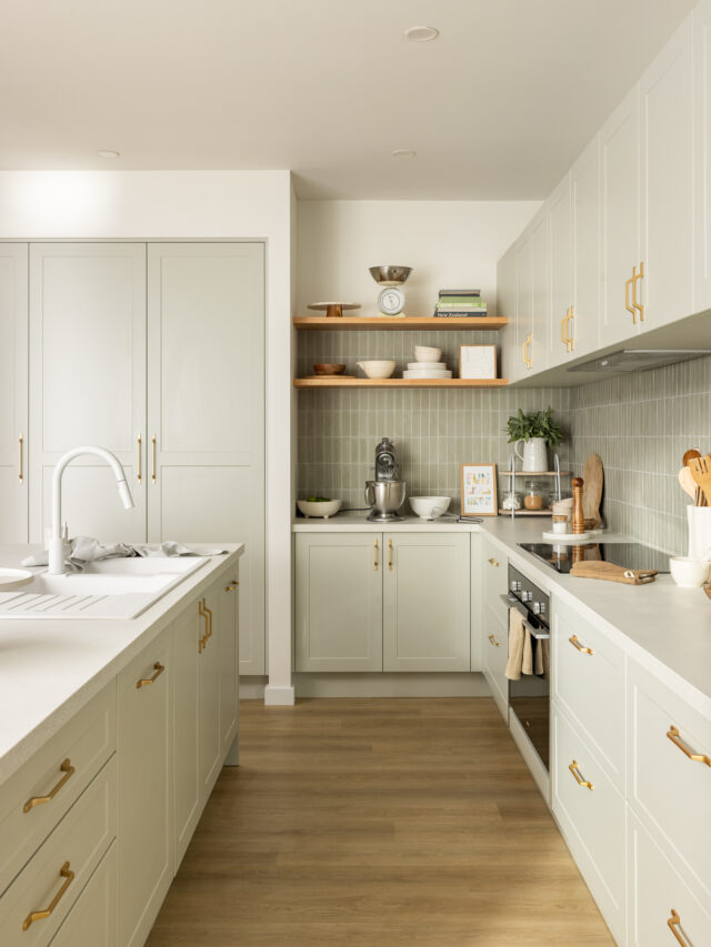
Saltbush
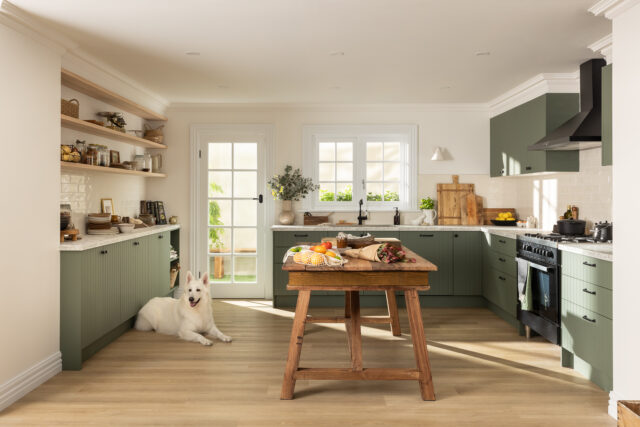
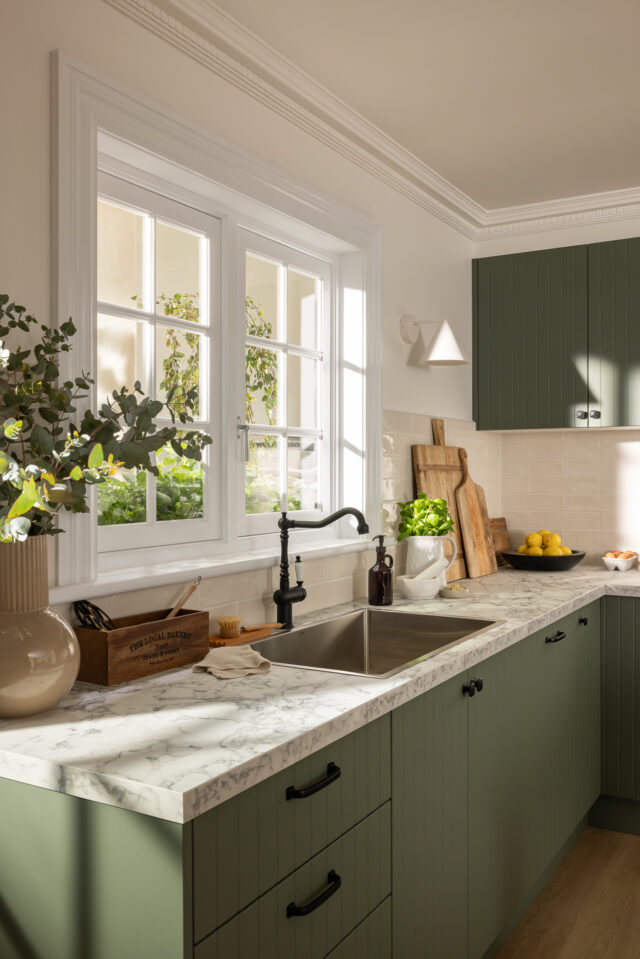
Rich and muted (and definitely our favourite!), this earthy green adds understated luxury and natural warmth. A versatile shade that creates a unique point of difference.
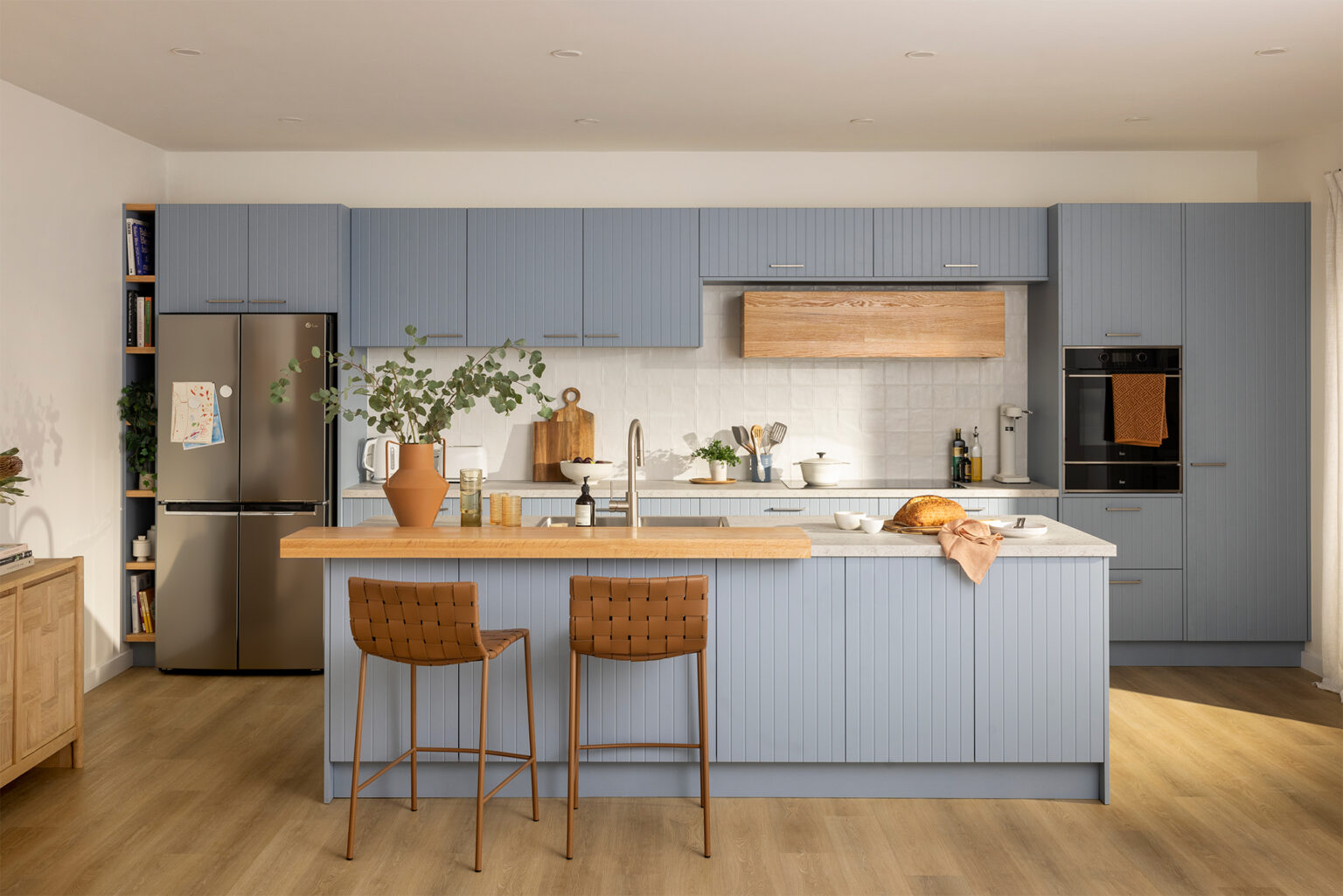
Juniper
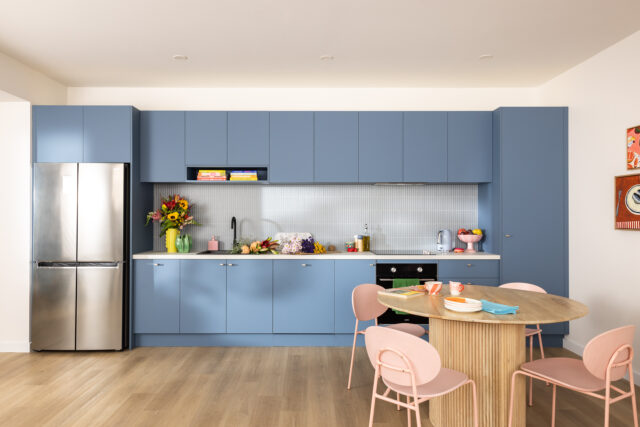
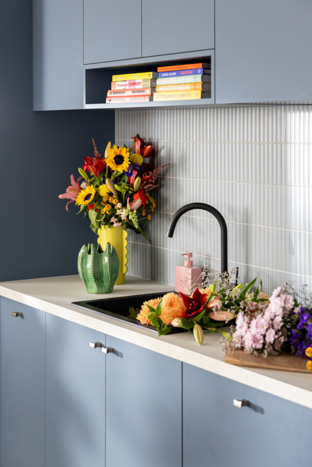
Misty blue with soothing grey undertones that evoke serenity and stillness, ideal for creating your own oasis at home. We love this one’s soft and feminine feel without being, well, pink!
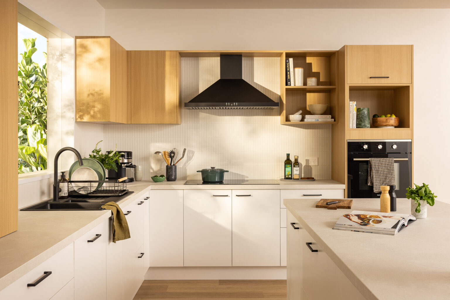
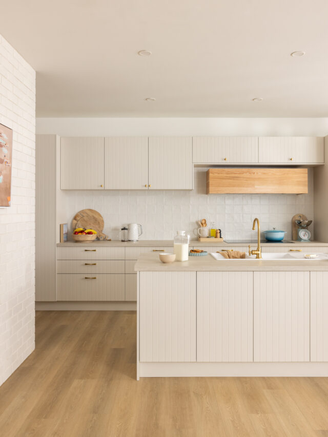
Cannellini
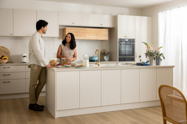
Neutral by nature, this sandy beige delivers instant warmth and softness. Grounding and comforting, it brings timeless appeal to any space. But it’s not (God forbid) beige or cream! It’s the perfect off-white; not too warm or cool.
Pistachio
A gentle blend of green and grey, this soft hue brings a fresh, calming energy to the home. Equal parts nature-inspired and contemporary, it offers a modern and elevated feel. We love this pick for a neutral kitchen that looks designer and expensive, rather than harsh bright white.
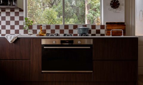
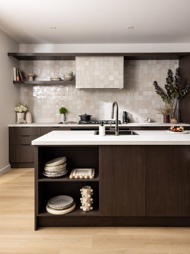
Truffle Oak
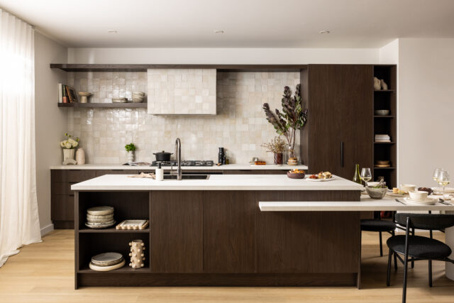
A deliciously decadent timber-look finish with textured woodgrain and deep cool tones that offer natural elegance with a contemporary edge. We’ve definitely been noticing a lot more people opting for walnut-style timber look kitchens lately. This would work really well in Mid Century style houses.
Explore the range online or pop in store at your local Bunnings to pick up some physical samples.