Recently I was lucky enough to have the opportunity to visit Milan Design Week 2015 and I had the most incredible time! There are so many events you can attend; you’d need a team of five scouts to even come close to covering the whole week. So while I didn’t get to see it all, I did get to see some amazing displays and products, which proved why Milan is the go-to city for design inspiration.
Some of the world’s best designers from around the world showcased their works, but standouts for me were Tacchini, Louis Vuitton and Moooi. It was a very inspiring experience to be able to see all the furniture, lighting, accessories and colour on display, which got me thinking of ways we can incorporate these trends into our lives here in Australia. So below are my top five tips for incorporating Milan Design Week’s trends into your home.
1. Keep it cosy with an autumnal colour scheme
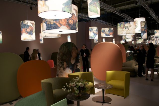
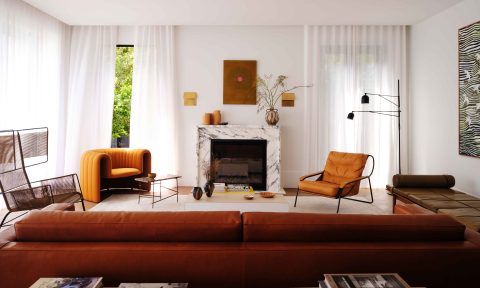
I wandered through a field of autumnal colours at the Tacchini display. Pale peaches, bold oranges, deep yellows and a spectrum of muted greens. The boldly coloured furniture was softened with the low lighting of the floral-printed drum shades.
Autumnal colours are perfect for making a room feel cosy as they draw the space inward creating an intimate scene. To prevent an autumnal palette from feeling too heavy, I would keep your accent timbers to a light oak as opposed to a dark brown or black colour, and dress with off white bed linen to give the perfect contrast. If you want to be a little more subtle, but still want that warmth, go for a stone colour on the walls like Taubmans Endure Portland Stone, and pull the deeper autumn tones through the room via a rug or artwork. This way you won’t overwhelm the room too much.
2. Go green!
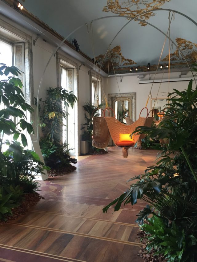
Amongst all the warm hues there were constant pops of dark green, like at the Louis Vuitton display, which showcased their Objets Nomades collection. Set amongst the backdrop of the magnificent nineteenth century Palazzo Bocconi, the cream and gilded walls with hints of pale duck egg blue were an incredible contrast to the dark greens of the display, which were inspired by Ernest Hemmingway’s travels.
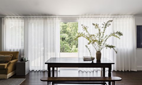
The key to making any shade of green work in your home is to mix it with elements of white and light coloured timbers so it feels fresh. Avoid using dark colours in your accessories and furniture as it can often make green feel dated and old-fashioned.
3. Dark walls and mood lighting
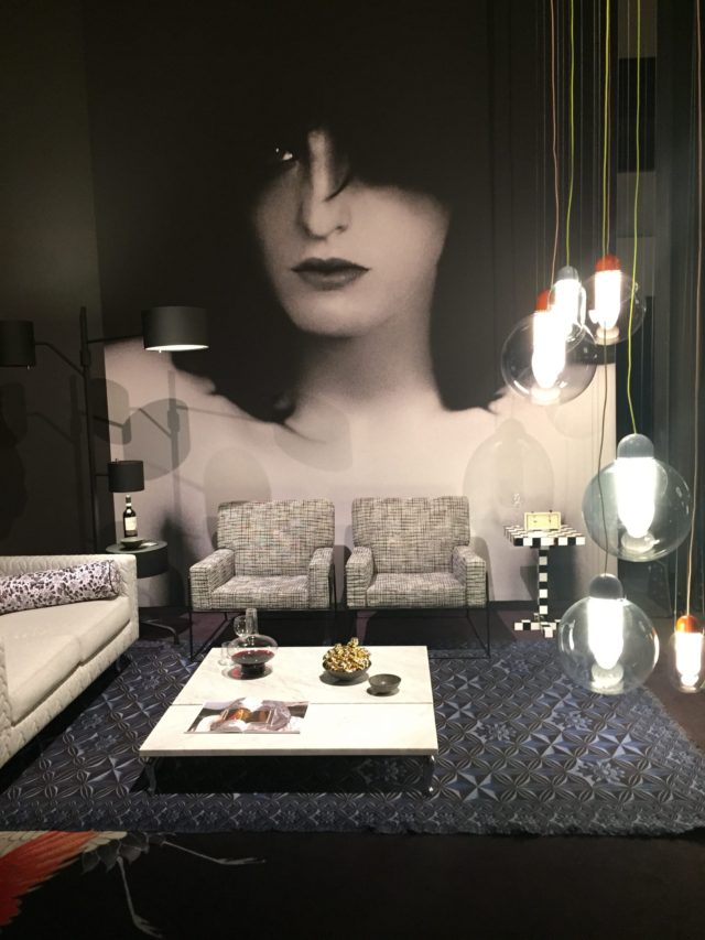
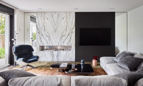
Most of the displays I saw featured backdrops of stark white, charcoal or black to accentuate each designer’s products. This also drew focus towards the feature lighting of many displays – another popular trend from Milan Design Week. Moooi’s display’s had a very dramatic, moody, yet playful feel to it with its dark walls, which showed off the unique feature lighting.
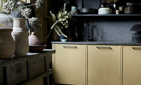
Dark colours have a tendency to enclose a room making it feel much smaller than it really is. To make a dark room feel more spacious, reflect the wall colour in your flooring or use a rug with a similar tone. This makes the room feel like one, big open space. Walls in a dark charcoal or black like Taubmans Chasm or Black Fox should also be mixed with plenty of white and light grey furniture and accessories, along with statement pendant lighting for the ultimate moody yet sophisticated look.
4. Bold and beautiful
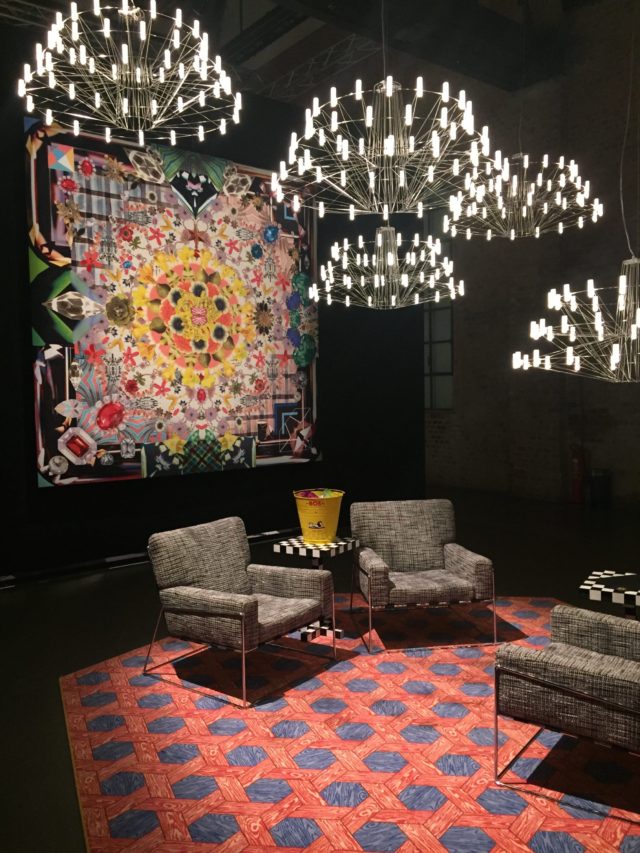
Moooi was definitely one of my favourites from Milan Design Week 2015. The large-scale prints on their new carpet range served as dramatic floor canvases in bold statement colours, which along with extravagant wall hangings offset the elegant furniture and unique feature lighting. A palette of red with accents of raspberry and purple was one dramatic combination I saw and loved at Moooi. They cleverly used strategic lighting to mute the intensity of the tones.
When incorporating into your own home, the key to using bold colours like these is to layer different variances of similar hues but keep the lighting soft around the walls. Use brighter lights on the furniture areas to balance the room.
5. Layers and layers
Milan Design Week 2015 was bold, playful and quirky with nothing pared back, especially when it came to colour. The same warm tonal colours caught my eyes at nearly every display. Shades of gold, brass, yellow, peach, tangerine and deep oranges layered upon each other were a common theme. Dark greens and blues often also popped up alongside the warm hues.
The trends we continue to see today are multi-layered looks, which means they appeal to many different personalities and markets providing something for everyone. Milan was a great example of a place that offers endless inspiration and unique ways to adapt colour and interior trends – from the exhibition into your home.
— Shaynna Blaze is Taubmans’ brand ambassador and colour creative director, host of Selling Houses Australia and judge on The Block.
