Haymes Paint has launched its Volume 14 colour library, with new shades designed to reflect the shifting home trends in the wake of this tumultuous year.
Embrace is inspired by the concept of embracing the ever-changing and unexpected challenges of the current world, and finding solace within the home space through colour. The movement is characterised by tones that elicit comfort and reassurance, aimed to create nurturing environments as a respite from the – often overwhelming – uncertainty that has defined our lives recently.
Comprising of three unique colour palettes: Grounded, Calm Mind and Happy Home, the range features hues that have been crafted to reflect the natural world, and produce a calm and joyful interior; attitudes that are expected to be a staple of the paint trends predicted for 2021.
Colour and concept manager, Wendy Rennie, says: “This year’s colour release has been interesting to put together as the world and climate we live in has changed dramatically.
“The current focus on wellbeing is more important than ever and using colour as a way of connecting us to emotions and improving the environments we are in will help people to make an impact where it counts most, showing us that home truly is where the heart is.”
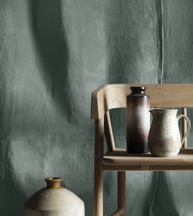
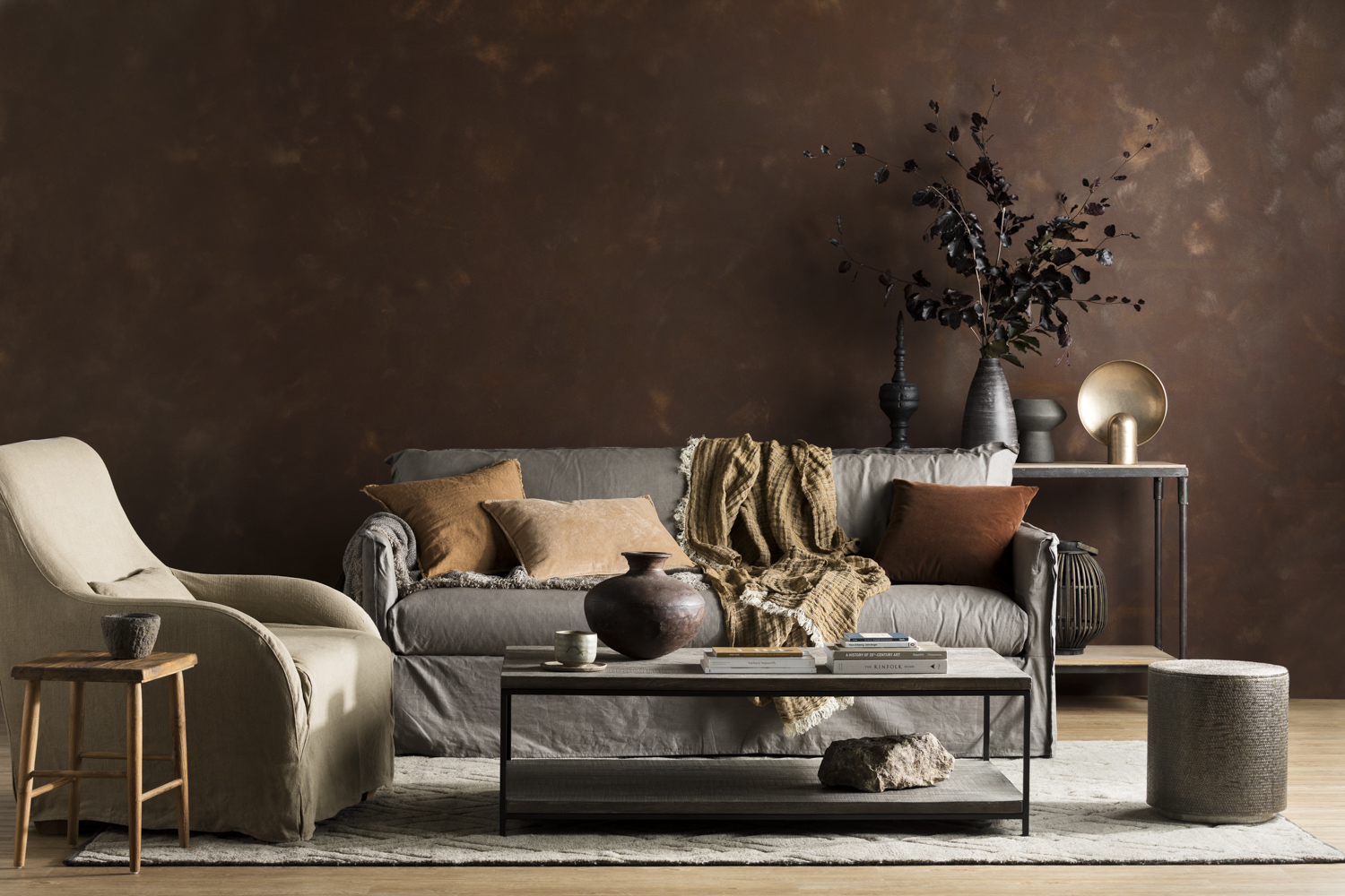
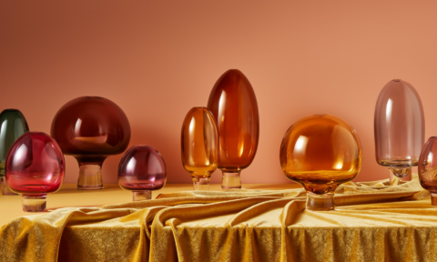
Grounded
The grounded palette draws inspiration from the earthy tones of the natural world, offering an escape from the speed and stress of our everyday lives. Its rich colours range from deep tones of ink blue to warm sandy neutrals and olive greens, emulating the calming force of the ocean, the earth and forest.
These colours promote the creation of spaces within our home that reinforce this important connection to nature, and the sense of serenity and “groundedness” that will act as central tenets of 2021 interior design trends.
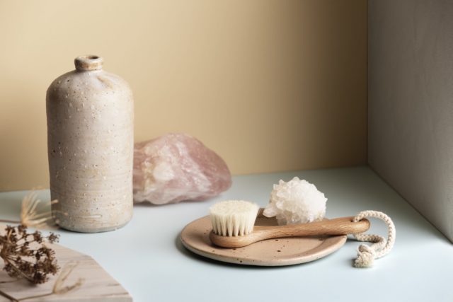
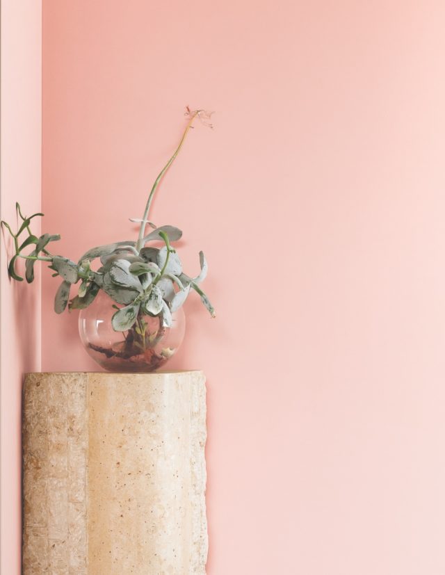
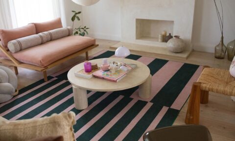
Calm Mind
Despite what is going on in the world around us, by looking inwards we can attempt to recapture our innate sense of calm and peace. The focus of this palette is to restore balance and inspire harmony, through emulating a “spa retreat” feel within the home. Soothing tones of creamy green and blue blend with muddied peach, pink and rusts to create a tranquil fusion of colour that nutures the mind and soul.

The new normal is to look for ways to promote self-care and relieve stress within environments you can control, and the Calm Mind palette was created to highlight just this; the power that the intentional choice of colour can have in creating a tranquil living space.
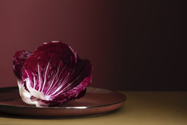
Happy Home
The Happy Home palette encapsulates a relaxed approach to interiors by introducing an uplifting array of tones and hues created to promote joy. Bold blues, rusty reds and pops of bright yellow bring a sense of fun and hope back into our homes.
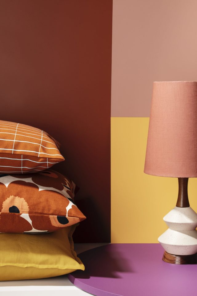
The palette inspires interiors that are characertised by quirky styling, bold colour blocking and smack of zesty exuberance. This theme is all about youthful design elements and injecting energy into spaces to reinvigorate the senses.
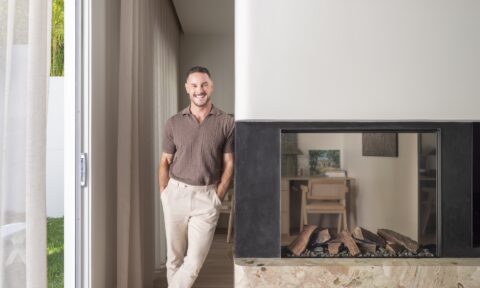
Imagery styled by Ruth Welsby with photography by Martina Gemmola.
For more on these 2021 palettes


Comments
This is very exciting! A lot of fresh and bright colours coming in for 2021.
The soothing tones of creamy green and blue mixed with pink and rusts give off a tranquil vibe.
Looking forward to more palette trends for the coming year.
I loved the concept. The grounded tone looks the most vibrant of all. Thanks for sharing.