We brought you the latest from Haymes Paint a little while ago but this month sees the brand reinterpret the colours within the context of family life. With names such as ‘Contribute,’ ‘Comfort’ and ‘Cohabitate,’ the palettes certainly do suggest a sense of home and togetherness and we caught up with Haymes Paint colour and concept manager Wendy Rennie who helped put them in context.
“We have re-edited our three Colour Conscience palettes, shifting the colours and ideas to provide different interpretations of how colour function can infuse to create thoughtful solutions within the home, providing the ultimate backdrop for the family to enjoy life whilst harnessing the essence of their own lifestyle,” says Wendy.
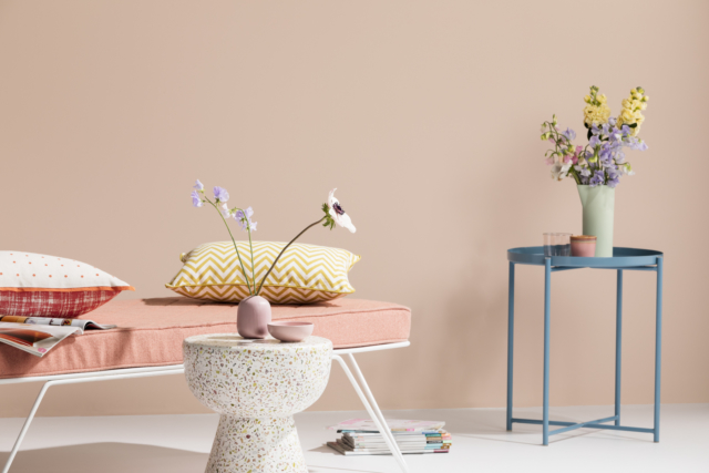
Cohabitate
As the name suggests, with its soothing pastel hues, this palette is ideal for shared zones within the home. “Cohabitate offers the ultimate in a light and airy pastel palette, perfect for any multifunctional zone, encouraging all generations to come and spend time together,” says Wendy.
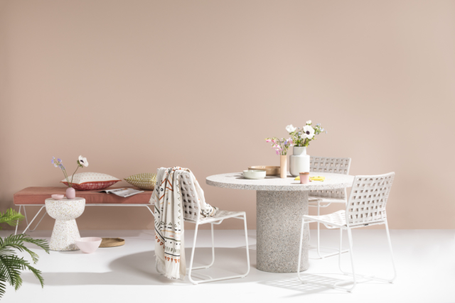
“Cohabitate offers the perfect summer palette with its use of soft and calming pastels from yellow, blue, grey, peach and pink tones all blending together seamlessly.”
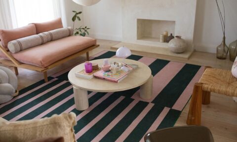
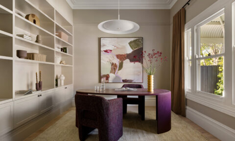
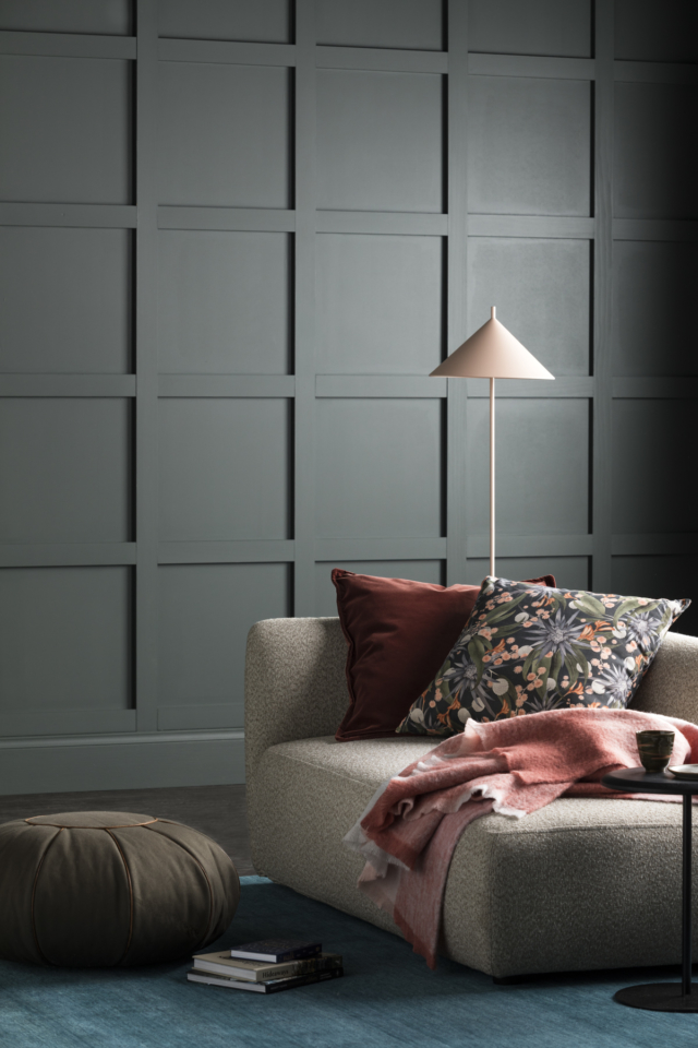
Comfort
In contrast to the ‘Cohabitate’ palette, the rich tones of the ‘Comfort’ palette are ideal for the lounge room, home theatre and even bedroom. “Comfort provides the ultimate palette to create a perfect sanctuary in the home. The intimacy and the depth of the colours can create the overall feeling of rest and ‘colour cocooning’ giving the feeling of security and peace. Switching off to outside demands, and feeling completely comfortable in your surrounds instils a sense of peace and calm,” says Wendy of the rich palette.
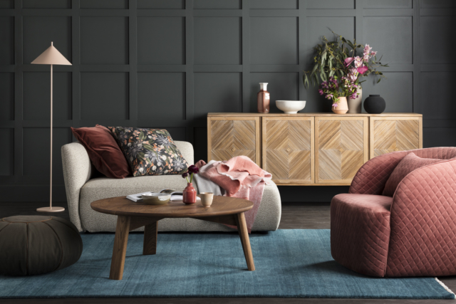
“Comfort incorporates colours that are sensual, tonal and evocative – rich red wine tones and soft dusty nude peach infused pinks blend seamlessly with deep contrasting greens, providing a soft and inviting environment.”
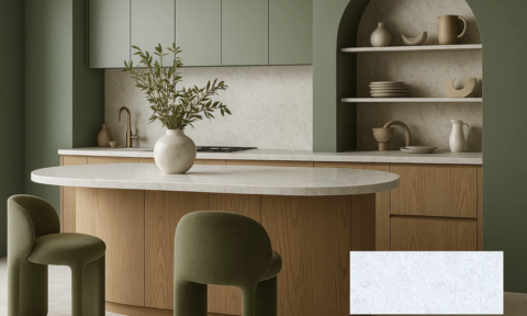
Contribute
“The Contribute palette uses smart ideas and design to create beautiful warm spaces. Using rich and inviting colours that play on texture, tone and materiality extends the connection with our external environment, providing security and peace in the surroundings,” says Wendy of the palette that features grey tones that range from lighter, putty inspired colours to ones infused with deep brown.
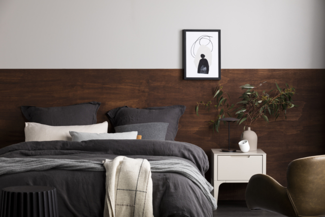
“The Contribute palette is monochromatic, embracing the natural shapes, colours and textures of our very own landscape.”
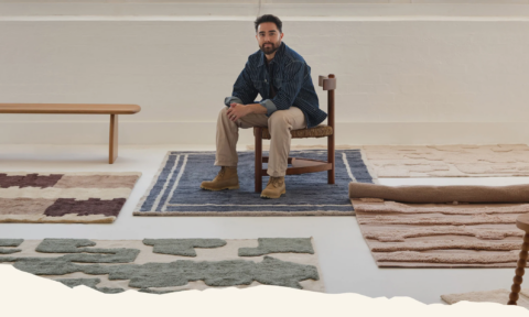
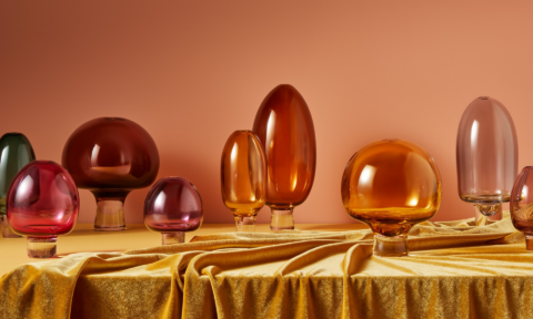
Photography: Martina Gemmola | Styling: Ruth Welsby