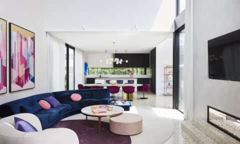
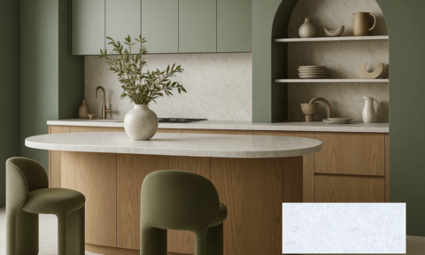
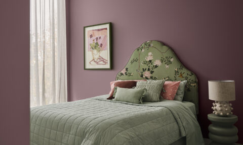
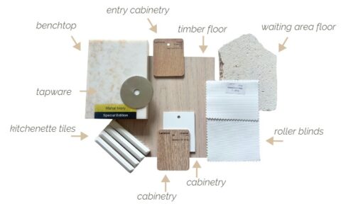
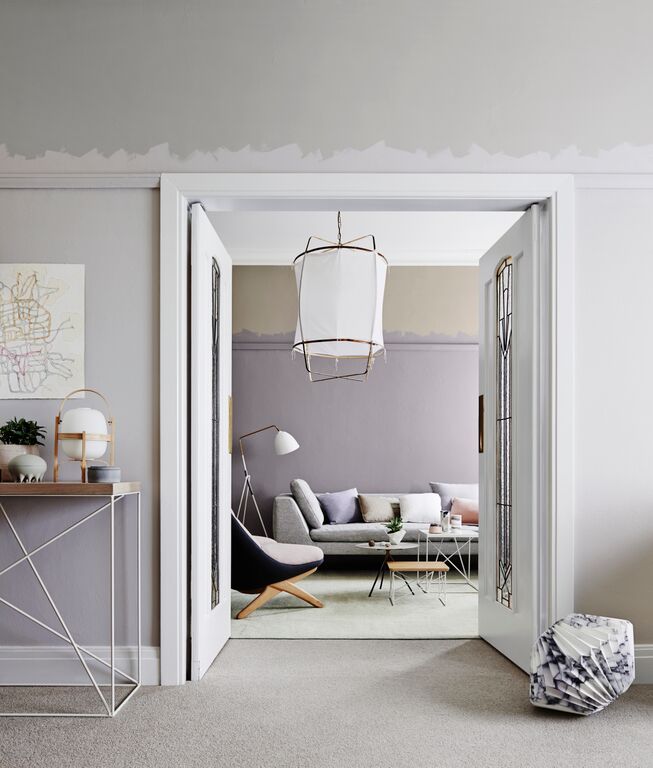
This season, interiors are set to be inspired by a softer collection of muddy pastels derived from nature and living matter; with Dulux’s colour trends for summer 2016 consisting of delicate hues such as greys, dirty pinks, nudes and natural greens.
Dulux’s summer palette, Bio Fragility, creates a beautiful, tranquil setting that is very easy to live with, as Dulux colour expert Andrea Lucena-Orr explains: “The summer palette for 2016 is quite neutral and has easy-to-use colours that most consumers would feel confident using in their homes. The palette has evolved from a more pastel feel last year, offering subtle muted undertones with a certain earthiness.”
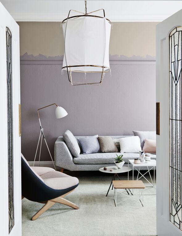
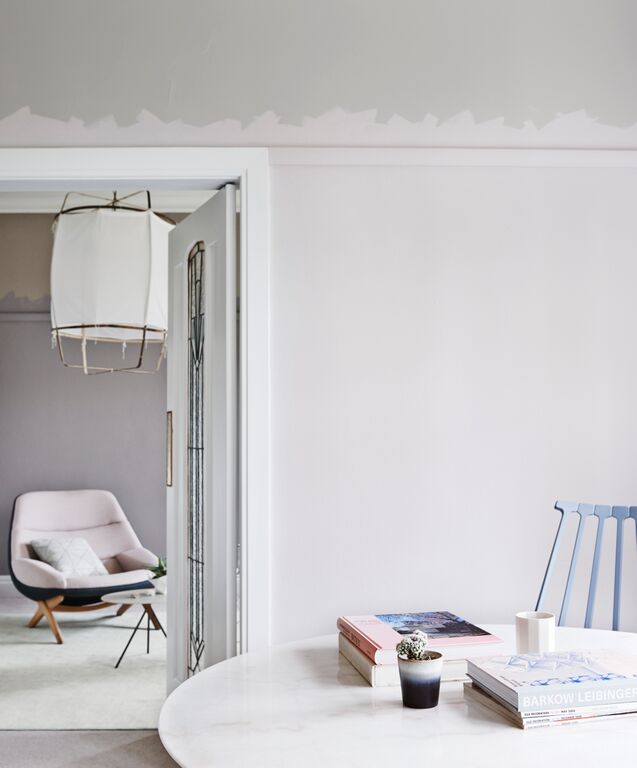
Homeowners can create a relaxed interior with beautiful detail by introducing these gentle summer hues that add a touch of colour, but are not overwhelming. Pale colours derived from natural matter create softness in a space and can be counterbalanced with unexpected mixes of warm and cool shades.
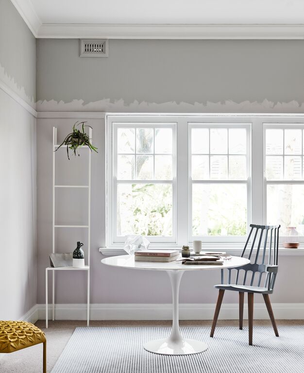
With summer calling for a more refined offering, the season’s colours can be easily adapted to virtually any room. For those not bold enough to transform an entire room, try using these refreshing and light colours in smaller volumes on accents, trims and accessories. “For a mini summer makeover a lighter shade can be introduced in smaller applications to complement colours in soft furnishings such as cushions and ceramic items,” explains Andrea. “Neutral accessories work really well with these more subtle and muted shades as well as soft and subdued combinations.”
Dulux’s Summer predictions are the product of research into global design, colour and finishes inspired by trade shows, fashion, technology, media and trends agencies.
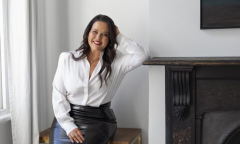
On Monday, Dulux’s creative consultant and stylist Bree Leech shares her style tips for using colour in your home this summer.
Photography by Lisa Cohen | Styling by Bree Leech and Heather Nette King