By Lexi Kentmann
Visit any hardware store and head to the paint counter. We collect countless swatches and paint chips, full of optimism and hope, only to get home and falter. Which colour looks best in this room? How do I make this work with the furniture I already have?
So when Pantone announced Cloud Dancer as the colour of the year, and everyone was scratching their heads feeling underwhelmed, even angry, we knew we had to talk to the queen of colour herself!
Melbourne-based Bree Banfield is an interior designer with over 30 years’ experience, renowned for her expertise in trend forecasting, styling, and masterful use of colour. Her work – splashed across magazines, websites and social media – is instantly recognisable: detailed, personality-driven, and confidently colourful.
Beyond Pantone’s Colour of the Year, what methods would you recommend for people to discover colours that will work for them and their homes?
Look at what you already love and live with. Clothing, artwork, books, travel photos, even the restaurants and cafés you gravitate towards. These are all subconscious ‘colour clues’ that you are already drawn to. It’s good practice to also consider the fixed elements in your home – flooring, joinery, stone, the view, light quality because colour doesn’t exist in isolation. The best palettes are built in conversation with context.
How can homeowners tap into their own colour intuition, rather than relying on trends?
Instead of asking “Is this on trend?” ask “How does this make me feel?”. People are often more intuitive than they give themselves credit for, they just haven’t been taught to trust it. Trends can validate choices, but they shouldn’t dictate them. If a colour makes you feel good – or creates the feel you want in a specific space then it’s the perfect place to start.
How do you approach forecasting for interiors? Is it different to fashion?
Fashion traditionally is fast, expressive and seasonal by nature. Interiors evolve slower and typically need to reflect more everyday needs than fashion – so there is a higher level of practicality. You’re designing environments people live in every day. Many of the same things are taken into account though – when forecasting for both fashion and interiors, I’m looking at cultural mood shifts, behavioural change, politics, technology, development of new materials, and historical similarities to the current zeitgeist but the biggest difference for interiors is examining how people will likely want to feel at home over the next five to 10 years.
For anyone who has played it safe with neutrals, what’s a good entry point to introduce colour?
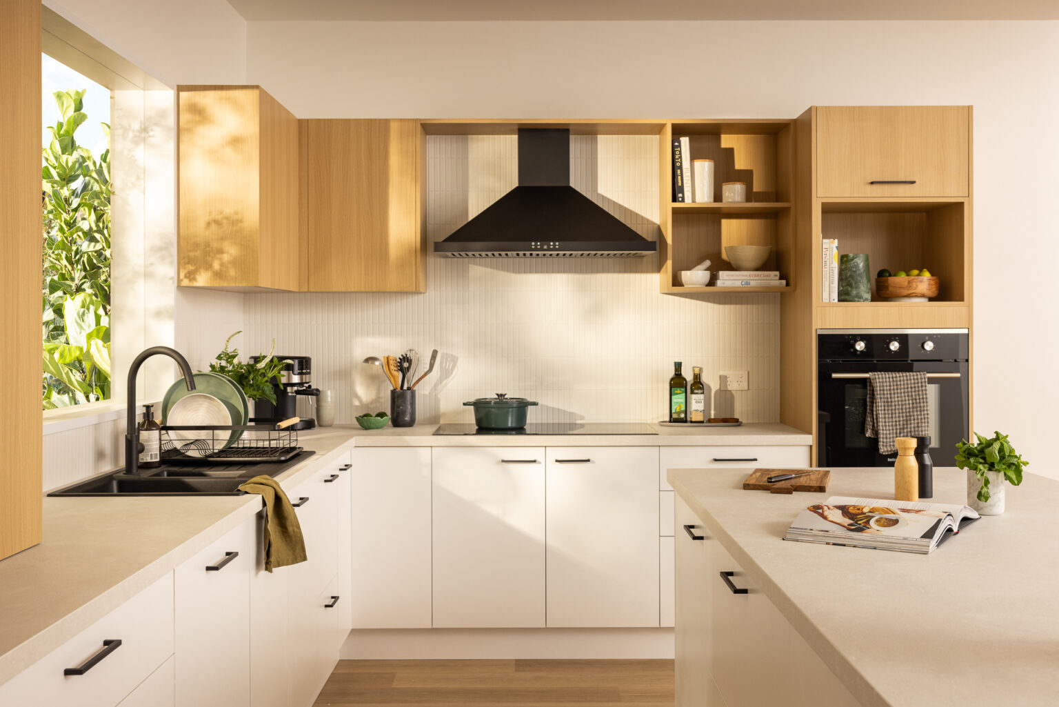
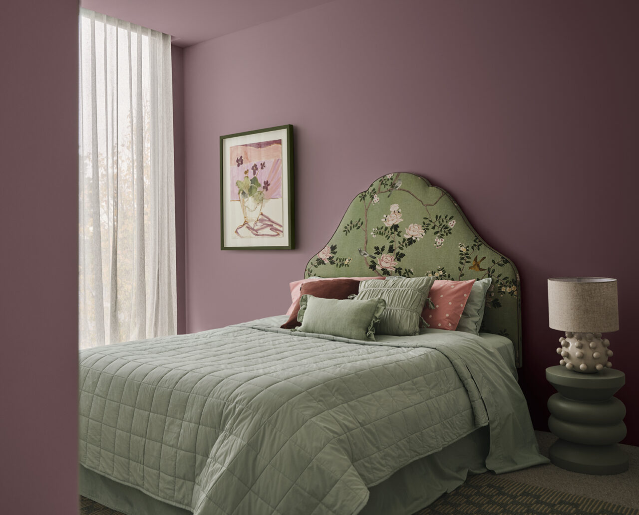
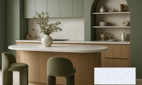
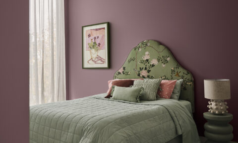
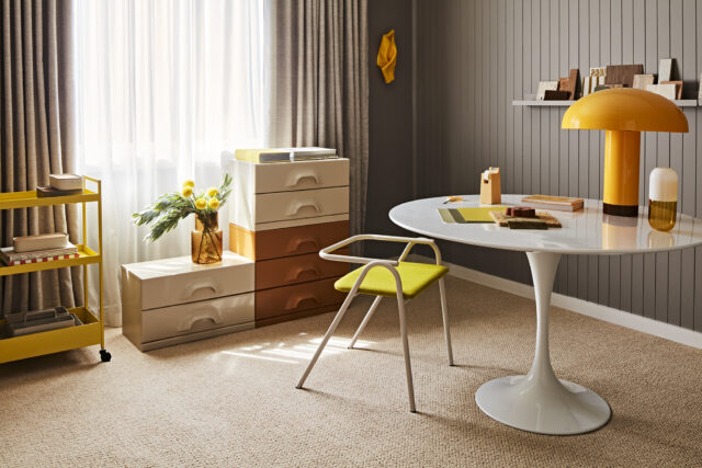
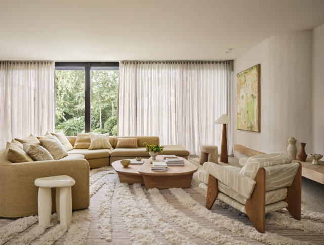
Soft colour in familiar forms. Think cushions, throws, lamps, artwork, rugs or painted joinery rather than walls if that feels intimidating. Muted tones, chalky finishes and layered shades of one colour family are often easier than high contrast. Colour doesn’t have to shout to be effective, the smallest amount can still completely shift a space.
What’s the biggest misconception about using colour in homes?
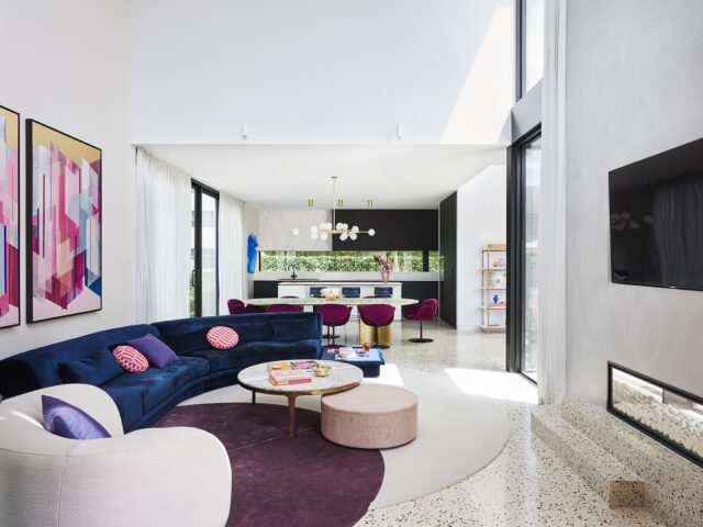
That colour is risky and neutrals are safe. Poorly considered neutrals can feel flat, cold and emotionally disengaging. Colour, when used well, actually creates character and the specific mood you want in your space – it’s also great at hiding flaws and creating balance. It’s not about being bold for the sake of it but rather creating atmosphere. Another misconception is that colour dates quickly – bad application dates but thoughtful colour rarely does.
How can people test colours in their home before making the commitment, beyond paint swatches stuck on the wall?
Instead of tiny swatches, always paint large sample boards and then move them around the room throughout the day because colour can shift dramatically with light. Use coloured objects like cushions, throws or art to see how the hue behaves in context of the space. You can also use those large sample pieces to place behind shelving or within joinery cavities to help visualise the impact. Digital tools are improving, but nothing replaces seeing colour interact with real materials and light.
We’ve endured years of neutral-dominated interiors. What are the psychological effects of living in a colourless space?
There is a reason that padded cells are devoid of colour. Lack of it can definitely help create calm – but long periods can suppress our energy and create feelings of emptiness, sadness and apathy. We are sensory beings and respond to variation, warmth and stimulation. Colour improves mood, mental clarity and can ignite particular feelings in us – which can mean we are more connected with our spaces and happier overall.
How does colour influence mood, energy and wellbeing in the home?
Colour is one of the most powerful emotional tools in interiors. Warm tones can comfort and ground, cool tones can calm or focus. Saturated colours can energise, while softer hues can soothe. The key is matching colour to function or mood. Bedrooms should support rest while kitchens and living areas can handle more vitality.
Why do you think there’s been so many polarising conversations around Pantone’s Colour of the Year?
This is a hard one to answer in a short paragraph. We actually recorded an episode on the Design Anatomy podcast that goes into this in more detail if you want the full rant! At a high level, when a single colour is positioned as a universal solution, it ignores nuance, culture and personal taste. Colour is deeply personal, so of course people react strongly when it’s presented as definitive.
This year’s choice felt especially polarising because many people read it as tone deaf. With so much global unrest and rising extremism, the idea of a gentle “reset” doesn’t quite land. We’re not in a moment of resolution or fresh starts. We’re in a moment of finding our voice, embracing differences and standing our ground. For me, 2026 doesn’t feel like the year for white.
As a trend forecaster, I can see how Pantone landed where they did. But I think they either underestimated how the colour would be interpreted culturally, or deliberately wanted to spark debate. Colour of the Year is a marketing tool, after all.
Can you share five key pieces that are a great way to introduce colour to the home?
Here are five great ways to introduce colour:
- A vessel or a vase – Australian brand Dinosaur Designs is always en pointe for colour.
- A cushion or throw – Kip and Co is a great place to start.
- A table lamp – Fenton and Fenton have some cute colourful options.
- A rug – check out Double’s range, especially their collab with Jono Fleming
- A side table – I love the Foldy side table by Dowel Jones.
The takeaway? Trust your instincts, start small, and remember that colour, when used well, creates the atmosphere you actually want to live in.
Find more of Bree’s work at:
Bree Banfield | Instagram | Design Anatomy Podcast
–Lexi Kentmann is a PR, brand marketing, events, copywriting, content and production whizz.