By Kellie Brown
What is colour blocking?
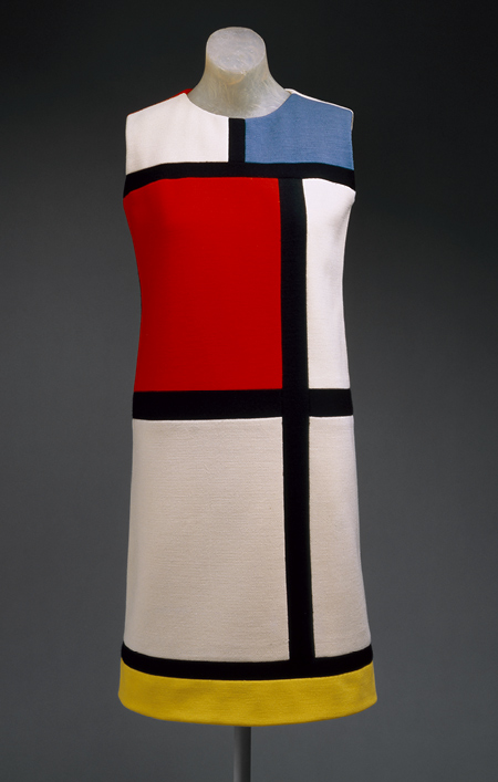
Colour blocking is a composition of blocks of colour used in a variety of design forms. It all began in the 1960s when fashion designer, Yves Saint Laurent created an iconic collection of dresses referencing Dutch painter Piet Mondrian. Mondrian was known for his stark, geometric and colourful shapes. He was the pioneer of colour blocking. Coinciding with the Mod style of the time, Yves Saint Laurent’s collection used bold, separate blocks of colours in different hues. In 2010, the colour blocking trend re-emerged on fashion catwalks around the world. Over the past five years it has filtered through into interior design, and now floral design.
Fashion
Using colour blocks and contrasting colours, fashion designers redirect forms into different shapes. If you want to look skinnier, taller or have a slimmer waist, it is easy to do with colour blocking. Position dark blocks in the regions you don’t want to draw attention to. The eye is naturally attracted to remaining blocks of solid colour.
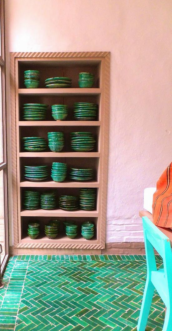
Interiors
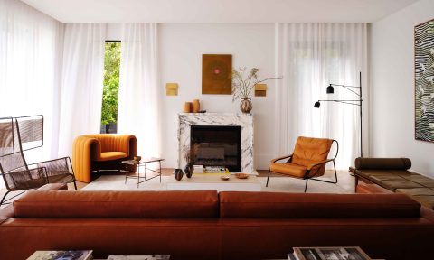
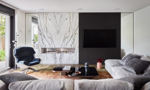
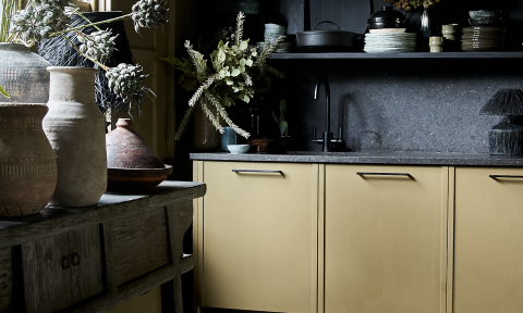
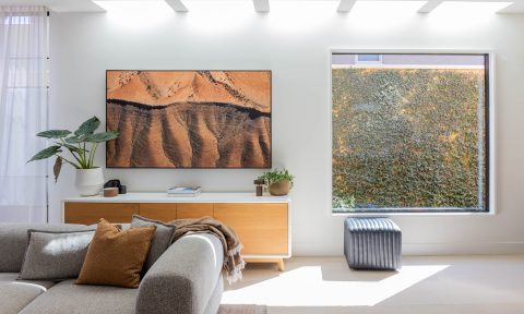
Inside the home the colour blocking trend follows the same ideal as in fashion. Colours are paired for their contrast and capacity to direct the eye. With interior design, the aim isn’t to conceal. Instead, designers use colour blocking to highlight a feature and create atmosphere in a room.
Flowers
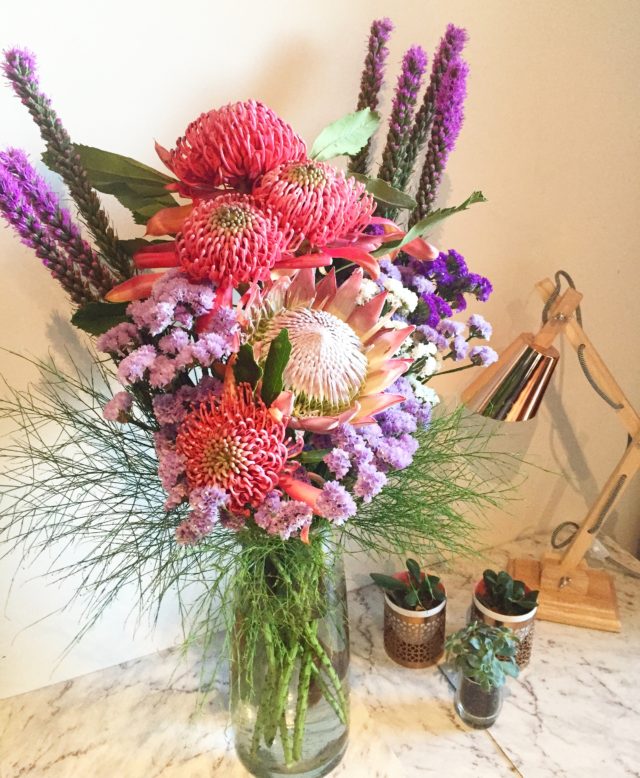
When I moved from fashion into floral design, I began exploring colour blocking in my designs. Unlike fashion or interior design, there is little commentary about floral design practices. People know a modern floral design when they see one but find it difficult to explain what makes it special. I’m hoping to change that by sharing some of our floral design secrets at Fig & Bloom.
Here is how we approach colour blocking.
Colour
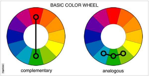
It all starts with colour, and there are two possible approaches. One approach is to choose complementary colours. These colours sit on opposite sides of the colour wheel. For example, pink might be paired with ice-green. Remember the intensity of colour hue is also important. Pair a soft toned bloom with soft coloured foliage.
The second approach is to select analogous colours, i.e. colours which are next to each other on the colour wheel. For example a deep red Peony paired with lush indigo Calla Lilies. It’s also possible to experiment with different hues of the same colour. This practice is known as colour toning.
Focal point
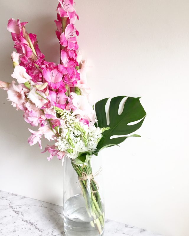
Colour blocking is all about directing to the focal point. When selecting secondary colours, it’s important to isolate points of focus using contrasting tones. For example, the focal point of this design is the tall pink Gladiolus. This focal point has been created by using the two tones of tall pink blooms which make strong impact through the centre of the piece. The eye is then drawn down the pink blooms to the white blooms and finally the flick of green foliage to the right.
Negative space
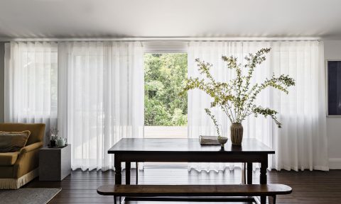
In fashion, negative space is used to direct the eye away from particular features of the body. Colours such as black, white and grey are often used to create this negative space. With interiors, designers can use a wide range of muted tones to create negative space. In floral design, we have a neutral palette of green hues.
Here to stay
Fashion designers, architects and interior designers all face the same design challenges. There are accepted practices but few genuine laws. When a practice is recognised long enough to feel like a law, often a designer comes along and makes their name by artfully breaking the law. But some practices are so deeply rooted that they endure, colour blocking is one of those practices.
— Kellie Brown is the creative director of Fig & Bloom flower delivery service, specialising in delivering fashionable flowers to beautiful homes.
