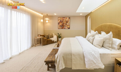
As the ensuite for the owner’s retreat, there’s a lot that has to be just right for this space, Scotty told the Blockheads as they set out to create the perfect main bathrooms, but were they listening?
For some, bold choices and luxury were the order of the day, with beautifully executed wet rooms that will catch a buyer’s eye. Others went for country charm and practicality and some missed the mark entirely.
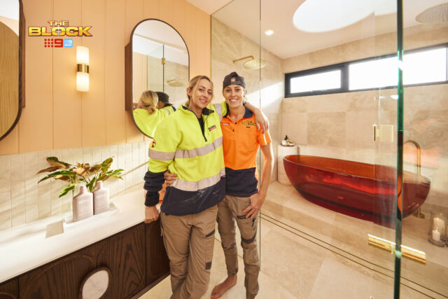
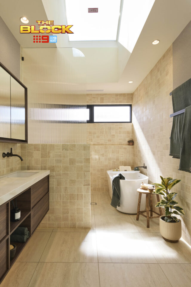
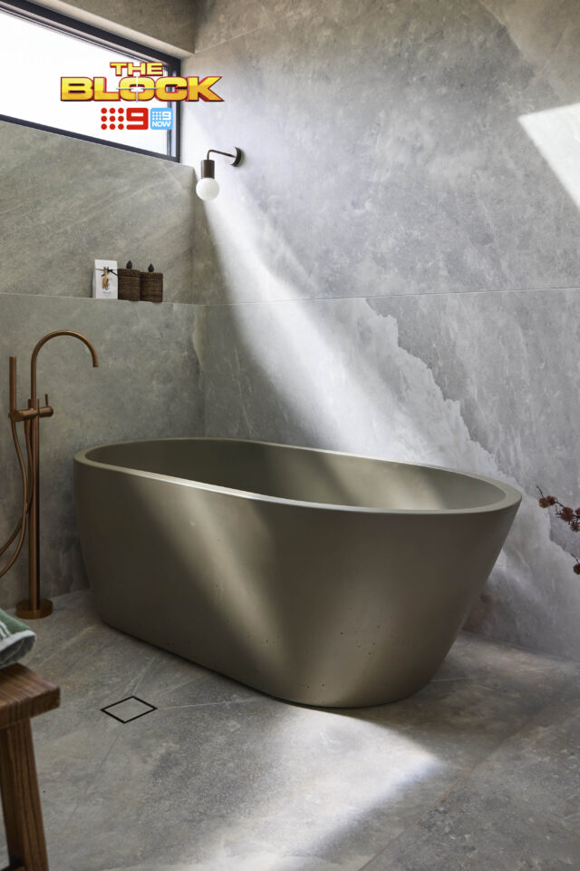
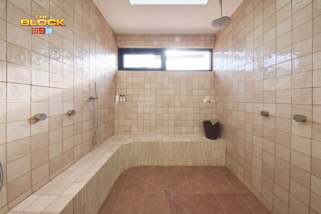
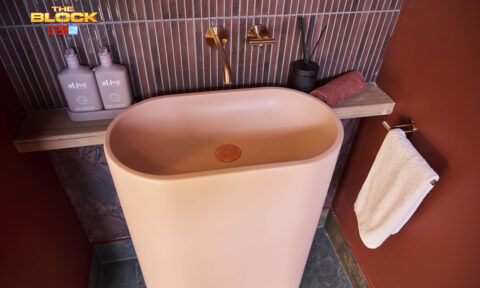
But what’s being talked about most on socials today? That resin bath! And as a hardcore bath lover (I’m in mine every night), I must admit I had a bit of a love/hate with it. But if you pushed me I’d have to say it was too polarising a choice. It didn’t do Han and Can any harm though, as they ended up winning!
Han & Can (First place): 28 (plus bonus point): 29/30
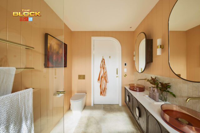
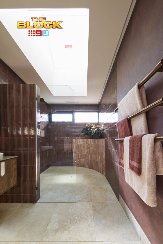
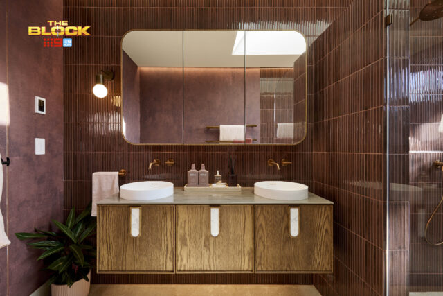
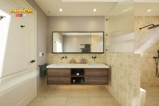
With its showstopper resin bath and bowls and complementing Block Shop artworks and Reece fittings, James Hardie cladding, a bold colour choices and high-end fixtures (a dimmer in the bathroom? That’s genius, Marty gushed) Han & Can’s main ensuite was a game changer, the judges agreed.
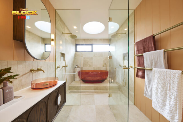
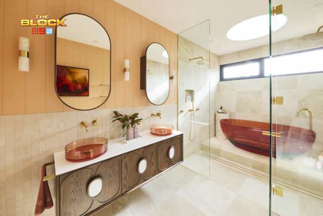
“Now that is marketable!” Marty said. “Mind-blowing,” Shaynna added. “A punch in the face with a velvet glove,” Darren added. Sitting in the bath looking up through the Velux skylight, Shaynna noted the perfect execution, well-planned styling including Ginger Living Essential Oils and the al.ive Shampoo, Conditioner and Wash plus Hand Body wash and Lotion sets, all adding up to the ideal space for the area.
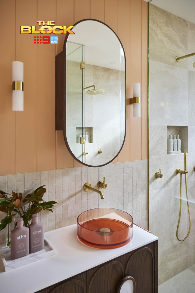
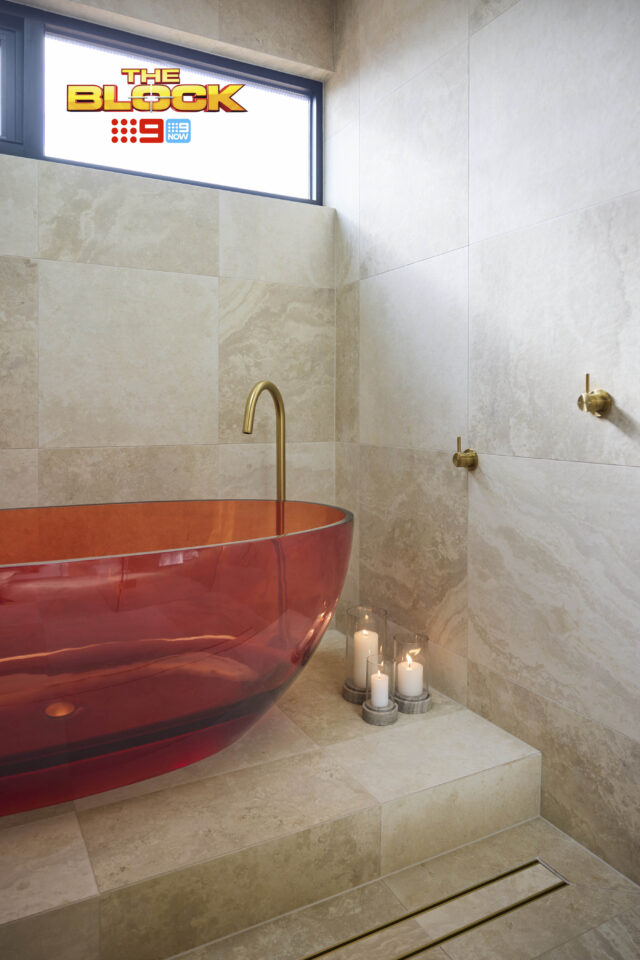
Product picks: That $6000 resin bath | Autumn palette artwork
Emma & Ben (Second place): 28/30
With country browns softened by a pink-undertone Beaumont tile this was mid-century western at its best, Darren said as he took in Ben & Emma’s main ensuite. “Yee hah!” he yelled, “I love it!”.
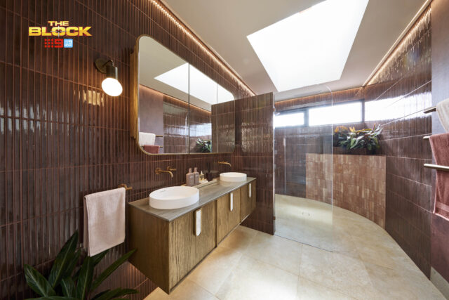
From the shower big enough for all three judges at once to the nib wall with curved glass topper, “rich organic and classy” tapware and beautiful Zuster vanity and shaving cabinet, layered with styling touches including the Ginger Living Essential Oils and the al.ive Shampoo Conditioner and Wash sets that brought it all together, this was a team heading in the right direction, Shaynna said.
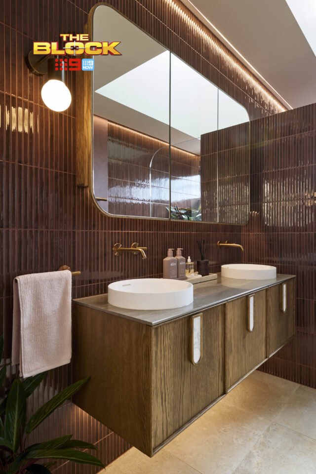
Only the lighting plan let them down, all three judges agreed, with the moodiness of the space not enough to balance the lack of practicality.
Product picks: Kitkat grape emboss gloss tile | Wall light
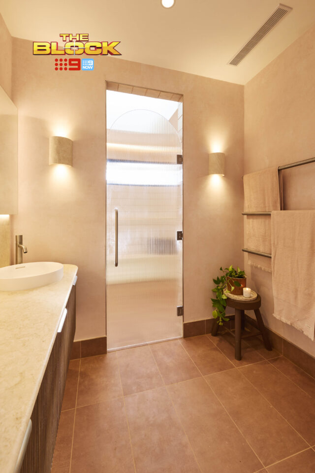
Robby & Mat (Third place): 27.5/30
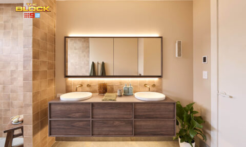
Grasscloth wallpaper, textured tiles, a spacious vanity, the perfect tiles and tapware, this was a bathroom that felt, Marty said: “International… like a high-end London hotel.”
But was it perfect? Not quite, Shaynna said. Even with the beautiful al.ive Skincare set, incense holder and Handwash and Lotion, the styling was a bit cliched, cluttered and not quite luxe enough.
A second showerhead would have been a great idea, Marty added, and more attention to details such as grout lines should be taken. Sophisticated but lacking the punch of houses one and two, this was a good bathroom, he said, but it could have been great.
Product picks: Grasscloth paste the wall wallpaper | al.ive skin Glow Set
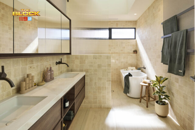
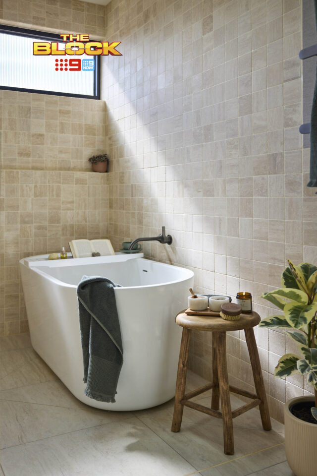
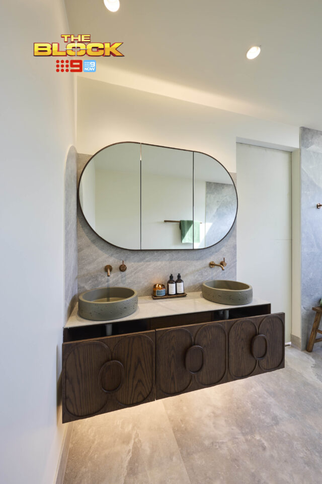
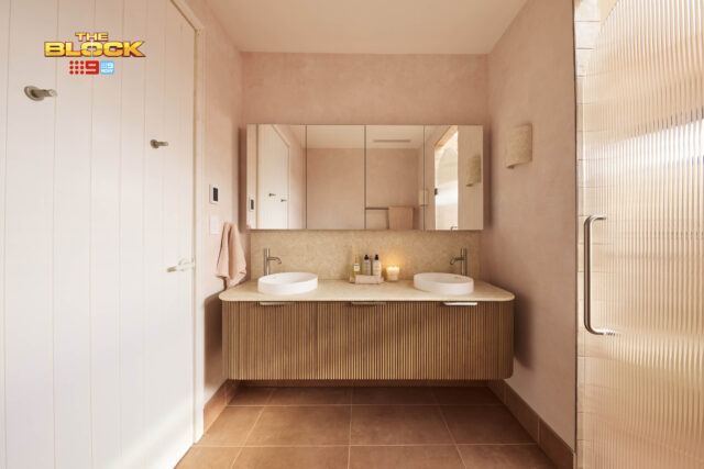
Sonny & Alicia (Fourth place): 26.5/30
“Ooh la la!” said Darren as he took in the huge slab tiles from Beaumont in Sonny & Alicia’s main bathroom, “That’s pretty!” As a background for a stylish and sophisticated space, with a beautiful Nood Co bath and matching basin, the perfect vanity and the best styling the judges had seen, it was a room that would photograph beautifully, Marty said and draw buyers in.
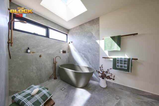
But by changing the room’s layout, the toilet was now on display as you enter the room, he pointed out and that was a worry. The main pieces felt pushed into corners, with vacant space in the centre. Eight out of ten buyers would still love this, Marty said, but was that enough?
Product picks: Olive freestanding bath tub | Lorient timber stool
Britt & Taz (Fifth place): 21.5/30
Twin nib walls separating the shower from the bathroom were a great idea, the judges said as they walked into Britt & Taz’s bathroom, but did the shower really need to be bigger than the rest of the room? “I’m not sure that’s the right decision,” Marty said and his fellow judges soon agreed.
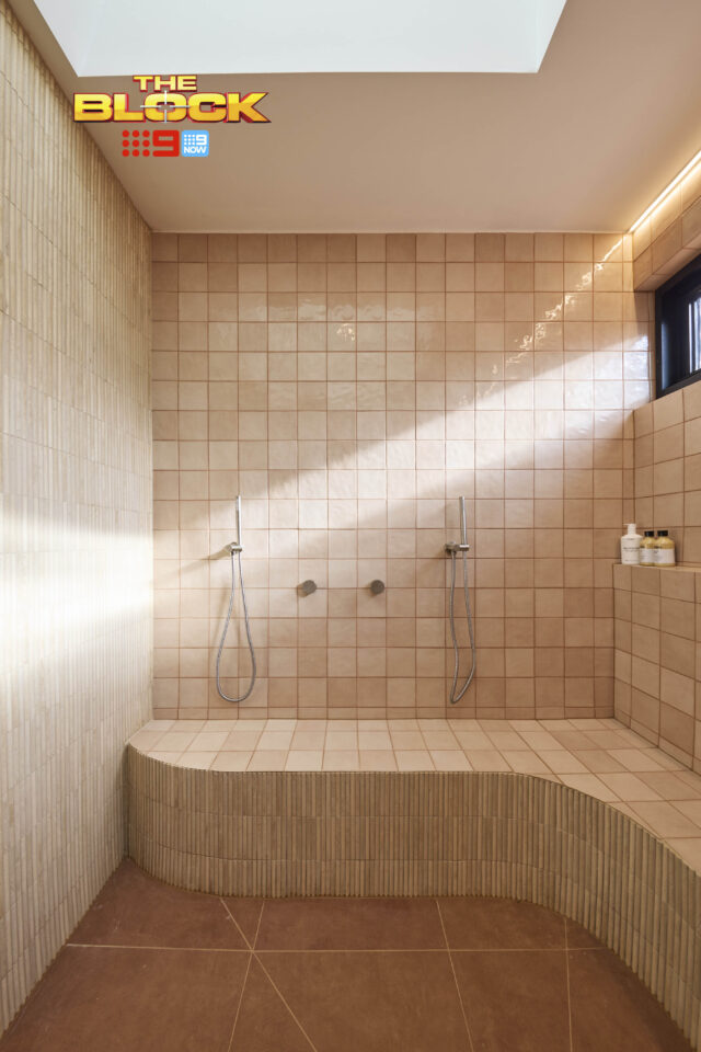
The twin showerheads next to each other were a nice touch, they thought, the stone on the vanity brought a calm and tranquil feeling as did the Ginger Living Crystal Candle and Hand and Body Oil, but the tapware should have been a different colour and the whole space just felt odd with some much real estate devoted to the shower.
It was nice, Marty finished, but with the floor-to-ceiling tiles, and no bath in the too-large shower area it felt “less like a bathroom and more like an abattoir”. Ouch!
Product picks: Shaving cabinet | Travertine natural emboss mosaic tile
What did you think? Love to know your favourite in the comments!
Comments
As an interior designer, I’m not a fan of ‘The Block’ for myriad reasons. That said, I enjoy seeing the results. Emma and Ben took a risk, and it paid off. Their’s was #1 for me. Han & Can did a fantastic job. I applaud their colour palette, and ignoring Scotty’s sly dig at their choice of basins saying they “looked like salad bowls” without him fully understanding the context. However, their choice of V-groove for the walls was questionable – great colour – it would have been more luxe to have tiles. And I truly dislike open showers so close to baths. But like most interior design work, it’s all personal taste. Thanks for the opportunity to comment, Jen. Cheers, Penelope
I wasn’t a fan of the bathroom that won…I remember that colour from the 70’s and 80’s…but they do say colour schemes go around in cycles…probably Robby and Matt’s will be the one to stand the test of time.