Dulux has revealed its annual Colour Forecast for 2026, which sees a rise in calming and connecting colours in response to continued global uncertainty and digital fatigue.
Curated into three palettes – Ethereal, Elemental and Evoke – this year’s forecast champions warm earth-based neutrals, rich burnt oranges, caramels, and greens such as sage, moss and spearmint. Soft pinks and vintage rose tones also feature, alongside tender pastels and muted berry shades. While each of the three palettes are distinct, there is universal yearning for wellness, stability and reconnection that can be seen within each of the palettes.
Led by the Dulux Colour Team, comprising of colour and design manager Lauren Treloar and colour and communications manager Andrea Lucena-Orr, the annual Dulux Colour Forecast is grounded in extensive, year-round research into global and local trends set to shape Australian interior design and the way we live. Since its inception in 1999, the Forecast has become a trusted guide for designers, architects and homeowners alike.
“As part of this research, the Dulux Colour Team closely collaborates with international brands, attends design shows and seminars, runway presentations, and global events such as Milan Design Week,” says Lauren. “We also draw from customised trend research and insights accessed through Dulux’s global network across the UK, Europe and Asia-Pacific. As members of the Color Marketing Group (CMG), we analyse key reports from CMG as well as forecasting firms such as Color Hive – Mix Magazine and LS:N Global to ensure our forecasting reflects what’s ahead.”
Andrea adds: “In times of uncertainty – including today’s cost-of-living pressures and geopolitical unrest – consumers tend to gravitate toward stability in design. That’s why we’re seeing a continued preference for warm, comforting colours in this year’s palettes. Colour has the power to lift spirits, offer emotional reassurance and bring a sense of calm into our homes.”
She adds: “Australians are feeling digitally overwhelmed. There’s a strong shift towards emotional reconnection – with ourselves, with others, and with nature. This translates into a need for warm, calming interiors that encourage reflection and joy.
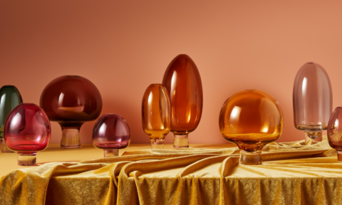
“Among the most notable changes this year is the rising dominance of spearmint green, complemented by soft earthy pinks that pair beautifully with browns and burgundies. These trends mirror our collective desire for grounding and positivity. In contrast, brighter colours are used sparingly to bring personality and optimism into spaces. These include playful berry hues, pinks and rich accents such as burnt orange and vintage pink, layered over tactile materials.”
Lauren adds: “Each palette has been thoughtfully designed allowing consumers to mix and match shades with ease by staying within the confines of each palette. This flexibility empowers people to personalise their spaces in a way that truly reflects their style and lifestyle.”
ETHEREAL
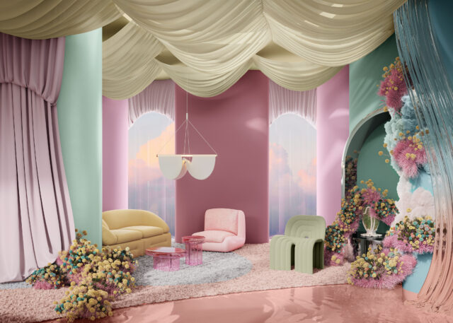
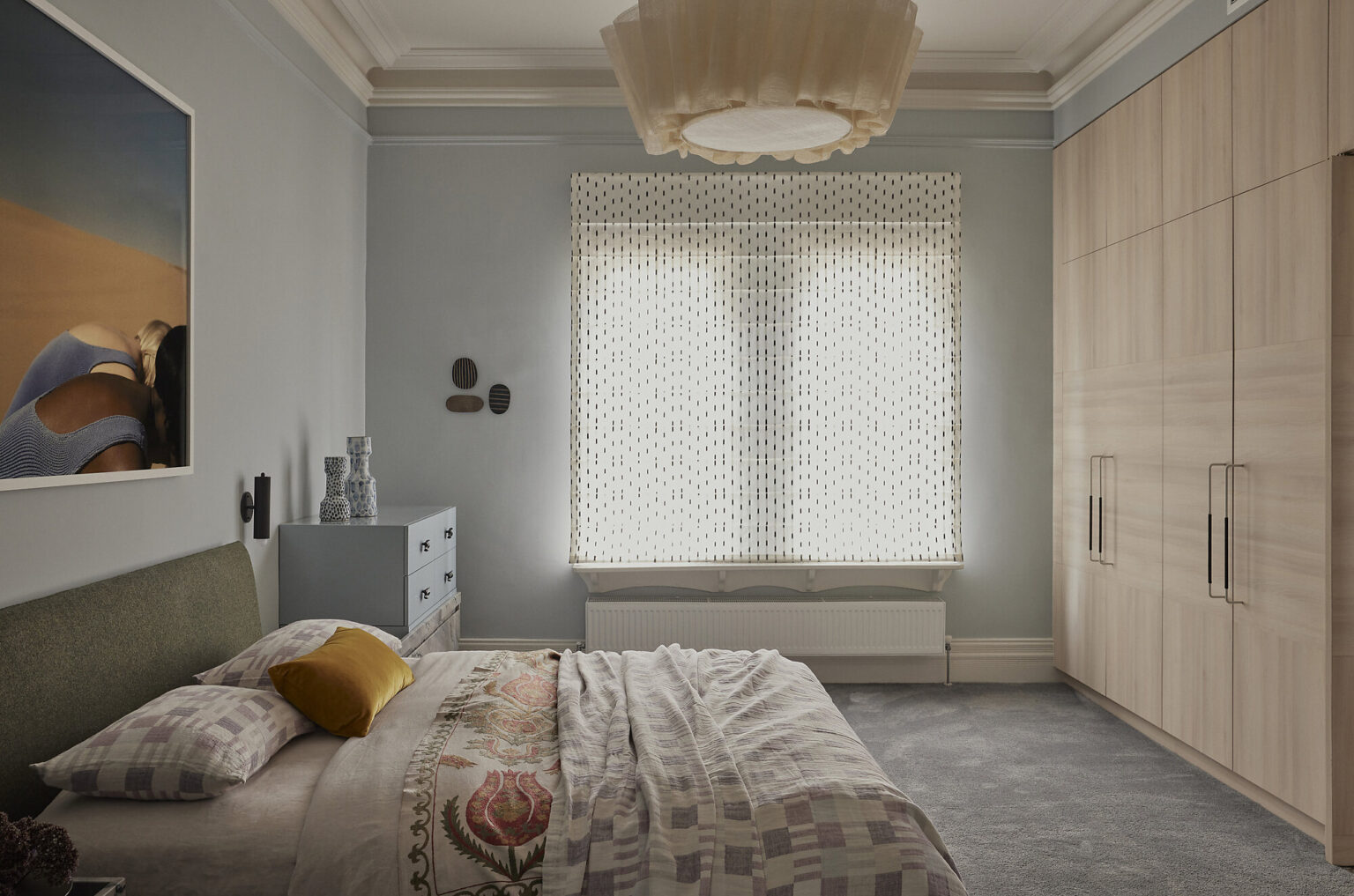
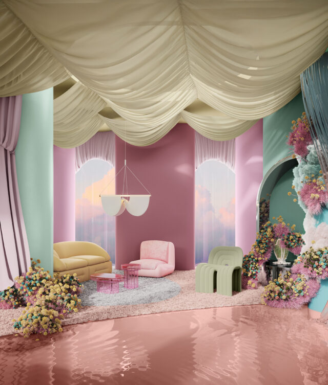
Dulux Ethereal is a soft, feminine, and whimsical palette that offers a magical celebration of nature’s nurturing power. Designed to uplift and soothe, it draws on themes of wellness, quiet strength, and spiritual self- care. This delicate yet playful palette encourages a reconnection with the natural rhythms that shape our lives over time. Inspired by fantasy fiction, and restorative rituals, Dulux Ethereal provides a gentle escape – offering calm and comfort in a time of global uncertainty.
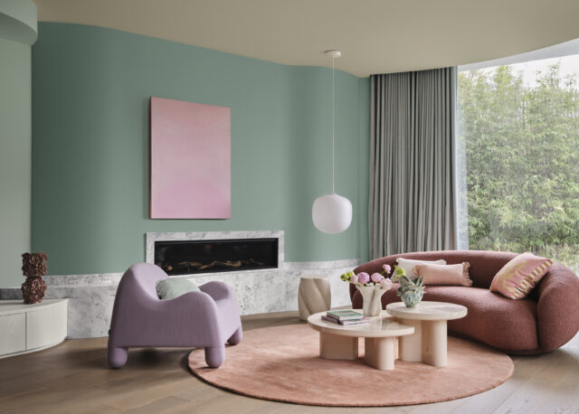
“Dulux Ethereal features a delicate pastel-like blend of soft and mid-tone hues – gentle greens, mauves, and blush pinks – that evoke a sense of serenity and joy,” says Lucena-Orr. “With romantic tones like Dulux Savin, Dulux Different Pink and Dulux Mask, alongside subtle pastels such as Dulux Tiamo, Dulux Blue Shell and Dulux Soft Fresco, this palette feels playful, uplifting, and quietly luxurious.”
“This is our most expressive palette,” says Treloar. “The materials feel soft and inviting – like soft oak, bleached wood, and plush fabrics with gentle botanical designs. Shiny surfaces like glass and chrome bring light, whilst sand-blasted textures soften the shine, creating a dreamy, layered look.”
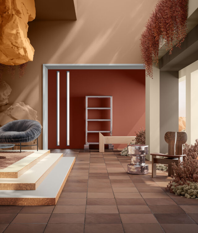
ELEMENTAL
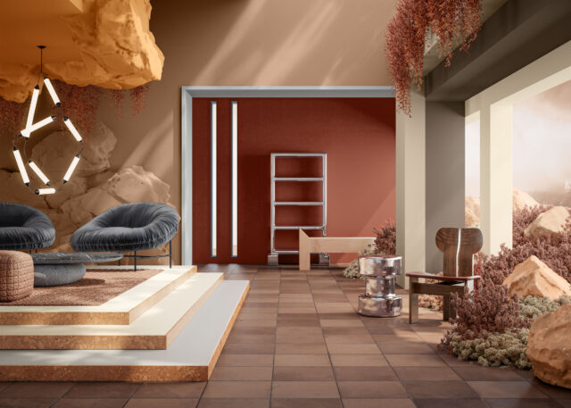
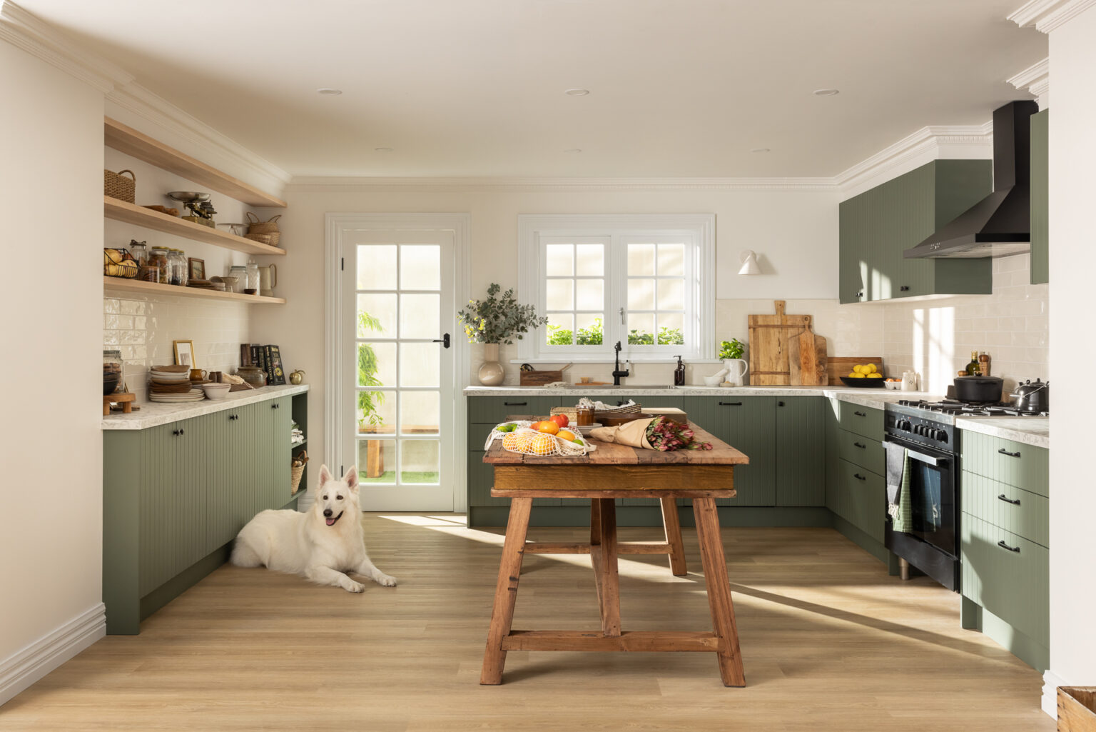
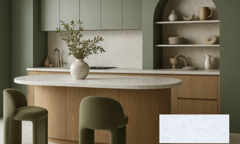
Dulux Elemental offers a calm, grounded response to the overstimulation of modern life. Rooted in anti-burnout culture, this brutalist-inspired style embraces slow living, emotional clarity, and purposeful simplicity. The mood is calm, thoughtful, and intentional, with pieces that feel solid, enduring and quietly beautiful.
“Dulux Elemental is a tonal, grounded palette built around warm whites and neutrals such as Dulux Blended Cream and Dulux Hog Bristle Quarter and enriched with golden brown hues such as Dulux Caramel Sundae and Dulux Coffee Dust,” says Andrea. “Subtle layers of grey, including Dulux Clear Concrete and Dulux Reckless Grey, bring stillness and structure, whilst darker charcoal tones add depth and dimension. The result is a timeless, cohesive palette that feels quietly confident.”
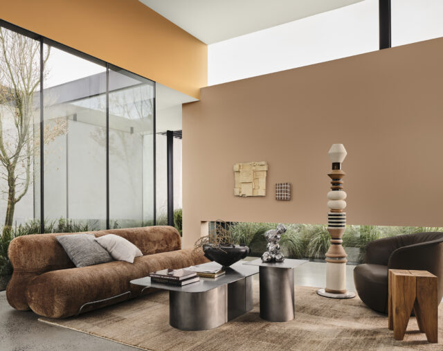
“Dulux Elemental reflects a desire for thoughtful consumption and balanced living. It’s not about having less for the sake of it but making room for what truly matters.” adds Andrea. “The materials are made to be durable and products are designed to be easy to repair – think clean linens, raw concrete, and polished marble, which combine both style and practicality. Chrome and aluminium bring a modern, industrial feel, softened by warm tones and small hints of copper.”
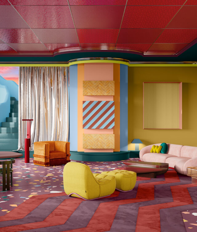
EVOKE
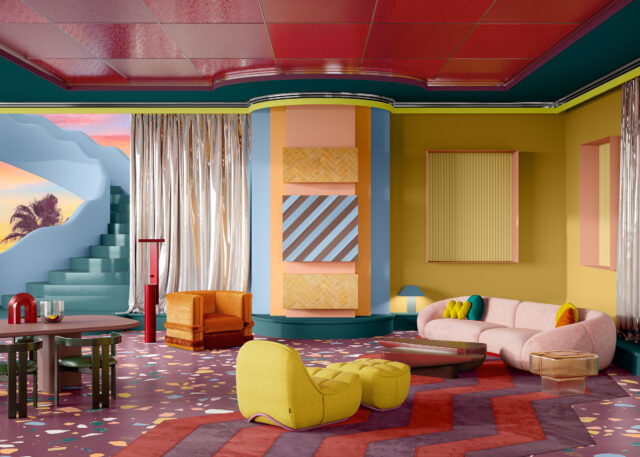
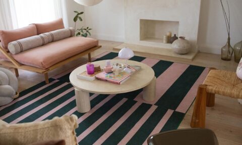
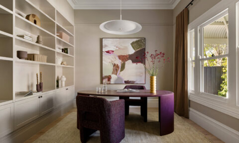
Dulux Evoke is an optimistic, bold and expressive palette that channels individuality, reminiscence and emotional warmth. Inspired by maximalist interiors and ‘nana chic’, the Dulux Evoke palette reflects a conscious shift towards circular design – celebrating sustainability, repurposed materials, and the beauty of imperfection. This sentiment is reflected in the rise of antique shopping for one- of-a-kind pieces, and the growing number of designers creating new works inspired by the elevated design of the 50s, 60s, and 70s.
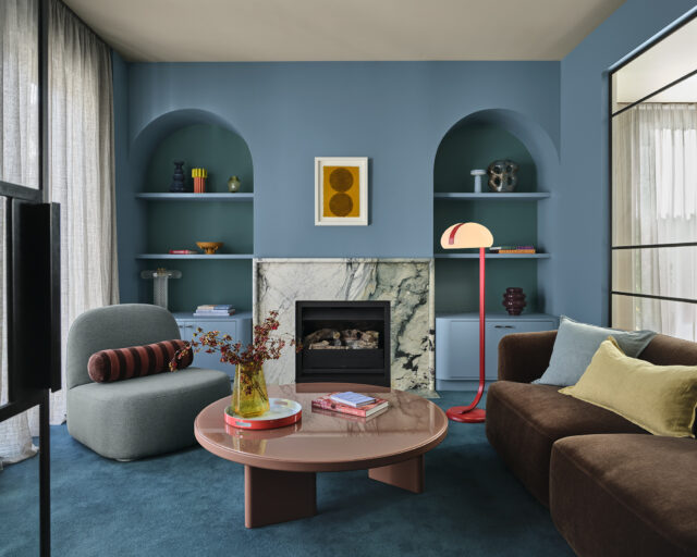
“Dulux Evoke is likely to be popular with home enthusiasts as the colours lean into deep, comforting tones rather than bright hues,” says Andrea. “Blush pinks like Dulux Baked Clay, burnt oranges like Dulux Magic Melon, and warm golden tones such as Dulux Germania are layered with deeper hues like Dulux Misty Grape, Dulux Wink and Dulux Red Jacks to create personality and depth.”
“Dulux Evoke favours eclectic, character-filled styling,” adds Andrea. “It features vintage-inspired materials, handcrafted elements, and curated clutter making spaces feel alive and layered, adding to our collections over time. Chrome and aluminium replace gold, whilst bold colour layering and clashing prints add texture, charm and a sense of layered character.”
Tips for using Dulux Colour Forecast 2026 hues at home
When considering painting your walls, mid-tone colours such as Dulux Wink and Dulux Baked Clay from the Evoke palette, complement the space best when painted on all four walls – particularly in bedrooms and formal spaces.
To brighten up walls in a room, warm whites like Dulux Hog Bristle Quarter from Dulux Elemental reflect natural light beautifully making any room feel both inviting and peaceful. For cosier, more intimate spaces, you might like Dulux Savin or Dulux Mask from Dulux Ethereal palette.
Feel free to get creative. Painted ceilings are having a moment, but things like dado rails, doors and trims are such underrated spots to play with on-trend colours from the Dulux Colour Forecast. These little touches can completely transform a room and make it feel more personal. You can also use soft furnishings like cushions, bedlinen, reupholstering a chair or a bedhead – or vessels and tableware to introduce colour to your interior.
If you’re after a subtle lift, mid-tone blues like Dulux Wink from Dulux Evoke works well in living areas and bedrooms. And for something more playful – say, a kids’ room or home office – I love pairing romantic tones like Dulux Savin or Different Pink with pastels like Dulux Tiamo or Dulux Blue Shell.
To make sure you get the colours just right, you can order Dulux A4 samples or Sample Pots from dulux.com.au in your chosen colour(s) and see how they look in your home’s natural lighting. Dulux has an online colour advice team and a Colour Design service if you would like a design professional to assist in curating your space.