The coveted Dulux Colour Awards 2025 were handed down at National Gallery of Victoria, Melbourne, last night and this morning, we’re taking a closer look at the winner and runners up in the Residential Interior category.
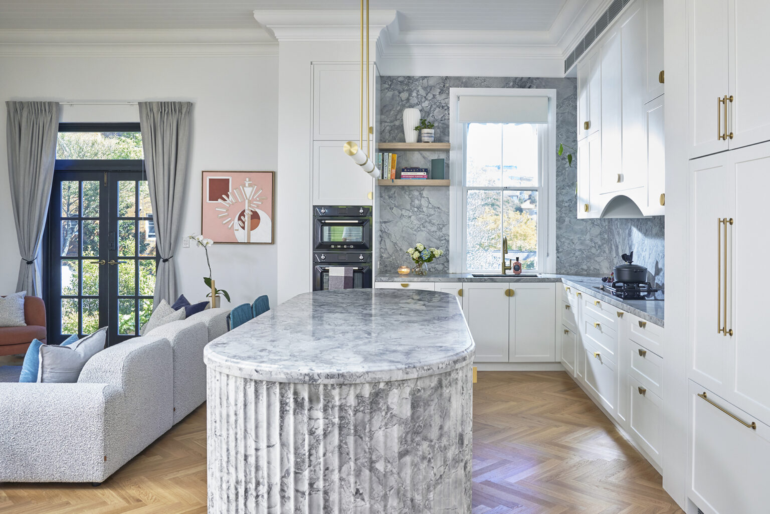
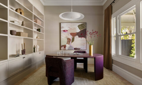
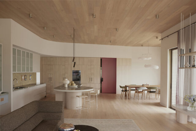
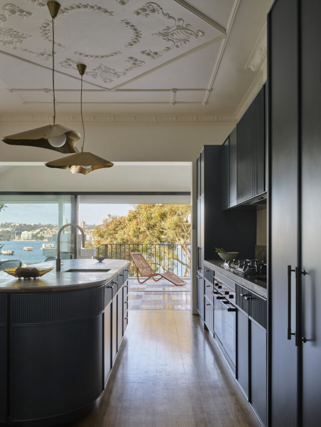
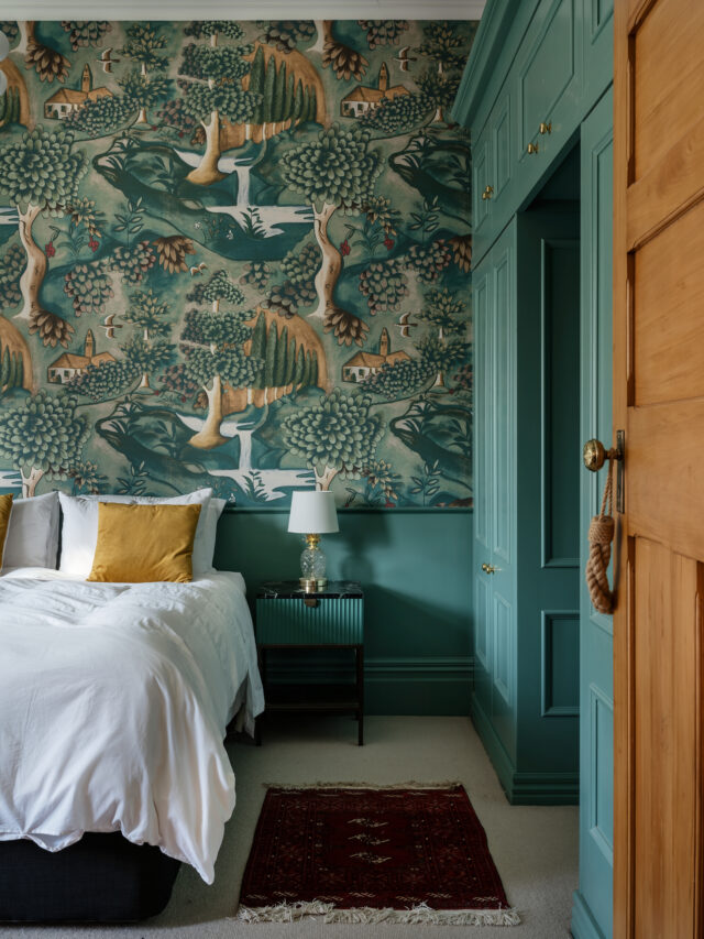
WINNER: Studio Doherty for Elonera House
Dulux paint colours used: Anoxic Dark Grey; Blue Balm; Calandre; Camellia; Palmer; Receding Night; Duralloy Surfmist; Vipere; White Exchange; White Exchange Half; Duratec Zeus Black.
Judges’ comments: “Elonera House has been exquisitely composed, with pitch-perfect tone, rhythm and dynamics.”
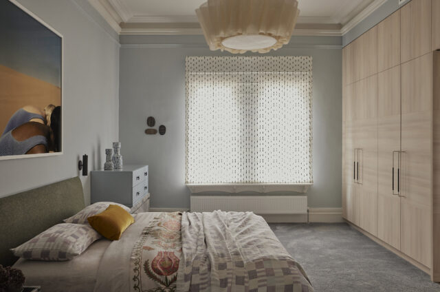
There’s an ethereal quality to Elonera House by Studio Doherty, a weightlessness and translucency that perfectly captures the goal to create a welcoming sanctuary from heritage beginnings. It epitomises the architect’s understanding of colour psychology to specify a palette with such nuance as to create a calm, even mellow, yet uplifting spatial sensibility. The overall composition is delicately balanced but, when dissected, reveals some unlikely participants. Take the inspired casting of Dulux Calandre as the predominant hue, proving remarkably versatile in a range of lighting conditions and in combination with brushstrokes of other colours, such as duck-egg blue, dusky pink and pale yellow. Tonally they click neatly together but there remains just enough contrast to sustain the curiosity and excitement of these spaces. It is not only the combination of colours that delights; it is their precise placement, proportions and ratios that are so exquisitely handled.
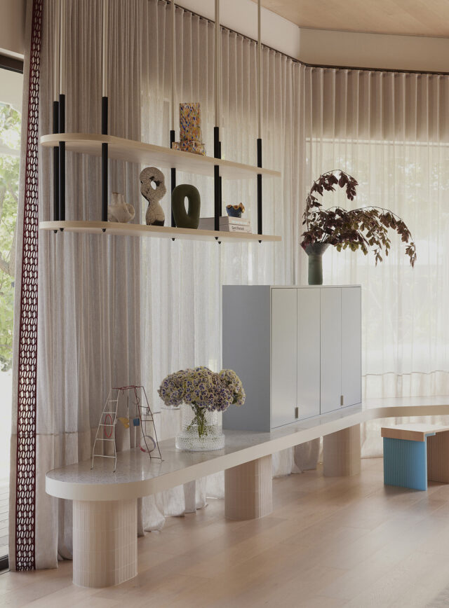
COMMENDATION: Kennedy Nolan for Rosherville House
Dulux colours used: Calf Skin; Eastern Gold; Nile Reed; Rusted Crimson; Wainui Beach; Wet Sand
Judges’ comments: “It amounts to a spatial and experimental exercise in nostalgia and the architects are commended for their intelligent, controlled execution.”
Rosherville House by Kennedy Nolan, on Sydney’s North Shore, has a beautiful cadence to it, its contemporary transformation honouring the 1980s original brick pavilion-style structure. Characterised by thoughtful and subtle interventions, the design resolution eschews grand gestures in favour of confident compositions. A tonal palette and layers of textured materials clad the architectural features of the living areas – a voluminous double-height ceiling above the kitchen, which opens to a planted courtyard – with details highlighted in bolder hues to sync with the retro furnishings. The sophisticated yet relaxed ‘80s lounge vibe gives way to bedrooms and bathrooms swathed in contemporary hues of muted blues, greens and tans.
COMMENDATION: Arent & Pyke for Wharf House

Dulux colours used: Antique White U.S.A.; Bread Crumb; Bread Crumb Half; Buttercookie; Copycat; Salty Seeds; Snowy Mountains Half; Spanish Olive; Wily William
Judges’ comments: “The distinct palette of each room is tonally cohesive and, consequently, this family home feels refreshed, grounded and timeless.”
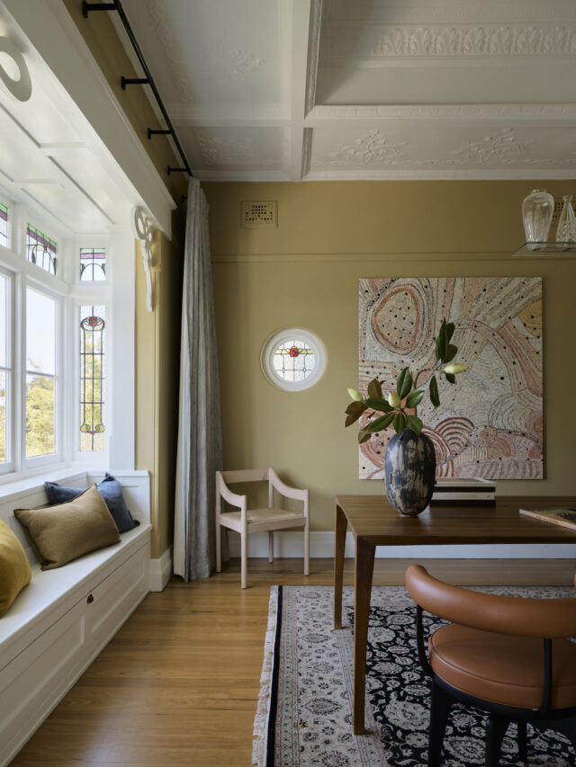
Contemporary renovations are at risk of overwhelming heritage integrity without a considered approach, and the role of colour in striking the balance is pivotal. Here, in an historic home overlooking Sydney Harbour, the architects have conceived of a palette to reinforce the dwelling’s original assets and, at the same time, pulled it firmly into the contemporary realm, while also embracing its context. Where the views are proximate, a deep marine has been used; where original leadlight windows are present, their jewel-like colours have been appropriated. Crisp whites delineate architectural elements, defining scale and highlighting the ornate ceilings. Butter yellow, clotted cream and whispering blue-grey adorn internal spaces and imbue them with a casual serenity.
COMMENDATION: Pac Studio for Lava Flow (also the New Zealand Grand Prix winner)
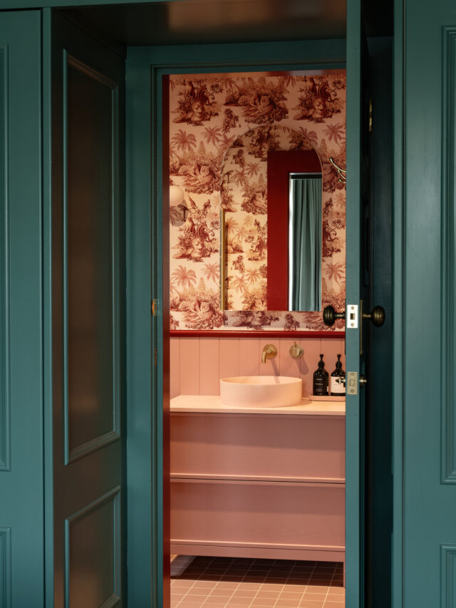
Dulux colours used: Cool Waters; Duvauchelle; Ellen; Epsom; Mornington; Silo Park
Judges’ comments: “As a whole, this home is a masterclass in colour use as an essential medium for mood, atmosphere and identity. The interplay of dark and light, dominant and recessive hues amplifies the architectural gestures and the sense of place.”
Uniquely sited within Auckland’s volcanic landscape, Lava Flow by Pac Studio is a home designed around the hues of its geographical context and boldly underpinning the entire scheme is Dulux Silo Park, a deep earthy crimson. It firmly reinforces the project’s connection to the site, playing a dominant role in the interior’s identity. Its liberal application defines the large geometric planes of a dramatic kitchen skylight and, in spite of its depth, this dense colour on the ceiling angles – the inverse of expectations – reflects light into the interior. Here the same hue is continued across walls and joinery elements and contrasted with a warm white for balance. Moving into the private zones reveals bedrooms of dark blue green and a bathroom of baby pink, united by exotically patterned wallpaper.
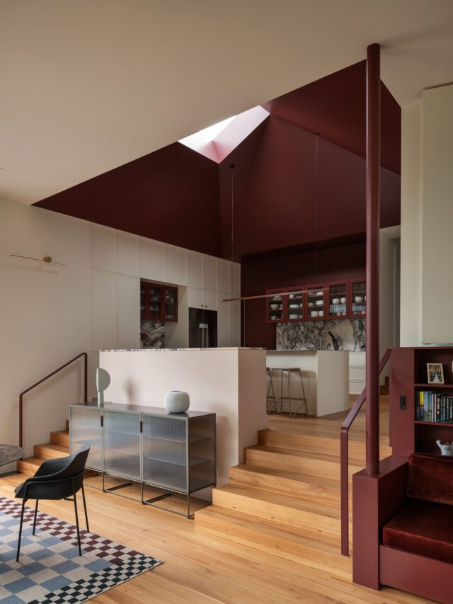
The 39th Dulux Colour Awards overall
“It never ceases to amaze us how conceptually courageous and strategically sophisticated the colour schematics are, year on year,” says Andrea Lucena-Orr, Dulux colour and communications manager. “Our aim with the Dulux Colour Awards is to reveal and reward the ultimate exemplars of architectural innovation using Dulux Colour as a central design device, therefore highlighting its unique potential to transform our built environment.”
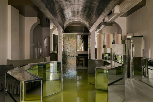
The Sarah & Sebastian Armadale store (below) by Richards Stanisich was Australia’s Grand Prix winner. It takes Dulux Delta Break – a striking green and juxtaposes it with reflective surfaces within faceted jewel-like spaces to elicit an ethereal effect of floating under a shimmering sea.
New Zealand’s Grand Prix winner was Lava Flow (already featured above) by Pac Studio. Its volcanic red ceiling and skylight, a dramatic red hue – Dulux Silo Park – referencing Auckland’s geographic context