We’ve just been given a peek into what some of the world’s greatest forecasters are seeing in terms of interior colours for 2027.
WGSN, one of the world’s most respected colour trend forecasters, in collaboration with Coloro, the design industry’s colour experts, have released their colour directions for 2027. And Wattyl have interpreted these predictions in a palette of hues for Australian homes.
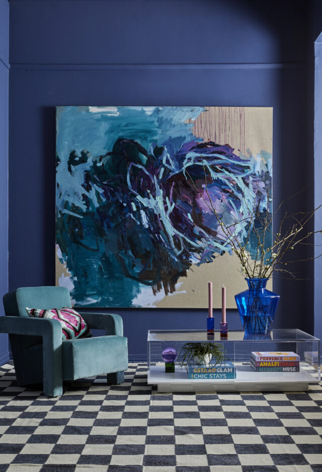
Colour of the Year 2027 is Luminous Blue, a vibrant, electric blue described as both a heritage colour (it’s a pigment used for centuries, having been originally derived from Lapis Lazuli) and a colour of the future, mirroring the hue of cobalt (the key ingredient of the lithium-ion batteries powering our current energy transition).


Having identified the over-arching theme of the 2027 colour trends as Interconnectedness, WGSN and Coloro have also announced four key colours to accompany Luminous Blue.
Interconnectedness is seen as integral to our daily lives, being the connections between light and dark, natural and technology and the past, present and future.While each hue in this collection is intensely beautiful, they are all decidedly versatile. They can, of course, be used as a full wall colour but can be used equally as effectively as pops of colour, in the form of textiles, furniture or artworks.
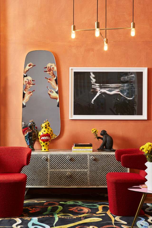
Energy Orange, a vibrant, saturated hue, demonstrates resilience in the face of intense change, not the least of which is climate change. It is seen as offering a sense of vitality and security, essential to satisfying the desire of many of us for safety and protection.


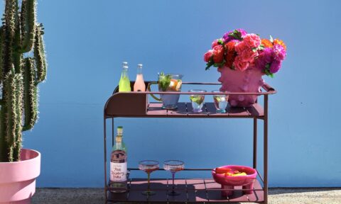
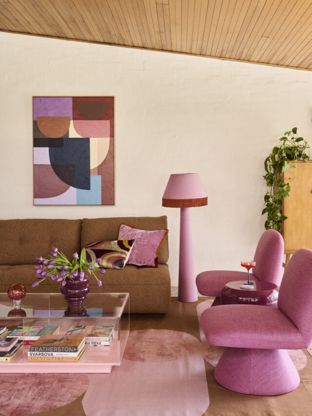
Pop Pink is joyful, uplifting and carefree, an essential tool in our drive to rise above the stresses of today’s living – it promotes fun, wellness and a little whimsy.


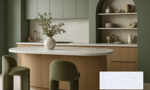
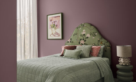
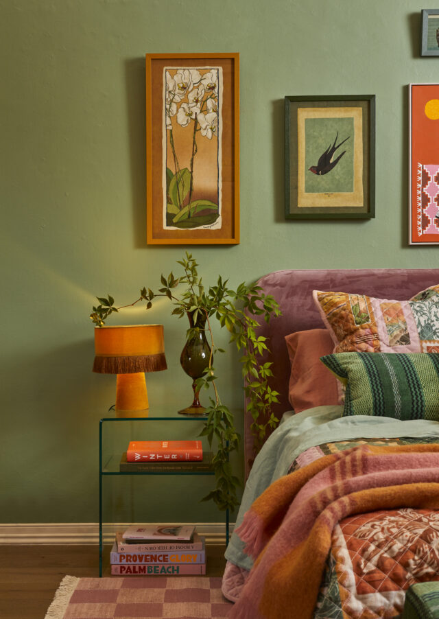
Meadowland Green, a nourishing mid-green, is a hue that imbues a space with rest and tranquility. It encourages us to slow down, embrace life and cherish relationships.


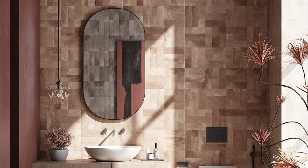
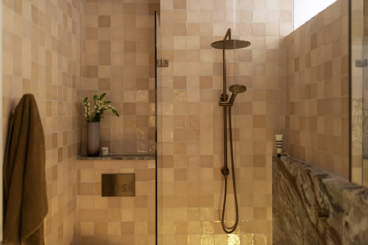
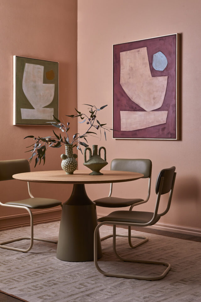
Clay is an earthy neutral with pink undertones. It represents the functional, natural elements of the earth that balance beauty and utility so perfectly. Clay embraces and enhances the many natural materials we are favouring for our interiors – stone, timber, leather and linens.


Wattyl’s current colour offering embraces all of these hues, and offers several tints and tones of each, ensuring consumers can adapt the look to suit their home’s architecture, aspect and existing furnishings.
Swatches and sample pots, together with cans of paint, of colours from the new Colour by Wattyl Fandeck, can be ordered online and in store at Wattyl Paint Centres.