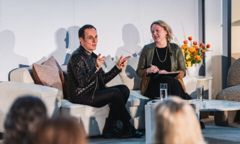
With the wrap-up of Milan’s annual design fair, Salone del Mobile, Australian paint brand Wattyl have released their annual take on the colour directions seen and how we can expect to use them in Australian homes.
The world’s largest design fair, Milan’s Salone del Mobile (21-to-26 April 2026), recognised as the international benchmark in interior design, once again gave us an inspired insight into what homes, hotels and public spaces are going to look like in the next few years.
The overall vibe was one of warmth and layered materiality – a step away from the sometimes stark minimalism of previous years – where craftsmanship and sustainability took central roles and colour palettes embraced the earthy hues of brown, ochre, terracotta, moss green and warm beige. The richer, deeper, more expressive hues of burgundy, aubergine and chocolate added a further layer of luxury and cocooning.
Unusually for Salone, many of the colour palettes on display reflected a lot of what we are already seeing in Australian interiors.


This palette direction reflects a broader movement in today’s interiors, whereby colour is used to build a warm, inviting ambience; a sanctuary offering respite from the turbulent world outside.
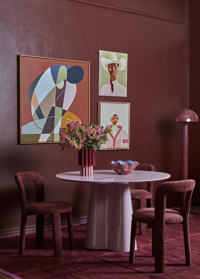
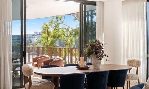
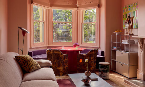
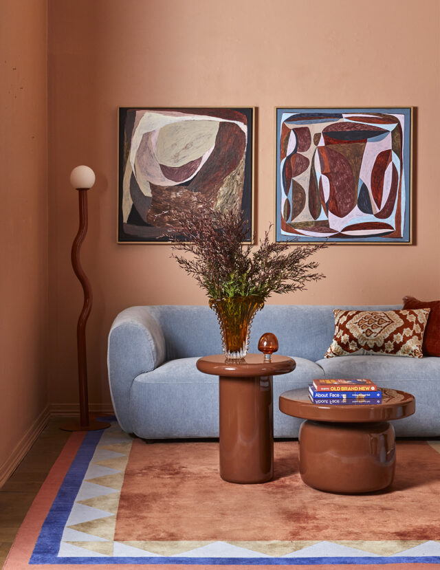
Materiality was a key focus at Salone, with textured, tactile and organic forms dominating, alongside sculptural shapes. The image above reveals how saturated hues, such as the burgundy of Wattyl Seductress, can be teamed with pops of pastels, as in the pink of Wattyl Tisty Tosty and the cerulean blue of Wattyl Veronica, to create a setting that is nurturing yet inviting and playful.


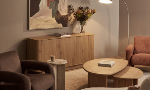
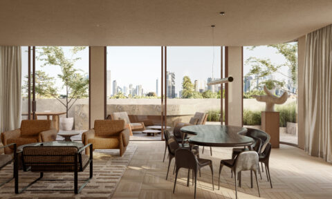
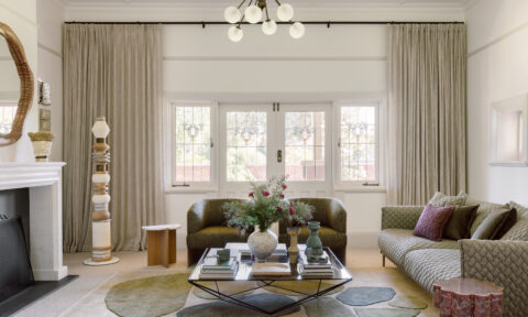
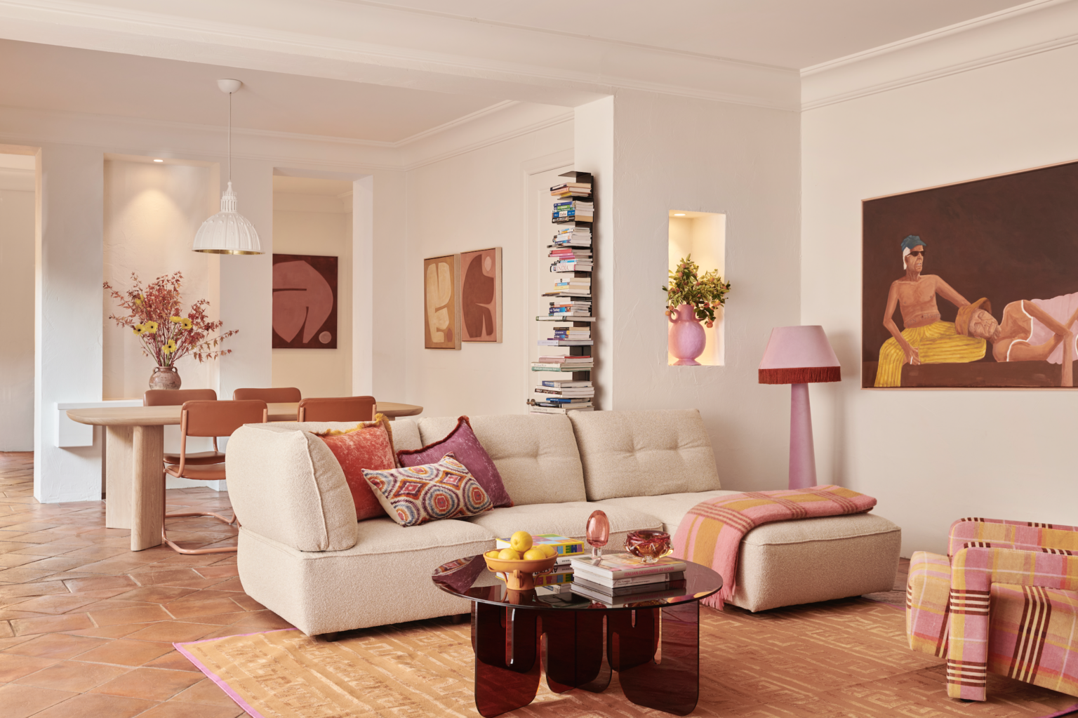
Warm whites and soft neutrals have a vital role in this colour palette, as can be seen below. The subtle beige of Wattyl Bleached Hemp provides a refreshing backdrop to the richness of the burgundy, rich pink and olive greens of the living space below.

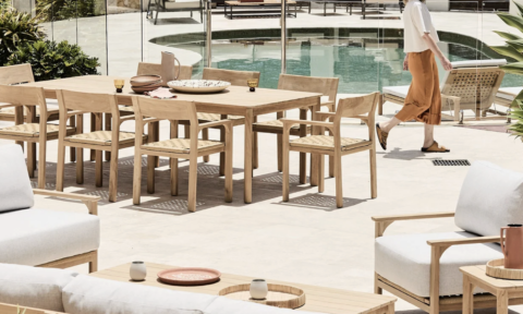
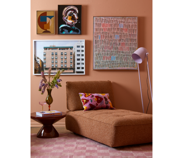
And for a quieter contrast to the many warm, earthy hues, powder blue made a valuable contribution. Pair it with terracottas and rusts alongside pale timbers, chrome and textural fabrics such as velvet, boucle and raw linens.
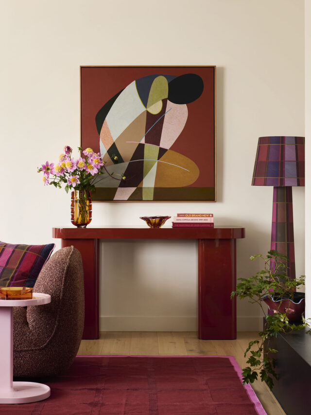
The beauty of these warmer, earthy colour palettes is their versatility – used in kitchen, bathroom, bedroom or living space their ability to invoke a sense of quiet luxury and tranquility is unrivalled. They work just as well with the soft furnishings and textures of the bedroom or living space as they do with the stone, timber and metals of the bathroom and kitchen.
For more information on Wattyl colours and to order samples.
…
…
All images courtesy of Fenton & Fenton