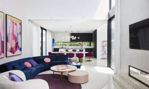
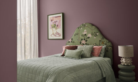
A stark departure from the cool, pastel hues that reigned last summer, the Dulux colour trend for this sunny season is a much warmer affair. Inspired by a mix of tribal and South American themes, the exotic look includes deep hues such as red, burgundy, orange and khaki.
“The summer palette for 2017 has a very different feel when compared to last year’s cool, pastel hues. This season’s colours evoke a cosy and inviting environment in the home. Rich colours add a dramatic atmosphere, while deeper tones create a sense of tranquility, ideal for creating a place to relax,” says Dulux colour expert, Andrea Lucena-Orr.
The look works particularly well when styled back with on-trend textural pieces and lots of fresh green foliage. “There are so many homeware items that work beautifully with the colours from the summer palette, in particular woven materials that highlight these shades and add a layering effect. Try potted plants in woven planters to enhance the ambience of a room,” says Andrea.
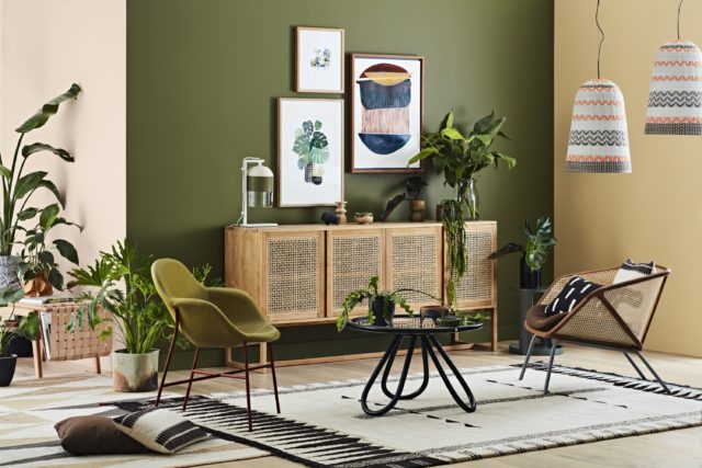
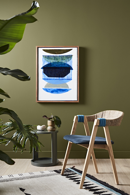
Perhaps the most surprising shade is Dulux Army Fatigues – when paired with neutral timbers it can look fabulous as a feature colour and Andrea agrees. “Homeowners can create a statement with a beautiful mid green like Dulux Army Fatigues. This shade really complements lighter timbers, rich textiles and natural elements,” says Andrea.
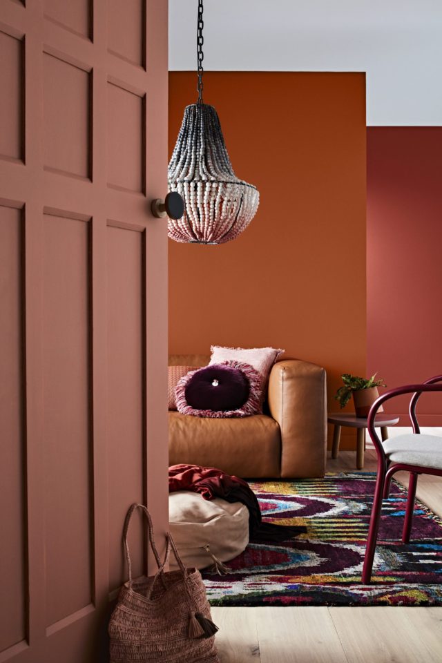
But for a really rich vibe, Dulux Carmen Miranda and Temptress might be just the ticket. “For those hoping to inject some warmth into their space, vivid red and orange shades like these can be used behind a favourite art piece or in a block design to really highlight a key feature of a room,” says Andrea.
Photography: Mike Baker | Styling: Bree Leech and Heather Nette King
See more online.