By Kerena Berry
If there’s one element of interior design that we agonise over, it’s colour. How many movies have you seen that feature a scene where a couple are debating the colour of a nursery? It’s become an old trope in film comedy.
But there are good reasons for careful consideration. Colours are like musical notes or chords for the eyes, and can be incredibly subjective, hence the common decision to go with neutrals. Let’s take a look at the options so you can decide whether to be daring or conservative with your colour palette.
Build off an existing pattern in your space
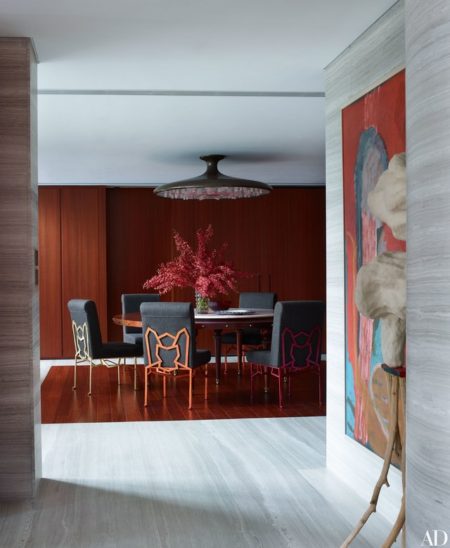
If you have patterned upholstery, a multi-coloured rug, or a striking piece of art, pull colours from this element to create your base colour palette. For a neutral base, focus on the whites, beige and grey tones. For a more striking, moody room, look to the deeper tones.
Focus on one room and let that define your scheme for the home
Working on your main living room’s colours first, and perfecting them, sets the tone for the entire home. For example, if you go for a neutral palette with deep blue textile accents, and rustic wood furniture in your living area, draw on those elements for your other spaces. Take that deep blue tone, go a little darker and paint your walls in the den, creating a cosy inviting space. Accent with white and mid blue textiles to help balance the palette. In your library try rustic, timber built-in furniture, again tying your design elements from the main living area but in a varied proportion. Use similar tones but various degrees and intensities.
Work on a dark to light philosophy
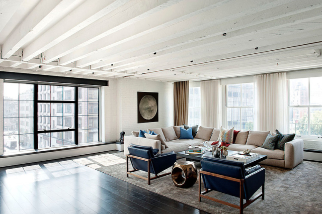
An old trick of the trade is to work dark to light, vertically. Use dark colours on the floor, mid tones on the walls, and light values on the ceiling. The floor can be any hue; just ensure it is the darkest in the space. Simple but very effective.
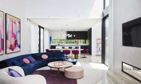
Follow the ratios 60-30- 10
Think of your space in three sections. Your highest percentage 60%, which is your walls and your dominant colour, 30% is your secondary colour for your main furnishings and fittings. Lastly 10% is your accent colour for your finishing touches and accessories. A Martha Stewart classic!
Trust the old Colour Wheel
Going back to basics is often the key to creating a sensitive palette. An analogue palette is one where the colours sit next to each other on the colour wheel like red and orange. Remember that this can be any tone, light through to deep. This is a slightly less daring take on a monochromatic room (focusing on one key colour in a space is a strong trend at the moment) but no less impressive!
White’s not always right
Don’t assume white is best to give small spaces that larger, brighter feel. Instead use darker or wow colours to bring punch or warmth for a room that envelops you. Embrace a space for what it is and resist the urge to go against the grain.
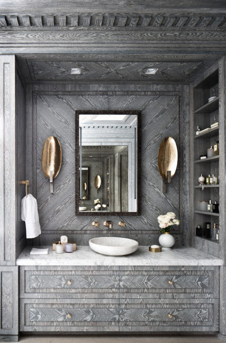
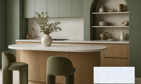
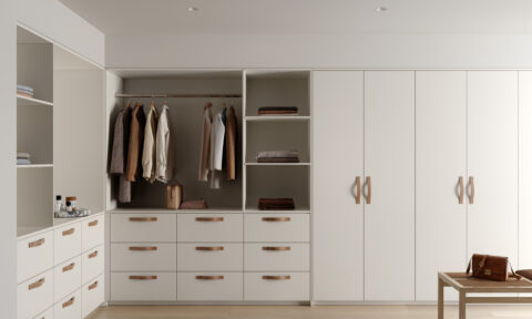
Grey is the way!
It’s certainly become the neutral flavour over the last few years. Paint colourist have responded with breathtaking options within their collections, making it hard to move past grey’s appeal. Grey’s also have this unique ability, similar to white, to absorb and reflect surrounding colours, becoming a chameleon of sorts.
Set the mood
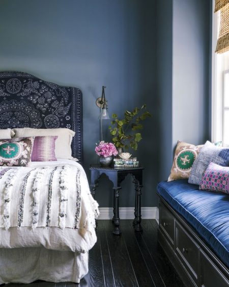
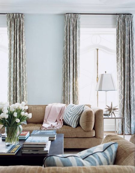
Colours invoke a mood. Be mindful of this when working in areas that require a definite vibe. Let’s say that in a casual living area, you want a vibrant, fun feel. In that case, opt for warm, contrasting or vivid colours. For a more relaxed and calming space, use neutrals, deeper blues and dirty greens—nature’s primary palette.
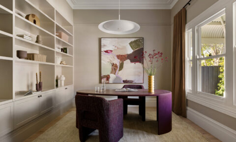
Hot flushes and cool currents
Blend warm and cool tones to bring an exciting tug of war into your space; it will keep the senses guessing and the mind curious. A warm caramel tone against a cool winter grey is calming yet interesting; a good option when a compromise is needed between butting personalities.
Black & white – is it right?
People will always debate whether these are actually colours (technically), yet they still prove to be a match made in heaven in the design world. From Modern, to Country spaces, this combination has a home. One could say they are a timeless combination; a safe yet powerful one!
There were three in the bed…
If you are yet to find your match then work to the rule of three. Use only three colours within your space and this should erode confusion, headaches, or debates. It’s almost fool proof.
Like what you like
There are a million design philosophies, principles and thoughts on how to select colours and why. But when you whittle it down, all you need to do is surround yourself with colours that bring you happiness, patterns and textures that support and encourage your lifestyle (even if it’s a little quirky) and a home that says ‘You’.
Kerena Berry is an interior designer and Co-founder of Designbx, Australia’s online interior design solution.