Vintage design, fossicking and gathering, the meeting of old and new, and the rise of new technology are among the key influences that will dominate Australian design over the next 12 months – and with it our choice of colour.
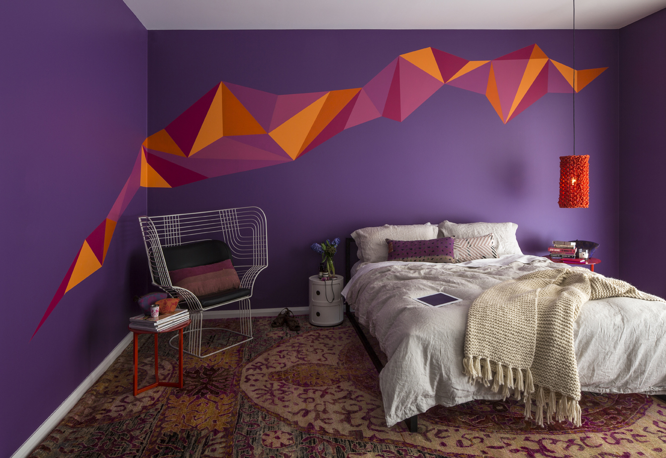
That’s the message from Dulux, whose colour experts have studied global trends to develop six palettes for 2013.
The Dulux Colour Forecast this year draws on the themes of movement, social change, people power and the march of the digital age. It explores how colour is shifting and changing in modern times.
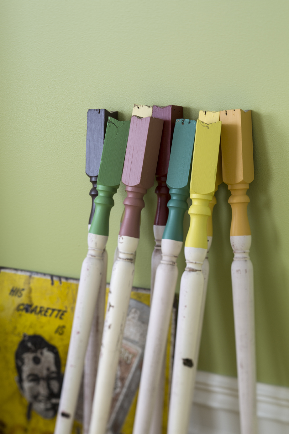
Dulux forecasters have identified six palettes, each reflecting a major trend in paint colours. Merge is warm and earthy. Seek updates vintage shades. Empower’s blue-greens speak of confidence. Relaxing Rise uses a soothing Japanese-inspired aesthetic. Share is monochromatic with metal and stone influences. Blur is bold and daring.

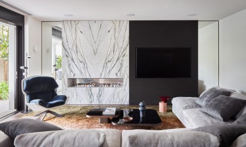
Australian interior designer Miriam Fanning, of Mim Design, says “concretes”, whites and soft parchments, will be a consistent thread in the next 12 months. “My personal favourite palette is the Share palette, in particular the colour Clear Concrete, as I believe this colour will have a lot of versatility. This colour is able to transform a room beautifully.”
Dulux has studied major consumer trends and movements around the world to develop its key themes and colour palettes. Each year its colour and design experts join others from around the globe at major colour forecasting conferences in Europe.
Dulux colour and communications consultant Bree Leech, predicts that muted red tones will prove particularly popular over the next year. “Yellow is a colour I see continuing throughout 2013/14 and pastel hues will also be important, but if I had to name a single colour I think I’d be leaning towards Dulux Persimmon.”
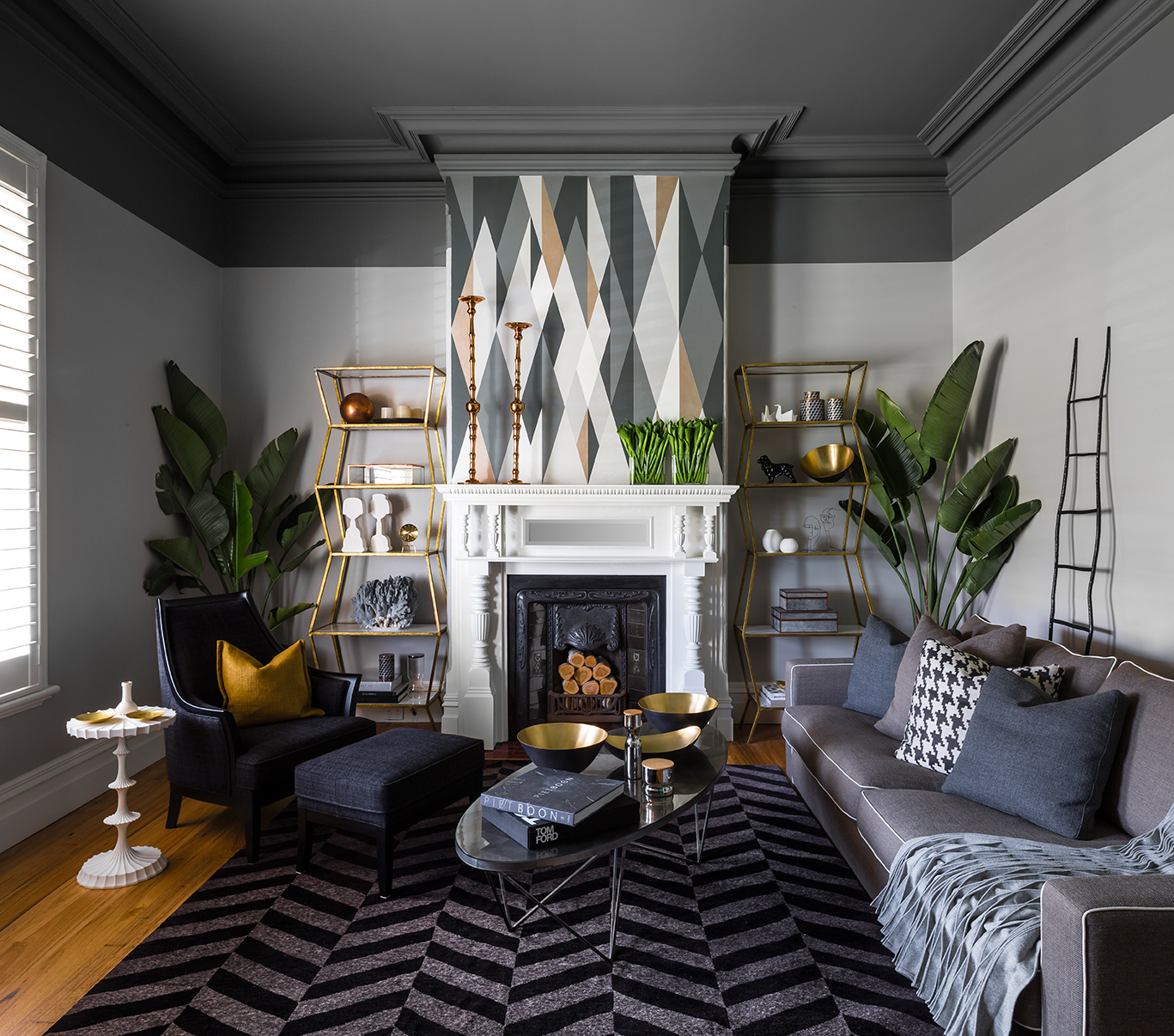
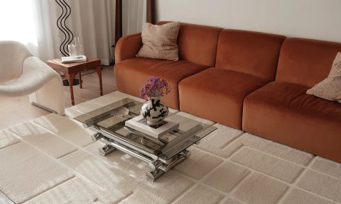
Melbourne architect Ella Leoncio says colour can play an important role in our everyday lives as a form of expression. “It’s amazing how colour can be associated with particular personalities, whether it be bright and fun or more austere and sophisticated,” she says. Her favourites can be found in the earthy shades in the Merge palette. “I like that it’s quite feminine without being too frou frou. The orange tones in the pinks give it a bit of edge.”
But while each expert has a different favourite, all agree that your choice should be personal. “Trends are there to inspire you to be creative with colour and bring to your attention colours or colour combinations you hadn’t considered,” Bree says. “Paint and colour has come a long way from just being a colour on a wall – sometimes it’s not about the art that hangs on the wall it’s the paint becoming the art,” Miriam adds.


Comments
Hi having a great deal of problems picking a white for external use.
can you suggest some great whites
thankyou