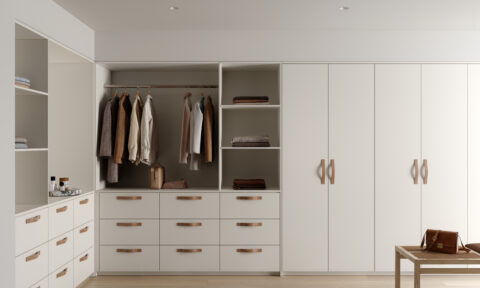
When it comes to home renovating, many of us shy away from colour, instead gravitating towards, the safer, more classic option of white, especially when our colour choices become overwhelming. But are we doing the right thing? Shouldn’t our home decor reflect our personality and really, who amongst us is happy to admit to being various shades of beige?
If you’re keen to add colour, texture and a hint of something different in your home, tiles may be the answer. “Australia is a nation known for our spectacular landscapes and colourful culture but often with colour choices being a bit overwhelming we steer clear of using it,” says Beaumont Tiles Strategic Designer Rachel Gilding. “With a bit of preparation however, colour can also be a part of our homes.”
It’s natural to be daunted by the prospect of shaking things up a little but Rachel reassures us that when it’s done right, tiles offer the home renovator an easy, cost effective option to update and brighten. “Using colour can be daunting to many renovators,” says Rachel, “but when done well can be rewarding and create visually stunning environments.”
Tile your way to a colourful and eye catching feature in your home with these top tips for adding a touch of colour.
Rachel Gilding’s tips on how to colour with tiles
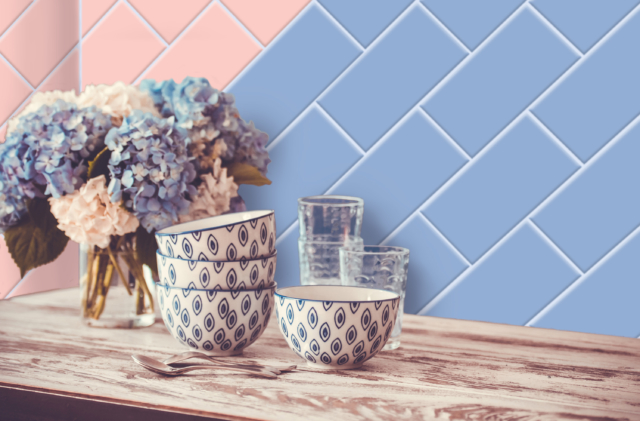
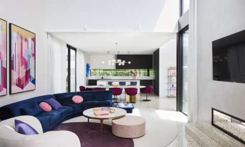
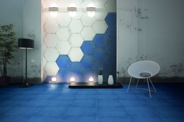
- Determine your desired effect – Decide how much colour to use in your home. Will your colour design dominate your room, or have a focal point creating emphasis, such as a colourful mosaic splashback, bath hob or a shower wall. Colour can be used to create pattern and geometry. Using colour in a patterned feature tile, shaped tile or through a coloured tile with laying pattern like brick-bond or herringbone is a nice way to inject colour into your home without domination. Coloured wall or floor tiles can liven up spaces such as the laundry, lifting the area and injecting energy and excitement.
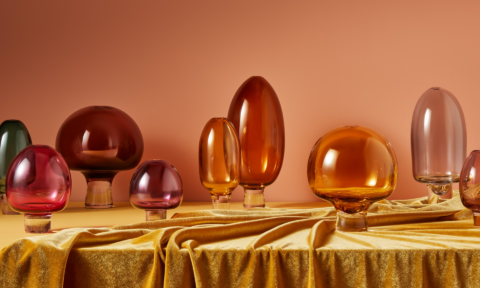
- Take the time to select your colours – As a starting point look in your own wardrobe; people are more inclined to gravitate to colours that look good on themselves. They become favourites and we tend to like to see them in their surroundings. Warm colours, such as red, orange and yellow are vivid and energetic and can spark emotions of happiness, optimism and energy. Cool colours, such as blue, green and purple, can give an impression of calm and soothing. Blue in particular is very popular now ranging from aqua tones expressing nomadic influences and beachside retreats to navy blue offering a more traditional influence.”
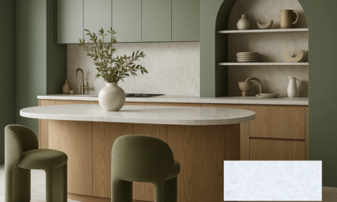
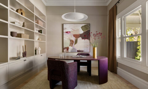
- Do your homework – Look at a colour wheel to assist in combining your choice colours. Being able to use colours consciously and harmoniously can help you create spectacular results. Colours that have different tonal values to each other work well together, for example navy and gold or blue and mustard. Another beautiful and less invasive way to use colour is to combine neutral colours that have contrasting base tones with natural materials, for example a cool grey used with a warm tan or timber hue. This organic touch adds colour and warmth without being too dramatic.”
- Consider your surroundings – Keep in mind the colours that are reflected in your geographic area. For example, aqua blues in Queensland, greens in lush tree filled areas, browns in rugged surroundings.”
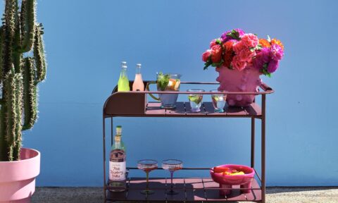
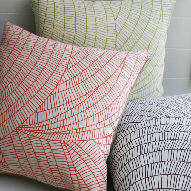
- Accessorise – When renovating a bathroom, add replaceable accessories such as colourful towels, candles, luxurious packaged creams and soaps. This can be a great way to complement your colourful tile selections. Scatter colourful cushions or statement wall art throughout your living spaces, and bright coloured appliances in the kitchen are a great way to add to your colourful look. Colour can create rhythm – your eyes can be lead around a room by placement of colour.
Beaumont Tiles is Australia’s biggest retailer of tiles and bathroom with 112 outlets across most states. For more information check out www.tile.com.au