2018 is creeping up on us. Did you know it’s 16 weeks to Christmas? Agh! So, as we look to the year ahead, Dulux has announced its colour trends for 2018. A collection of globally inspired hues, breezy neutrals and muted shades, the trends include four carefully curated themes: Essential, Kinship, Escapade and Reflect.
So how are 2018’s trends different from the past? Dulux colour expert Andrea Lucena-Orr explains: “Natural, earthy colours and textures will be coming to the fore and there will be even more of an appreciation for the splendour of imperfection. At the same time, we’ll also see an inspiring travel palette emerging filled with palm prints, happiness and visual delights.
“Soft, greenish-greys and neutral pinks are predicted to be popular in 2018 as they provide the perfect base to experiment with many of the bolder brights coming through. We’ll also continue to see darker colours and striking hues being used in small doses to add dashes of drama to the home.”
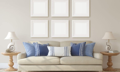
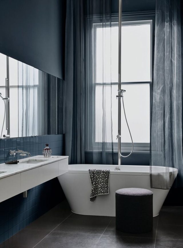
Essential
With its predominantly muted palette, Essential will create a soft and peaceful setting through warm shades of leather and putty with cool grey-green. “From the four palettes of 2018, I predict this one will dominate,” says Andrea. “As home enthusiasts will appreciate how easily these colours can transform and update a space.”
GET THE LOOK: For a subtle effect try a soft pink such as Mornington Half paired with a neutral grey-green such as Spanish Olive.
Kinship
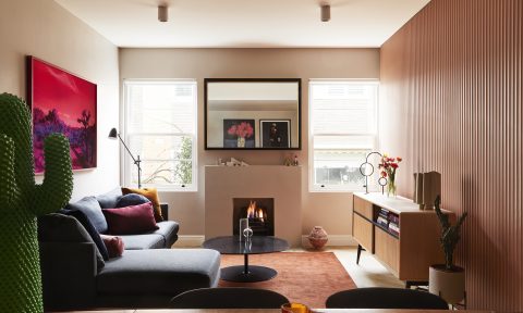
Mixing subtle neutrals with bolder hues derived from nature, Kinship is an exciting and eclectic palette that will rejuvenate any interior. Think terracotta, burnished red and faded green.
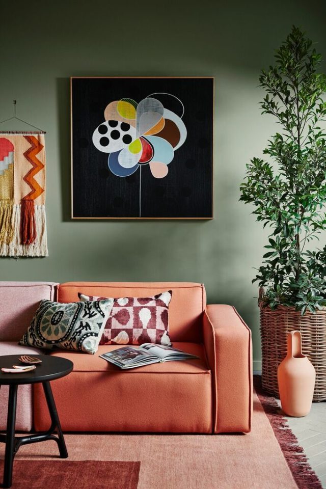
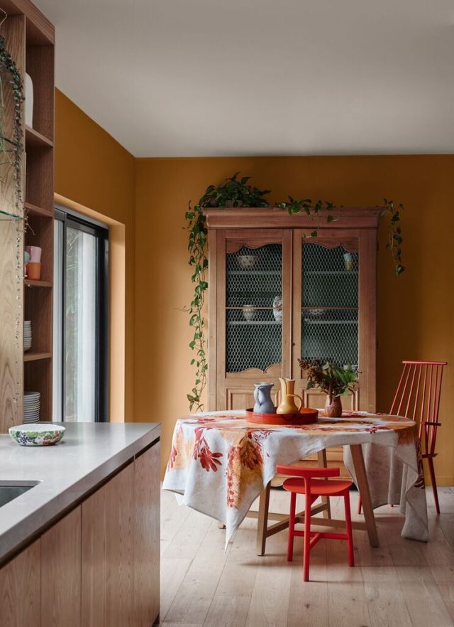
GET THE LOOK: Make a small space pop with Very Terracotta or for a moodier feel consider a charcoal such as Ruski.
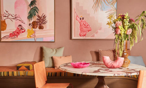
Escapade
Be on holiday every day with a collection of saturated, summery brights that make you think of tropical beaches and cocktails by the pool. “Escapade is all about fun and adventure,” explains Andrea. “It’s a great example of how the emotional impact of colour can create a playful retreat with an added zest for life.”
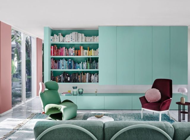
GET THE LOOK: For an exciting and unexpected combination combine a teal such as Bondi with a greenish-yellow hue such as Pale Mustard.
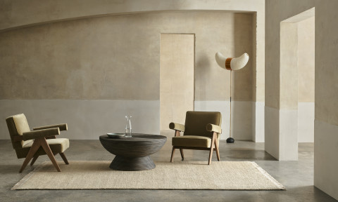
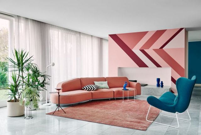
Reflect
Celebrating ’70s glamour and ’90s swagger in an understated and thoroughly contemporary way, Reflect is all about decadent green, greyish purple and burnt rose.
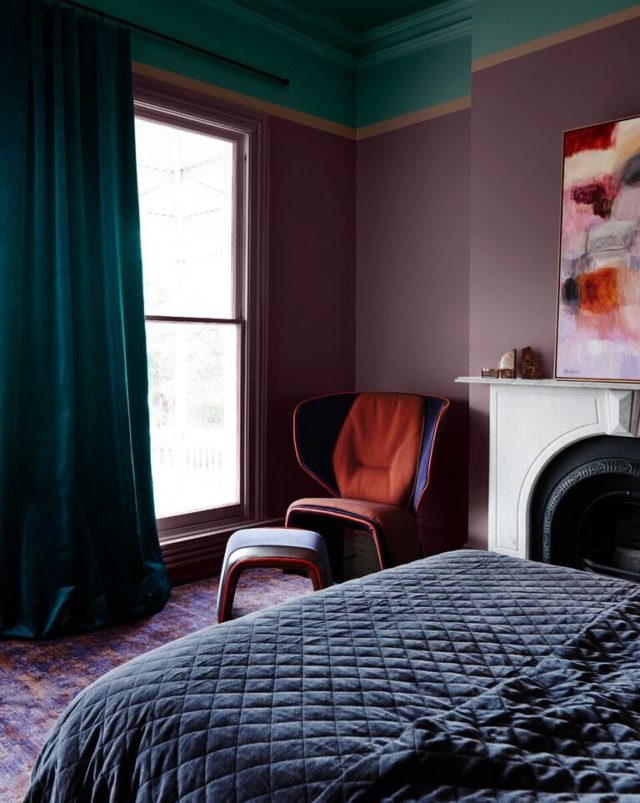
GET THE LOOK: Add a touch of drama and decadence to your home with deeper hues such as Biro Blue or Bruised Burgundy.
Photography by Lisa Cohen | Styling by Bree Leech